Yeah when you put it that way it makes sense to have it on top to avoid it getting hidden by too many options.
Feed Advanced Search
Jan 22 2020
Jan 22 2020
pedrogomes1698 added a comment to T10470: Improve the visuals of tray popups.
pedrogomes1698 added a comment to T10470: Improve the visuals of tray popups.
I'd put it somewhere around there, wouldn't want to go against the design we have so far and take away the title bar.
Jan 17 2020
Jan 17 2020
pedrogomes1698 added a comment to T10470: Improve the visuals of tray popups.
Is that supposed to be the new design?
Jan 10 2020
Jan 10 2020
pedrogomes1698 added a comment to T12308: Dolphin UI redesign.

Was this idea not good enough?
It doesn't take much away from those that use split view and it keeps that elegant style for those that don't care about split view at all.
Dec 21 2019
Dec 21 2019
pedrogomes1698 added a comment to T12372: Elisa UI Redesign.
We can always not having anything on top.

Dec 3 2019
Dec 3 2019
pedrogomes1698 added a comment to T12308: Dolphin UI redesign.

How it'd look smaller, really like it!
pedrogomes1698 added a comment to T12308: Dolphin UI redesign.
Yeah, I'd go for the standard
pedrogomes1698 added a comment to T12308: Dolphin UI redesign.

I think that on the non standard UI it's better to not add those separator lines on the top bar, I feel like they clutter it a bit, looks cleaning this way.
And personally I wouldn't want the word "Configuration" showing, but that's personal preference and there's a option to show just icons, just text or both.
But other than that, great design, if dolphin actually turns out like this, I gotta say, it'd look really sleek.
Nov 24 2019
Nov 24 2019
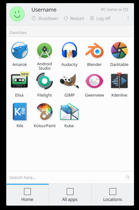
pedrogomes1698 added a comment to T12192: Redesign application launcher.
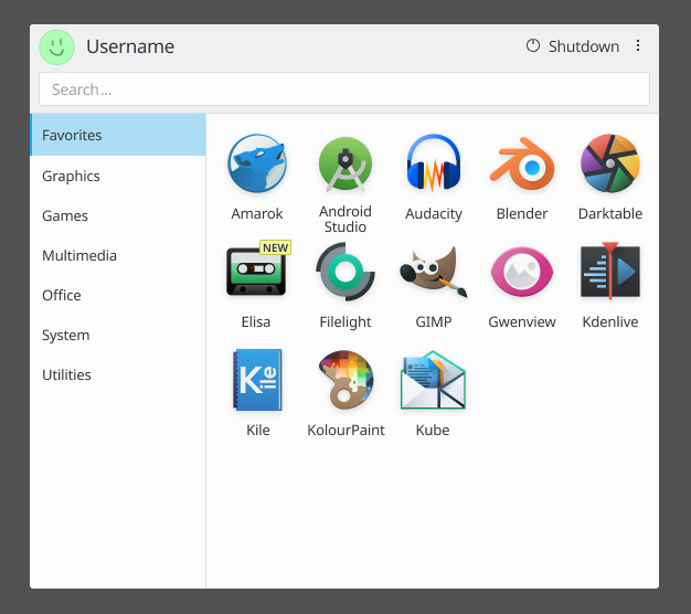
I feel like this should be left here, it's the last mockup on the other discussion that people liked a lot.
Nov 23 2019
Nov 23 2019
pedrogomes1698 added a comment to T11662: Improve visual appeal for KUrlNavigator when in Breadcrumbs mode.
I like the bottom one Joricke did, I think it's pretty solid.
Nov 20 2019
Nov 20 2019
pedrogomes1698 added a comment to T11662: Improve visual appeal for KUrlNavigator when in Breadcrumbs mode.

Isn't it cleaner to just have straight lines?
pedrogomes1698 added a comment to T9041: New "Home" tab for Kickoff.
I think we should keep the usual kickoff the way it is in terms of layout and just give it adjustments to fit the current design language breeze is going for in this next update.
And perhaps give it a option to change between lists and icons.
Though if we make the top part gray how would that work with transparency?
Nov 19 2019
Nov 19 2019
pedrogomes1698 added a comment to T9041: New "Home" tab for Kickoff.

Made a little change, I think it gives it a cleaner look.
pedrogomes1698 added a comment to T9041: New "Home" tab for Kickoff.
Aren't the bottom ones the latest way of highlighting?
pedrogomes1698 added a comment to T9041: New "Home" tab for Kickoff.
Yeah I'd like if home was more simple like this, or at least have a option to activate and deactivate the "recent" ones.
Did a little change to Manuel's mockup.
Nov 12 2019
Nov 12 2019
pedrogomes1698 added a comment to T10201: Window titlebars.

pedrogomes1698 added a comment to T10201: Window titlebars.
Last idea that I'll just throw in here, maybe something on these lines would be neat.
pedrogomes1698 added a comment to T10201: Window titlebars.
I don't think it's ideal but it's imo a improvement.
pedrogomes1698 added a comment to T10201: Window titlebars.
Having the line separated from the titlebar separator would make it a bit better, if we were to stick to this overall look.
Nov 4 2019
Nov 4 2019
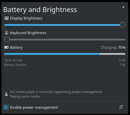
pedrogomes1698 awarded T10470: Improve the visuals of tray popups a Love token.
pedrogomes1698 added a comment to T10470: Improve the visuals of tray popups.
Nice job making the header in the music popup consistent with the rest of them and fixing the highlights in the calendar popup.
Your concepts are really consistent with the design that Breeze should be adopting from here on out.
Really hope the actual implementations are as good as these.
Oct 31 2019
Oct 31 2019
pedrogomes1698 added a comment to T11925: Breeze Desktop Theme Transparency.
Personally I think for contrast reasons, everything could be opaque by default, as long as those "[Configure blur and transparency...]" options make it to Plasma.
Having those options would be a huge improvement.
I'd love to see the accent option available too.
Sep 24 2018
Sep 24 2018
pedrogomes1698 added a comment to T7983: Reevaluate design vision and principles.
You mean single-pixel* lines right? Just to be clear.
Aug 30 2018
Aug 30 2018
pedrogomes1698 added a comment to D13481: Recommend window border size "None".
Plasma is already my number one but I do notice inconsistencies here and there and getting something like in that picture would really be amazing.
Thanks for your work!
pedrogomes1698 added a comment to D13481: Recommend window border size "None".
Well I gotta say this (https://ibb.co/deWY8U) looks gorgeous, no blue line around the white box, everything is simple and really elegant, it would be awesome if dolphin actually looked like that.
Sorry for getting off topic.
pedrogomes1698 added a comment to D13481: Recommend window border size "None".
I'm on board with removing the borders, just wondering if things like this will be changed:
Jul 29 2018
Jul 29 2018
pedrogomes1698 added a comment to T3064: Design Plasma Layout Editing Mode.
Those "recent changes" that you guys are planning, are those anywhere I can see? I'm super curious about this type of stuff.
pedrogomes1698 added a comment to T3064: Design Plasma Layout Editing Mode.
Are there any news on this? Looks really nice but seems rather abandoned.