Improving single-click / creation of contextual action toolbars
Open, WishlistPublic

Description

Why we use single-click

There are a lot of good reasons for defaulting to single-click:

  • New user friendliness: double-click must be learned
  • Accessibility for children, the elderly, people with shaky hands, laptop users, and those with poor mouse skills
  • Consistency with mobile and the web, where there is no double-click
  • Predictability: no question regarding what needs to be single-clicked and what needs to be double-clicked (we've all known people who double-click everything)

Problems with single-click

Nevertheless, single-click has one big Achilles Heel: selecting items. Right now, there are three flawed methods:

Click the selection marker in the corner that appears on mouse hover

  • Requires precision mousing skills
  • Easy to destroy your selection with a mis-click
  • Unusable on touch since there is no concept of hover, and the click target is too small anyway
  • Inconsistent UI; Dolphin and Folder View display a green emblem in the corner, while Gwenview displays a square button along with other contextual hover buttons
  • Selection marker doesn't even appear in KDirOperator views used by open/save dialogs and many app sidebars (https://bugs.kde.org/show_bug.cgi?id=185793)

Ctrl+click on individual items

  • Not discoverable; even some experts and longtime users don't know about it, as revealed in VDG chat this morning
  • No good for touch; ctrl key is unavailable for tablets and phones, and awkwardly far away for convertible laptops

Click-and-drag to make a rubber-band selection

  • Can only be easily used to select a line or box of items; must combine with ctrl+click in a multi-step operation to select arbitrary items
  • Impossible on touch, where empty areas of a scrollable view will scroll the view if you touch-and-drag

Difficulty selecting items extends to difficulty doing things to items that do not involve opening them (i.e. renaming, deleting, copying and pasting, etc). With double-click, a common workflow is: click item to select itchoose action with main menu or a keyboard shortcut. But with single-click, selecting items is difficult, so using a keyboard shortcut or main menu to act on a selected item is more rare. Instead, the typical UX is to right-click on the item and choose an action from the context menu. But this is problematic because there is no right-click on touch, and anyway, a lot of people don't right-click very much using their desktops and laptops. With laptops in particular, right-clicking is often awkward, difficult, and non-discoverable.

Proposed solution

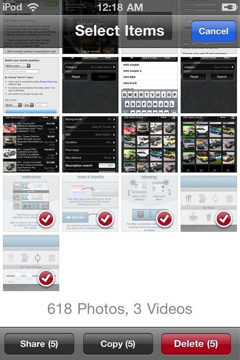
I'd like to propose a new UI that will address the selection problem: a dedicated "selection mode" wherein single-clicking on items will select them. This is a very common and user-friendly pattern on mobile. Here is an example taken from a GNOME Photos mockup I saw a while back:

And here's how it worked with a very old version of iOS:

Adopting such a thing would be really nice for us too, as it would not only improve the selection situation for single-click, but also allow seamless touch support. The whole item plus its background in the grid becomes a click target, so it's very very fast to select a bunch of icons this way--much faster than using the selection marker, and even a bit faster than ctrl+clicking on icons. We could also allow click-and-drag to do rubber-band selection for bulk selection.

This mode would be activated by clicking on a visible button marked Select items or by using a keyboard accelerator--perhaps the ctrl key, or even the spacebar.

Next, we can add a contextual action bar full of items that can act on the selected items--or even when there's no selection. Basically the idea is to replicate the features available via the right-click context menu, but without the need to right-click. Here are some rough mockups for how it might look in Dolphin (thanks @broulik!):

Some other mockups in which the contextual action area is put next to the status bar (by @felixernst):

  • All of this probably relies on first unifying the icon/folder views: T9226: Unify icon/folder views

    ngraham created this task.Oct 18 2018, 4:05 PM
    ngraham triaged this task as Wishlist priority.

    I personally like single click so much that it's basically annoying me when I hear someone double-clicking with a mouse loudly nearby :)

    One of the problems with single click, though, is that GTK apps still use double click, and when you use an app that relies on the GTK file dialog, you have to switch your mind to the double click perspective. This can be confusing to beginners who can't tell the framework by app's appearance.

    Is it possible in theory to force GTK to conform to single click, too?

    You forgot the middle/wheel click as a forth option for selection. One of the drawbacks, if you middle click on a folder in dolphin it although opens the folder in a new tab. If you middle click on a file it gets selected.

    You forgot the middle/wheel click as a forth option for selection. One of the drawbacks, if you middle click on a folder in dolphin it although opens the folder in a new tab. If you middle click on a file it gets selected.

    Heh, I didn't even know about that! Drawbacks would be:

    • Not discoverable
    • Inconsistent behavior between file and folder behavior
    • Not possible on touch
    • Difficult to impossible to do with a laptop touchpad (depending on the hardware and software)

    Windows explorer has also a feature like this I think already since the XP era.

    When take a look at the ribbon toolbar we have actions like:

    • Add to favorites / quick access
    • Copy
    • Paste
    • Move
    • Copy path
    • Add link
    • Move to ...
    • Copy to ...
    • Delete
    • Rename

    • Open
    • Edit
    • Properties

    Windows explorer has also a feature like this I think already since the XP era.

    The toolbar in Windows 7 explorer is what inspired my Dolphin mockup :) I didn't want people adding random buttons like "Create New Folder" and "Show Hidden Files" in the toolbar but instead have a secondary contextual toolbar for the current view.

    clel added a subscriber: clel.Dec 15 2018, 2:47 PM

    Is this issue just for the selection "problem" of single click or also about other problems, (like some meta issue)? Because I'd recommend either being just about selection and then rename the title accordingly or to have it as a meta issue and then maybe only link the corresponding issues.

    Reason: Selection does not seem to be the only problem of single click:

    One of the problems with single click, though, is that GTK apps still use double click, and when you use an app that relies on the GTK file dialog, you have to switch your mind to the double click perspective. This can be confusing to beginners who can't tell the framework by app's appearance.

    Is it possible in theory to force GTK to conform to single click, too?

    There might be other inconsistencies as well that should be considered.


    Regarding the selection problem:

    My suggestion is:

    • Change the plus and minus signs that show on hover to a (empty) checkbox like on Windows to be more intuitive including making the whole icon adding to a selection after entering the selection mode
    • Do not use another button to enter selection mode as this feels worse having to travel longer distances with the mouse
    • For touch devices that don't have hover and also where a tiny checkbox is hard to hit I suggest long press (does libinput / whatever give an information whether a click comes from a touchscreen? - then this can only be used for touch inputs)

    Consistency with mobile and the web, where there is no double-click

    Just to be precise: There is double click on the web like on Google drive which uses it probably to simulate the normal file browser experience. Also there is double click on some mobile devices at least if you consider Windows tablets a mobile device (I agree that their solution is not nice with a touch screen).

    ndavis added a subscriber: ndavis.Dec 15 2018, 3:15 PM
    ndavis added a comment.EditedDec 15 2018, 3:19 PM

    You forgot the middle/wheel click as a forth option for selection. One of the drawbacks, if you middle click on a folder in dolphin it although opens the folder in a new tab. If you middle click on a file it gets selected.

    Another less obvious drawback is that it's not uncommon for cheap mice to have problems with clicking the mouse wheel after a while. For example, my current mouse, my previous mouse and the mouse I had before that all developed an issue where sometimes the mouse wheel would double middle click or not click at all. If that was the only good way to select items in single click mode, it would be hard to use with cheap mice after a while.

    This comment was removed by raddison.

    Here's the thing. Windows has double by default but people who have higher-than-average IQ switch to single. Plasma has single by default but people who have lower-than-average IQ ask someone else to switch it to double for them. Stop the nonsense. Make it double by default but don't make it hard on me to switch it back to single.

    I'm not going to bombard you with links, but I'd like to know the source for this, which seems to be a bit strong. Or maybe my IQ is simply low enough.

    This comment was removed by raddison.
    This comment was removed by raddison.

    @raddison

    Are you okay? Is there someone I can call?

    This comment was removed by raddison.
    This comment was removed by raddison.
    raddison added a comment.EditedJan 8 2019, 1:37 PM

    I'm sorry but I had misunderstood the purpose of the task. This task is about improving single click. Has nothing to do with double click. @ngraham My apologies.

    Your apology is accepted. In the future please read things more closely and avoid posting enormous rants. They aren't helpful and make people less likely to listen to your point of view, not more.

    Also, Phabricator is really intended for developer-to-developer communication. It becomes difficult for developers to communicate when users show up offering their opinions, especially in the form of huge rants that insult people. That's what https://bugs.kde.org is for (without the insulting rants, preferably).

    As you are a user and have never submitted any patches for anything, please refrain from posting in Phabricator tickets. I would recommend sticking to https://bugs.kde.org and forums/reddit/etc.

    See https://community.kde.org/Get_Involved#Getting_in_touch_and_working_together

    I'll be politically correct.

    ngraham renamed this task from Improving single-click to Improving single-click / creation of contextual action toolbars.Sep 12 2019, 2:15 PM

    The idea of a contextual action area seems very promising to me. I think we need to make sure though that the area is hidden most of the time. Otherwise users who are happy with Dolphin's current UI will be bothered by the "unnecessary" addition. We need to make sure that we can have the area enabled by default or its use for non-expert users will be close to zero.

    That isn't really all that difficult to achieve because we already have the toolbar for actions which are supposed to be available regardless of context. For specific contexts the new action area is used.

    I would suggest to have this area below the view. This seems like a sensible decision to me because this way we have the view and its state which defines the context above the contextual area. The user would be aware of the context first and then sees the recommended actions for the current context. Another advantage is that the status bar text frames the context in words which makes it act somewhat like an information that explains why these actions are recommended.

    These mockups should make more obvious what I mean:

  • Different from the current status bar, it would be better if this area would not appear twice in split view mode for one because of space concerns and because it greatly simplifies implementation I believe.

    That's great! Very much like what I was envisioning.

    It seems like we would need to relocate the zoom slider and the capacity bar though.

    That's great! Very much like what I was envisioning.

    Thanks! That's good to hear.

    It seems like we would need to relocate the zoom slider and the capacity bar though.

    Not necessarily. As you can see in the mockups, the zoom slider is normally visible when browsing files. When files are selected one most likely doesn't want to use the zoom slider right now. Zoom buttons appear in the hamburger menu when the zoom slider is hidden.

    Similarly the capacity bar is normally visible for normal browsing and most importantly when navigating to another storage. The storage space in text form could always stay visible like in the mockups.

    The whole idea of the contextual area is that certain actions are sometimes hidden from the UI. The zoom slider and the capacity bar are mostly useful while browsing and not while manipulating files I think. I think the UI will seem overloaded if we just add the new stuff without hiding these two items sometimes.

    Ah that's a great point. Seen through that lens, I agree that the Zoom slider and capacity bars are only relevant when no files are selected.

    meven added a subscriber: meven.Dec 21 2020, 9:05 AM

    I'd rather have a proper panel as the information panel, folder panel, folder panel...
    So that user can hide it, or move it, and for general consistency/ having a proper alignment with minimal overflow.

    I don't see a way to add the area as a proper panel that won't be problematic. Do you have a clear picture in mind how that could work?

    I think it is important that this contextual area can be enabled by default. This would especially help users that don't know when to use the right mouse button. I like my solution a lot in that regard. Maybe there is a way to improve on it and reduce the shortcomings you are seeing?

    clel added a comment.Dec 21 2020, 2:47 PM

    Just adding a few thoughts of mine:

    • Currently those action areas seem to be applied more widely (at least judging from what was recently added to Konsole), so this seems like a good thing to introduce. Making it contextual is even better I guess.
    • Not sure how relevant the original topic of this task still is, but if I read it correctly, it was suggesting to have a dedicated button to enable a "selection mode" to improve single click experience. Both approaches can be implemented independently, though I guess.
    • Personally I never liked the buttom area that much and was rather hoping to see its usage getting less than more. I think if one can come up with a nice way to show/hide those actions they will feel better when placed at the top together with other toolbar actions. I think that is because currently such menus are mostly placed there (also see Konsole for comparison) and thus it feels more natural.
    • Regarding the discussion about zoom slider and capacity bar: I have no problem with those being hidden in that mode (but I never was a big fan of them in the first place).
    • In general, when making the options appear this might lead to content being either hidden or moved, probably this is worse when placing it at the top.
    • Currently those action areas seem to be applied more widely (at least judging from what was recently added to Konsole), so this seems like a good thing to introduce. Making it contextual is even better I guess.

    Yes, and also header and footer areas are used more often so this does follow a general trend but I think this is a good way forward even if they weren't.

    • Not sure how relevant the original topic of this task still is, but if I read it correctly, it was suggesting to have a dedicated button to enable a "selection mode" to improve single click experience. Both approaches can be implemented independently, though I guess.

    I added selection buttons to my mockup to stay on topic but I am really mostly here to discuss the action area. Yes, maybe it's best to discuss them somewhat independently because that's already complicated enough imo. But I think we can do this here for now.

    • Personally I never liked the bottom area that much and was rather hoping to see its usage getting less than more.

    I used to be like that mainly because I hardly use its features. If we'll be able to show the correct size of the selected items (T13083: Dolphin: improvements to directory size counting), the status bar text together with the total current storage capacity information will be of great assistance for basic file copying between storage devices. For users that don't do that a lot it might make sense to make the bottom area hidable but let's try to figure out the default appearance first.

    • In general, when making the options appear this might lead to content being either hidden or moved, probably this is worse when placing it at the top.

    Yes, this together with the arguments I mentioned above is why I think putting it at the bottom is better. Another argument is that one shouldn't pile up all actions at close proximity unless they share a logical connection. Putting the actions that deal with the currently selected items to the bottom and away from the more general navigation-controlling actions which are currently on the toolbar makes it easier for users to mentally group the use-cases for what they are seeing.

    felixernst updated the task description. (Show Details)Dec 22 2020, 5:01 PM
    clel added a comment.Dec 22 2020, 6:12 PM

    Agreed to your first two points.

    Regarding the both last points: I understand where you are coming from and this mechanism also seems to be largely applied on mobile OSs (like the screenshot from iOS in this description - probably also because of proximity to the fingers). For "normal" oldscool desktop/laptop UIs this is currently still pretty uncommen, though. The argument with close proximity could also be used against the approach: Action buttons are in close proximity to unrelated info text there, while when having them above would result in close proximity with other action buttons. Maybe instead of integrating them in the status bar they could be arranged in a separate "box" that appears when things are selected.

    Action buttons are in close proximity to unrelated info text there

    Not really: The status bar text states the selected items, the actions below that text act on these selected items.

    [The action buttons] could be arranged in a separate "box" that appears when things are selected.

    I mean, that's kind of what I did. It's just that I think the best place for this box is below the view and the status bar. I already gave my reasoning why I think this is probably the most sensible solution but feel free to try to contrive something better. It might be useful to have multiple designs to ponder about.

    clel added a comment.Dec 23 2020, 11:59 AM

    Action buttons are in close proximity to unrelated info text there

    Not really: The status bar text states the selected items, the actions below that text act on these selected items.

    I added a comment on a mockup I was referring to now.

    [The action buttons] could be arranged in a separate "box" that appears when things are selected.

    I mean, that's kind of what I did. It's just that I think the best place for this box is below the view and the status bar. I already gave my reasoning why I think this is probably the most sensible solution but feel free to try to contrive something better. It might be useful to have multiple designs to ponder about.

    I'll try to come up with something!

    Neither Claudius nor my mockups found enough agreement so far with Méven having a contrasting suggestion to put the actions below the information panel (https://phabricator.kde.org/M178#4431). There aren't enough other voices in general here for us to come to a conclusion. We would need better mockups or more people supporting one idea here I think for this task to move forward.

    abetts added a subscriber: abetts.Sep 16 2021, 1:59 PM

    Dolphin has this now! It's really cool.

    I guess the text step is to add it to Gwenview, Folder View, and file dialogs, and various other places.

    Ideally we would have a common icon view library component so that it could be done everywhere automatically, but we're a long way away from that.