Tweaked contrast effect values, adjusted transparency accordingly, switched from Background to ViewBackground
AbandonedPublic

Authored by niccolove on Feb 3 2020, 11:05 AM.

Details

Summary

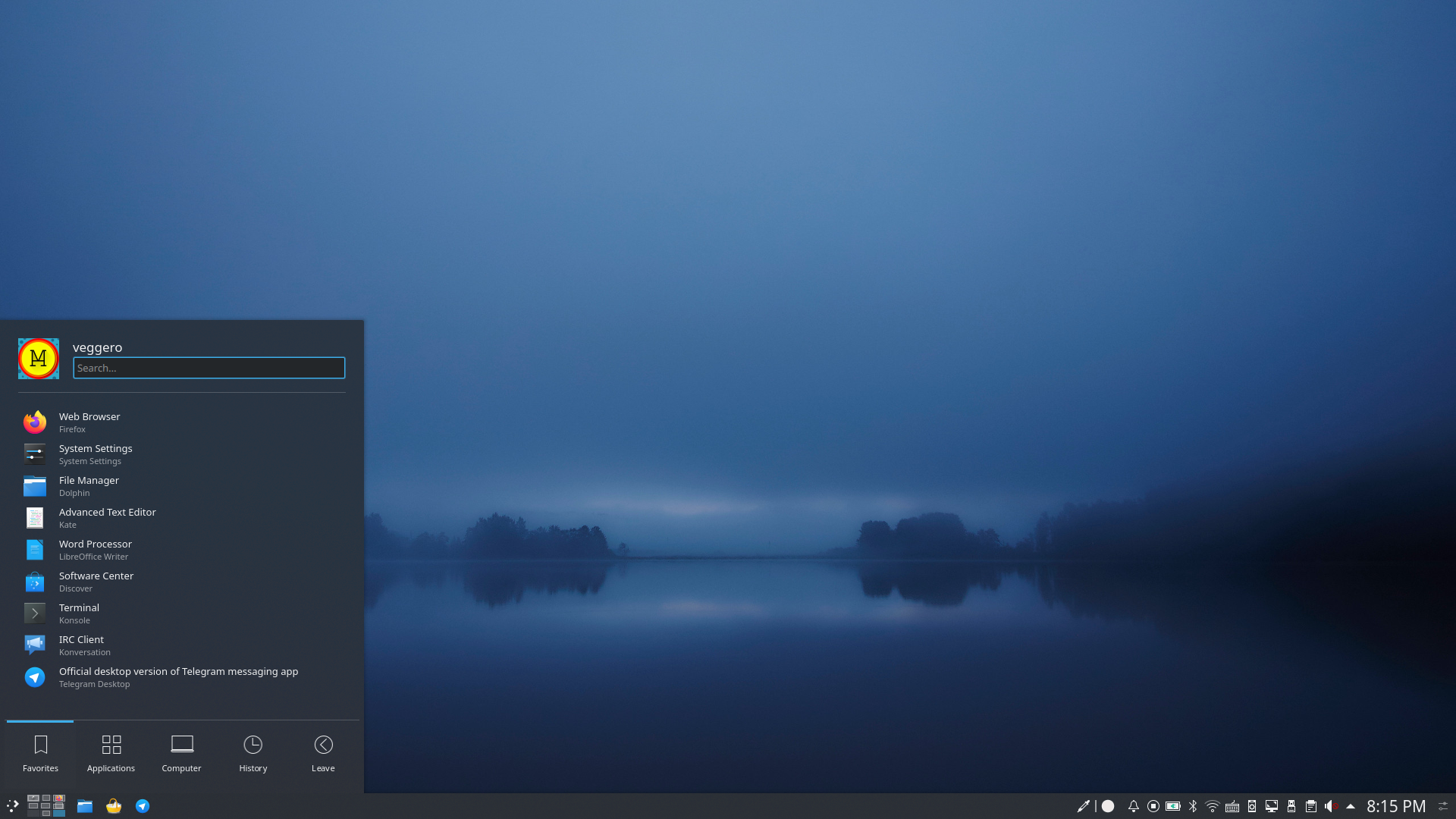
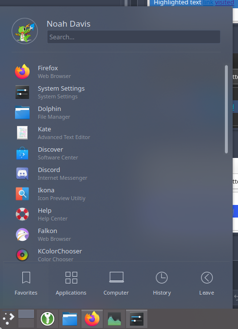
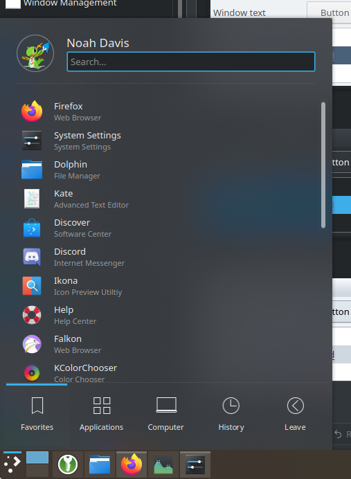
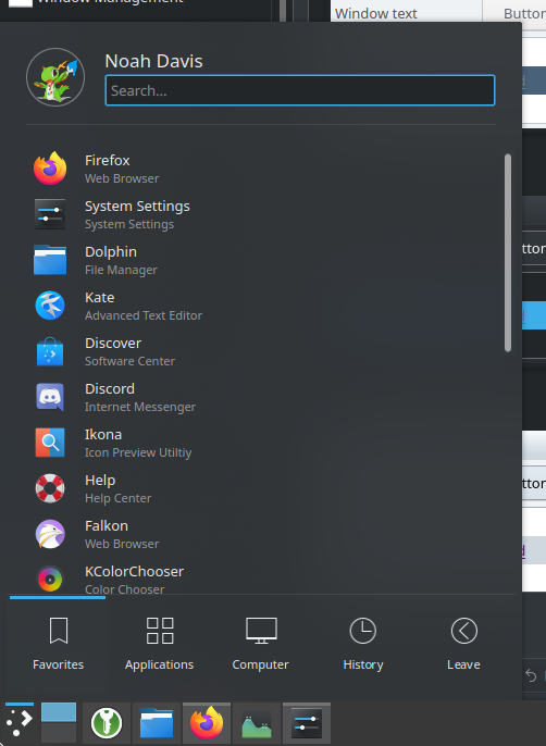
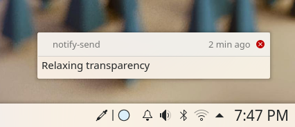
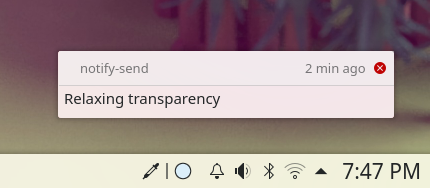
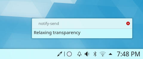
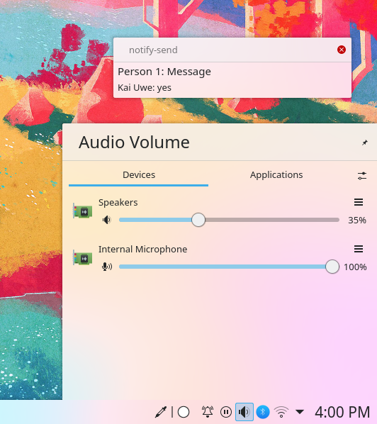
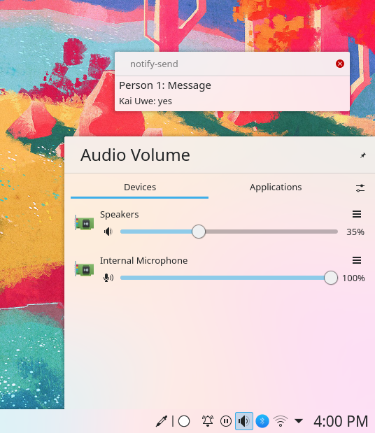
I tweaked the contrast effect values to make Breeze a bit prettier (also similiarly to what's described here https://notmart.org/blog/2013/11/plasma2-all-about-elegance/). I changed transparency from .6 to .8 (dialog) and .88 (panel) to adapt to those changes. To improve legibility, I changed the background from ColorScheme-Background to ColorScheme-ViewBackground (otherwise it was a bit too gray-ish).

The panel transparency is a bit higher as a workaround of the bottom-white-area on blur bug.

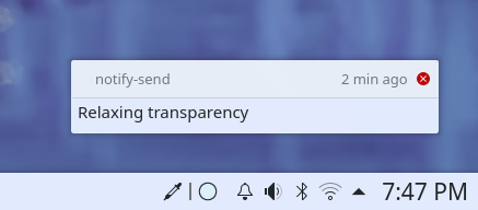
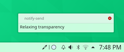
I added a new panel_background.svg file to the dark theme as it needs to be less opaque than the light version.

I removed the intensity value as:

  • Even with default breeze, it was calculated incorrectly and resulting in weird colors. Making the saturation higher made that even more visible; see: https://i.postimg.cc/qMD5mwnc/image.png. I created a bug report about this at https://bugs.kde.org/show_bug.cgi?id=416699
  • As far as I understood it, the intensity value was calculated based on the darkness of the wallpaper. I did not see any noticeable difference on dark wallpapers when setting the intensity to a fixed value, and all the content is absolutely readable.

Not included in this patch, but suggested to go with it, is using the max blur radius by default.

Depends on D27189
Depends on D27439

Test Plan

Suggestion: look at the screenshot fullscreen!

Light theme:

Before:


After:

After +sat:

Before:


After:

After +sat:

Before:


After:

After +sat:

Before:


After:

After +sat:

Before:


After:

After +sat:

Before:


After:

After +sat:

Before:


After:

After +sat:

Before:


After:

Before:


After:

Dark theme:

Before:


After:

Before:


After:

Before:


After:

Before:


After:

After:


Diff Detail

Repository
R242 Plasma Framework (Library)
Branch
contrast_effect_background_color (branched from master)
Lint
No Linters Available
Unit
No Unit Test Coverage
Build Status
Buildable 22913
Build 22931: arc lint + arc unit
There are a very large number of changes, so older changes are hidden. Show Older Changes
ndavis added a comment.EditedFeb 4 2020, 8:01 AM

Using View Background is semantically incorrect. If you want to change the color, you should patch the color scheme.

ndavis requested changes to this revision.Feb 4 2020, 8:03 AM
This revision now requires changes to proceed.Feb 4 2020, 8:03 AM

Using View Background is semantically incorrect. If you want to change the color, you should patch the color scheme.

But in order to change ColorScheme-Background I should change Window Background in the colorscheme, which would make all KDE apps lighter, right? I don't think that it makes sense to use the same color of windows for dialogs, since they're not windows, especially since they are also transparent and that requires adjusting the color.

ndavis added a comment.Feb 4 2020, 6:07 PM

Using View Background is semantically incorrect. If you want to change the color, you should patch the color scheme.

But in order to change ColorScheme-Background I should change Window Background in the colorscheme, which would make all KDE apps lighter, right? I don't think that it makes sense to use the same color of windows for dialogs, since they're not windows, especially since they are also transparent and that requires adjusting the color.

If you need to adjust the color specifically for the desktop theme, you should adjust the color schemes of the Plasma Light/Dark desktop themes.

Gotcha.

ndavis added a comment.Feb 4 2020, 6:11 PM

Also, you can set contrast effects per desktop theme. If you do that, you may be able to improve the look of breeze light without hurting breeze dark. Let the Breeze desktop theme be a fairly neutral one that works well with most colorschemes.

Also, you can set contrast effects per desktop theme. If you do that, you may be able to improve the look of breeze light without hurting breeze dark. Let the Breeze desktop theme be a fairly neutral one that works well with most colorschemes.

Yes, I was just doing that as well. One question: if I change the colorscheme for background of default Breeze, it will become the same as Breeze Light, won't it? Should I remove that one? It would be probably better than having two different ones but the default one (Breeze) is a bit more gray-ish than the other (Breeze Light)

ndavis added a comment.Feb 4 2020, 6:16 PM

Also, you can set contrast effects per desktop theme. If you do that, you may be able to improve the look of breeze light without hurting breeze dark. Let the Breeze desktop theme be a fairly neutral one that works well with most colorschemes.

Yes, I was just doing that as well. One question: if I change the colorscheme for background of default Breeze, it will become the same as Breeze Light, won't it? Should I remove that one? It would be probably better than having two different ones but the default one (Breeze) is a bit more gray-ish than the other (Breeze Light)

Keep in mind there's the Breeze Light desktop theme (uses the Breeze color scheme) and the Breeze Light color scheme (not that great). What are you referring to?

I'm referring the the Breeze Light desktop theme, which I guess uses the "color" file to look, well, lighter, but it won't be different if I make the color file for Breeze as well

ndavis added a comment.Feb 4 2020, 6:18 PM

Also, you can set contrast effects per desktop theme. If you do that, you may be able to improve the look of breeze light without hurting breeze dark. Let the Breeze desktop theme be a fairly neutral one that works well with most colorschemes.

Yes, I was just doing that as well. One question: if I change the colorscheme for background of default Breeze, it will become the same as Breeze Light, won't it? Should I remove that one? It would be probably better than having two different ones but the default one (Breeze) is a bit more gray-ish than the other (Breeze Light)

Keep in mind there's the Breeze Light desktop theme (uses the Breeze color scheme) and the Breeze Light color scheme (not that great). What are you referring to?

I'm referring the the Breeze Light desktop theme, which I guess uses the "color" file to look, well, lighter, but it won't be different if I make the color file for Breeze as well

Don't make a color file for the breeze desktop theme. It doesn't have one so that it can use any system color scheme.

Don't make a color file for the breeze desktop theme. It doesn't have one so that it can use any system color scheme.

Uhm; but then, there's no way for the default theme to not look gray-ish without changing the globar colorscheme? (Also - since this is approaching a discussion that would work better in chat, can we talk in the VDG chat directly?)

niccolove updated this revision to Diff 75010.Feb 4 2020, 7:11 PM

Tweaked contrast effect for dark and light versions, added new panel file for dark

niccolove edited the test plan for this revision. (Show Details)Feb 4 2020, 7:16 PM

I've done the dark theme again, should be nice now

Light version still looks good to me. For the dark version, I still see a difference between the background opacity of the panel and the pop-up:

niccolove updated this revision to Diff 75017.Feb 4 2020, 9:08 PM

Updated cmake

ngraham requested changes to this revision.Feb 4 2020, 9:23 PM
ngraham added inline comments.
src/desktoptheme/breeze-dark/CMakeLists.txt
12

Using GLOB in CMake is considered a code smell; just list the individual files explicitly.

Also this doesn't work; the files don't get installed.

This revision now requires changes to proceed.Feb 4 2020, 9:23 PM
niccolove updated this revision to Diff 75018.Feb 4 2020, 9:25 PM

Fix cmake

niccolove updated this revision to Diff 75019.Feb 4 2020, 9:26 PM

Replace dialogs with widgets as that's the actual one

Still not installing the file for me. Is this working for you?

I'm unable to build anything right now unluckly so I tried to use code from the breeze folder but I'm not good at cmake. I will try to make cmake for me tomorrow

Nope, I'm absolutely unable to build plasma-framework right now, I have many problems that I don't understand :-/ Also, I have 0 Cmake experience
If somebody has time, can they look into how to make Cmake read that file?

niccolove updated this revision to Diff 75145.Feb 6 2020, 10:06 PM

Fixed mistakes in breeze dark cmakelist

niccolove marked an inline comment as done.Feb 6 2020, 10:07 PM
ngraham accepted this revision.Feb 6 2020, 10:15 PM

Can confirm that it works, and I do think it looks better now. I'm not an expert on the SVG changes but I don't see anything obviously wrong in there.

Please add a comment in the Description section of this patch explaining why the previously disabled Intensity value is now enabled.

niccolove edited the summary of this revision. (Show Details)Feb 8 2020, 11:38 AM
niccolove edited the test plan for this revision. (Show Details)EditedFeb 8 2020, 11:42 AM

Please add a comment in the Description section of this patch explaining why the previously disabled Intensity value is now enabled.

Do you still see Breeze after installing this? For some reason, mine disappeared, there's just Breeze Light and Dark
edit: seems like it was installed as "veggy" instead of "breeze", weird, but maybe that's just on my machine, I don't see any change that could lead to that

niccolove added a comment.EditedFeb 8 2020, 2:16 PM

I personally choose 0.4 for opacity, but I was now thinking whether higher or lower values could be better. I took 50 screenshots in different conditions, but since those are a bit difficult to upload to Phab, I also made a website which helps you pick a value: https://niccolo.venerandi.com/backstage/files/opacity/compare.html - I'd suggest using fullscreen and trying a couple of times. It's very hacky and bad-written, but it's only supposed to be a quick tool.
You can also see *all* screenshots at https://niccolo.venerandi.com/backstage/files/opacity/{0.2,0.4,0.5,0.6,0.8}/{1:10}.png

Edit: some results that I collected so far: [0.53, 0.51, 0.33, 0.31, 0.6, 0.2, 0.73, 0.77, 0.7, 0.57] - Right now in this patch it is set to 0.4, so maybe I would make it a bit higher, like 0.55/0.6

My result was 0.644.

But ultimately, don't let this become design-by-committee. This is your patch, and your proposal. It's good to take into account feedback, but not to the extent that it compromises what you're trying to accomplish in the interests of pleasing people who fundamentally don't like it and never will. You do need to maintain text legibility, but beyond that, the people who just don't like transparency won't be happiest with any opacity value less than 1. If you try to placate them, you'll be pushed in the direction of compromising your design vision. If your design vision is fundamentally sound, those people will just need to adapt a bit.

(and I say this one of those people :) )

Thanks for the feedback!
My personal opinion is that something like .6 looks best, and I think the general feedback I got is in line with that. I will update the values accordingly :-)

niccolove updated this revision to Diff 75277.Feb 8 2020, 6:54 PM

Changed saturation to 6.0

niccolove edited the test plan for this revision. (Show Details)Feb 8 2020, 6:57 PM
cblack accepted this revision.Feb 8 2020, 7:06 PM
cblack added a subscriber: cblack.

Style-wise, the tinting effect definitely an improvement over what we currently have. Everything here LGTM.

ngraham accepted this revision.Feb 8 2020, 9:53 PM

Me too!

ndavis requested changes to this revision.Feb 9 2020, 9:00 AM

Still uses ViewBackground on panels. For panel popups, you wanted to use a header area like the systray mockups, right? If so, the dialog SVG could use ViewBackground and you should mark this patch as dependent on the toparea patch.

This revision now requires changes to proceed.Feb 9 2020, 9:00 AM

Still uses ViewBackground on panels. For panel popups, you wanted to use a header area like the systray mockups, right? If so, the dialog SVG could use ViewBackground and you should mark this patch as dependent on the toparea patch.

Using Background for panels would break the visual integration with dialogs, so I would avoid doing that.

Regarding panel popups / dialogs; I'm already working on the toparea patch - https://phabricator.kde.org/D27189 - but I was thinking, the problem with using Background is the controls on top of it e.g. kickoff search. Since the transparency makes the background color not as gray, the only problem is when things are opaque (I remember we talked about this in the VDG chat). Now, *there is* a version of Breeze opaque in the breeze/opaque/ directory which is used when compositing is disabled. For that one, I did leave ColorScheme-Background, so the problem is not there when the actual opaque version is used. I think that people who want things to be 100% opaque will install a theme rather than manually editing the svg, so they would not have that problem as well. That isn't to say that I won't work on the top area, just that I would not make the this patch dependent on it.

I also tried to tweak the intensity value to make the normal ColorScheme-Background fine, but I did not have any success. It seems like it's not a color which manages to work in this usecase, while ColorScheme-ViewBackground is okay.

Arcpatched and compiled and I was getting an overly transparent Breeze Dark:

It was only when I turned Contrast Effect off and then on again that I was seeing what's in the test plan.

We should still investigate this because I also reproduced it in a different install.

Using Background for panels would break the visual integration with dialogs, so I would avoid doing that.

Regarding panel popups / dialogs; I'm already working on the toparea patch - https://phabricator.kde.org/D27189 - but I was thinking, the problem with using Background is the controls on top of it e.g. kickoff search. Since the transparency makes the background color not as gray, the only problem is when things are opaque (I remember we talked about this in the VDG chat). Now, *there is* a version of Breeze opaque in the breeze/opaque/ directory which is used when compositing is disabled. For that one, I did leave ColorScheme-Background, so the problem is not there when the actual opaque version is used. I think that people who want things to be 100% opaque will install a theme rather than manually editing the svg, so they would not have that problem as well. That isn't to say that I won't work on the top area, just that I would not make the this patch dependent on it.

I also tried to tweak the intensity value to make the normal ColorScheme-Background fine, but I did not have any success. It seems like it's not a color which manages to work in this usecase, while ColorScheme-ViewBackground is okay.

This is really about how this fits with our color scheme system, not so much about the aesthetics of transparency and blur. If you need different colors from normal to get this to look right, how will it look when you use other different colors? How does this look with color schemes besides Breeze and Breeze Dark (e.g., Arc Dark, Materia Dark)? If it only works properly with Breeze/Breeze Dark because ViewBackground is a lighter/darker color, this isn't going to work for all color schemes. You'll end up having to use a custom colors file anyway (as in Breeze Light/Dark desktop themes) to guarantee that everything will look right.

Now that I've had the chance to try this patch, I can some issues. Even if you use a custom colors file, it seems this patch only looks right when there are no windows open, which doesn't seem realistic.

Arc Dark:

Materia Dark:

Nordic-Darker:

Even Breeze Dark has trouble:

That's not to say the current situation is perfect, but the color difference isn't so stark (Breeze Dark):

Light themes don't really have this problem, but dark themes have a big problem.

Right, I also noticed the color-aware theme now has somewhat more pronounced discrepancy between the panel and the popups when dark color schemes are used.

niccolove edited the test plan for this revision. (Show Details)Feb 10 2020, 5:39 PM
niccolove edited the test plan for this revision. (Show Details)

One thing I notice other platforms do is to make the panel more opaque when there's a maximized window up against it. That resolves the issue of a translucent panel reflecting the wallpaper color in a way that's jarringly different from pop-ups that appear on top of window content.

  • Breeze panel and dialog being different when using a dark theme
  • Avoiding controls to be used in ViewBackground areas / using Background Breeze color without it looking gray

I have no idea how these could be fixed without just using a color file-d theme by default :-(
The top area could work for the second one, but stuff like wifi password box and clipboard box might probably still fall outside...

  • Breeze panel and dialog being different when there's a maximized window

I have no idea how this could be addressed at all. It's not currently doing that either. And making the panel opaque on maximized app would not work either unless the dialog is also fully opaque. Which I'm not a fan of, in this patch.

tl;dr: kinda stuck with this one, not sure what I could do to address those problems. I should keep thinking about this.

Maybe the look could be implemented first for just Breeze Light and Dark and not Breeze first, but it would probably be very weird to explain it to the user ("Breeze is more opaque and follows the colorscheme, Breeze Light is the opposite").

I think rather than adjusting hardcoded opacity in the SVGs, we need to make configurable plasmashell opacity a reality. Then, if we want to do an effect like what Nate described, we could have a way to automatically adjust the global plasmashell opacity.

I think rather than adjusting hardcoded opacity in the SVGs, we need to make configurable plasmashell opacity a reality. Then, if we want to do an effect like what Nate described, we could have a way to automatically adjust the global plasmashell opacity.

I agree, but I think this kind of fall outside the scope of this patch (change the default plasma look), also because even with the slider, the above problems would persist. Rather, I was discussing that in the last post of https://phabricator.kde.org/T11925

@niccolove wrote:
Breeze panel and dialog being different when using a dark theme

I'm working on fixing the blur effect thanks to Alex Nemeth help.

niccolove updated this revision to Diff 75786.Feb 16 2020, 5:50 PM
  • Merge branch 'master' into contrast_effect_background_color
niccolove updated this revision to Diff 75787.Feb 16 2020, 5:51 PM

Make the panel always as transparent as the dialogs

niccolove edited the summary of this revision. (Show Details)Feb 16 2020, 5:52 PM

Regarding maximized windows: I don't think it's possible to make the dialog and panel feel united in this case; windows has this problem as well:


I'd say this is the expected behavior for a theme with some transparency. It would be possible to make the panel more opaque on maximized window, but this would be hard to implement and a bit hacky since the panel would not look like the dialog anyway.

Couple of screenshots more from this patch:


niccolove updated this revision to Diff 76373.Feb 25 2020, 3:07 PM

Tweaked values

I felt that the transparency was not working very well with the headerbar on some wallpapers, so I toned down the transparency a bit, going from


to

trmdi added a subscriber: trmdi.Feb 25 2020, 3:22 PM

Hmm, I think you need to rebase to remove unrelated files in this patch e.g. dropjob.cpp ... ?

Hmm, I think you need to rebase to remove unrelated files in this patch e.g. dropjob.cpp ... ?

Definitively. *sigh*

niccolove updated this revision to Diff 76382.Feb 25 2020, 3:36 PM

re-tweaked commits

Now that is relaxing :) I like it.

I'll make this patch again, as much has change since then, there are things I'd do differently, and I'm not a fan of rebasing svg files. I will post the progress I did there.