Changed contrast effect values to have more transparency, and then changed transparency accordingly
Changes PlannedPublic

Authored by niccolove on Mar 27 2020, 4:23 PM.

Details

Reviewers
cblack
ngraham
Group Reviewers
VDG
Plasma
Maniphest Tasks
T11925: Breeze Desktop Theme Transparency
Summary

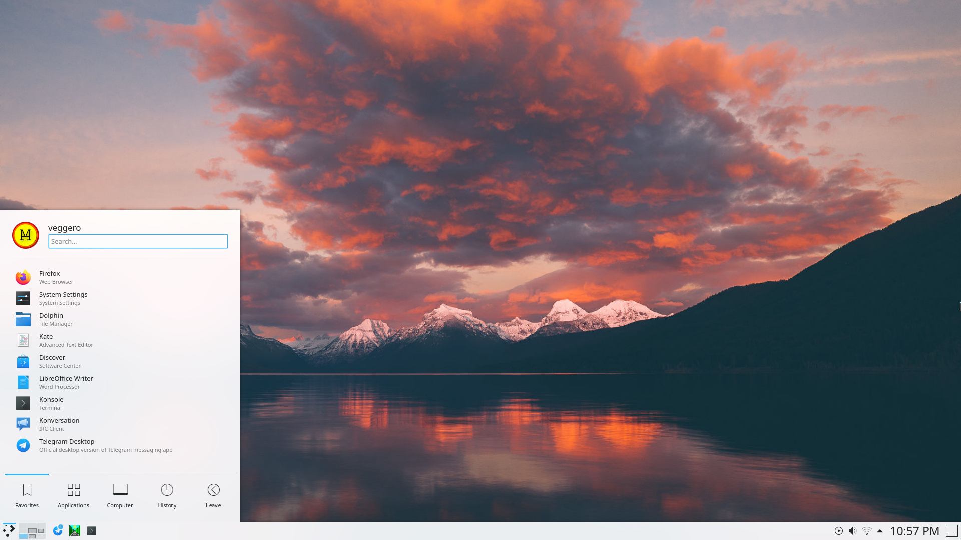
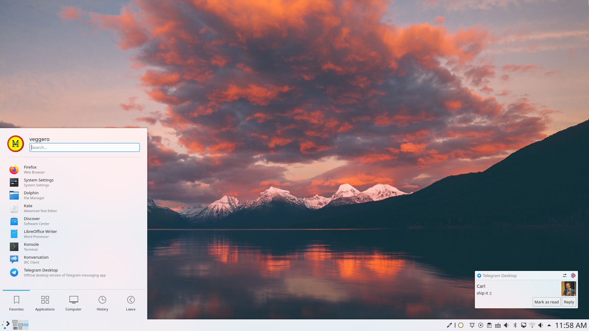
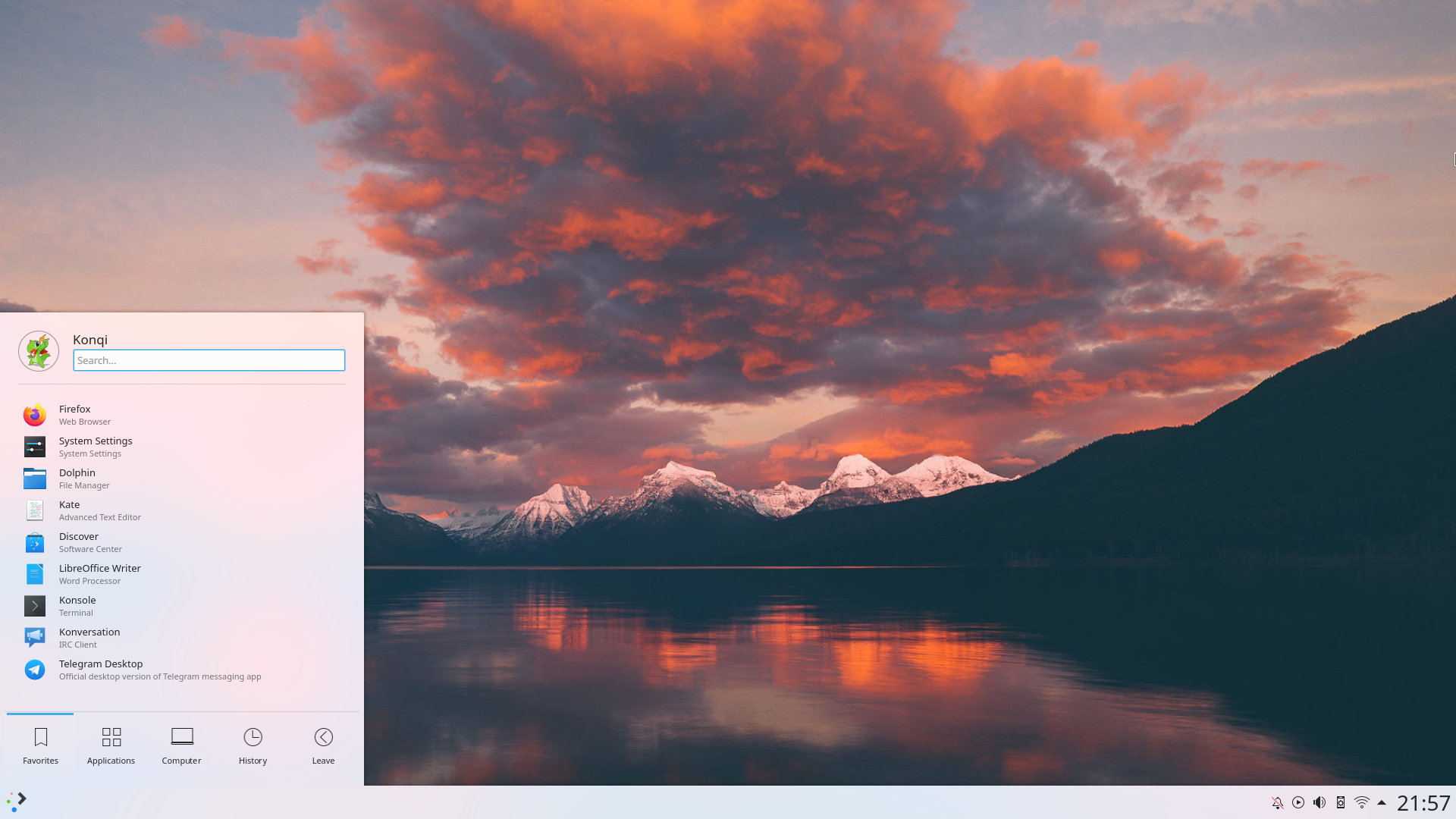
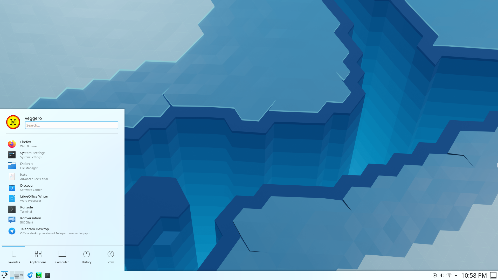
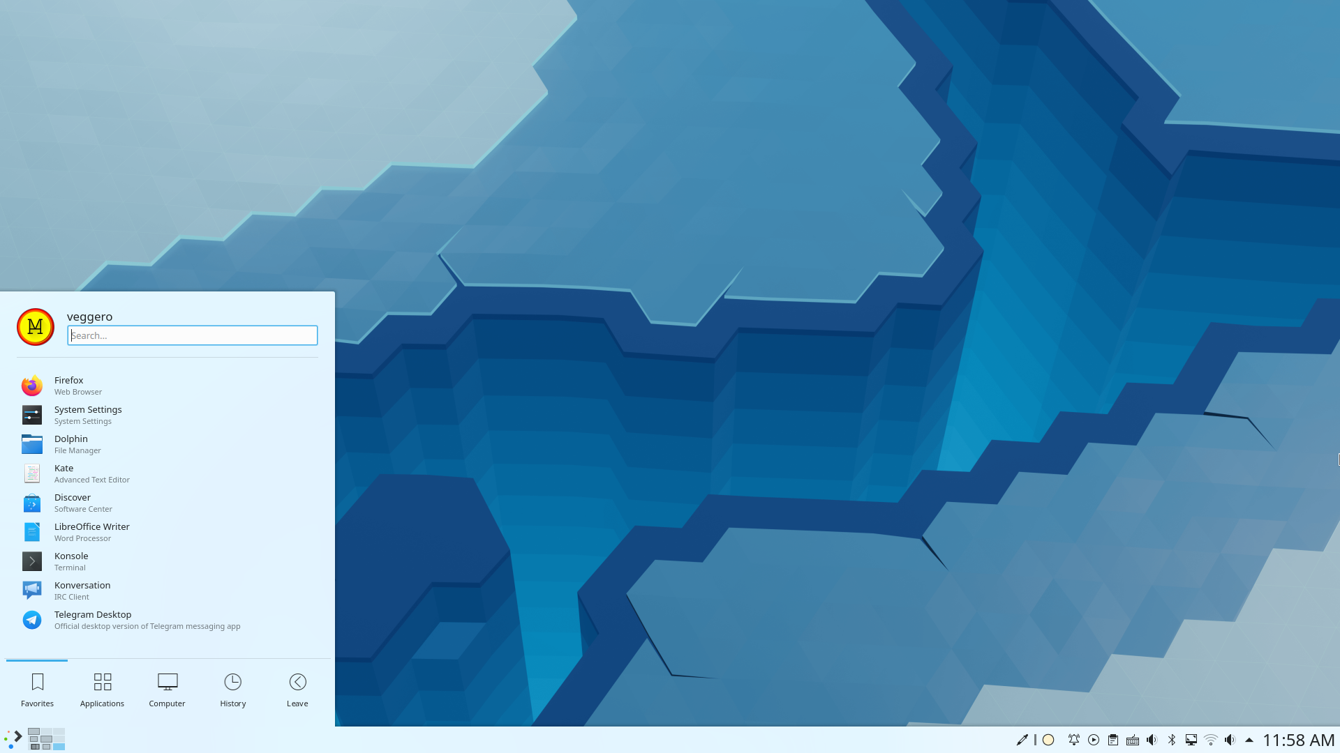
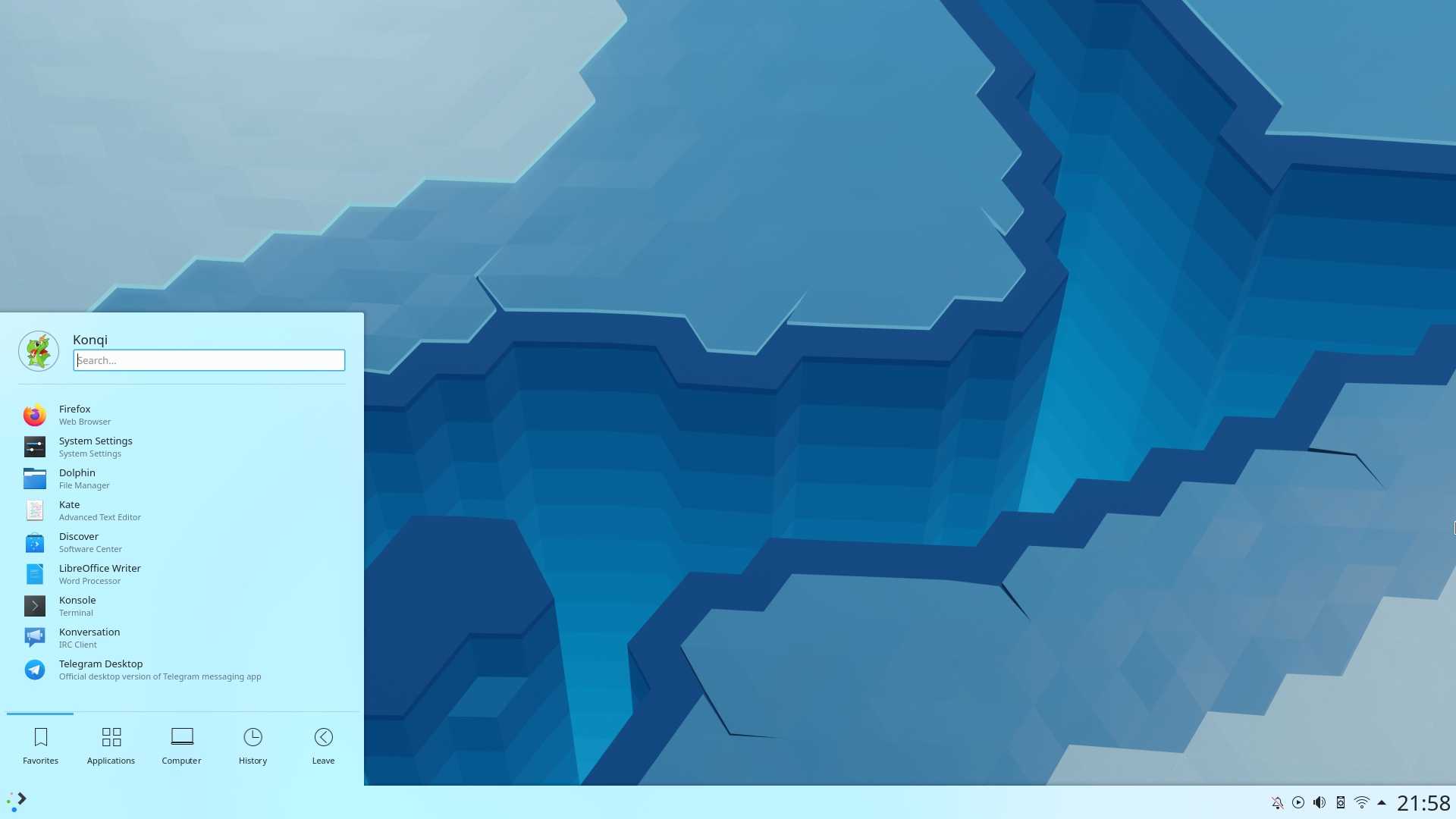
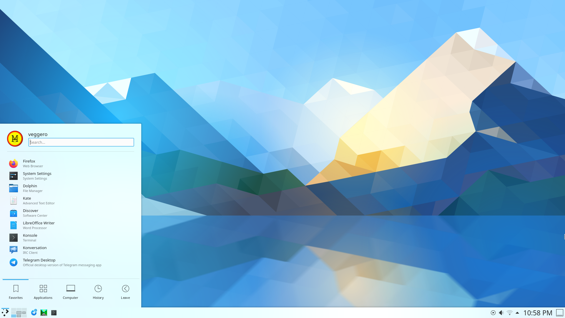
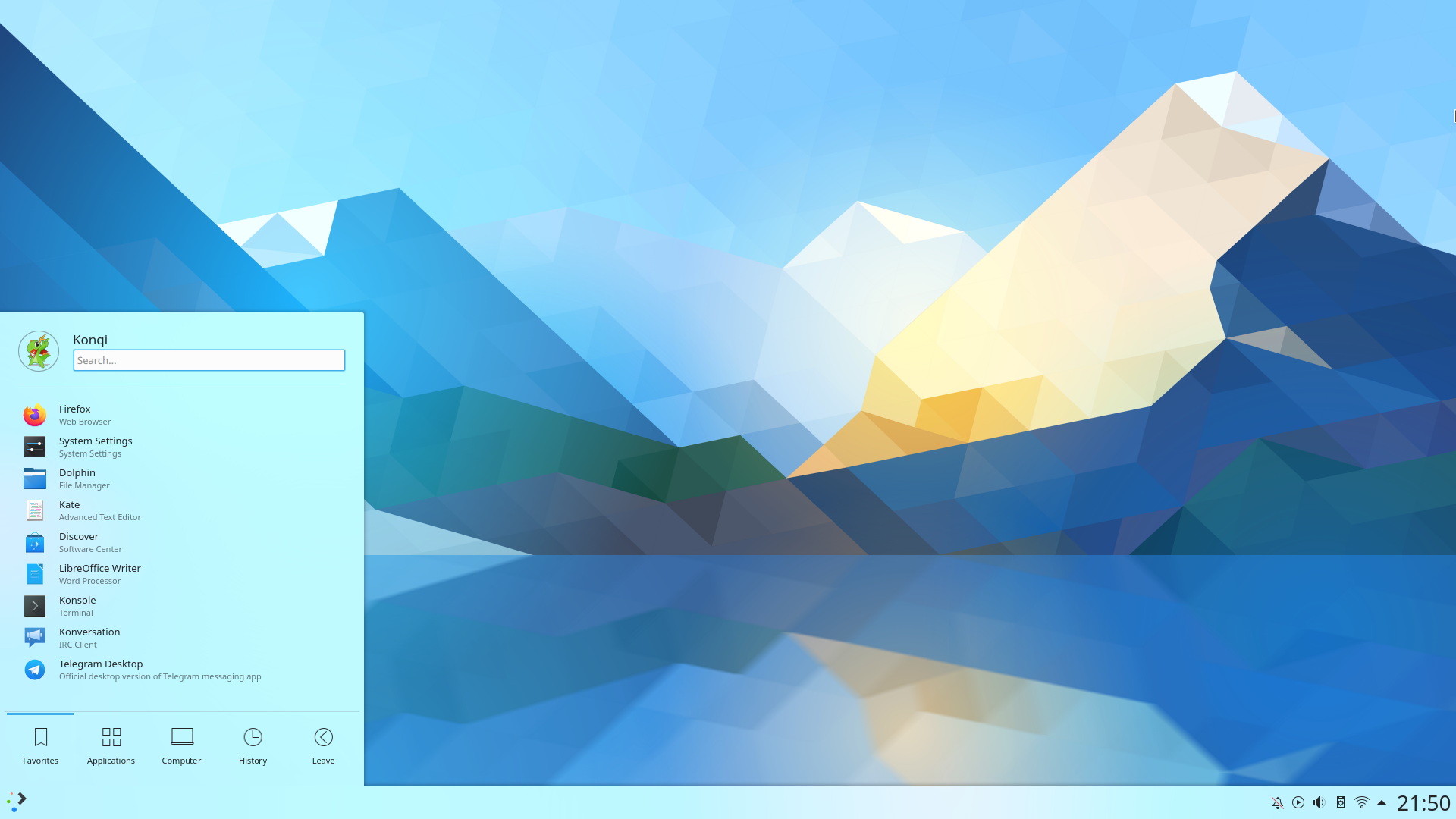
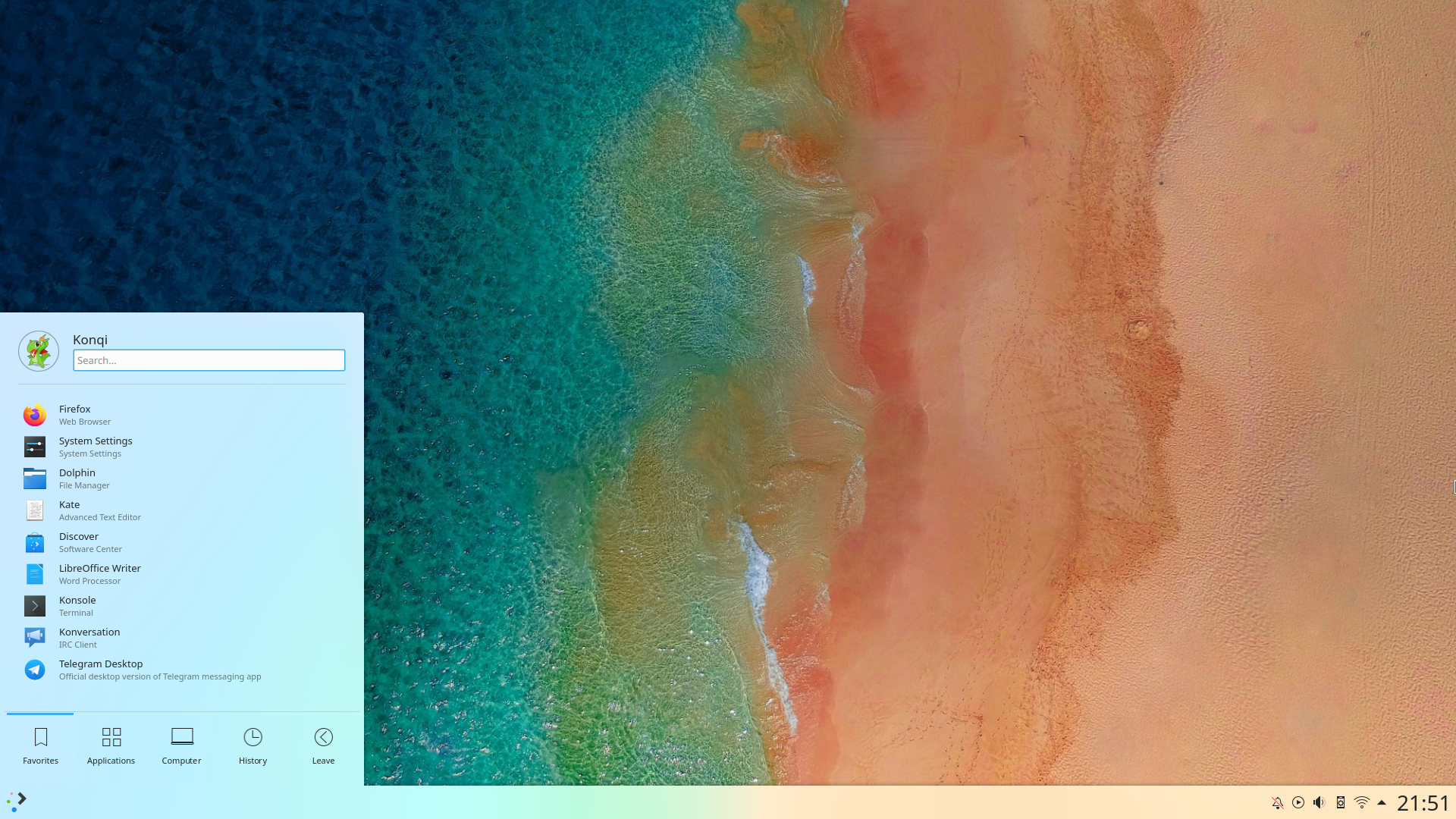
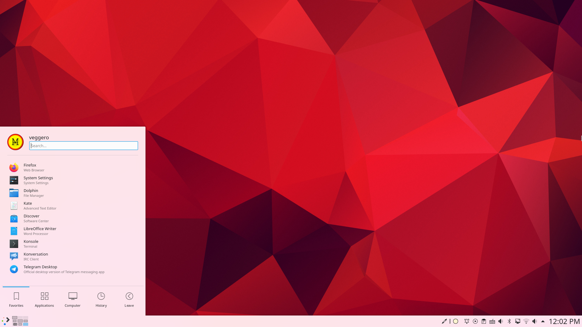
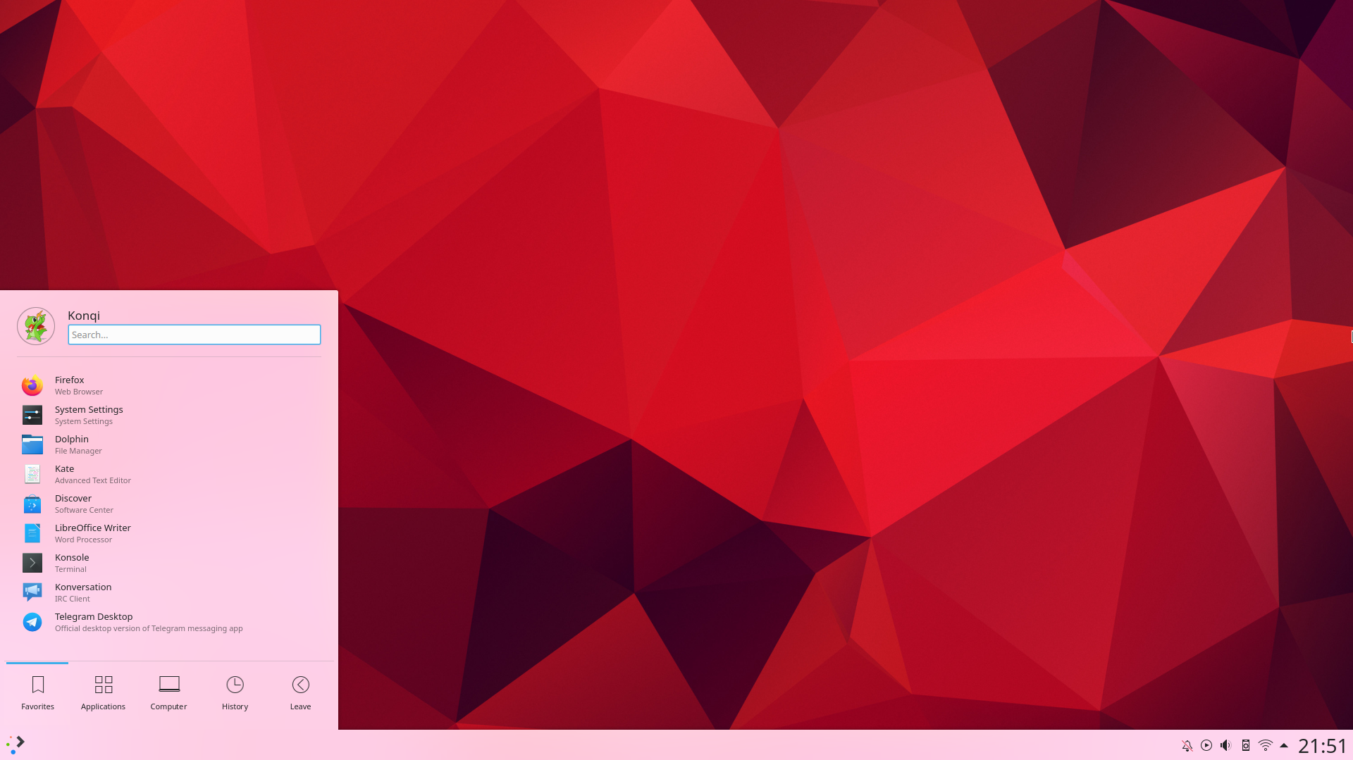
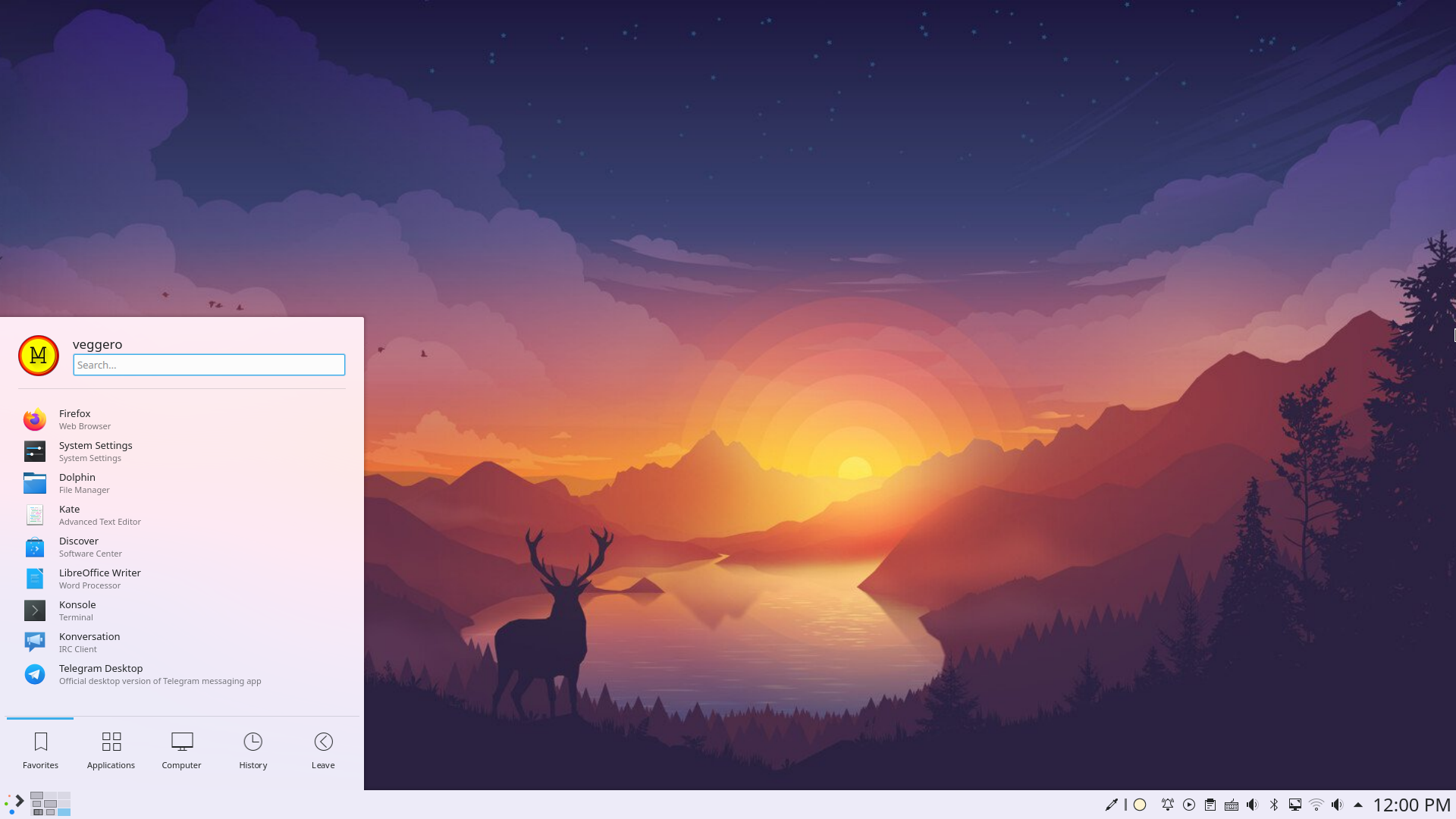
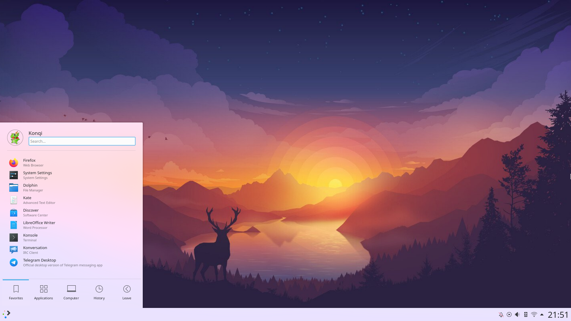
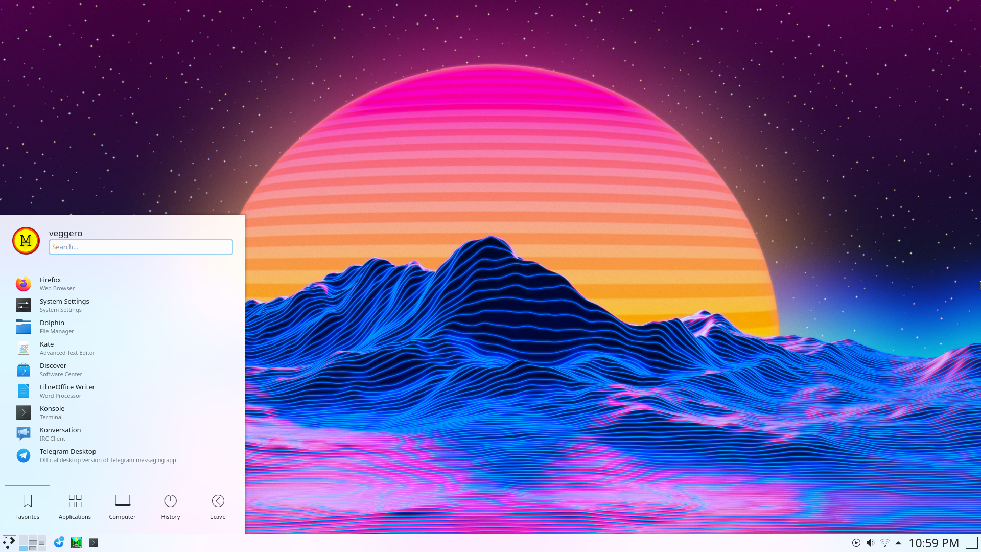
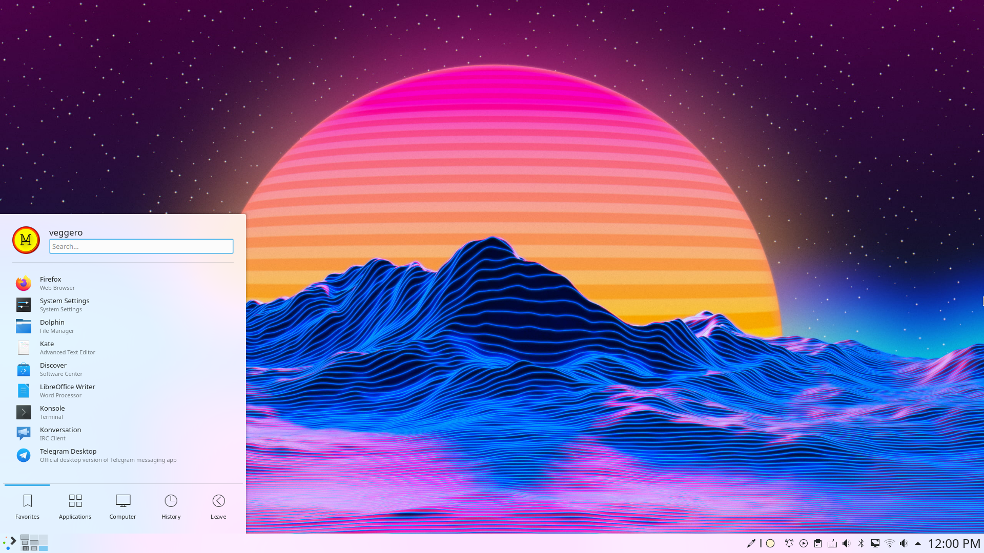
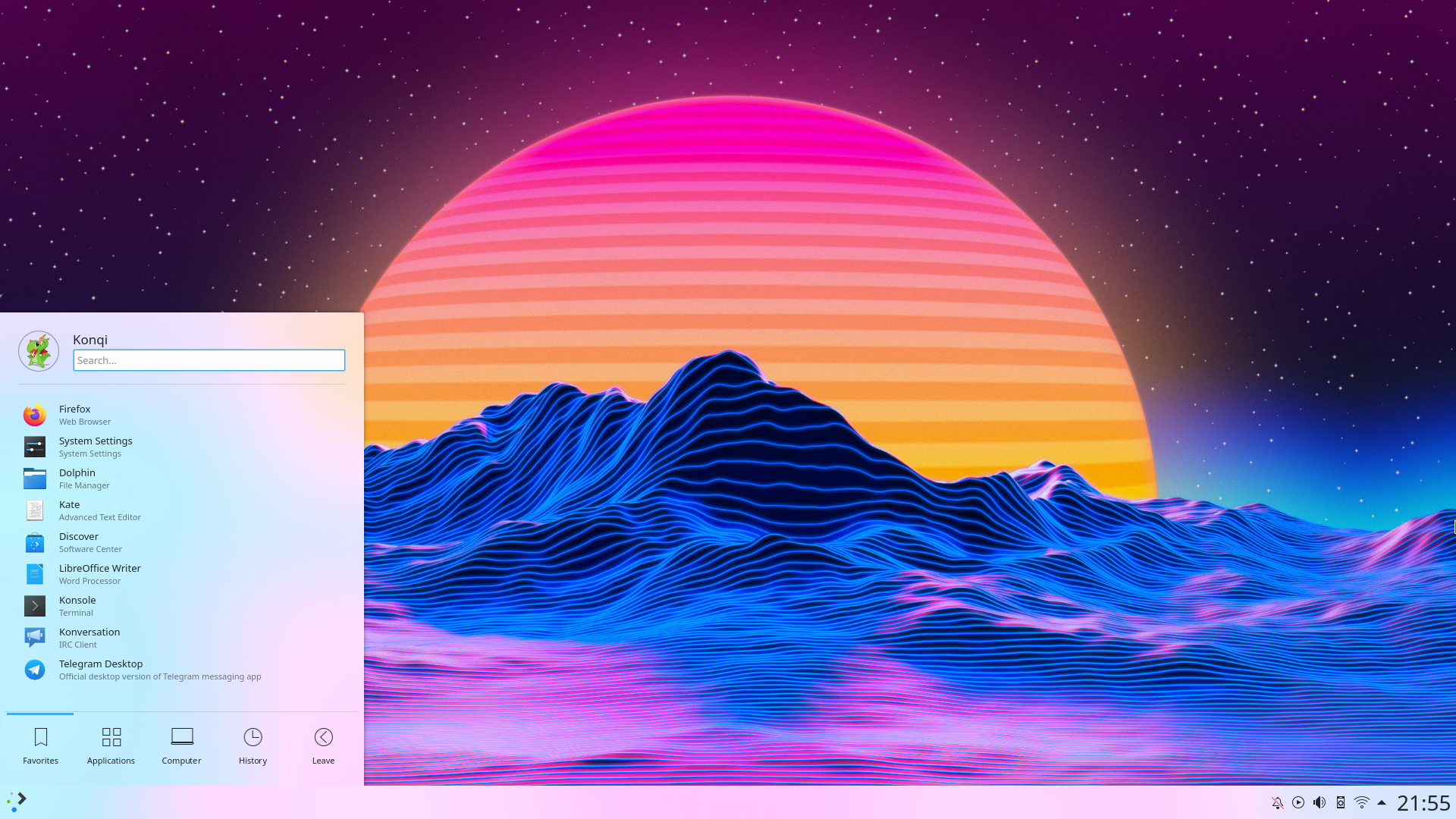
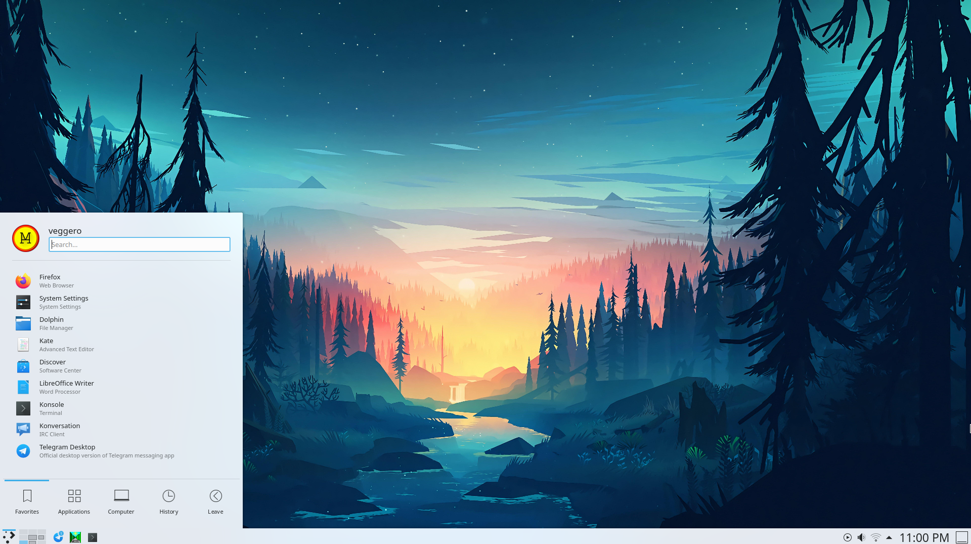
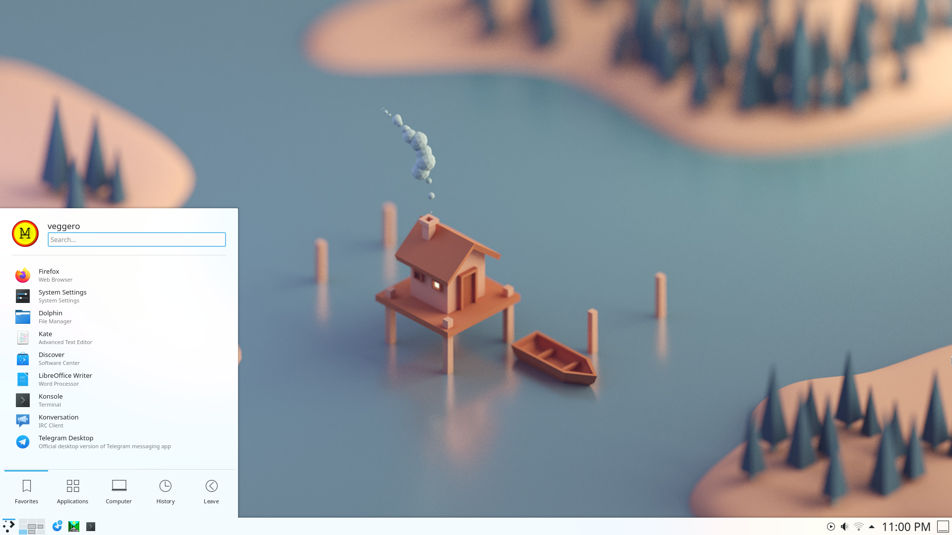
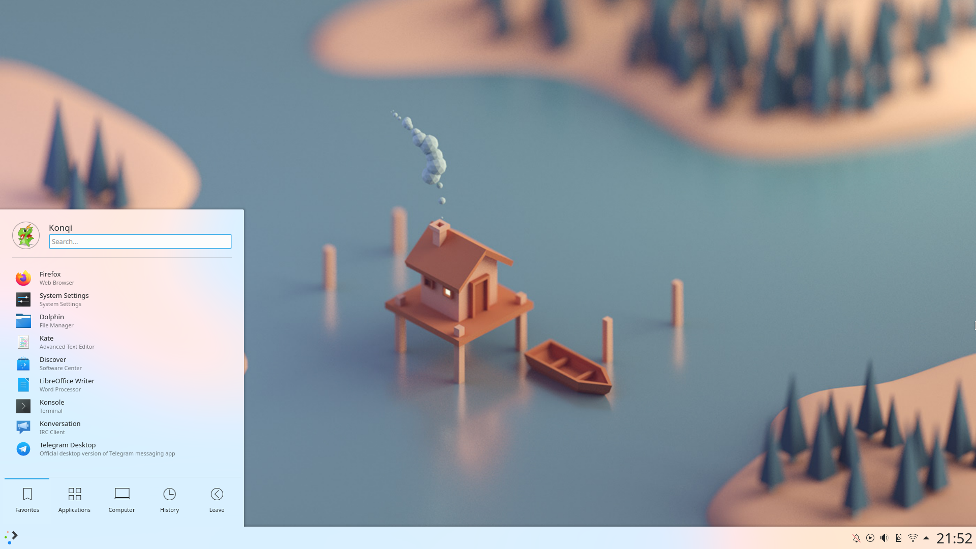
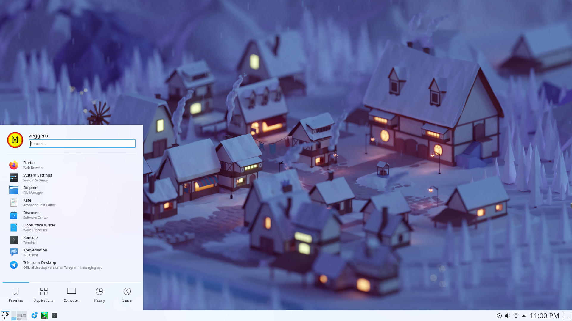
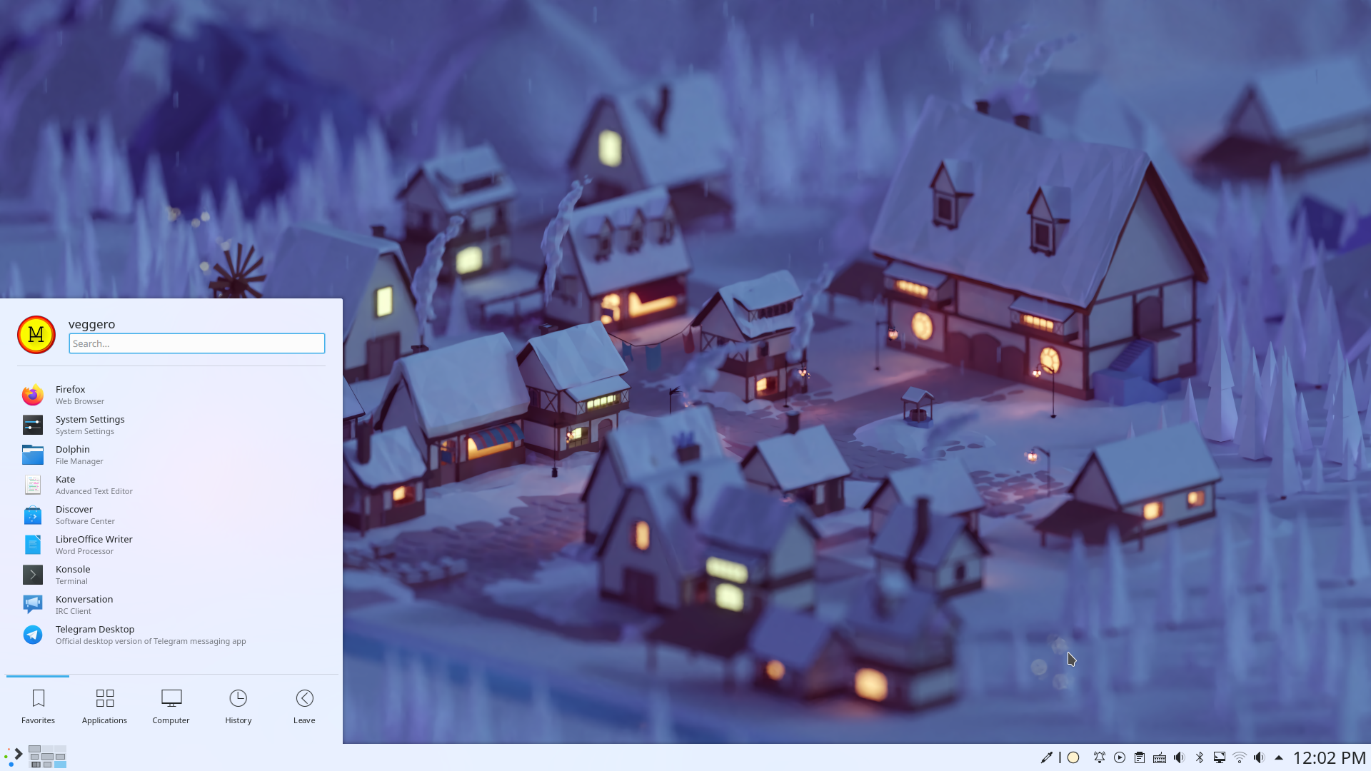
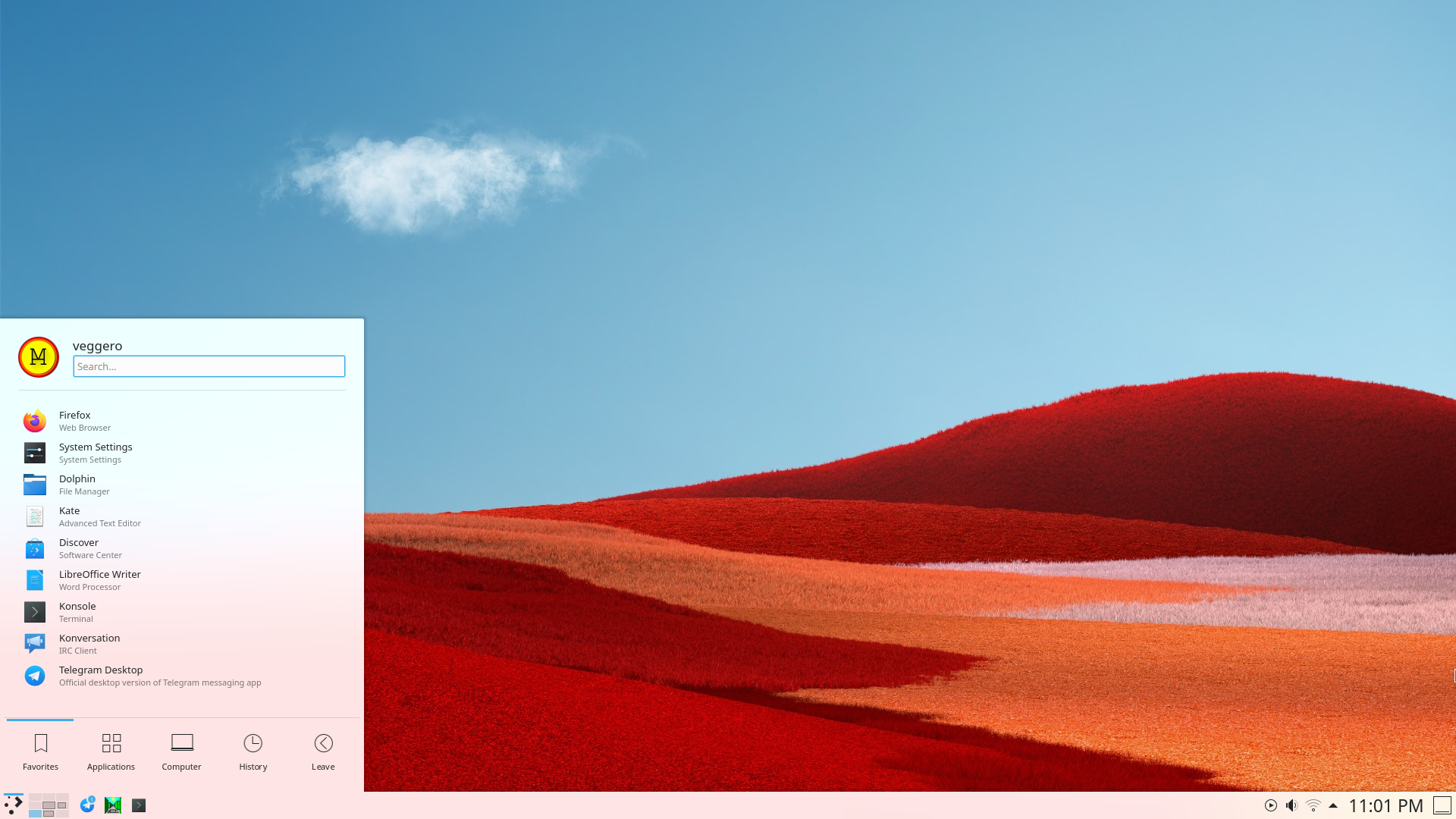
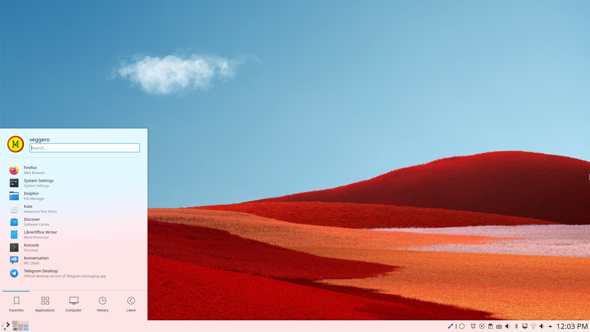
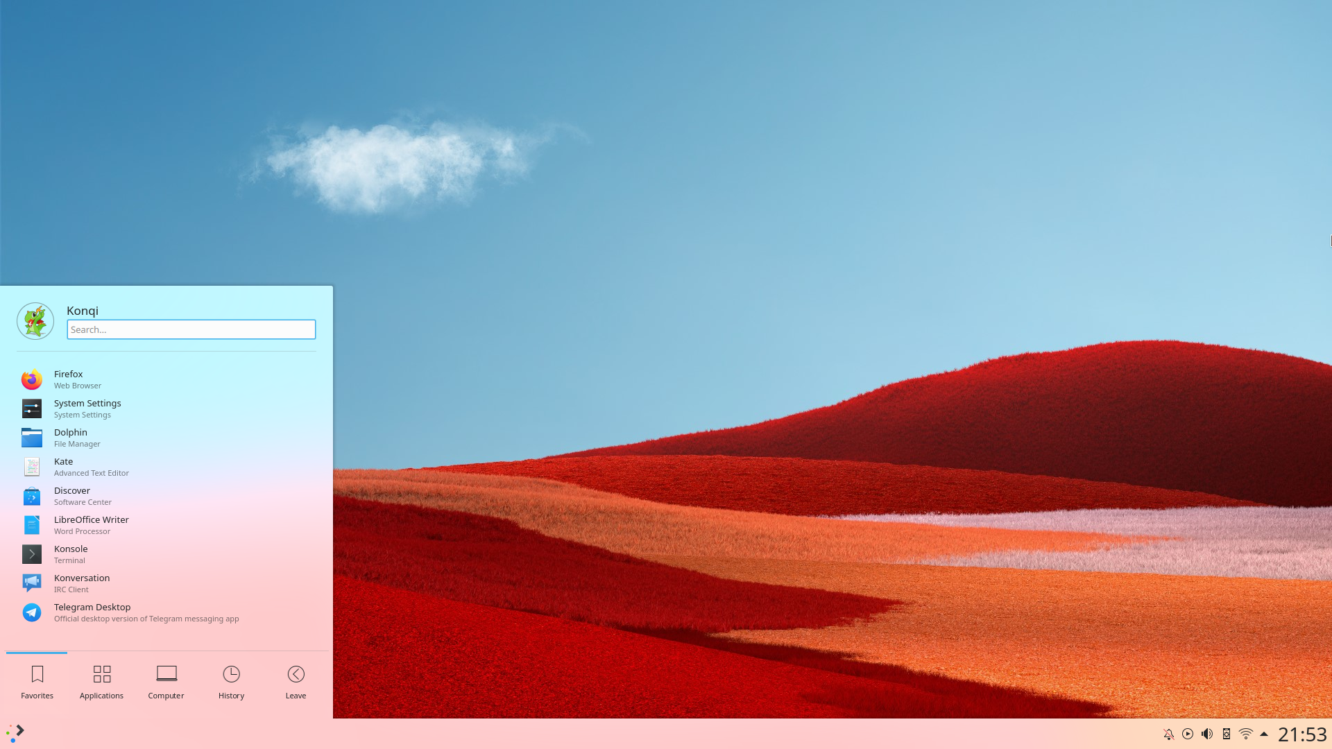
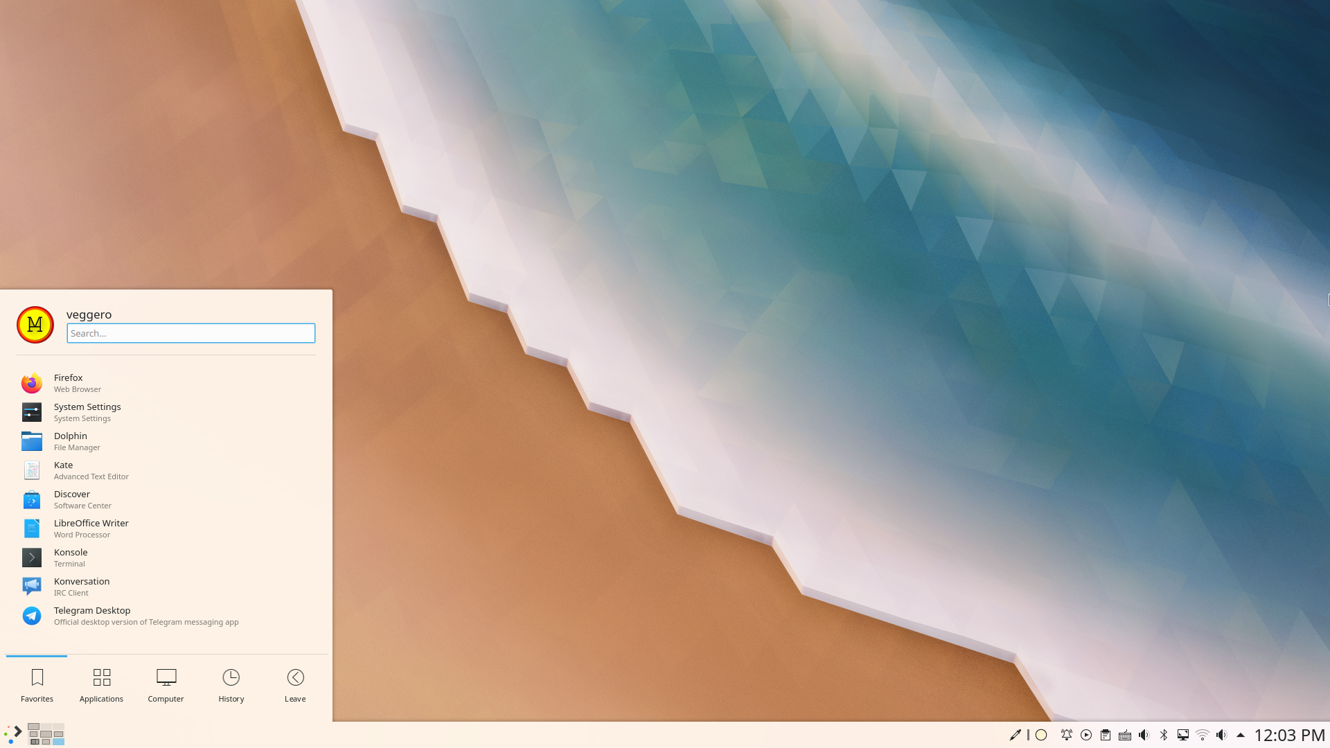
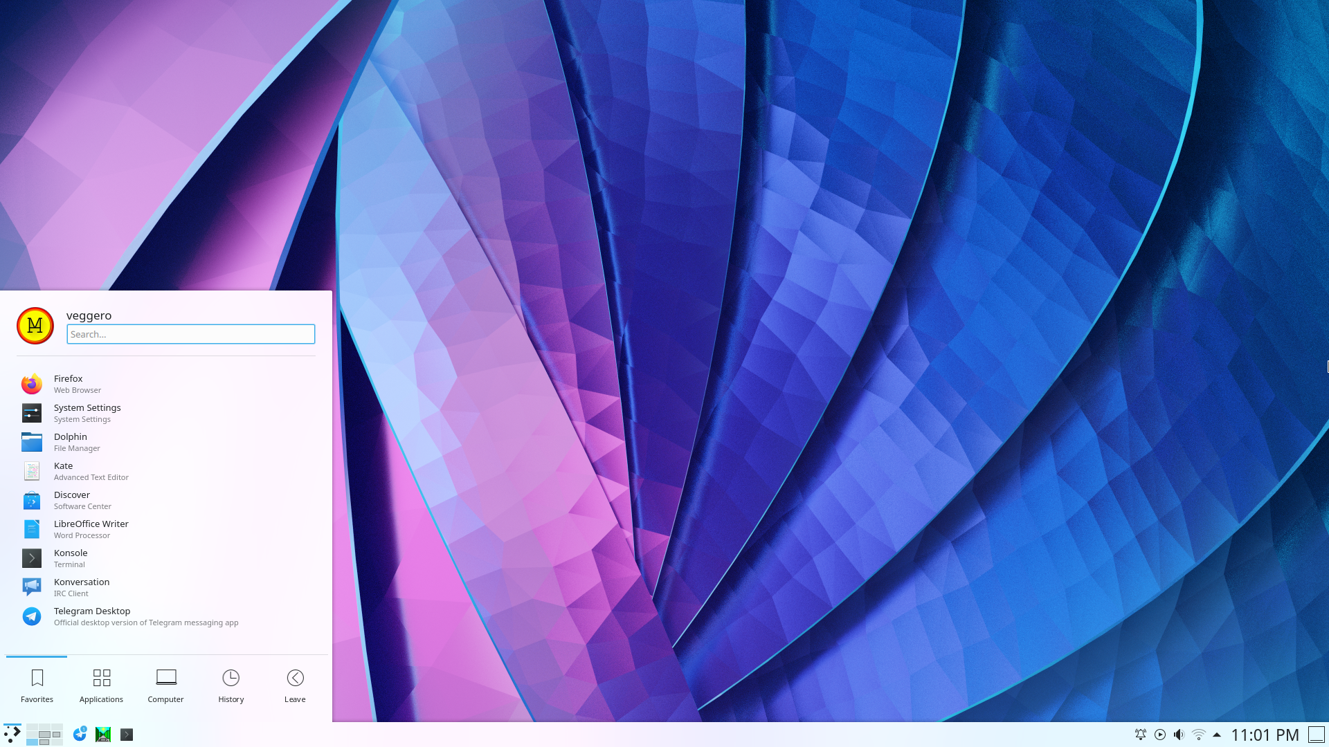
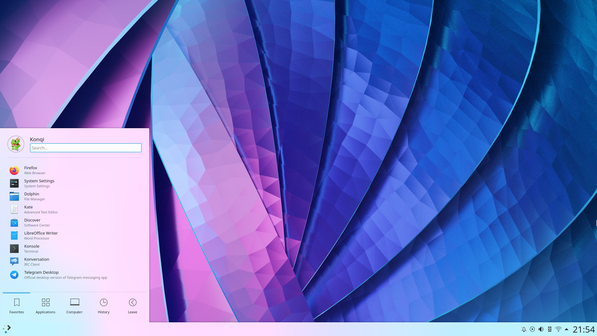
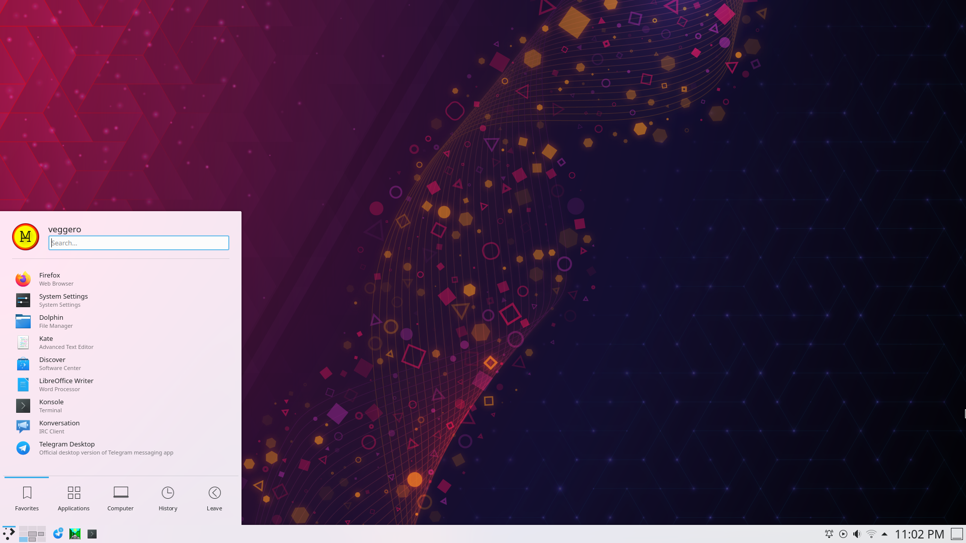
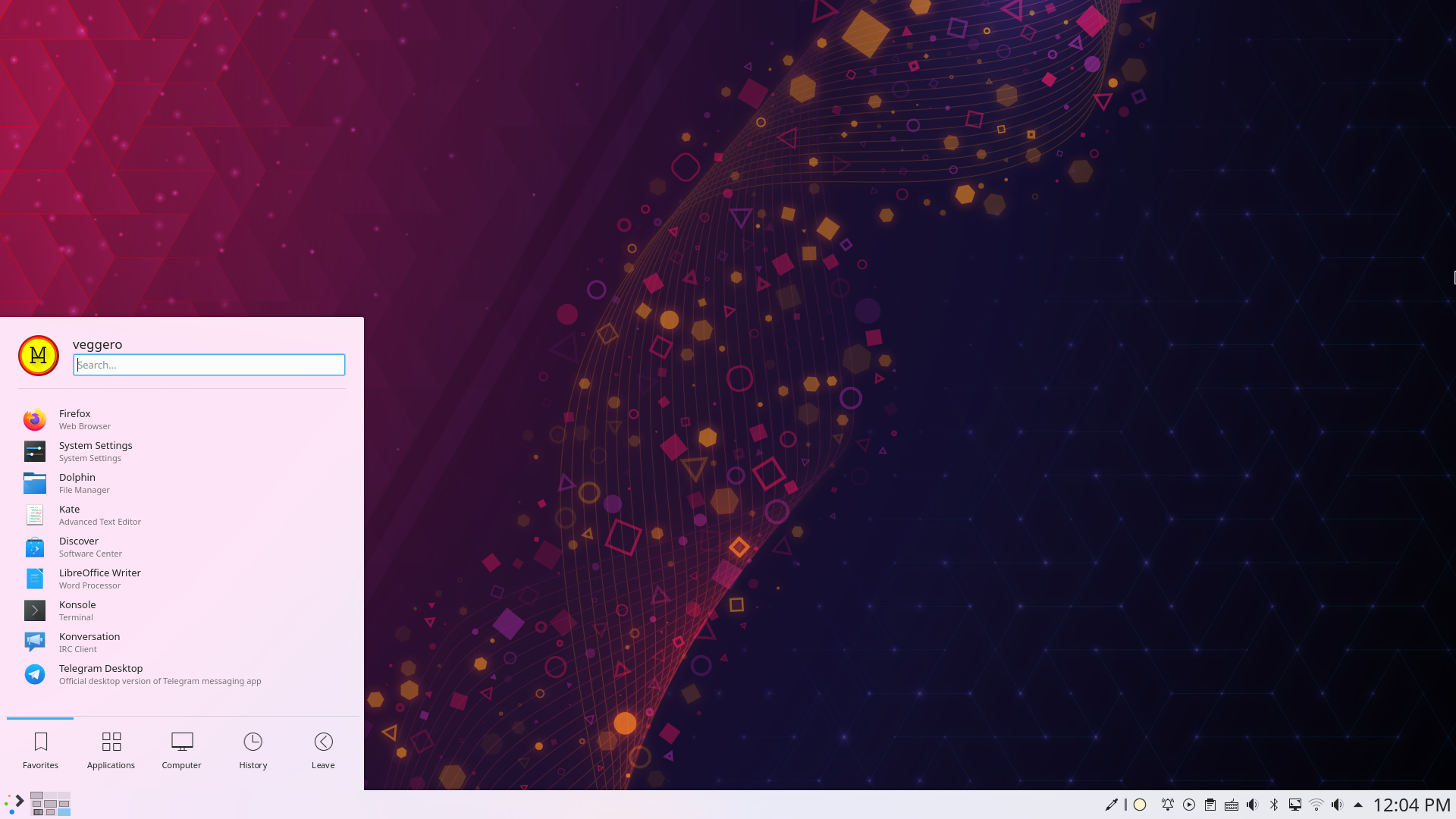
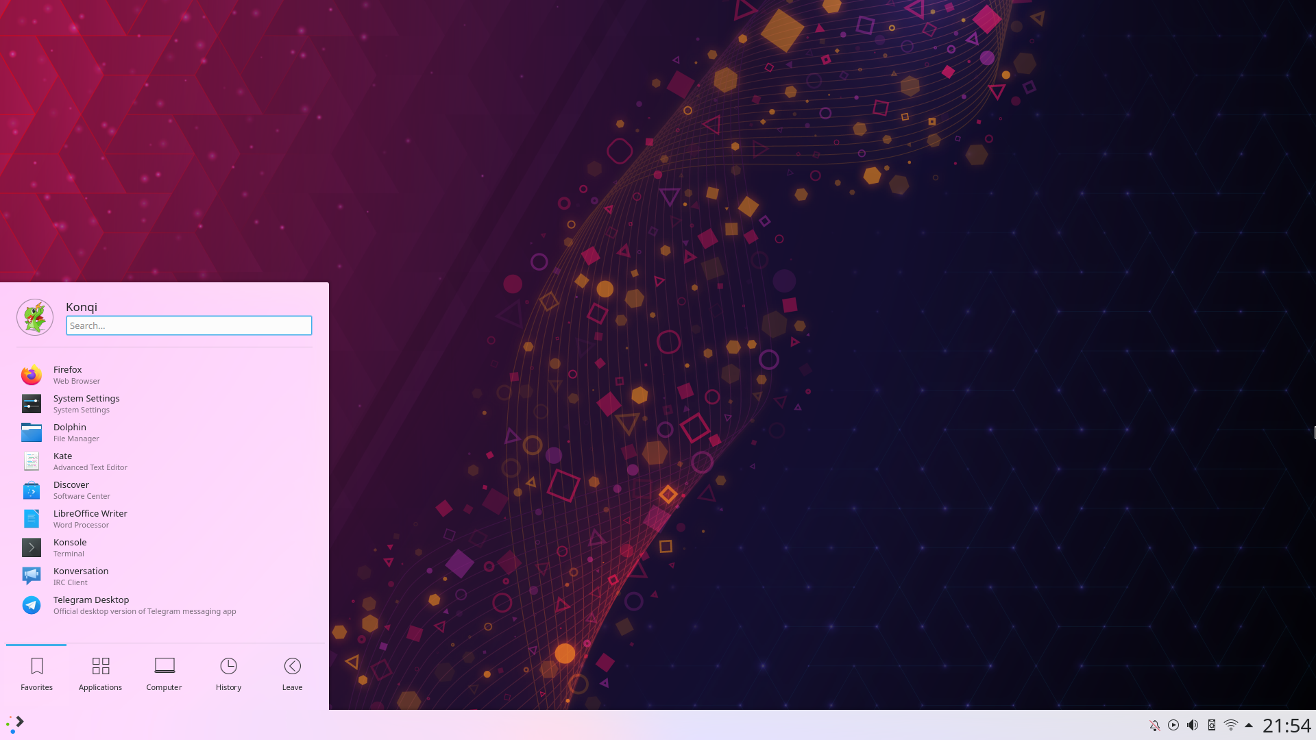
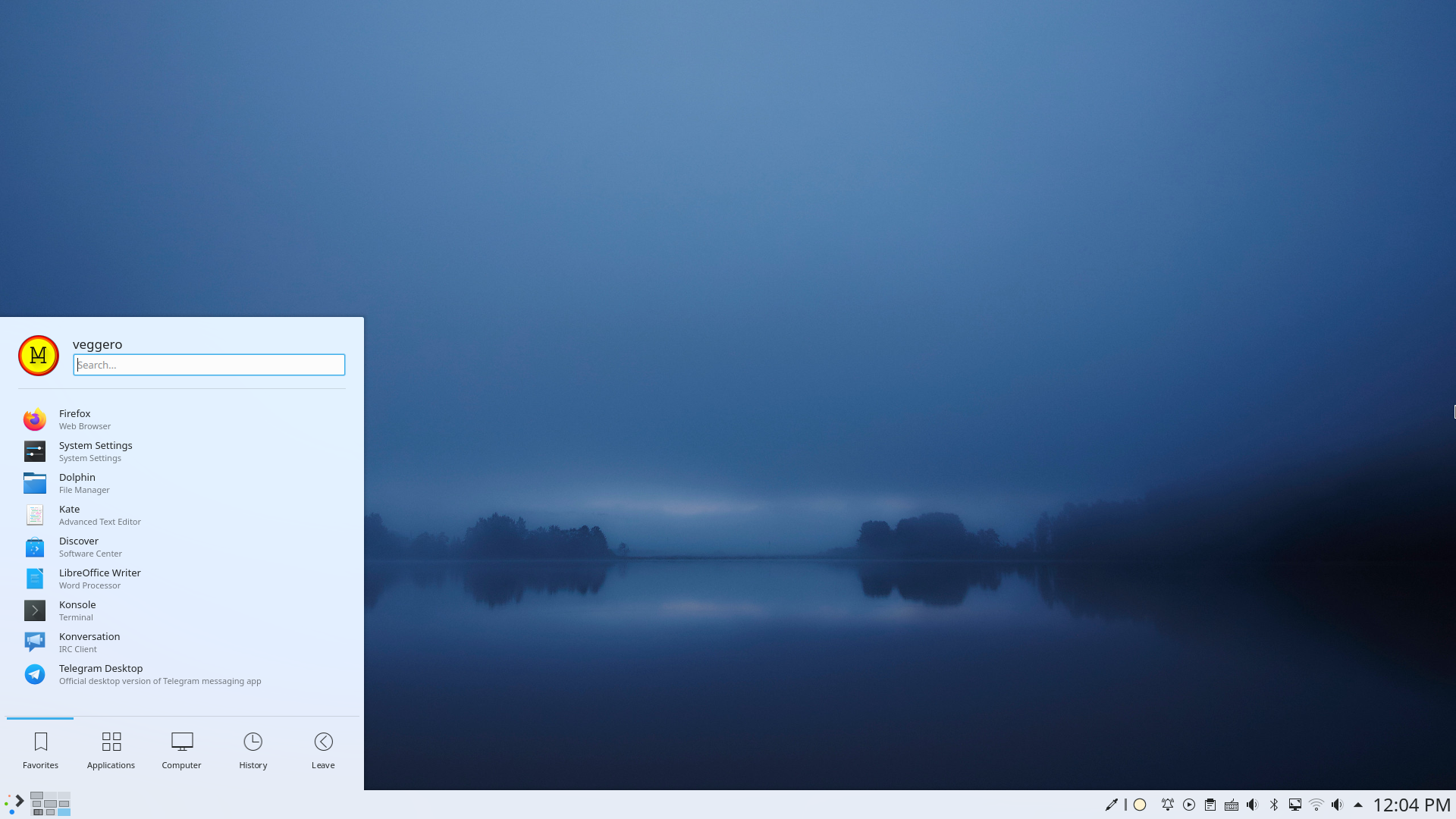
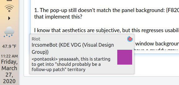
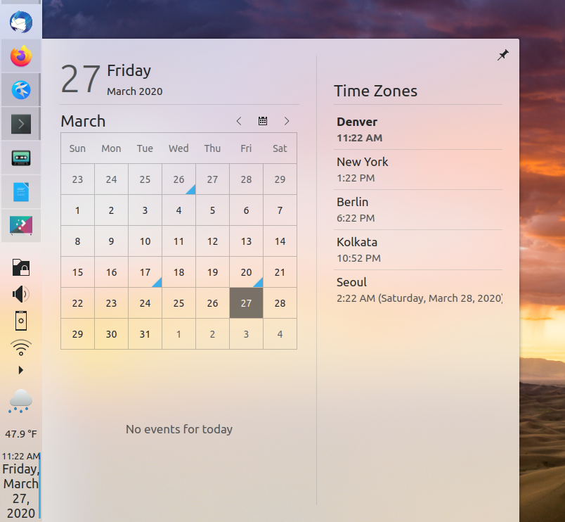
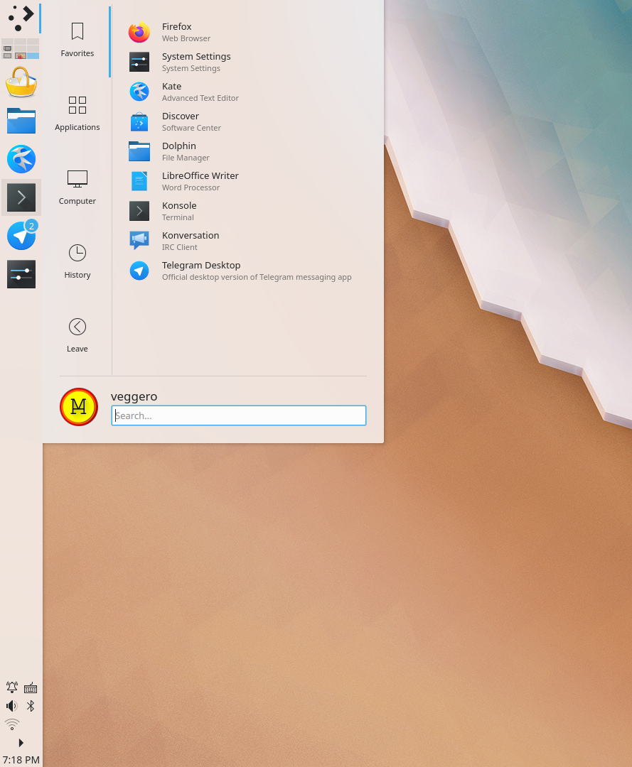
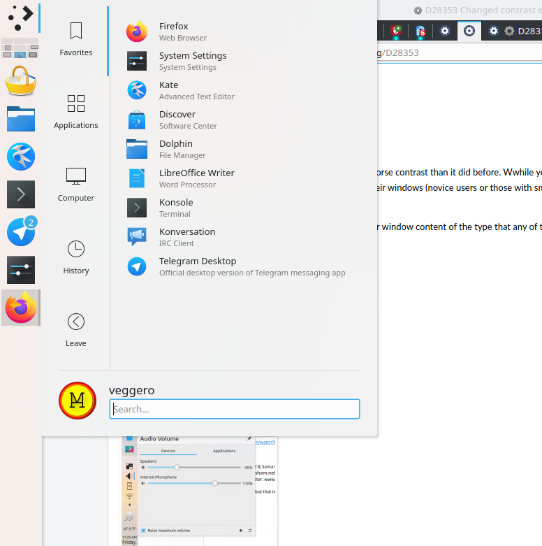
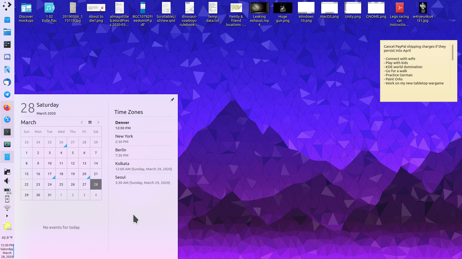
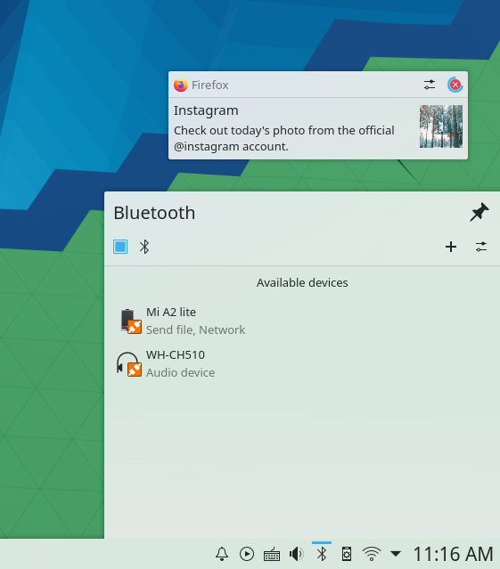
This changes the contrast effect values to make saturation higher and make the wallpaper blend through more easily. Then, transparency of svgs is changed accordingly.

I'm currently still experimenting on what values are best. Particularly, how to make this look good when using a plasmoidheading.

Test Plan

Breeze Light

(backlog of past proposed values: (.4, 1.3, 4, .8), (.4, 1.65, 5, .82))

Before:


After (.25, 1.5, 2.5, .75):

Colorful (.2, 1.45, 12, .75):


(breeze dark incoming)
(screenshots include depends on diffs)

Depends on D28317
Depends on D27439
Depends on D28627

Diff Detail

Repository
R242 Plasma Framework (Library)
Branch
contrast_and_transparency (branched from master)
Lint
No Linters Available
Unit
No Unit Test Coverage
Build Status
Buildable 25505
Build 25523: arc lint + arc unit
niccolove created this revision.Mar 27 2020, 4:23 PM
Restricted Application added a project: Frameworks. · View Herald TranscriptMar 27 2020, 4:23 PM
Restricted Application added a subscriber: kde-frameworks-devel. · View Herald Transcript
niccolove requested review of this revision.Mar 27 2020, 4:23 PM
niccolove added inline comments.Mar 27 2020, 4:25 PM
src/desktoptheme/breeze/metadata.desktop.cmake
99

I changed this because: simply put, it doesn't work. I opened a bug about it https://bugs.kde.org/show_bug.cgi?id=416699. It results in weird colors that have nothing to do with the background. If I understood it correctly, it's supposed to tweak the value based on the background darkness in order to make the background more light in those cases and preserving readability, but that does not seem to work either as there are some places in the 'before' screenshots that look way too dark, and are instead much more readable with this patch.

niccolove marked an inline comment as done.Mar 27 2020, 4:25 PM
niccolove edited the summary of this revision. (Show Details)Mar 27 2020, 4:32 PM
niccolove edited the test plan for this revision. (Show Details)
niccolove edited the summary of this revision. (Show Details)
niccolove updated this revision to Diff 78675.Mar 27 2020, 4:45 PM

Fix breeze dark values

niccolove edited the test plan for this revision. (Show Details)Mar 27 2020, 4:46 PM
niccolove added a reviewer: VDG.
niccolove edited the test plan for this revision. (Show Details)Mar 27 2020, 4:51 PM
cblack accepted this revision as: VDG, cblack.Mar 27 2020, 4:52 PM
cblack added a reviewer: Plasma.
cblack added a subscriber: cblack.

Looks visually appealing to me, with one question: How does this look on low-end hardware where there's compositing but no blur?

This revision is now accepted and ready to land.Mar 27 2020, 4:53 PM

Looks visually appealing to me, with one question: How does this look on low-end hardware where there's compositing but no blur?

Before:


After:

It is more grayish, but that will no longer be as soon as D28317 lands

Looks visually appealing to me, with one question: How does this look on low-end hardware where there's compositing but no blur?

Before:


After:

It is more grayish, but that will no longer be as soon as D28317 lands

Looks like a downgrade in legibility, but it wasn't too great before either. I wouldn't consider it a blocker.

ngraham requested changes to this revision.EditedMar 27 2020, 5:34 PM
ngraham added a subscriber: ngraham.

I see some problems here.

To be honest, the level of transparency is way too high. I know aesthetics are subjective, but it just doesn't look good to me. Even with our default wallpaper, something about it feels off:

In addition, on the usability side, every transparent surface has worse contrast than it did before. Wwhile your screenshots look appealing enough when there are no windows on the screen or the wallpaper is otherwise visible, that's not really how people use their machines, right? Users tend to maximize their windows (novice users or those with small screens) or tile everything (advanced users) or have a dozen or more un-maximized, un-tiled windows in a huge jumble taking up every pixel of the screen (messy users).

The effect produced when a very transparent popup appears over window content of the type that any of these users will be looking at just looks really bad to me; the background becomes an ugly gray:

Also the pop-up still doesn't match the panel background:

. Is there another patch I'm missing that implement this?

This revision now requires changes to proceed.Mar 27 2020, 5:34 PM
cblack requested changes to this revision.Mar 27 2020, 5:36 PM

I've changed my mind to agree with @ngraham here—this is too transparent.

Bug! It should look like this:


Let me check again.

niccolove edited the test plan for this revision. (Show Details)Mar 27 2020, 9:17 PM

Cannot reproduce, it looks like what's in the screenshots to me. Just for sure, I also added the dep on Nate's patch as that improves legibility. I totally agree on your points seen what you got, that'd be extreme. With what I'm actually trying to propose (I don't know if the problem is on my or your side), the change looks like the screenshot I added. I also added screenshots with fullscreen windows, as that's important as well. E.g., with the default wallpaper, left panel and maximized white window it looks like this, which is good enough IMO since master is not perfect either:

ngraham resigned from this revision.Mar 28 2020, 6:37 PM

Maybe it was that darned plasma cache! Re-applying the patch and clearing the cache substantially improved the appearance. It would be helpful to remind people of those details in the Test Plan section in the future. :)

Looking at it for realziez, I think it's okay. The appearance is indeed improved IMO when the wallpaper is visible, especially when the wallpaper is very visually striking:

However as you can see from that screenshot, the background color of the pop-up still differs from the color of the panel.

And the panel transparency effect is still a bit too pronounced for my tastes when a visually striking wallpaper is being covered by windows and only the panel is still visible. It results in a significant difference between the background colors of the panel and plasma pop-ups that appear on top of windows:

I might have proposed this before, but I think an improvement would be to dynamically change the transparency of the panel and pop-ups from widgets living in it based on the proximity of windows; when a window is butted up against a panel, the background color of that panel as well as all pop-ups of widgets living on that panel would become opaque, and when the window moved away, un-maximized, or tiled, they would resume being transparent. I think this would look great and would seem to satisfy everyone: people who want pretty transparency when the wallpaper is visible would get it, and people who want maximum legibility and visual consistency when the system is being used heavily would get that too.

Of course that's a bit more ambitious than what could be done in this patch, but I think it's a good way forward. However I won't block this patch in its current form as it's no longer the usability regression that I originally and mistakenly feared.

It would be helpful to remind people of those details in the Test Plan section in the future. :)

I will! Sorry. It applied to me without cache clearing, so I assumed it didn't need it, but I guess I had some previous transparent theme in the cache.

However as you can see from that screenshot, the background color of the pop-up still differs from the color of the panel.

It is, but near the panel it gets whiter because of the bug that I'm solving in D27439. I didn't put it as a dependency as the bug also affects current Breeze, but I could add it if you think it's necessary for this patch.

And the panel transparency effect is still a bit too pronounced for my tastes when a visually striking wallpaper is being covered by windows and only the panel is still visible. It results in a significant difference between the background colors of the panel and plasma pop-ups that appear on top of windows:

Heh, you're right here. And I think that...

I might have proposed this before, but I think an improvement would be to dynamically change the transparency of the panel and pop-ups from widgets living in it based on the proximity of windows

...I will implement this :-)

Heh, you're right here. And I think that...

I might have proposed this before, but I think an improvement would be to dynamically change the transparency of the panel and pop-ups from widgets living in it based on the proximity of windows

...I will implement this :-)

<3 <3 <3

I think people will really, really like that.

niccolove edited the test plan for this revision. (Show Details)Apr 3 2020, 6:52 PM
niccolove edited the test plan for this revision. (Show Details)
niccolove edited the test plan for this revision. (Show Details)Apr 3 2020, 6:54 PM
niccolove updated this revision to Diff 80625.Apr 20 2020, 9:03 AM

Toned down transparency

niccolove abandoned this revision.Apr 20 2020, 12:04 PM

I've tweaked it so many times that I eventually ended up with something that looks almost identical to default without even noticing. I still think there is margin for improvement over the default, but I need to take some more time to tweak the values again until I get to something I'm again really confident proposing.

Heh. That can happen. :)

Maybe try again once the adaptive transparency patch has landed.

niccolove edited the summary of this revision. (Show Details)Apr 22 2020, 9:03 PM
niccolove edited the test plan for this revision. (Show Details)
niccolove edited the test plan for this revision. (Show Details)Apr 22 2020, 9:05 PM
niccolove edited the test plan for this revision. (Show Details)
niccolove reclaimed this revision.Apr 22 2020, 9:10 PM

This should've been "Changes planned", not "Abandoned". I'm really feeling sorry for all of the emails.

niccolove planned changes to this revision.Apr 22 2020, 9:10 PM
niccolove edited the test plan for this revision. (Show Details)Apr 22 2020, 9:13 PM

It's okay. :)

This is gonna seem like a really dumb question, but which images are the befores and which are the afters?

niccolove added a comment.EditedApr 23 2020, 12:40 PM

It's okay. :)

This is gonna seem like a really dumb question, but which images are the befores and which are the afters?

Not a dumb question! They are all before-after, but keep in mind that they have the colorscheme change patch applied, so they both look different from default. First one is default + your colorscheme patch, second one is defult + colorscheme patch + this patch.

(Also keep in mind that I might tweak the values a bit still, so not definitive yet)

niccolove edited the test plan for this revision. (Show Details)Apr 23 2020, 1:49 PM
niccolove edited the test plan for this revision. (Show Details)

To be honest, I kinda prefer the befores since the afters are significantly darker. Is there a way to preserve the desired level of translucency without causing the background to darken like that?

niccolove edited the test plan for this revision. (Show Details)Apr 23 2020, 6:07 PM

To be honest, I kinda prefer the befores since the afters are significantly darker. Is there a way to preserve the desired level of translucency without causing the background to darken like that?

Yeah, but it results in very altered colors in wallpapers like Volna. I added a second variant to show that. Feedback very welcome!

Yeah, to me the third version looks better than the status quo for some wallpapers, but worse for others.

Same. I will try some half-way that works everywhere more consistenly.

niccolove edited the test plan for this revision. (Show Details)Apr 26 2020, 10:04 AM

What do you think of this one? It's slightly less bright than before, but not as much as the first proposal.

This version looks great to me!

niccolove edited the test plan for this revision. (Show Details)May 7 2020, 5:47 PM
niccolove edited the test plan for this revision. (Show Details)May 7 2020, 7:55 PM
niccolove edited the test plan for this revision. (Show Details)
niccolove edited the test plan for this revision. (Show Details)May 7 2020, 7:57 PM
niccolove edited the test plan for this revision. (Show Details)

I like #2 the best!

ndavis added a subscriber: ndavis.May 8 2020, 6:13 AM

I generally prefer type 1