User Details
- User Since
- Aug 21 2019, 3:01 PM (295 w, 6 d)
- Availability
- Available
Oct 13 2020
It doesn't work when trying to capture open menus. At least on X11, menus close when doing the capture.

Jun 6 2020
I just took a look at mailo online:
Jun 5 2020
Ah it doesn't apply the authentification mode without a restart.
Well that's interesting, I can send mails though ;) I just created one and sent it to myself and got it (in a different client).
So I will write this while I experiment due to the fact that I do make progress and identify possible ux problems.
Jun 4 2020
\n in your domain is clearly not normal or correct. One slash only is also incorrect, it's always smtps:// or imaps://.
Maybe that https://phabricator.kde.org/D23932 would come in handy?
Jun 3 2020
Warning: {4f753f1e-1199-4b51-bea8-fd909b626645}.synchronizer : Synchronization failed:  Error:  5 Msg:  "Invalid server url: smtps://\nmail.mailo.com:465"
Warning: {4f753f1e-1199-4b51-bea8-fd909b626645}.synchronizer : Error during sync:  Error:  5 Msg:  "Invalid server url: smtps://\nmail.mailo.com:465"
Log:     {4f753f1e-1199-4b51-bea8-fd909b626645}.synchronizer : All requests processed.
Log:     {c5e63138-a611-43d3-bd52-53d7232c6f2e}.org.kde.pim.kimap2 : "Socket disconnected. false"
Warning: {c5e63138-a611-43d3-bd52-53d7232c6f2e}.org.kde.pim.kimap2 : "Socket error: QAbstractSocket::HostNotFoundError"
Warning: {c5e63138-a611-43d3-bd52-53d7232c6f2e}.org.kde.pim.kimap2 : "Connection to server lost  QAbstractSocket::HostNotFoundError"
Warning: {c5e63138-a611-43d3-bd52-53d7232c6f2e}.imapserverproxy    : Job failed:  "Host not found." KIMAP2::LoginJob 105
Log:     kube.sinkfabric                                            : Received notification:  Notification(Type: "status" , Id: "sync" , Code: 3 , Message: "Synchronization has started." , Entities: () )
Warning: {c5e63138-a611-43d3-bd52-53d7232c6f2e}.synchronizer.changereplay : Change replay failed:  Error:  2 Msg:  "Host not found." Last replayed revision:  1
Warning: {c5e63138-a611-43d3-bd52-53d7232c6f2e}.synchronizer              : Changereplay failed:  Error:  2 Msg:  "Host not found."
Warning: {c5e63138-a611-43d3-bd52-53d7232c6f2e}.synchronizer              : Error during sync:  Error:  2 Msg:  "Host not found."
Jun 2 2020
Still not working.
Mar 6 2020
I don't have a strong opinion either. I just thought that it could be of interest to capture only the app itself. Maybe at least for developers?
I think most users are primarly interested in the normal screenshot function and the other features are rather niche. (But it's hided in a popup and it's already there, so I see no particular reason to not have it)
Mar 5 2020
Thanks a lot Nate!
- Fix button bug
Mar 4 2020
First it doesn't load. Because you hardcode the path to "src/MobileFrontend/main.qml" and don't even install the qml files it only works when spectacle is run from the source directory. I don't get the difference between mobile frontend and mobile backend. To me it looks like both are frontend and the backend class does only connect some signals.
- Change structure
Sep 28 2019
Also we are not in a situation where we have that many backends where there would be a significant impact on executable size
Sep 24 2019
I can build it, but when I run spectacle - I get a segmentation fault. Has anyone else such a problem?
The problem seems to be in the setupShortcuts().ofc, i commented it out just to see if it would run at all.
Sep 23 2019
Yes, that's why it's called that way now :-)
Thanks ;) Any chance you know what exactly is set by it?
Split the KCM into two KCMs: one for theme, one for desktop layout
Hi there,
- Fixs to CMakeLists
- Added CaptureMode Rectangular Region
- Moved code to determine wether the "Current Screen" CaptureMode should be shown to the comboBox
- ComboxBox and shutter options update, when the backend changes
- Fixed a few bugs
- Only uses one enum now called CaptureMode, instead of two very similar enums
Anyone, who can review this?
Is there something holding this back to land?
Sep 21 2019
While I think both look quite good, I would go with the horizontal line. Our current goal is to make the look more consistent and I feel like part of this should be to respect cross de standards. And at least to me, the horizontal line seems to be the standard out there.
@ngraham I hope I understand you correctly. Your problem is that the actual sidebar or the side view, which comes if you click on the sidebar, takes width as well ... and therefore you don't want to waste more width, right?
Sep 20 2019
Personally, I prefer the suggestion of @felixernst with some small changes
Sep 19 2019
Personally, I prefer branding icons much over functionality. It would be horrible if all my browsers and code editors would have the same icon. I want to know when I look in my task bar, what apps exactly I have open. Furthermore, it's always been like that ... no app on my phone or somewhere else uses a generic icon ... for good reason, I search for an app by looking at the icon and not at the text (in fact, some icons don't even have text like the icon in the bottom "favourite bar" on iOS).
Imho, a good branding icon gives some hint about the functionality as well, but it doesn't have to. And well the branding icon is designed by the application, not by breeze.
- Use dynamic plugins instead of static plugins
- Changed CMakeLists, so plugins will be compiled to shared libs (dymanic plugins)
- Use json metadata
- Improved auto selection algorithm (added "recommended" field in .json, so the algo knows, which plugin should be preferred)
- Added runtime checks, so the plugins can check whether all requirements are fullfilled (for example if kwin is available)
- plugins are unloaded automatically if not needed (instead of install/remove button)
- Fixed some Bugs
Sep 14 2019
...But is this true? the feature doesn't exist yet. We have no idea whether or not it would impose overhead on Spectacle when not in use. Maybe we should implement it before designing a feature to turn it off if it has bad performance. Who knows, maybe the performance turns out to be just fine! :) I honestly have no idea how the feature could possibly cause bad performance when it's not in use. "I want to turn it off because it has bad performance" smacks of a fixable design error that should be fixed, not worked around.
Sep 13 2019
Anything requiring so technical an explanation of the options is certainly not something that should be in the UI.
That's unfair :D it's not a finished feature, it's wip , it was a technical analysis of scenarios, which should be taken into account and possible solutions (with the option to add some solutions from you or another). That doesn't make the setting complicated or anything for the user. I could explain every single revision I've done in such great detail ;)
Sep 6 2019
unless all icons were removed from the desktop theme (all icons would come from the icon theme)
Sep 5 2019
Okay I changed it in Spectacle, so in the ComboBox, Spectacle shortcut settings, global settings it displays the correct string.
Updated capture/action names (and captureMode names in enum)
One important change with that version is that Fullscreen is called "Entire Desktop" instead.
Changed include order
- Improve code in various places
- Change model to QListModel
- Keep reference to QAction (so the texts can be updated if a shortcut changes)
- Add captureMode as a property of QAction (setData)
I'm not sure about the structure of the tableModel. Thinking about it we don't really have a table structure of items but a list. Also it seems you are mixing columns an roles. Your model advertises itself with 3 columns but only has data 2 and each column in a row refers to the same item.
Changed if condition according to David's comment
Sep 4 2019
- Removed formatting/style issues mentioned by ngraham
- Shortcut changes no dynamically if user changes them in spectacle's or the global settings. It does't work for the fullscreen shortcut though, this needs to be fixed
Would be great if someone could check again all options make sense in the different branches and I have not deleted any useful information accidentally.
Updated style for the other if branch
Alright, in terms of strings if I were to make one suggestion it'd be this:
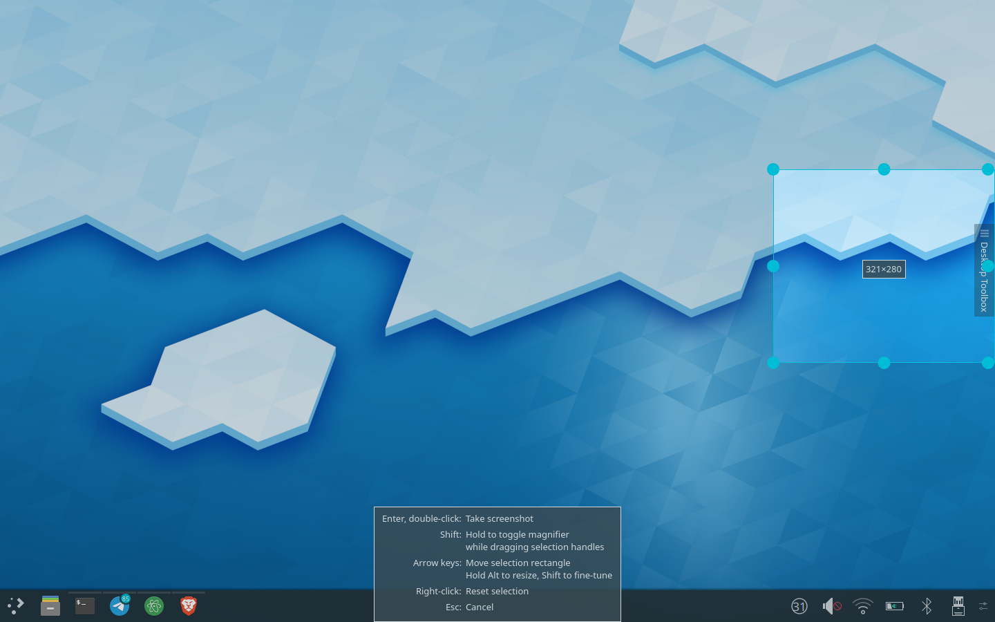
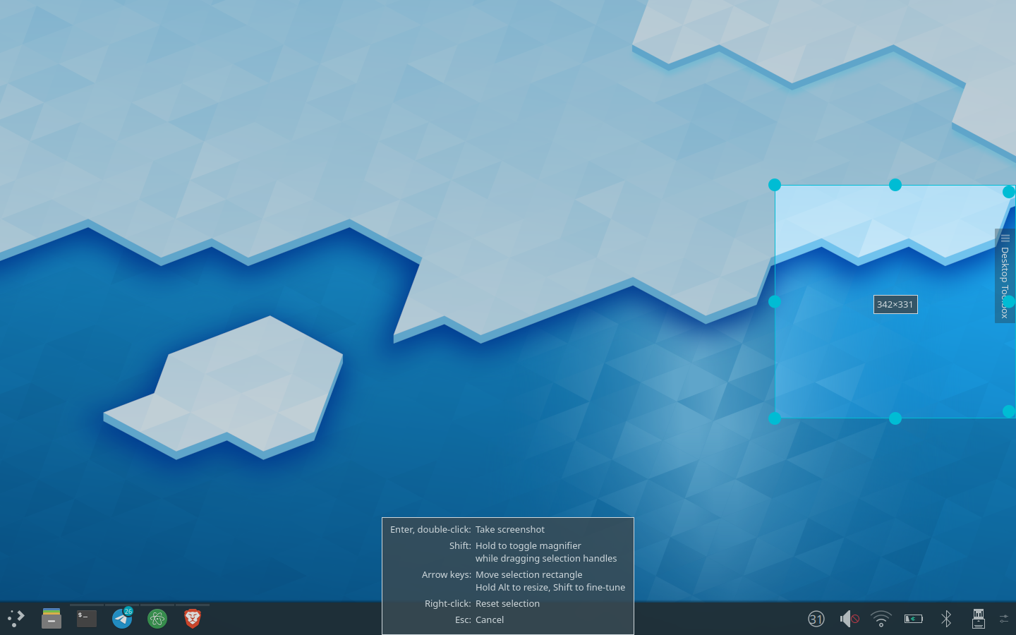
Change the SHIFT tips to language like "(Hold SHIFT to Blah)" (e.g.: "Hold SHIFT to Magnify").
Fixed small bugs, updates now if you change global shortcuts
- Result is now on the left side, action on the right side
- Mouse Actions are above Keyboard actions
- Word fine-tune replaced by more clear explaination
I don't know if it's the right metric
- Did things David suggested in the comments
Sep 3 2019
< Also, "pixel-by-pixel" (there might be a better way to say it, maybe find it later) is better than "fine tune" because it's more accurate.
If we would write it in qml I would still disagree since my initial feeling how this would look like would be somehting like:
This is how it could look like. I really like it and perhaps we could add some styling to make it look better (but I'm not a designer, so perhaps someone else has a mockup for that then :P)
I just had another idea: We have multiple controls for the same action. What about switching the order of Layout around:
I'll try to explain what I have thought about the different things you mentioned (and hope it makes sense):
Sep 2 2019
The style should be now as normal with the right margin and selection color.
Especially getting the right margin was more difficult than expected, I figured a way out to get it, although I'm not 100% sure if that's the simplest way.
- Added style for ComboBox from theme
- Added logic for resizing the ComboBox View
- Works directly with the Color from the colorscheme and changes the transparency, rather than constructing a new color
- Style is connected to a paletteChange of QGuiApplication, so that the style would be updated if the colorscheme changes (makes no difference at the moment as the Object is created new every time at the moment anyway)
Aug 31 2019
- Refactored code
- Added licensing
- Used QPalette instead of stylesheets
Aug 27 2019
Figured out with @davidre how to do get the highlighting text color (on in general the text brush) and the padding most likely:
Aug 26 2019
@felixernst my bad, sorry! I was only focused on the ComboBox itself and therefore overread that you were actually talking about the dropdown.
If the combobox's pop-up is a bit long sometime, that's not really a problem.
I actually haven't thought about that at all! I just assumed that the popup has to have the same width as the QComboBox itself. Thanks for the suggestion :)
@ngraham That's how it currently is. The shortcuts are only displayed in the popup, but the space there is limited. I agree with you that it should stay there and shall not be displayed in the ComboBox itself.
Unless you were talking about tooltips? Or did I misunderstand you completely?
@ngraham Good point, I didn't know that. What would you suggest then? It seems to me like the only way to go then is to set a width limit for the shortcuts? If a shortcut to long we could display an error message there? Something like "too long" just?
Personally I think it would make sense to have the same shortcut for copy and non-copy with an additional modifier.
+1
Also I am a fan of Meta + Print for taking a screenshot of the active window as it maps to the windows key on my laptop which is a great metaphor.
+1
I agree if the shortcut is displayed it should be displayed always
I'm not sure if you mean the same than me. I was favouring an approach, where only default shortcuts are displayed. So even if custom shortcuts were short enough, I wouldn't display them as from a user perspective it seems more reasonable to me when all my custom shortcuts are not displayed then when only a few of them are displayed and some other not (because they are too long).
I agree though, perfect would be to display all shortcuts always, but that's probably impossible -> Print+Volume Up+Volume Down ... I don't see a way to display such a long shortcut without making the shortcut incredibly wide, which would perhaps look very strange.
Aug 25 2019
Personally, I find it a very useful feature too. Especially the argument of @felixernst that there is not really a point anymore in displaying the shortcut, if the user has changed them, is quite strong. In general, we can assume that users, who change the default shortcut, are then aware of their own shortcut they set (most likely these users are also power users). Still one could argue that it might be helpful for one shortcuts as well. So there would be the possibility to display only shortcuts up to a specific width. I would rather not this though, as such an approach is not straight forward to the user and might lead to confusion and bug reports.
Removed unrelated changes
Aug 24 2019
Hi David,
Code refactoring: Bottom text has own class, improving readability, better separation of position and layout -> improved performance for changing the position (screen)
Aug 23 2019
An idea to avoid calling layoutBottomHelpText would be to store the current screen rect as a member and only relayout if the center of the selection is outside the screen.
Yeah thought about that as well. But I suppose the screen rect is not really an attribute of that class from an OOP view. I think the actual problem is more that positioning logic has been mixed up with the logic for layouting.
I think it's not a problem. The default is that spectacle only remembers the old selection until it is closed. Also I would be seeing the relatively big bottom help text on one screen. And I don't really find the old rectangle I can simply start drawing a new one by clicking and dragging.
Convinced. Especially if spectacle doesn't remember the old selection on closing, my argument has no point anymore.
mid help text should be displayed on right screen now: mSelection`s top left corner defaults now to the active screen`s top left corner
bottom help text should update: update() (-> paintEvent()) calls now layoutBottomHelpText
No it's always on the left screen. The reason is probably we call drawMidHelpText if `mSelection.size().isEmpty() .
Aug 22 2019
Removed unecessary local variable
Implemented new behaviour of handlers when they touch a screen edge
Rectangle can no be resized on edges, if the rectangle is big enough (>= 100x100)
Okay going to implement the feature that only some of the handles move inside (and we can see then if it's worth it) and going to implement the feature that resizing work on the rectangle`s edges works as well if the rectangle is not too small.
This is how it would look like
or like this