Another icon that need improvement is elisa.svg. It looks bad with dark background.

Another icon that need improvement is elisa.svg. It looks bad with dark background.
Thank you @rrosch. @alex-l I will work with official Kwrite icon and try to improve it. Let it be clear that what I am presenting here are just ideas. Something that improves the distinction of applications by relating them to their functions as @rrosch said, which will be very important for new KDE Plasma users (especially the newly orphaned Windows 7) who will be added to our user base.
@alex-l. These icons was made using Inkscape default palette (the effort at it design time was to discuss the ideas). Later I redesigned the ark, gwenview and kwrite icons from scratch using the breeze palette and colorfull icon guidelines.
@alex-l can you say me what's wrong with these icons? I'm trying to do it following all HIG recommendations (sizes, margins, colors...). I'm not a specialist as you said, @ngraham does not recruited me, and I'm aware his OK is not a approval. But I'm trying to help because I love KDE and I'm doing personal hacks and improvements for years. Please contact me privately if you want.
I'd made two proposals for the new logo. What one of them I'll should submit as a merge request?
Okular icon proposal.
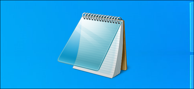
Colored Kwrite icon proposition:
Updated license and metadata in file.
It's not a derivative. The icon was made from scratch. Circle-icons-eye.svg was taken as inspiration only.
The title bars consume space, so the terminator way is more productive. Would be nice if I can hide these title bars in Konsole. But the tabs in konsole looks much better than in terminator.
An icon proposal for Ark.
Gweview icon inspired by: Circle-icons-eye.svg
Terminator have an option to divide terminal area horizontally or vertically. This is very util to avoid tabs.
I think the bigger side panel instead of the popup is more usable and productive if you have to manage multiple VPN connections, have a lot of notifications and have a good amount of data saved on clipboard. But I'm agreeded with you that sometimes it compromisse usability.
A right panel is not a solution. Notification area continues to show a popup, not an embeded widget in panel. I tried to resize it, but without success. There are a hack to do this, but it's not recommended because it is not official and it potentially conflicts with next plasma versions changes:
I think level 1 can be a "card list" on plain dialog, like in the new Windows 10 settings. Level 2 at left sidebar and level 3 at main section.
I think the image gallery (or image/video) app must be like Piktures is for Android.