Multi-level Appearance KCM
Closed, ResolvedPublic

Description

Over the years, we have flattened the System Settings Appearance section and moved most pages to the top-level category:

However we still get feedback that people can't find things, and in particular people don't understand the relationship between Global Themes and other appearance-related settings. Also the System Settings Appearance section is now quite large, causing the sidebar to be very tall and making it harder for people to find anything because of the greater number of top-level categories. And we're limited in the number of things we can add as additional top-level categories without worsening this problem, which is a problem because we want to eventually add more things to the Appearance section (Application Launch Feedback, Splash Screen, Plymouth, the appearance section of the separated Desktop Effects KCM).

@davidedmundson and @mart and I were discussing ideas to alleviate this recently and came up with the idea of renaming the top-level Global Themes KCM to be "Appearance" and fully embedding all the other appearance-related KCMs inside it using the multi-page KCM API.

This would clearly communicate that the other appearance KCMs are children of a logical parent (e.g. Global Themes). It would also remove six items from the top level of navigation in System Settings, making it easier to find everything else. Finally, we would have more room to put other appearance-related settings that logically belong there without overloading the top level of navigation.

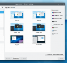
Here's what the VDG came up with today, and I implemented a prototype:

Clicking on any of the buttons in the column on the right would take the user to the appropriate KCM, shown as another page using the multi-page KCM API. The only technical blocker that I can find is that we need to make the multi-page KCM API allow pushing a whole KCM, not just a single file.

ngraham created this task.Dec 29 2019, 2:08 AM
ngraham triaged this task as Normal priority.

Apart from desiring having a 'Global Style' sub-KCM for only applying the Theme part of the Global Theme like how Desktop Layout is only applying the Layout part of the Global Theme, and the icon for 'Desktop Layout', this is pretty much perfect already for a Proof-of-Concept and in terms of its GUI design.

One suggestion: Align 'Customise' to the left of the icons

abetts added a subscriber: abetts.Dec 30 2019, 3:06 AM

I proposed a change to this structure long ago, I believe it might be good to consider and organize. Maybe also we can offer more than one way to find things as SySe is launched. For reference, here is what I made,

https://phabricator.kde.org/M112/417/

We don't want to do anything that will break searching - typing "colours" should still work as-is.

To a large extent it seems like we're reinventing something that already exists.

Effectively we just want to have one entry at level 2 and move everything into level 3 and then the searching still works.

The other key difference is that the KCM you open from level 2, doesn't appear at level 3 to indicate it's some sort of parent - but maybe we can find a less invasive way to visually hint that within the current architecture.

The other key difference is that the KCM you open from level 2, doesn't appear at level 3 to indicate it's some sort of parent - but maybe we can find a less invasive way to visually hint that within the current architecture.

That's basically the design goal here, yeah.

If we make a group called "Appearance" as the level 2 item, put all the appearance KCMs into it, and make Global Themes the top item so that it opens up when you click Appearance, then the problem is that the other KCMs in the Appearance category are not communicated to be children of the Global Themes KCM. That's what we're trying to do here.

tosta added a subscriber: tosta.EditedJul 3 2020, 11:41 AM

I think level 1 can be a "card list" on plain dialog, like in the new Windows 10 settings. Level 2 at left sidebar and level 3 at main section.

I think organizing various related things into a single place to manage it all would be best.

davidre added a subscriber: davidre.Oct 2 2020, 6:32 AM

We don't want to do anything that will break searching - typing "colours" should still work as-is.

To a large extent it seems like we're reinventing something that already exists.

Effectively we just want to have one entry at level 2 and move everything into level 3 and then the searching still works.

The other key difference is that the KCM you open from level 2, doesn't appear at level 3 to indicate it's some sort of parent - but maybe we can find a less invasive way to visually hint that within the current architecture.

I just had a simliar idea. Maybe it would be possible to associate a kcm with a sub category (X-KDE-IS-CONFIG-FOR-CATEGORY or some key in the category itself) which then opens when your click on that hierachy. So the parent/child relationship is clear

clel added a subscriber: clel.Oct 2 2020, 12:48 PM

We don't want to do anything that will break searching - typing "colours" should still work as-is.

To a large extent it seems like we're reinventing something that already exists.

Effectively we just want to have one entry at level 2 and move everything into level 3 and then the searching still works.

The other key difference is that the KCM you open from level 2, doesn't appear at level 3 to indicate it's some sort of parent - but maybe we can find a less invasive way to visually hint that within the current architecture.

I think since there currently already is a logic of hierarchy in place, it would be inconsistent to have a different logic applied to only some KCMs. So one would probably have to discuss the overall logic instead. The whole systemsettings application might benefit from it (maybe hide all level 2 entries by default and make level 1 entries bigger and with icons- that would make the list feel much less crowded). One could also discuss different arrangements for the level 1 entries like the one @tosta suggested.

So in short, I suggest closing this and discuss it on a higher level in a new task.

Nah, we'll keep discussing the proposed changes to this KCM here.

clel added a comment.Oct 2 2020, 10:04 PM

The problem is that these proposed changes might introduce inconsistencies with other KCMs as far as I see this. That would be something I didn't like and why I suggested discussing this on a higher level. But if you have a solution that doesn't introduce inconsistent behavior (maybe what @davidedmundson suggested) that would be fine with me.

I don't see how changing navigation/kcm hierachy introduces incosistencies itself.

clel added a comment.Oct 5 2020, 7:02 PM

@davidre It does not if it is applied to all KCMs in the same way. However, if I understand this task correctly, this is only for one KCM while the others stay the same. That would be inconsistent, because then they treat hierarchy differently (plus the proposal introduces a right sidebar that is not used anywhere for this level, I think).

That is why I suggested to discuss this on a higher level for the whole systemsettings application.

mart added a comment.EditedOct 12 2020, 11:45 AM

I like the idea, and i can work on some infrastructure to make some kind of loading kcms from within other kcms work correctly.
I would open them with that breadcrumb mechanism whem opened..

I don't like much the design with a right sidebar. it makes the window feel very cramped.
If more and more emphasis is placed on the global theme, perhaps the sub modules should have even less emphasis (in that screenshot there is really no practical difference compared to just have to the same list being on the left sidebar... just that it looks a bit uglier)
so perhaps could they be under a popup menu/combobox/something along the lines?

Also: how searching would be managed? would those sub-modules still show up in results?

mart added a comment.Oct 14 2020, 2:30 PM

here is current status:

I know this is merged now, but I have a bit of a gripe with the interaction. The fact that the global theme becomes part of the toolbar makes it seem like there is no button there. It seems like the global theme button is a header instead. This pseudo header/button also replaces the search button when the syse window is not big enough, leaving the user without the search field. If global theme was "not" a kcm, then it would make sense to have the placement it has. This is the only button that behaves this way. By the same token, you would expect all other headers like Workspace, Personalization, Network to also become header/buttons and have their own kcm, which they don't.

I think one solution would be to "repeat" the global theme button in the list of kcms, then put "Appearance" as the header back button instead of global theme.

clel added a comment.Nov 14 2020, 4:21 PM

I fully agree that the current solution of having the header as some kind of button is not really what one expects and will propably confuse users (or that option will be completely unnoticed by them).

I am not that much into the technical details. What is the reason why the Global theme settings are presented as a header button while all other settings are in a list? Why not add the global theme settings to that list as well? Because it is higher in hierarchy? At least in the past that has not seemed to be the case.

fvogt added a subscriber: fvogt.EditedNov 14 2020, 4:47 PM

(Originally written on https://invent.kde.org/plasma/systemsettings/-/merge_requests/32#note_136280, so this copy doesn't have images embedded)

Now it's much harder to find and access appearance settings:

Using the sidebar view, there's just "Appearance" visible:
Screenshot_20201114_173146

Only after clicking on that, a list of KCMs appears:
(also looks like the title there has the wrong background color...)

Screenshot_20201114_173253

Using the icon view, it's even worse:
Screenshot_20201114_173332

The items were clearly visible and easy to find before, now they're hidden and require a click more.

fvogt reopened this task as Open.Dec 14 2020, 12:38 PM

It seems like there are still parts which need discussion here, so reopening.

For the record, I still think my original idea was clearer, with all of the child KCMs presented as a vertical list embedded within the Global Themes KCM.

clel added a comment.Dec 15 2020, 4:53 PM

Judging from how other menu entries behave (not speaking about the technical workings) both the currently implemented and the suggested idea here are not really consistent afaict, although this is a somewhat special case probably.

There are overlaps of problems that are tried to be fixed.

For the single purpose of reducing the first level entry count, I'd suggested something like:

  • Appearance entry (maybe this needs to be some dummy in the real implementation?)
    • Global Theme (as a list entry, not like it is currently)
    • Plasma Style
    • Application Style
    • etc.

The other problem of somehow indicating that Global Theme also influences the other entries of the Appearance category is valid, but I don't know whether this can be treated in a way that can preserve consistency.

I start to somewhat understand the reasoning behind the proposal here (for example the Customize header above the entries), although I am not sure whether there might be more consistent approaches.

The other problem of somehow indicating that Global Theme also influences the other entries of the Appearance category is valid

That's the whole point though. It's the central thing that needs to be communicated, and it can't be thrown out without scrapping the entire project.

clel added a comment.EditedDec 19 2020, 3:59 PM

I just had some thought about this again. I still feel neither current approach is "right" in every aspect.

I hope that there is a better approach with less downsides overall.

Currently both approaches have the "proplem" that it is a bit hard (or unintuitive) to "go back" to the global theme page after customizing sub-content like cursors (at least that is how I understand them).

A "back" button could solve that, but still both approaches would look a bit inconsistent.

A third approach that would be more consistent with existing ones would be to have the sub-content pages (like cursors) be on a new sub-page. Like for the users KCM.

Global ThemeTheme specific sub page opened when clicking on a customize button. The options for customization are presented then in a list
BreezePlasma Style
OxygenDesktop layout
......

That might have new downsides though as users might be confused that adjusted settings are not remembered for Breeze when changing from Breeze to Oxygen and then back to Breeze for example.

The-Feren-OS-Dev added a comment.EditedDec 21 2020, 5:24 PM

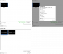
So... I randomly brainstormed a way for us to 'redesign' Global Theme if we stick to the current simplistic approach of making it a main page for an overall 'Appearance' subsection. This would involve some light changes to Global Theme, as well as some potentially major undertakings for the sub-Appearance KCMs' code, but I'll outline it nonetheless:

Global Theme tweaks:
The footer under the grid would get a new row above its current footer. This row would look something like this:

SELECTED GLOBAL THEME NAME (header-like formatting)
SELECTED GLOBAL THEME DESCRIPTION (formatting like in 'Uses color scheme' (Plasma Style), etc.)                  [ Apply full Global Theme ] [ More Options ]
[ ] Also apply Desktop Layout from Global Theme                                          [ Get New Global Themes... ]

It goes without saying, but this proposal would also mean this KCM no longer has a standard 'Apply' button in SySe due to having its own 'apply' button.

Pressing 'more options' would show a Kirigami dialog, with a list consisting of checkboxes/switches for each and every element a Global Theme can set. These would obvious have a label prefix of 'Apply ', and below each label there'd be a sub-label saying what it'll set that value to in human-readable name form.

The buttons for this dialog would be 'Cancel' and 'Apply Selected'.

Sub-Appearance KCMs:
Each KCM with a grid in it will now have the option the Global Theme sets be the first item in the grid, with an additional sub-caption for them saying "Recommended for Global Theme" or similar. The priority as being the first item on the grid is for ease of item discovery.

How's that sound for an idea?

clel added a comment.Dec 21 2020, 8:31 PM

That is a nice UI to make the user aware of what applying does and at the same time offering fine grained control over what will get changed / inherited from a global theme. +1 from my side!

I still feel like having an additional indication of hierarchy (like proposed above) might be beneficial but am not so sure about that anymore.

ngraham closed this task as Resolved.May 14 2021, 3:26 PM

Baaaaasically done now.