Make custom stamp image support more discoverable
Closed, ResolvedPublic

Description

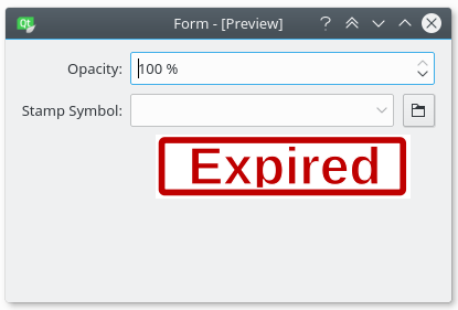
Currently, you can add a custom image to Okular's stamp tool by entering the image's full path into the combobox. This UI is sub-optimal for the following reasons:

  1. The typical workflow for selecting images for some use involves a button with text like "choose image" that opens a file chooser; many/most users would never even think of entering a path into the box.
  2. The user needs to be able to enter a valid file path, which is a challenging task for many/most users, especially if the file or any intervening directories contain spaces or symbols.
  3. There is no feedback when an invalid path is entered or an image with an unsupported file format is chosen. It just... doesn't work, but the invalid path/file stays there in the combobox.

BUG: 383652

simgunz created this task.Feb 25 2018, 11:14 AM
simgunz triaged this task as Normal priority.
simgunz added a comment.EditedFeb 25 2018, 11:35 AM

I am willing to work on this. Before starting I would like to discuss the design.

My suggestion is to reshape the config dialog as follow (some parts missing)

This reduce the clutter in the interface by removing an unusful group box and displaying the preview image bigger.

Thanks for working on this, Simone! This is a high priority on my "how would my mother figure this out? " list.

I think it's important to help users add new images from main custom stamp tool UI, without having to first go into the program's Settings. It feels acceptable to have the stamp images managed from there, but you should be able to add new stamps from the main UI.

I haven't understood your point. If it is related to the mockup above, that is the main stamp config dialog ( I did not draw the parts above because I am lazy ). So that is not a sub-config dialog.

See D10859#214352. Having the annotation tool configuration UI hidden away in dialog boxes that you need to go to Okular's Configure window to access is the biggest impediment to discoverability, not the layout of the config dialogs themselves. My vote is for removing the config dialogs entirely and showing the annotation tool settings inline when the tool is active. This would also improve usability, since it would be much easier to change the current settings of the active tool, and it would represent a much more standard UI convention too.

Thanks for working on this, Simone! This is a high priority on my "how would my mother figure this out? " list.

Agreed! It's things like this (and digital signatures) that are important for business adoption. For example, my company stamps documents with a whole list of various terms to classify them. Making this easy to do is important.

simgunz moved this task from Backlog to In progress on the Okular board.Jun 2 2019, 8:30 AM