Replace Task Manager with Icons-Only-Task Manager in the default panel, and thicken it
ClosedPublic

Authored by ngraham on Mar 4 2020, 8:09 PM.

Details

Summary

This patch implements the part of T12441 that was virtually universally agreed-to:
switching out the regular Task Manager for an Icons-Only Task Manager and pinning
some apps by default. The panel is also thickened to to 46px (with the default font,
since the calculation is based on GridUnits, which are font-aware). The panel remains
in its current position pending further discussion about whether or not we want to
move it to the left edge.

Ideally I'd like for this patch to used for discussions about the implementation, not the
general concept, so if you have concerns about that, please put them in T12441.
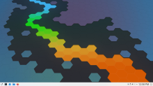
Test Plan

This is now the default panel:

Diff Detail

Repository
R119 Plasma Desktop
Branch
iotm-by-default (branched from master)
Lint
No Linters Available
Unit
No Unit Test Coverage
Build Status
Buildable 26474
Build 26492: arc lint + arc unit
ngraham created this revision.Mar 4 2020, 8:09 PM
Restricted Application added a project: Plasma. · View Herald TranscriptMar 4 2020, 8:09 PM
Restricted Application added a subscriber: plasma-devel. · View Herald Transcript
ngraham requested review of this revision.Mar 4 2020, 8:09 PM

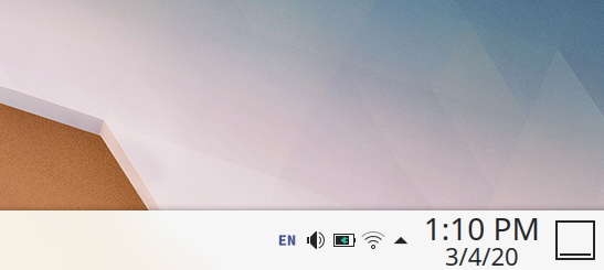
One other note: it might make sense to turn on the Digital Clock's date display by default if we go with this, as the clock text is currently rather gigantic and IMO adding the date results in both more information and also a better use of space:

It might also be nice to make the date automatically appear for panels of a certain height, and then change the date display to a three-position setting "always shown", "always hidden", and "automatic". That would be material for another patch though.

<default>applications:systemsettings.desktop,applications:org.kde.discover.desktop,preferred://filemanager,preferred://browser</default>

There is currently an issue that might make this change cumbersome, unless it was fixed very recently as part of the patch work for this, being that preferred://browser causes duplicated entries for stuff like Vivaldi, etc (they'll be separate from the preferred:// pins meaning the preferred:// item basically acts as a quick launcher which is far from what is intended). Similar problem with preferred://filemanager. I would've used those instead of hard pins to vivaldi.desktop and org.kde.dolphin.desktop by default in Feren OS if it wasn't for that aforementioned issue being there.

ngraham added a comment.EditedMar 4 2020, 8:28 PM

Sounds like a bug we should fix with the preferred:// schemas then. We can't hardcode a non-KDE browser because we can't know in advance which ones might be installed on the user's system. This is the exact problem that the preferred://browser string was meant to solve.

Some folks in the VDG channel have objected to the panel being 48px tall, so here's how it would look at 38 (the default Windows panel height):

Not as touch-friendly, but the clock text looks better and it won't be so huge for people using low-DPI screens. However 38 is not easy to calculate by our existing units so it would likely need to be hardcoded.

+1 to 38
Weirdly enough, the plasma icon only looks that big from >40, while the IOTM does not use big icons in 40 yet. I'd like small icons to be used consistently.

ngraham added a comment.EditedMar 4 2020, 8:46 PM

Now to my eyes, 38px is too small. But apparently my tired old eyes and small screen (13.3" FHD) are not representative of other VDG people's views. :)

Still it makes me realize that we really need to get https://bugs.kde.org/show_bug.cgi?id=356446 done so that Plasma can properly scale itself. Ideally I would be using a 1.1 or 1.2x scale factor and everything in Plasma would automatically get bigger. And even more ideally, the correct scale factor would be auto-detected and applied based on the user's display metrics.

ngraham updated this revision to Diff 76967.Mar 4 2020, 9:05 PM

Use 38px as the height, and hardcode it since there's no good way to get there with a
multiple of gridUnit

ngraham edited the summary of this revision. (Show Details)Mar 4 2020, 9:05 PM
ngraham edited the test plan for this revision. (Show Details)
ngraham edited the summary of this revision. (Show Details)Mar 4 2020, 9:11 PM
ghost34 added a subscriber: ghost34.EditedMar 5 2020, 8:27 AM

Some folks in the VDG channel have objected to the panel being 48px tall, so here's how it would look at 38 (the default Windows panel height):

Not as touch-friendly, but the clock text looks better and it won't be so huge for people using low-DPI screens. However 38 is not easy to calculate by our existing units so it would likely need to be hardcoded.

Why Show/Hide Desktop icon is so huge?

The plasma logo is also quite big. For reference, here's my 38px panel:

The plasma logo is also quite big. For reference, here's my 38px panel:

It's looks so small (to me), but feels more consitant.

ndavis added a subscriber: ndavis.Mar 5 2020, 2:20 PM

I don't want to turn this into bikeshedding, but I think a size of 42 is better because that raises the size of task manager icons to 32px. 22px is pretty small for an IOTM.
With that said, I think something we'll have to work on is finding ways to improve the way panel items are sized so that we don't have to pick sizes based on how different widgets change icon sizes.

ndavis added a comment.Mar 5 2020, 2:22 PM
In D27845#622434, @KonqiDragon wrote:

Why Show/Hide Desktop icon is so huge?

Because icon sizing in panels is a mess.

I don't want to turn this into bikeshedding, but I think a size of 42 is better because that raises the size of task manager icons to 32px. 22px is pretty small for an IOTM.
With that said, I think something we'll have to work on is finding ways to improve the way panel items are sized so that we don't have to pick sizes based on how different widgets change icon sizes.

I don't disagree, and would also prefer something bigger than 38. 42 would be nice.

davidedmundson added inline comments.
layout-templates/org.kde.plasma.desktop.defaultPanel/contents/layout.js
28

why is this no longer unit based

ngraham added inline comments.Mar 5 2020, 4:15 PM
layout-templates/org.kde.plasma.desktop.defaultPanel/contents/layout.js
28

Because VDG people wanted a size that isn't a multiple or clean divisor of gridUnit and none of the other units values would evaluate for some reason.

Some people think 38 is the best pixel value, and others think something in the 40s would be better.

Open to options.

davidedmundson added inline comments.Mar 5 2020, 4:27 PM
layout-templates/org.kde.plasma.desktop.defaultPanel/contents/layout.js
27–30

I'm seeing this on too many tickets where we replace doing any design and thinking for being lazy copy cats. If people want exactly Windows, they can just use that.

We're meant to have a Visual Design Team, not a Vista Duplication Team.

I can't express how much this comment irks me.

ndavis added a comment.Mar 5 2020, 4:51 PM

@davidedmundson Nate says smallSpacing doesn't work here. Do you know why?

gvgeo added a subscriber: gvgeo.Mar 5 2020, 4:53 PM

IMO better use Math.round(gridUnit*2.1) than fixed value that will not always look good with a scaled display.

@davidedmundson one problem here is that a gridUnit is a fairly coarse unit of measurement, and gridUnit * 3, or 54px is a bit larger than we'd like, but the current thickness (gridUnit *2, or 36px) is too thin. We initially settled on something in the mid 40s, but seeing 54 made various people think we needed to go even lower. Basically we have not yet achieved consensus on the exact pixel value we want for the panel, but whatever we settle on is not likely to be an exact multiple of gridUnit, and other units such as smallSpacing didn't seem to evaluate when I tried to use them here; maybe that's just a bug that needs to get fixed.

Should System Tray icons be larger then?

ngraham updated this revision to Diff 77053.Mar 5 2020, 9:08 PM

Use a gridUnit-based measurement again, and increase the thickness a bit to effectively 46px tall, which I really don't think is excessive

ngraham edited the summary of this revision. (Show Details)Mar 5 2020, 9:09 PM
ngraham edited the test plan for this revision. (Show Details)
ngraham marked 3 inline comments as done.

Should System Tray icons be larger then?

Here's how it would look to go from iconSize=1 to iconSize=2 (i.e, 16px to 22px):

filipf added a subscriber: filipf.Mar 5 2020, 9:20 PM
filipf added inline comments.
layout-templates/org.kde.plasma.desktop.defaultPanel/contents/layout.js
28

can we do Math.round(gridUnit * 2.25) or at least Math.round(gridUnit * 2.33) ?

That's about 41px and 42px respectively, and shouldn't stand out us a huge change from what we had or look awfully big on PCs.

mart added a subscriber: mart.EditedMar 5 2020, 9:25 PM

Not as touch-friendly, but the clock text looks better and it won't be so huge for people using low-DPI screens. However 38 is not easy to calculate by our existing units so it would likely need to be hardcoded.

all of that at what dpi?
for each scaling everyhting will look fairly different (and yes, using a number of pixels instead of a gridunit is just going to break)

In D27845#623019, @mart wrote:

Not as touch-friendly, but the clock text looks better and it won't be so huge for people using low-DPI screens. However 38 is not easy to calculate by our existing units so it would likely need to be hardcoded.

all of that at what dpi?
for each scaling everyhting will look fairly different (and yes, using a number of pixels instead of a gridunit is just going to break)

Yeah, we moved back to using gridUnit-based sizing. :)

gvgeo added a comment.EditedMar 16 2020, 2:41 PM

Are there objections for Math.round(gridUnit * 2.33) (42 with default settings) suggested by @filipf? So that it can have big icons.

I don't want to turn this into bikeshedding, but I think a size of 42 is better because that raises the size of task manager icons to 32px. 22px is pretty small for an IOTM.
With that said, I think something we'll have to work on is finding ways to improve the way panel items are sized so that we don't have to pick sizes based on how different widgets change icon sizes.

Personally I thing that 36 is good, with 40 been the max I would like to see. But don't see 2 more pixels a good enough reason to stall this patch, when the majority of VGD agree on IOTM for various reasons.

ngraham edited the summary of this revision. (Show Details)Apr 6 2020, 6:35 PM

The blocking bug was just fixed with D28632, therefore...

ping! :)

Size should be an even number

  • For sizes from 36 to 40, I'm OK with it
  • At 42 and 44 the icons in the task manager become too big for the panel; their size should be reduced to same as the launcher button, then it's fine
  • At 46 and over it's fine
ngraham updated this revision to Diff 82142.May 6 2020, 7:07 PM

Round up to nearest even number

ngraham edited the summary of this revision. (Show Details)May 6 2020, 7:09 PM
ngraham edited the test plan for this revision. (Show Details)
ngraham added a comment.EditedMay 6 2020, 7:13 PM

So now with this patch, the new default panel height is 46px. It seems like there's still a camp that would prefer a smaller value, and I don't want to steamroll over them. However I agree with @niccolove that the 42 and 44px sizes look odd given the current icon scaling algorithms, so I'd prefer not to use those. I also happen to think that 40 looks odd too, since the Kickoff icon is visibly larger than the icons for pinned apps:

The system tray items do seem to fit the space better with the thinner panel though. But I don't think that's a huge deal since tray icons are supposed to be small and unobtrusive.

Also from less technical angles, I think that when using an IOTM, a larger icon looks nicer, and a larger effective click area is desirable since the buttons are now much less wide than TTM items are. This is especially true for touch use cases, which we need to consider since 2-in-1s are all over the place these days. So personally, I think the extra size imparted by 46px is useful.

Since I'm not feeling a lot of enthusiasm for this patch, I've submitted an alternative that fully implements the proposal in T12441 with no design compromises: D29501: Use left-aligned thickened panel with IOTM populated with some apps by default

Since I'm not feeling a lot of enthusiasm for this patch, I've submitted an alternative that fully implements the proposal in T12441 with no design compromises: D29501: Use left-aligned thickened panel with IOTM populated with some apps by default

I think you should not move the panel to the left, because "Kool Desktop Environment" and Plasma always had a panel on bottom by default, such a sudden change may upset users.

Every change upsets somebody; that's not a reason to avoid change. We change things when the proposed change is a universal or net improvement, and we leave things the same when it would be worse or no better. So you should evaluate that (and any) patch on its merits.

Is this to land in 5.19?

There's still disagreement over whether we should do this or the other one, and how to implement them, so I don't think we know what release one of them will land in (if any).

We discussed this and D29501 at the virtual plasma sprint today and concludes that we should probably do the horizontal version here. Nobody overtly hated the vertical version, but issues displaying the clock +date and system tray items were brought up and we don't really have a great solution for those. So let's shelve that idea for now and stick with this one here.

I'm going to stand firm on 2.5x gridUnit for now. That works out to 46px, which is not too tall (IMO) and increases touch friendliness by a lot. Let's all keep in mind that this is super easily configurable.

niccolove accepted this revision as: niccolove.Jun 12 2020, 5:36 PM
This revision is now accepted and ready to land.Jun 12 2020, 5:36 PM
cblack accepted this revision.Jun 12 2020, 5:36 PM
ngraham closed this revision.Jun 12 2020, 5:39 PM