This patch adds an option to center the Breeze's decoration shadow.
| hpereiradacosta |
| Breeze | |
| VDG |
This patch adds an option to center the Breeze's decoration shadow.
| Lint Skipped |
| Unit Tests Skipped |
FWIW, I would love this too. IMHO this should even be the default (but is obviously something for the VDG to decide). Reasons:
Patch LGTM.
However, I noticed a small inconsistency (probably just food for thought and not something for this patch): Shadows of menus do not respect this, they are still offset. While that's the behaviour on Windows too, on MacOS menus have shadows on all three borders.
Hi,
Thanks for the patch.
Few comments (on the functionality, not yet on the code)
1/ this is a decision VDG should make (Thomas Pfeiffer ?): when I first wrote the code for breeze we discussed this possibility to have the shadow centered (as well as left oriented) but it was rejected. The right oriented shadow being a concious choice of the main breeze designer at the time, Andrew Lake
2/ if the option is added it must be applied consistently everywhere. This includes (as already noticed): menu and combobox shadows, but also buttons shadows (including checkboxes, radio buttons, slider handles, etc.)
This requires changes to breeze::style as well as breeze::decoration.
The shadow code for menu and comboboxes is 'similar' to that of the decorations. The button shadow is somewhat different, but ...
3/ I don't think this should be an option. The change is too small (and implies too much code complexity, once 2/ is fullifille) for being controled by an option, and doesn't bring/remove anything functionality wise, instead of eye candy. This would be like adding an option on how many pixels are used to round corners at the top of the window decoration. Bottom line one should choose one design or the other, it is not worth it to keep both. On the other hand we must then be prepared to people complaining when the change is introduced, and have a good story for justifying the change (rather than just : because I think it looks better).
4/ note that oxygen has centered shadows everywhere (decoration, menus and buttons).
Comments welcome
Hugo
This is not true
There is a shadow at the top and at the left. It is simply not as pronounced as the one at the bottom and the right. Also, the shadow strength (not its centering) is already configurable.
- It would be consistent with GNOME, Windows (all borders) and MacOS (all borders except the top).
This is not a strong enough reason, imho
Patch LGTM.
However, I noticed a small inconsistency (probably just food for thought and not something for this patch): Shadows of menus do not respect this, they are still offset. While that's the behaviour on Windows too, on MacOS menus have shadows on all three borders.
I agree that this should be a change, not a new option. Personally, in addition to aesthetics, I like the change because it fixes the following visual glitches:
Personally I like the feeling of the shadow falling at the bottom right.
I just found it a bit too much.
I think it must go a little more to the left and top but preserve the feeling that the shadow falls at bottom-right like the original designer thought it.
I tried my best at the following screenshot to show a good top and left shadow, that was the best I could do.
The settings for size and strength are: 57px. - 37% take into account that I am in a hidpi screen.
The shadow size isnt that important because the offsets are calculated in proportion of the shadow size but
the bigger the shadows the better can be observed the location of the shadow for the window.
That's true, but Oxygen shadows suffer from a different issue, as they seem to blend in an odd way. For example, say you want a light shadow. In order to achieve this effect you need to change the inner color to a light gray. This works fine over lighter backgrounds, but over a darker background the shadow becomes a gray glow, as seen here:
This could be fixed by adding an option to change the shadow's alpha, so that a light shadow can be created with a small alpha and setting black as inner color. At first I thought about creating a patch to allow this in Oxygen, but I really like Breeze so I decided to try with this patch we're discussing now.
I tried at first playing with the parameters, but I couldn't come up with a good result. For me, the screenshot you present just feels unbalanced, and trying to focus on the window content makes me feel dizzy.
As for shadows in menues and windows, I'm fine with the way they look now, but I wouldn't mind having centered shadows in menues as well.
! In D8232#155370, @rpelorosso wrote:
For me, the screenshot you present just feels unbalanced, and trying to focus on the window content makes me feel dizzy.
+1, me too.
my previous screenshot was to show you the problem with the current implementation not to suggest new defaults...
in order to demonstrate you the best in my liking I will give you two screenshots using the current breeze defaults.
The first one is the default current breeze shadow, the second is my liking which has been produced by reducing the offset
to half by changing line #643 of breezedecoration.cpp to:
const int shadowOffset = qMax( 3*g_shadowSize/16, 2*Metrics::Shadow_Overlap/2 );
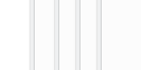
Current:

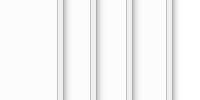
Proposed:

I am on Michail's side.
Having the shadow falling at the bottom right feels more natural to me. I also like the sharper edge at the left. Makes the overall look of the desktop a little cleaner.
Actually, the clean look of breeze was the main reason why I finally switched to Linux. I tried Gnome and KDE4 before and was not satisfied by the overall look and feel, so I stayed with MS Windows. Breeze changed this.
In my opinion, a decent shadow at the bottom right is enough to seperate application windows from each other.
I however can understand that this is depending on personal preference. And by this I am against centering the shadow without an option.
Either do this optionally (we already have several options here, another one won't hurt that much), or slightly reduce the offset like Michail proposed.
Totally aggree. If the falling shadow was a concious choice, then the reasons for this decision should be discussed here. Are they documented somewhere?
3/ I don't think this should be an option. The change is too small (and implies too much code complexity, once 2/ is fullifille) for being controled by an option
I think you might underestimate the impact of this change. The overall feel of the system will change with this.
Also, I am not sure if it is really that complex to have an option for centering the shadows.
On the other hand we must then be prepared to people complaining when the change is introduced, and have a good story for justifying the change (rather than just : because I think it looks better).
Definitely. And thus it would be great if we could find some reasons why the shadow was designed as it is in the first place
I also prefer the compromise screenshot above to the status quo. FWIW, I gave some substantive, non-aesthetic reasons to center the shadow up-thread at https://phabricator.kde.org/D8232#155293
Let me illustrate the problem I have with the current shadows. Imagine this situation:
Here it is very important from a usability standpoint to tell the windows apart and to get a sense of depth.
Do you know which window is in the front in the following screenshot? I cannot tell:
Here it is much easier:
And here is the full screenshot:

I think Plasma should support a diverse set of workflows, currently I do not feel it is optimal in every case. Of course nobody stacks windows like in the screenshot, but the visual presentation for users cascading on the left border is much worse than for users cascading on the right.
Can you explain in which situation/workflow these two screenshots are the only part of the screen that you see ?
I completely agree, @rkflx. For just this reason, 10 years ago Apple changed the window shadows to be super super gigantic: https://arstechnica.com/gadgets/2007/10/mac-os-x-10-5/3/

It was a bit controversial at first, but eventually people really liked it for exactly the reason you indicate: it provided a great sense of depth. I always make Breeze shadows as huge as possible to try to emulate this. Programmer-types like us often underestimate just how hard it is for many people so know which window is in the active one. Anything we can do ti make it more obvious, without becoming garish, IMHO is worth it.
This is mainly on external displays with a lot of windows open, some maximized vertically. If you focus on parts of the screen (e.g. to read something in a particular column or use a toolbox), you do not look at the whole window. Imagine someone sitting close to the screen so he has to move his head to see the full screen. In this situation you do not see the complete shadow, but only some parts.
Edit:
Here's another demo workflow: It has a main window maximized vertically and additional smaller windows (terminals, editor, notes…). Windows switching is done by subconsciously pointing the mouse to the target window.
Note how either the left or the right window border is visible, but never both (except for the currently active window).
That's a cool idea. I would just try to make it smoother. The proposals still look pretty rough. I don't know programming, but can you tell me the current parameters to create the shadow with this patch? Blur, spread, color?
Indeed, in fact, what I was meaning to achieve was exactly that effect. I like centered, big shadows, that allow me to differenciate widndows with small (or non-existant) borders easily while still being smooth. The proposed compromise may seem like a good idea, but the fact that the shadow is not horizontally balanced is, although subtle, still noticeable, and gives me that "something is not right" feeling that's hard to shake off.
+1 for the centered shadow proposal as an option.
I'd hesitate for this to be the default since to do it well, in my opinion, it'd take a complete lighting (re)design effort on Breeze to help ensure visually consistency.
If it has to be an option, and if it can bring inconsistency in the theme, then honestly I would rather see it as an "aurorae" theme than a breeze hack.
If it goes to breeze (whether as an option, which I would disfavor, or as the default), it has to go as a complete relightning , with consistency across menus, combobox drop down, and buttons.
We do not want to ship a default theme that is inherently inconsistent, whether in its default configuration mode or when tweeking any random options.
Absolutely +1, I was waiting for this option since Plasma 5 was launched. I suggest to make it default, I can't really get why the shadow should be on the right.
The thing is that they arent totally centered. They are centered at x but they have a small y offset, it gives the feeling that the shadow is going down.
Ok, I agree now that there shouldn't be an option. I think it is fair to say that the contrast on the left side of overlapping windows could be improved. The proposed compromise solution actually looks decent too and it keeps the lighting reasonably consistent. The VDG and Hugo are discussing. Oh and in case it is sometimes forgotten, thanks for submitting the patch. :-)
Thank you! :) In case centered shadows aren't going to be an option, as it seems it's going to be the case, I'll go back to my idea of creating a patch for oxygen to allow changing the alpha of the shadow. I think, with that in place, I'll be able to configure shadows to look the way I want. I won't have the energy to patch breeze myself every time a new version is out.
Thank you! :)
I didn't want to stop mentioning that, unless I'm missing something, it looks like breeze *window* shadows are not taking into consideration the Screen Scaling settings, so basically they don't scale if that value is increased, making the shadows look small in 4k screens with screen scaling. I haven't yet created a bug report because 1- I want to really make sure this is an issue, and 2- I want to have a look at it if that's really the case.
Personally, I'm in the centered shadows camp. I have windows set up to have no borders and they always seem to visually blend into each other in a similar way to what @rkflx describes.
I don't understand the reasoning behind light coming from the top-left, it seems arbitrary. If it's because of the reading direction, then I'm sure speakers of RTL languages would prefer top-right lighting :).
Top-centered lighting would look more balanced and avoid leaving sides with (almost) no shadow.
They look great!
I think the consensus (from Telegram discussions) was that I would submit two review requests to superseed this one:
This would allow people (including designer) to test both in real life, possibly offer suggestions for improvement, and ultimately we decide between one solution or the other.
I'm still working on the patches though. Will take a bit of time (~a week)
Thanks for summarizing the discussion and doing the prototyping, that's appreciated.
Just noticed a point which has not been mentioned yet: There are also the shadows of the Plasma widgets to consider. Ironically, those are already centered (but could be adapted, of course – who would work on that?).
Let's not jump to conclusions here too fast :) We should evaluate both approaches in how they solve the problem at hand (if that's done, and only after that, maybe also by the looks and personal preference). It may turn out it makes sense to also deviate from centering in Plasma.
Sorry to say, but this is a completely gratuitous, non constructive and demotivating comment nathaniel.
Hugo
Sorry guys, didn't mean to offend. Though I currently favor the centered approach, I'm absolutely willing to be convinced out of it, if VDG can come up with a non-centered shadow that looks good and resolves the issues with insufficient depth and contrast on windows' top and left sides.
In fact, not only are they centered, but they are equal on all sides (top, left right and bottom). Is that really what we want for the widget style / window decoration ?
In fact, answering my own comment, looking at the original patch, it seems like yes ...
Let's put is this way: Ideally the shadows of the Plasma widgets would follow whatever the window decoration is doing. Especially the Plasma popup widgets are very similar to a normal widget menu popup, from the user's point of view – see the link above for how inconsistent this looks sometimes. While there may be a point in differentiating visually between freestanding Plasma "windows" on the desktop and normal windows, at least the direction of the shadow should be consistent.
Anyway, this would probably be material for a second patch. Not sure who is maintaining Plasma's shadows, but we should probably include him or her in the discussion. @mart or @sebas, please comment :)
Per recent VDG discussions, I've put together a patch that changes the defaults to horizontally center window and menu shadows, and make them a bit larger: https://phabricator.kde.org/D9549
Agreed! I think also, we can always experiment and change things going forward. I don't think of this patch as the ultimate solution. Just another iteration in an evolving theme.
I would really like to avoid too many iterations on this topic. Window decoration are very visible to users, so changing it every two releases gives a really bad impression.
We _should_ get it as right as possible before pushing to the official repo, sorry.
Andy, if you think the shadow should be improved, please indicate how so that the patch gets fixed before its get committed.
Devs can work with patches, there is no need to commit.