Very slightly increase text contrast for the default Breeze color scheme
Summary:
BUG: 381288
For active elements, use Shade Black instead of Charcoal Grey and Paper White instead of Cardboard Grey. This slightly increases contrast and makes text easier to read.
Test Plan:
Insufficient text contrast has been noted in reviews of Plasma, for example http://www.ocsmag.com/2017/10/18/plasma-5-11-keep-the-momentum-going/
However, font color and contrast are in need of an improvement. I had to change the theme and set the text color to pure black, and this provides an immediate ergonomic boost and helps reduce the strain on the eyes. I really don’t understand why distros don’t use simple black color for fonts. Everything else is configurable but the text should be crystal clear.
Pure black has a few disadvantages, since some people find pure black on pure white to be blinding. So I changed the gray text to a darker gray, but it's not solid black, so there is still never a solid-black-on-pure-white situation.
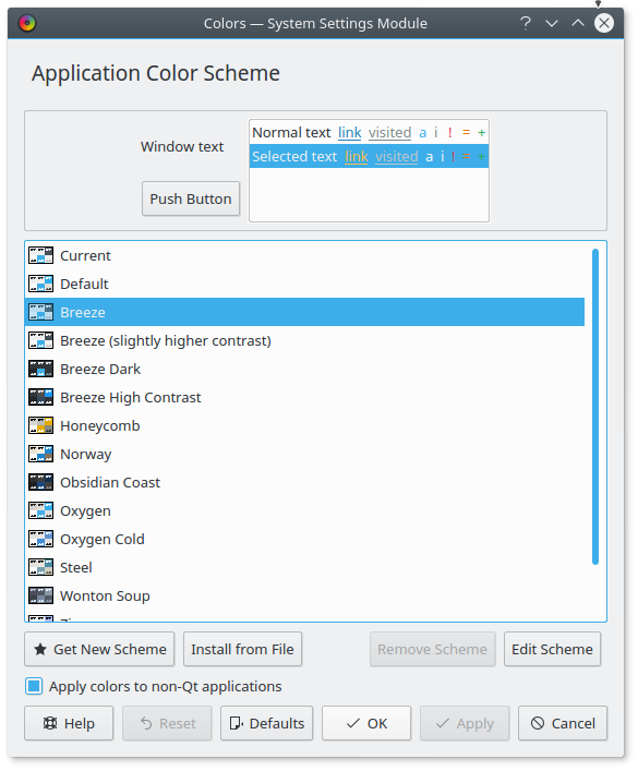
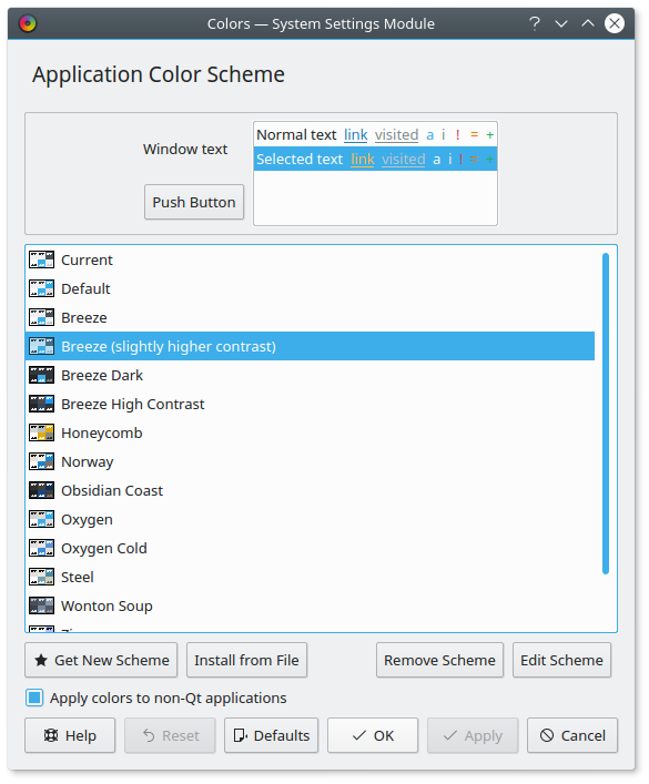
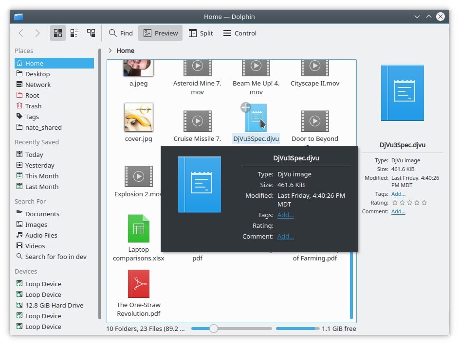
Compare old vs new and look at the text and tooltips:
Before:
After:
Before:
After:
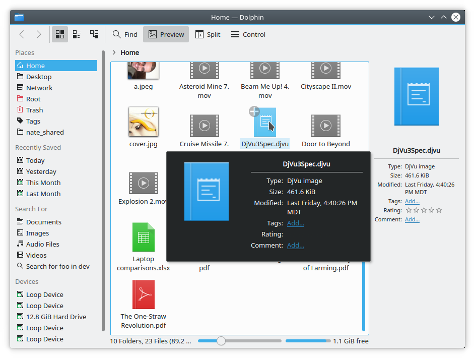
IMHO the second ones are clearer and less muddy, and therefore easier on the eyes, not harder.
Reviewers: hpereiradacosta, jensreuterberg, jriddell, kvermette, VDG, abetts
Reviewed By: VDG, abetts
Subscribers: subdiff, abetts, januz, progwolff, broulik, sebas, plasma-devel
Differential Revision: https://phabricator.kde.org/D7424