This patch turns off light font styles for some headings because they cause visual and legibility issues, as explained in the respective bug report.
CCBUG: 402730
FIXED-IN: 5.54
| ngraham | |
| mart |
| Plasma | |
| VDG | |
| Frameworks |
This patch turns off light font styles for some headings because they cause visual and legibility issues, as explained in the respective bug report.
CCBUG: 402730
FIXED-IN: 5.54
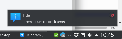
Worst case scenario testing - font does not have a "light" variant and falls back to using a thinner one such as "hairline"
Before:
After:
Plasma defaults testing
Before:
After:

| No Linters Available |
| No Unit Test Coverage |
| Buildable 6535 | |
| Build 6553: arc lint + arc unit |
Strongly approve for all the reasons given in https://bugs.kde.org/show_bug.cgi?id=402730.
Let's wait a bit though to make sure the Plasma developers have a chance to weigh in.
Goodness, I think this is all about taste. I am more on the side that it looks good. It visually prioritizes hierarchy with labels. @mart Does it just look bad for you or do you think this will cause issues somewhere else?
I think the idea to have a light style for big titles is nice and could theoretically work, but in our case unfortunately fails in practice :/
The thing is, even if we didn't have a problem with fonts (btw defaults are not a guaranteed experience either, e.g. Fedora ships Plasma with "Sans") potentially failing, visual hierarchy is still something which doesn't work the best with the old code.
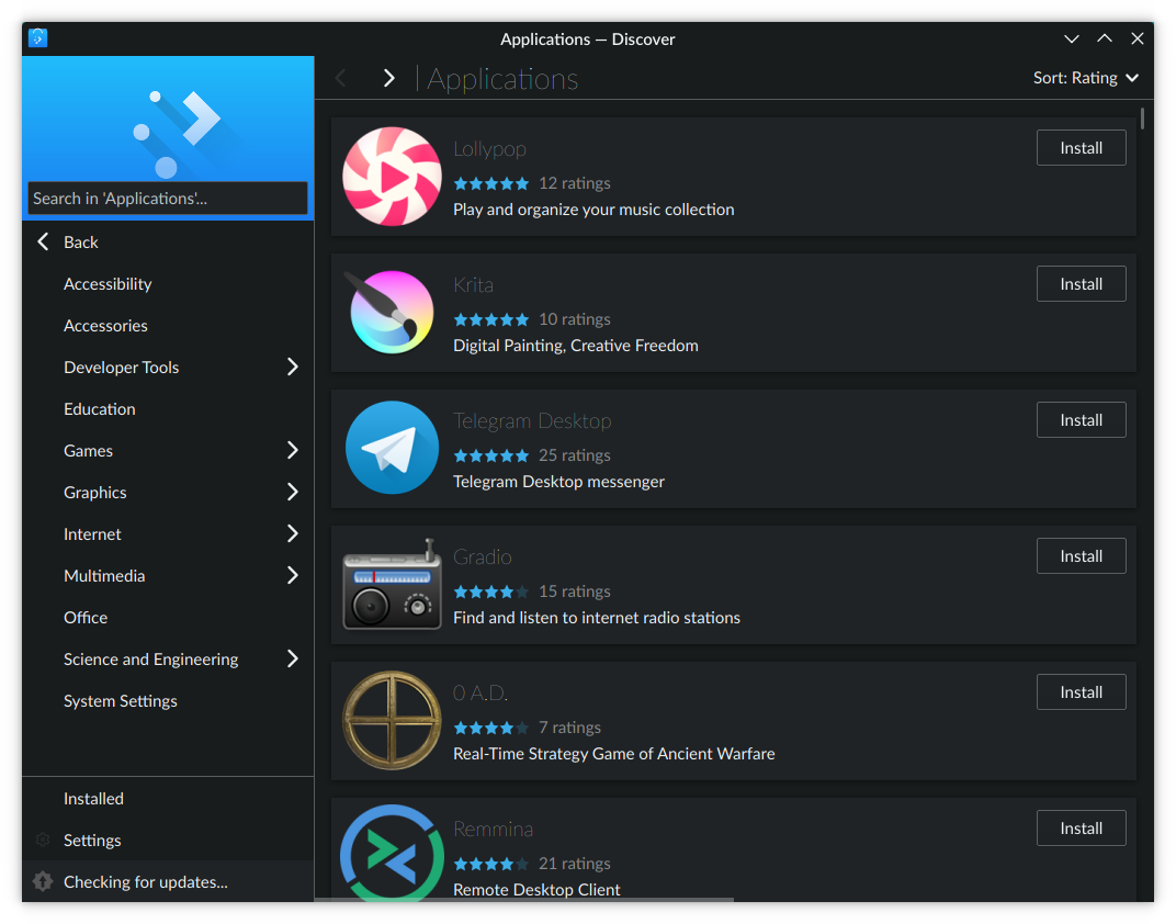
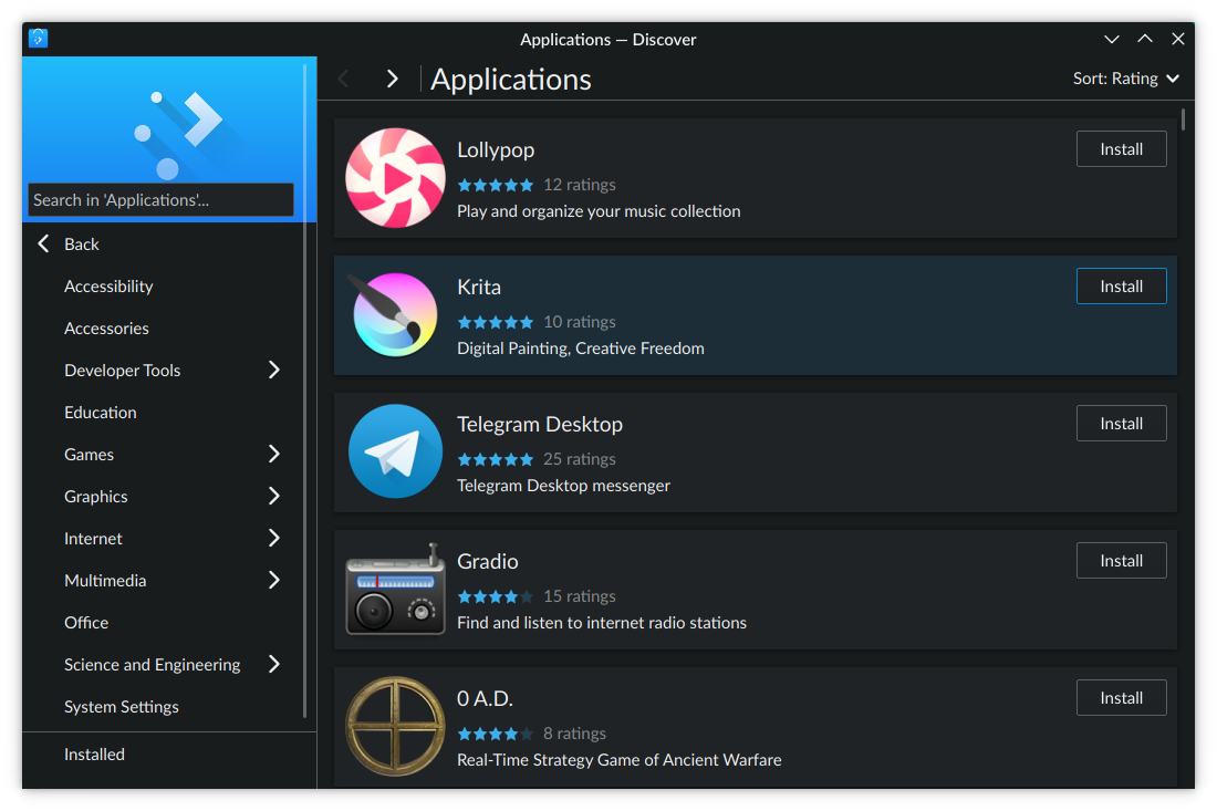
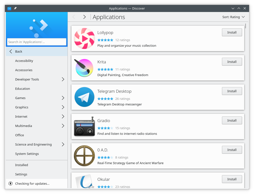
Attaching some screenshots from our main competitors for comparison's sake:
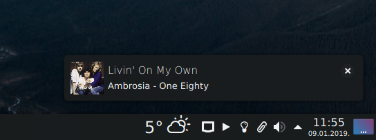
Notifications (D17905):
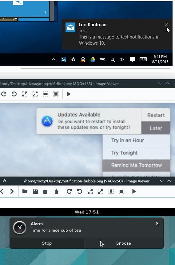
App stores:

With the exception of the case of the Windows Store (which does nonetheless manage to achieve some visual hierarchy with different font sizes and colors), others mostly actually have an opposite approach and go the bold/semi-bold route for the more prominent titles, which makes sense - you want to highlight the information contained in them. But the point of this patch is to just make sure the most important information is not made less important or even illegible, which is guaranteed if the labels are "regular" style.
Aesthetics are admittedly subjective, though I must note that pretty much all of VDG is in favor of moving away from light header text for aesthetic reasons. However there are other important technical arguments as well, which I will restate here:
of all of those the one i prefer by a long shot is indeed windows store which actually looks exactly like our graphics,

the reason that in many places the visual hierarchy has been broken, like in plasma tooltips or calendar, is because the title text has been changed to be stupidly small, but the fact that it has been ruined, is not a good excuse to ruin it even more.
in the end i *may* accept non light titles, even tough i still very much don't like the idea, but what i don't want to never, ever see in any circumstance is bold titles, anything of that will just be reverted.
can we still keep as light the first level of heading, which is huge (and use that sparsingly) and go to levels from 2 onwards where needed smaller and bigger?
I was actually just going to reply that light titles could work theoretically well with level 1 headings before I saw your last comment. For this to work right, for me it would mean:
Although you then still have the problem of potentially too thin "light" styles with some fonts + not being able to guarantee your effect if the font doesn't have the light style. So the latter also means if you fix point no. 1 I mentioned, you get super in your face titles because the font is now regular.
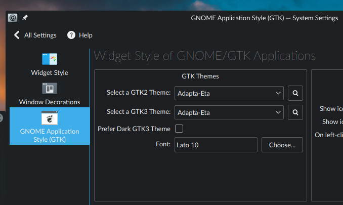
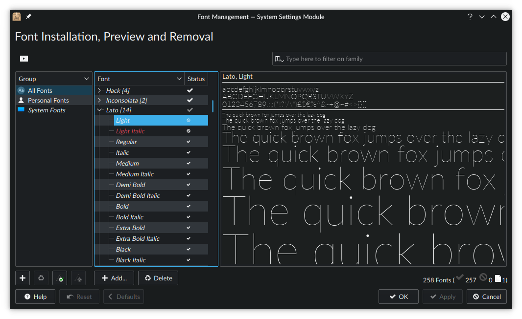
Have you managed to test the current solution with some other fonts maybe? With more testing we could see for how many it works in the first place and how many are troublesome (e.g. DejaVu Sans).
very much against this idea... it might work if we used segoe ui, but that's about the only instance in which it would
+1
Not true, it might work with Noto Sans and with adjustments, but the problem is we dont lock people into using the same font. They have an easier job in Windows and co.
Updating an another computer to Frameworks 5.53 and Qt 5.12 I get the same problem.

For me this represented a massive regression, and there's bound to be more people in a similar situation. We can't have this happening.
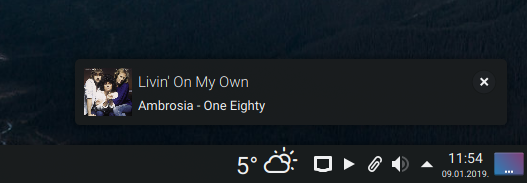
This photo is quite different. Here the header text is no larger or barely larger than the text beneath it, and its line weight is lighter. Also, it's very visually disconnected from the thing it's a header for, since it's stuck up in the top-right corner of a visually superfluous stock photo. Nothing about the header text tells my eye "I'm a header!"
uuh, that's the wrong color.. that's seriously weird?
that's on same version how i get notifications on a dark color scheme
The HIG states: "When the visual design calls for an area of exceptional focus, a larger typeface size may be used. In this case use a Light typeface weight to keep the stroke width similar to other styles throughout the interface"
I think, if you want to have something like
To me it seams the predefined Header[1-4] are mainly to be used for regular content and chrome?
This the "Qt will use whichever light font style is present" problem.
It says "Light", but is actually "Hairline". On both of my machines the font got installed this way.
As I said, light titlebars don't work great with Noto now either, but can even fall apart more with other fonts.
bah, seems very tricky to make it work properly across distributions.
to me, it speaks mostly as a failure for us to control the look of our product, due to broken fonts in distros and qt font rendering still buggy, issue that unfortunately the vertical platforms like Windows don't have.
the intention was to have heading with the same stroke width as the rest of the text, or slightly more still (which works on noto at least for level 1, apparently not on other styles)
so i'm ok to remove the light font here, but clearly as a failure to make it work properly due to the state of the lower stack
to me, it *is* still a clear visual regression, but is ok to go as "the least broken" option for now to not touch weigth.
with a clear intent to monitor the situation.
I wonder if it shouldn't be something in the future eventually part of the theme, I see things like menu font and toolbar font in fonts kcm as something completely obsolete, while those settings should be more about conventional typography (like normal font, heading font etc)
so, if this is pushed, the same thing should happen at the same time to the corresponding plasma components