This patch turns off light font styles for some headings because they cause visual and legibility issues, as explained in the respective bug report.
BUG: 402730
FIXED-IN: 5.54
| ngraham |
| Plasma | |
| VDG | |
| Frameworks |
This patch turns off light font styles for some headings because they cause visual and legibility issues, as explained in the respective bug report.
BUG: 402730
FIXED-IN: 5.54
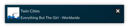
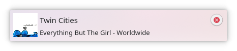
Worst case scenario testing - font does not have a "light" variant and falls back to using a thinner one such as "hairline"
Before:


After:


Plasma defaults testing
Before:


After:


| Automatic diff as part of commit; lint not applicable. |
| Automatic diff as part of commit; unit tests not applicable. |
Strongly approve for all the reasons given in https://bugs.kde.org/show_bug.cgi?id=402730.
Let's wait a bit though to make sure the Plasma developers have a chance to weigh in.
I don't have a problem with the font as much as I have a problem with the spacing for the title labels. They seem to be super close to checkboxes, other labels and controls. There should be a clear separation. Adding a heavier font to the title label helps a lot but because of its weight and the closeness with the rest of the elements, it seems crammed.
Here are some good spacing examples for title labels
https://dribbble.com/shots/5774759-Photo-Album-Application
https://dribbble.com/shots/5779939-Qwick-Platform-Sneak-Peek
https://dribbble.com/shots/5774973-Chris-Jon-Podcast
And some good typographical advise
https://medium.com/@lukejones/3-typography-tips-for-a-more-comfortable-read-fed478affa8d