Brush Editor Regressions (was brush editor user interface direction)
Closed, ResolvedPublic

Description

There have quite a few discussions on the brush editor and why it needs to be improved from a UI standpoint.

Brush editor is too large.
https://bugs.kde.org/show_bug.cgi?id=360972

Think about how to manage brush thumbnails better
https://bugs.kde.org/show_bug.cgi?id=322677

Stacked brushes and adding more UI complexity
https://phabricator.kde.org/T124

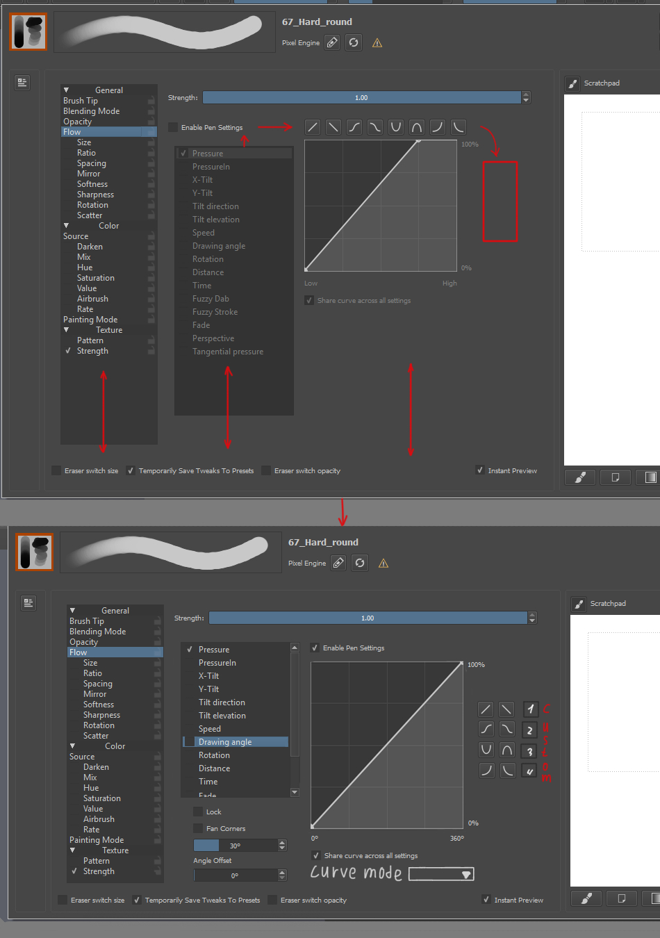
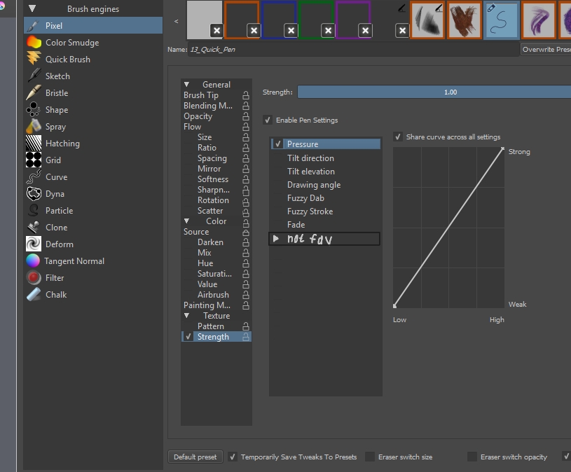
It is currently difficult to find and identify brush presets when you have more than 10-20. You cannot see their names, so you have to click around if that is what you are searching by. This becomes more evident with things like the pixel engine.

maybe other things to think about with this that I am not considering...

scottpetrovic added a subscriber: tokiedian.

I attached a few ideas that I have. I also attached some ideas that @tokiedian has come up with.

scottpetrovic added subscribers: Deevad, gdquest, rempt, woltherav.

If you want to follow any UI discussion, you can subscribe to the mockups and leave your comments there...

In regards to the different areas being shown and hidden with toggle buttons. I made a quick video of my branch showing off the idea of toggle-able areas for the editor.

https://youtu.be/_f_tvpdvsVU

It has a few other things in it that I added while I was working on it. I think it saves quite a bit of space especially if we hide the presets and scratchpad by default.

kamathraghavendra added a comment.EditedNov 17 2016, 6:25 AM

@scottpetrovic , Thank you very much for the screen capture. it really helps to understand the changes.

  • If I may ask, is there any reason the brush engine are tied to the preset section? I understand that it will be quick for the user to select a preset quickly. Will it be good if we rename the preset section as "Brush Engine" since that is important factor in the brush editor. I am just tossing ideas.
  • Can there be somehow a (live) preview stroke ( calculated automatically according to the parameters one). If it is not far fetched, an option to add this preview stroke in the thumbnail area or it can be generated in thumbnail area itself with a default icon of the brush engine on top right of the thumbnail box. that way icon will be generated for user . If he wants to generate his own icon we can give him an option to clear the auto generated icon and doodle his own.
  • Nice thought to have pin button, I wonder why it is going to get removed. And also nice addition to control size of brush thumbnails
  • I always wondered why there is no checkbox besides flow and opacity are they somehow superior of different than other parameters like size , spacing etc. the settings seems to be same for both. right now it seems as if size spacing etc are subsections or different set of parameters. having a checkbox for flow and opacity will help user to instantly switch them on or off, other wise he has to go inside the opacity settings and then uncheck "enable pen settings"
  • Another thought that i had is can there be a option to have presets of the graphs in various settings. like the Soft brush tip setion. or even the graphs of the parameters
  • Pardon me for asking too much , :) - can we have a feature to rename the brush tips , may be double clicking on the name you show besides the predefined section
  • lastly can there be two modes of the brush editor
    1. normal mode where most used options with default setting will be shown where user will just tick or untick parameters etc
    2. advanced mode with all the settings shown like it is now. This choice should be somehow remembered.
rempt added a comment.Nov 17 2016, 8:55 AM
  • Can there be somehow a (live) preview stroke ( calculated automatically according to the parameters one). If it is not far fetched, an option to add this preview stroke in the thumbnail area or it can be generated in thumbnail area itself with a default icon of the brush engine on top right of the thumbnail box. that way icon will be generated for user . If he wants to generate his own icon we can give him an option to clear the auto generated icon and doodle his own.

We used to have that, but there's a big problem with the idea: it works for simple applications like Photoshop, but with the amount of settings possible in Krita, and the amount of inputs, it just never gives a realistic idea of what the stroke can be. That's why we added the scratchpad, so you can interactively refine the stroke.

  1. As I understand it, I think the preset selector on the brush editor is mostly useful for people that are in the brush editor a lot making brushes. I don't think it needs to be shown by default. Most people are scared to even look at that window with how much stuff it shows. For renaming, I think stating what the window is for is the most helpful. That window isn't about brush engines, but editing settings. The other areas around only support the main "editing brush" aspect.
  1. It has been discussed a number of times. I will defer to boud's comment for that.
  1. Things like Shift + Gesture brush resize do not update the brush editor window. I am not sure what else isn't getting updated, but Dmitry seemed a bit concerned about it the "pin" functionality.
  1. I don't know either about the flow and opacity. I don't think you can just turn opacity and flow off. A brush has to have to use those properties. I guess other "required" parameters don't have a checkbox that are inside the brush tip. Maybe that is something we can think about that can use some re-organization.
  1. That is an idea. I think right now I am concentrating simplifying the brush editor instead of adding more features. The current complaint seems to be the brush editor is too large and too complicated.
  1. That is a good idea about renaming the brush tips. That will probably need some more thoughts and ideas on how to accomplish that.

In general, my branch has high level work being done to the organization. It makes the editor area much smaller which was one of the current big issues. I haven't dug into the individual setting areas and how to condense those. I think after this "direction" work is done, we can look at individual areas in the settings more and how to simplify or condense them.

eliotj added a subscriber: eliotj.Nov 17 2016, 4:40 PM
  1. I like these 3 new buttons for on/off: Presets, Settings, Scratchpad. I like that these are blue when are enabled - I think in many place in Krita this rule should be applied, for GUI consistency and nice visual feedback what is enabled.
  1. I like this new "tag" area - it gives easier search. I have proposal: It would be good to add "All" position into rollup menu of the "Engines". This solution would give possibility to search brush presets through all avalible, not only through certain engine.
  1. I like "Icon Size" slider - now GUI gives feedback about this possibility.

I have made some mocks of the brush editor window. most of the ideas are based on scotts mock. you can take a look here -> https://phabricator.kde.org/M86

I will add more supporting mocks of windows such as brush icon editing , parameter with curves section etc.

After some research into some issues @Deevad was telling me about, I think we are going to have to remove both the detach and pin functionality right now. It is causing some problems in some linux desktop environments where switching the window type disables everything inside. boud and I think it is a Qt bug. We can try to add it back in later at some point.

I still think we can focus on the brush settings area for now as that needs the most cleaning up.

In T4536#66537, @rempt wrote:
  • Can there be somehow a (live) preview stroke ( calculated automatically according to the parameters one). If it is not far fetched, an option to add this preview stroke in the thumbnail area or it can be generated in thumbnail area itself with a default icon of the brush engine on top right of the thumbnail box. that way icon will be generated for user . If he wants to generate his own icon we can give him an option to clear the auto generated icon and doodle his own.

We used to have that, but there's a big problem with the idea: it works for simple applications like Photoshop, but with the amount of settings possible in Krita, and the amount of inputs, it just never gives a realistic idea of what the stroke can be. That's why we added the scratchpad, so you can interactively refine the stroke.

The majority of sensors aren't used by the majority of brushes, and it's the same for half of the engines themselves. Deevad, raghukamath and I almost exclusively create pixel and color smudge presets anyway. @kamathraghavendra 's suggestion seems like a good one to me: it would be a big time saver. Despite having a smaller amount of features, PS's brush editor offers a ton of flexibility - to me, it's exactly what an illustrator or a concept artist needs, without extra clutter. And the preview works very well! Plus as it is a docker, your document is your scratchpad.

A real-time stroke preview like in PS allows you to see how the parameters you change affect your stroke. I look at every preset bundle I get my hands on, and so far I've rarely seen people use patterns. With the default textures and parameters, the effect is rarely convincing, and due to the absence of preview, finding the right cutoff, scale, and strength curve takes a lot of trial and error. When the stacked brushes feature is there, it's going to be a pain to use for the same reason (the performance hit you get with textures, and I imagine with stacked brushes is also going to play a role in making the feature less popular than it should be).

Plus as it is a docker, your document is your scratchpad.

+1 for this. document as a scratchpad is good. I was infact suggesting the same thing in IRC. but for it to be like the brush editor needs pinning ability or it should be a docker.
I also like the idea of separate scratchpad docker suggested by @scottpetrovic on IRC, like mixer palette in corel painter. choosing between these two option I think brush editor as a docker is good. may be user can be given a choice to make it a dropdown too like the tool option docker.

Only drawback of these removal and re structuring is that user shouldn't be taken aback, the change should be gradual in steps.

As we already have a scratchpad, it is hard to just remove something and tell people to use the canvas. The problem the scratchpad solves is playing with brushes and colors without affecting your canvas. If we remove it, we need an alternative that solves the same problem. I know people from a Photoshop background aren't used to having that type of functionality, but people with other application backgrounds will see it as a feature loss.

Before we can remove or move the scratchpad, we need to get that preview area out of the scratchpad. The one that creates the thumbnails to your brushes. It is clever that it is there, but also creates a relationship where the scratchpad is a requirement to being able to save a brush. I think moving the thumbnail area to a new save dialog could be one potential solution.

hanu added a subscriber: hanu.Jan 15 2017, 5:13 AM
tymond added a subscriber: tymond.Jul 15 2017, 12:44 PM
scottpetrovic removed scottpetrovic as the assignee of this task.Oct 18 2017, 11:53 PM

I am currently not working on this...so unassigning for now. I have done quite a bit to the brush editor after looking through these notes in the past months. The brush editor is significantly better than it was when this ticket was created. I am sure it can get better though. We might be able to pick this task up again in the future when it comes up again more.

This comment is from @radianart . These ideas/suggestions are based off some UX improvements I made the editor.

Some thoughts about editor (+picture):

There is kinda wasted space, especially in the lower part. This space used only in predefined brush tip\texture\blending mode options because they have big scrolling area. So it might be used more efficiently.
Curve presets can be moved to free vertical space on the right of curve widget, there is enough space for much more buttons for future.
"Enable pen settings" can be moved to the right to save some space for sensor list. For options with additional checkbox\slider (like spacing) curve and sensors list will be a bit smaller but it shouldn't be a problem.
All of this can save about 150px of vertical size and there is still borders that can be smaller.

Another stuff:
Texture strength can be moved to another tab in texture option.
Airbrush and Rate options can be "merged" to one, rate control how much is airbrush... rate.
Get rid of Color and Texture groups maybe? I mean only groups, not options inside.
Make order of options more logical (why airbrush is in color for example?)
Create new option for "some random stuff" like Overlay mode (Smudge), Painting mode (Wash\Build up), Source (maybe), Eraser switch size\opacity, Instant preview, Temporally save tweaks (or better move it somewhere to settings and enable it by default)

Some more thoughts from forum:

  1. sensors list: by clicking on the title of some sensor this sensor will be checked and the others unchecked. To check multiple sensors shift-click or click on checkbox. With current list you must check another sensor first and only then you can disable previous one, which unintuitive and a bit frustrating.
  1. ability to hide some sensors (pic), for example if user don't have Pro wacom tablet they can hide all tilt sensors, barrel rotation and airbrush scroll.

Bugs:

https://bugs.kde.org/show_bug.cgi?id=387180 (Saving a new copy of a brush doesn't keep tags)

rempt triaged this task as High priority.
jounip renamed this task from Brush Editor User Interface Direction to Brush Editor Regressions (was brush editor user interface direction).Nov 25 2017, 12:39 PM
jounip assigned this task to scottpetrovic.
woltherav closed this task as Resolved.Mar 26 2018, 12:59 PM