Dynamic Brush preset preview discussion
Closed, ResolvedPublic

Description

This task is to brainstorm about a live brush preview and where it would be useful. Just with a little bit of discussion, it already appears different people are wanting different things.

Hopefully we can collect a lot of feedback here and make the best decision possible. The main questions is what could use a live preview and why would it be useful.

A small demo of something Scott started with a live preview:
https://drive.google.com/file/d/0BxTkQjZvn-ytZ2dJb2VSZFFHZ1E/view?usp=sharing

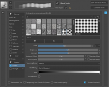
Live preview in brush editor area mockup (deevad)
https://www.peppercarrot.com/extras/temp/2017-09-23_krita4_mockup-brush-settings-cleanup.png

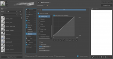
Older version of Krita that used a scratchpad area for bigger icon.
https://www.peppercarrot.com/extras/temp/2010-06-krita-2-2-svn.jpg
I think this would be perfect for replacing the paintoppresset toolbar (F6 menu). Because this way it will remove the necessity for brush makers to create icons for the brushes.

I have a 50+ brush pack and it's a nightmare to update. This live preview would help tremendously.

I would not want to see the preset icon removed, because there's a ton of information that artists can encode into those custom images that isn't possible with a preset preview, for example: tilt, rotation, wetness, blending mode, precise angle in degrees.

Yes. And effects and like cloning are impossible to see with a generated preview. One of the questions too would be if people want to see a live preview of their selected brush without being in the editor. There are ways to edit your brush outside the editor like through the popup palette

This is one of those features I always wish to have on Krita:

-A time ago, I was "fussing" about the curves and how to understand them (from a very beginner point of view), a live preview of the effects will definitely put at ease the learning curve not only for those interested in creating their own presets, but for anyone who while painting needs to do a quick fix.

-Is also good as a learning method to figure what the vocabulary used on the editor's settings means, many traditional painters coming to the digital world (and newcomers altogether) may have a few of those words in the unknown. A visual feedback can instantly demonstrate its meaning/purpose.

-For placement also outside the editor window, I think is a good Idea, as you just mentioned Scott, for when settings are used outside the editor, I don't know how many settings can be previewed though, but having and Idea of the stroke is quite helpful. The popup type preview in the video seems fine, although within the editor I find David's mockup better. That same style (David's) could be placed within the toolbar as an Item, since the toolbar is configurable there is no need to be "enforced" there. but as default could be good imho. And as a docker? to keep on at all times, but when canvas only mode is activated, as it can discriminate dockers, not sure how "overkill" these could be though.

-All in all, I personally think the presets editor definitely can provide good feedback through the live preview of the stroke, would prevent overusing the scratchpad to figure whats going on at every stroke with the configuration been modified. Not saying that scratchpad is not useful here, I think this two can complement each other in the aid of the editing of the presets.

Excellent! Looking good already. To me, a curved stroke going linearly from 0% to 100% pressure, that updates ideally while you tweak a curve or a parameter is perfect. This way it can give a preview of direction, angle, opacity, flow, texture, size, spacing, scatter, mirror... a great tool to design brush presets faster.

I would not want to see the preset icon removed, because there's a ton of information that artists can encode into those custom images that isn't possible with a preset preview, for example: tilt, rotation, wetness, blending mode, precise angle in degrees.

You can't remove it that easily as it's used in 3 different places. But I second razvan, it's a big pain-point. In my experience, people have trouble learning how to use each preset. Thumbnails are very bad at conveying this info. A stroke preview gives you a rough idea of how the preset will look. The preset's exact attributes don't matter as much: you must experiment with each preset to learn when to use it. Other digital painting programs use generated strokes and it works. Right now, it often takes more time to produce decent thumbnails than presets.

rempt added a subscriber: rempt.Sep 25 2017, 8:43 AM

It is impossible to have an automatic stroke that works for all brush engines, so the icons aren't going to go away. It's also not like all other application use strokes or dabs instead of icons to identify brushes: photoshop does, giving a choice between text, two sizes of thumbnail, two sizes of list (no idea what the difference is with text...) and a stroke . But Photoshop's brush engine is fairly simple and even so, the stroke just doesn't identify the brush reliably. Sai and OpenCanvas use a squiggle preview as well, but that's clearly copied 1:1 from Photoshop for familiarities sake, not because it's an inherently good idea.

On the other hand, Corel Painter uses icons, probably because, like Krita, it's brush engines are too complex to allow using a stroke preview to identify a brush. Art Rage uses icons for its presets as well.

I'm not opposed to showing a stroke preview in the brush editor, but the reasoning for having a scratchpad + icon still stands. A stroke preview is just too primitive. If managing icons for a brush collection is a pain, then we should make that task easier, not replace it by something that isn't a replacement.

rempt added a comment.Sep 25 2017, 8:49 AM

Btw, I saw some discussion when I was on vacation, but I cannot find it anymore about whether the brush editor should be a dropdown or a docker. Given that we've got the quick tweaks available on the popup palette now, I think that the brush editor should be a non-modal dialog. It is not something people should have open all the time (so, not a docker) and it is something people will spend time in to create new brush presets, so it shouldn't popup and disappear all the time.

@rempt I agree that the icon and scratchpad are different things that aren't specific with this live preview. Modifying either of those is not part of this work item. People can talk about it, but it ultimately won't apply to what I am doing with this. It is just about where the live preview might exist. Nothing will be removed.

@gdquest We do have a new workflow for saving presets that will come out in 4.0. It will make updating existing presest and creating new ones a bit easier. If we do anything with preset icons, it will probably be a modification with how saving brushes work in 4.0. Deevad's screenshot in this ticket is closer to how the editor looks in 4.0.

I think the main question remaining is if this live preview needs to be somewhere else besides the brush editor. One idea I had was to make it a docker instead. People would be able to change the display with how the stroke looks, move the docker to a second monitor, increase the size of the docker for a bigger preview, etc. The idea was that it would be used for previewing how the stroke would look as you are using the brush presets docker, or modifying settings in the popup-palette. It would also show the same thing as the brush editor preview, so it would be redundant in that way. Only putting the live preview in the brush editor has the negative point of only being visible when that is shown, but has the positive point for being more discoverable by new people that might not know about the docker.

rempt added a comment.Sep 25 2017, 2:27 PM

I wouldn't mind having the preview part of the brush preset selection docker, either on top, or at the bottom (and preferably collapsible).

@rempt -- ahh, that is a neat idea. I like that. I can see what I can do

For coding this...it is actually quite simple with how I am doing it. When brush properties are changed, the preset emits a settingChanged() signal. I am just listening to that and drawing the stroke at that point. For drawing the stroke, I am using the stroke benchmark code for reference and drawing it to a QGraphicsScene so it can be shown in a widget. I will probably have to add a few methods to eventually limit the brush size. Right now, anything over 100px brush sizes just take up the whole area without giving a good preview.

radianart added a comment.EditedSep 26 2017, 11:17 AM

About placement, I see 5 variants for now:

  1. Part of brush settings dialog (my vote)

pros: users will see realtime feedback then they really need it (playing with settings) and won't see it if the don't need it (when they already know their brushes) - it's kinda for experienced users
cons: brush settings is already quite complex, hard to find place, also it doesn't help much if user want to get more familiar with brushes or trying to find some specific one

  1. Brush preview docker, @scottpetrovic idea:

pros: user can change brushes and see preview for them, also see feedback for changing settings via other things (like pop-up pallette), also docked can show more advanced kinds of strokes or a few strokes a the same time
cons: it needs place, more experienced users don't need it all the time (and it'll takes time to hide\show it when they need it)

  1. New mode for brush preset docker and popup (https://i.imgur.com/7EgTlwI.jpg):

pros: it's very easy to find brush you need and easy to get familiar with brushes, don't take a lot of space (but it'll probably better to make bigger than on my image)
cons: it doesn't help so well when user changing brush settings (especially if user use presets popup instead of docker, like me), it may take some time to generate previews for all brushes (just save preview with preset and update it when settings changed?), probably hard to code

  1. Just keep it pop-up like in the video:

pros: don't take a lot of space, show preview when user need it (changing settings or brushes itself)
cons: need good (or changeable) placement, can be a bit distracting?

  1. Part of brush preset docker, either on top, or at the bottom (and preferably collapsible), @rempt idea:

pros: don't take a lot of space, show preview when user changes brushes or settings
cons: not helpful for playing with brush settings if user use presets popup instead of docker

Personally I really want it to be part of settings or pop-up what shows with settings, that way it fits in my workflow pretty well. I also like #3 but only as addition to pop-up or settings preview. Not because it's how PS work, but because it's the best way imo.

Also I'll throw some ideas of options for preview itself:

  1. configurable curve (straight - curved - very curved)
  1. configurable background (plain greyish color - some pattern (for smudge brushes) - colored (for brushes with custom blending modes))
  1. configurable pressure (from 0% to 100% - just 100% - just 50% - from 20% to 100% then to 60%)

PS I'm very 100% agree with @rempt about brush editor, except I'd prefer to have an option for editor to be either "open until you hide it" or "open until you click somewhere to hide it" (like now), or maybe even "open until you hover outside of pop-up" (for detailed but quick tweaks).

In T7059#111474, @rempt wrote:

It is impossible to have an automatic stroke that works for all brush engines, so the icons aren't going to go away. It's also not like all other application use strokes or dabs instead of icons to identify brushes

I didn't say that, or that the icons should go away. In short: the option to generate a stroke to get a base thumbnail (S or C curve, anything) would give brush designers a head-start. Even if it's just for the pixel engine.
The majority of thumbnails feature some brushwork/stroke preview and an icon. The time consuming part of the job is to draw the icons, the pictograms, and draw a few brushtrokes to get a clean one. I spent more time working on thumbnails than I spent on presets so far. I'm waiting for py support to write a tool to at least generate templates for the thumbs: open the .kpp file, layer the bg, generated stroke, icon/pictogram picked from a library, save, and let the user override any layer, e.g. if the procedural stroke doesn't work.

In T7059#111537, @rempt wrote:

I wouldn't mind having the preview part of the brush preset selection docker, either on top, or at the bottom (and preferably collapsible).

Could be very nice, even when you just pick presets or first look at a new bundle. Looking forward to the non-modal brush editor.

Based off all the feedback, the direction I am going to try to go is the following:

  1. Add the live preview in the brush editor like deevad's mockup as a first patch. This seems to be universally praised to add there and will have the most impact. With what I played around with, it makes learning the brush editor *significantly* easier when you can see what each button does to the stroke.
  2. Second patch will be to add a live preview to the brush preset docker. I will play around with the placement of where it will live.
  3. Think about view options for the live preview. For certain brush engines, the generated stroke will probably need a different appearance so you can see what is going on. There will probably be more ideas with this after the first two points are added.

Thanks for all the feedback. Now hopefully I can actually code this. :)

Deevad added a comment.EditedSep 27 2017, 10:53 AM

@scottpetrovic : Good plan. Good luck for the code and do not hesitate if you need feedback! (I can compil a dev branch)

@woltherav @scottpetrovic of course it can replace the icons entirely. What makes you think those inputs can't be simulated (tilt, rotation, clone, smudge, blending etc.)? Any type on input -> output could be simulated, that's why the program works in the first place.

In any case I understand that the icons won't go away any time soon. I just hope next version will take pity on us brush makers.

I checked out preview branch, great work! But I see 2 issues:

  1. Brush size\stroke length. Strokes with big brushes are too short and it's hard to see how it works with different pressure. Solution - made stroke (path?) size relative to brush size, like max(250, brushSize * 5). Instead of 5 it should be right ratio that will make stroke fit in preview area. Small brushes will be shown at real size, what's why it should have minimum size (250px here, not sure what size is it now).
  2. I like 2 modes of preview (lets call it "real size" and "fit to screen"). There is actually 2 problems: "fit to screen" not actually fit very well and "real size" changes back to "fit to screen" after any change. I think "fit to screen" shouldn't allow moving preview and it should be in the best position and zoom to show the brush preview. And "real size" shouldn't move view and change size\zoom when brush settings changes (maybe except brush size).

Also I think it would be better to move brush related buttons (reload, rename, overwrite) to the right, preview buttons to the left side and use free space to make preview a little bigger. Like this maybe: https://i.imgur.com/tZgpeXI.jpg

@radianart Yes, I still need to do some programming stuff with those those areas. The UI is going to be a bit more tricky as there are extra buttons and fields that popup when you do a rename.

When I get to a point I am ready for feedback, I will post a video of everything that I have been working on. That is usually the best way for everyone to give input and understand what other people are talking about..

Here is a video of what I have done so far. Let me know if there is any feedback. I think I need to tweak the values a bit for where things zoom in/out with brush size, but I think I have the important stuff mostly in there.

https://youtu.be/jWBFIXnXDr4

Any feedback?

@scottpetrovic You did an outstanding job! You seem to render the stroke at a pretty large resolution. I'm not sure the ability to interact with the preview was necessary considering the viewport's small, and once you zoom in it only shows you part of the stroke. It's more that there's a little bit of lag already, and with textured + stacked brushes in the future, the preview may take .x s to update.

But this is nit-picking. Collectively, all the improvements to the editor will be more than welcome, especially the rename button and curve presets.

It is hard to tell in the video, but some propetries are updated WHILE dragging a slider, while other properties update ON MOUSE RELEASE. Maybe the really heavy operations are only updated on mouse up. I am sure that was added for a reason

I like this editor design more. And now it shows big brushes much better. But strokes still don't fit into view very well. Also I'd prefer bigger preview (I see space between brush settings and preview borders but I'm not sure it's possible to use).

While changing presets I noticed some things: "Block_tilt" doesn't show in preview at all (because of tilt elevation), many brushes sometimes loads with wrong settings (my clone brushes shown without textures, "Blender_blur" loads with much bigger scatter).

I also don't quite understand why auto brush tip settings update preview only on mouse release but same settings in predefined brushes works realtime.

rempt added a comment.Oct 3 2017, 2:28 PM

It looks pretty cool now, but I think that it would be best to just render at one fixed brush size: right now, it's possible to choke the editor by working the brush size slider, and the result isn't ideal anyway when the brushes get really big.

Thanks for everyone's feedback. I submitted the patch for review... https://phabricator.kde.org/D8130

I am limiting the brush size that the preview will be rendered at. Larger brush sizes didn't give good previews and seemed to create frustrating slowdowns to the editor. After playing around with it, the best brush size preview was from 1 to 150px. Anything greater will just show a preview at 150px.

the patch was approved. If anyone wants to test it out it is in the master branch (which will be 4.0). I might let this feature settle a bit and get more usage before extending it to other areas. There are a couple bugs that I need to look into related to this, so I might focus on that for a bit.

After adding the live preview, I think we need to update the layout of the brush editor a bit to fit everything better. I followed @Deevad mockups to move the presets and scratchpad buttons to the right and left areas. I also moved all the saving/renaming stuff to the top. I found out that the "load default engine" is actually loading a different preset. I moved that button to the presets area and fixed a bug so it actually shows that information in the editor.

Here is what I have so far with an "all closed" view appearance

and one where all the windows are open.

There is one area that is really taking up a lot of space that would be neat to do for this next patch. The texture portion (you can see that in the first screenshot). That is the main obstacle right now with making the brush editor any smaller.

One option would be to put it in multiple tabs (one tab selects texture, another tab modifies settings). Another solution would be to put it in a scrollable area.

Let me know if there is any feedback about what I have done...or feedback with what to do about that texture area.

There is one area that is really taking up a lot of space that would be neat to do for this next patch. The texture portion (you can see that in the first screenshot). That is the main obstacle right now with making the brush editor any smaller.

I'd vote for tabs: the predefined brush resource picker is sort of a tab already, while I don't think there's any other scroll area in the editor. Also as your pattern library grows, it's interesting to have a larger window to spot them fast. And as you have a pattern preview, this would be the opportunity to increase its height or length to see a bit of the tiling.
I see you added brightness/contrast sliders (excellent!). Any plans for a pattern preview when you change the settings, eventually? If you've ever done procedural texturing, it's really valuable. Right now I don't use textures a lot because of the performance hit + the fact they blend uniformly on the stroke. But it's one of the pillars of convincing natural media presets (along with dual/stacked brushes).

@scottpetrovic : Thank you very much for the changes in the layout ! It looks really cool and easier now to teach the brush editor.

There is one area that is really taking up a lot of space [...] The texture portion [...] Let me know if there is any feedback

@gdquest : Yes, subdividing the panel with a tab is an option ( as what "Brush Tip" category does with the sub-tabs "Auto"/"Predifined"/"Text" since long long time ). But hiding many option behind tab is hard to find imo. But I don't have a better option to propose :-)

@gdquest -- could you provide a link with what a "pattern preview" is. I am not sure how that would be different than what the live preview we have will give.

I think he mean to apply Brightness and Contrast to texture preview on this texture chooser widget.

januz added a subscriber: januz.Oct 16 2017, 10:05 PM
I think he mean to apply Brightness and Contrast to texture preview on this texture chooser widget.

Yup I thought about previewing the texture settings. But forget it, with the live stroke preview it's not important

rempt closed this task as Resolved.Feb 28 2018, 10:43 AM

This is done, it's going to be in 4.0