Recreate the Text Tool
Closed, ResolvedPublic

Description

We need a new text tool. The first step is requirements gathering.

Existing Bugs

Here's the list of existing text tool bugs:

  • 355772 - Navigation controls stop working when in text edit mode
  • 355770 - Unable to select spaces or tabs while editing an Artistic Text object
  • 355771 - Unable use the '.' character on the keyboard's number pad in Text Editing
  • 355773 - Duplicating Artistic Text will remove multiple spaces
  • 344124 - Text becomes uneditable once dragged into an hidden Group layer
  • 346799 - Artistic text tool does not support cut, copy and paste.
  • 343025 - UI Flickering using pen tablet to edit Multiline text in Ubuntu 14.04 Unity
  • 342223 - Multiline Text Background Colour Transparency isn't saved properly
  • 306181 - Multiple issues with the multiline text shape
  • 350782 - Doesn't support Writing using Arabic text
  • 361169 - overlapping characters rendered incorrectly
  • 364167 - Make it possible to adjust letter spacing and line spacing in Mutipleline text tool -- Tyson Tan's Kickstarter Chosen Bug

Requirements

  • paragraphs (but not pages)
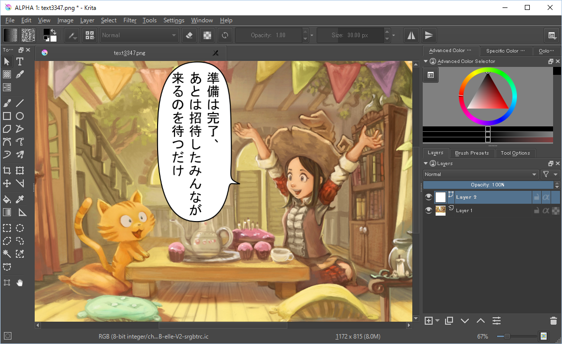
  • right-to-left, left-to-right, top-to-bottom script layout: support for western scripts, semitic scripts and chinese/japanese. Mongolian, probably not so much.
  • fill irregular shapes (balloons and boxes)
  • styles: bold, italic, fonts
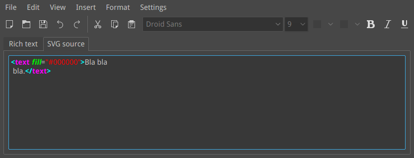
  • compatible with inkscape (svg)
  • can be put on a path
  • easily translatable using scripts that work on .kra files
  • can be baked/rendered from a .kra file

Not Requirements

  • On canvas editing. Creating the text in an editor popup should be fine.
  • OpenDocument support
  • PSD text support. Though we could try to convert to and from PSD text, I don't think we should make PSD's text handling our native file format. Can PSD to RTL and TTB, actually?

Design

  • File format: SVG, for inkscape compatibility. Does that support RTL, TTB scripts?

Details

Related Objects

rempt created this task.Oct 30 2015, 6:56 AM
rempt updated the task description. (Show Details)
rempt raised the priority of this task from to Needs Triage.
rempt claimed this task.
rempt added a project: Krita.
rempt added a subscriber: rempt.
rempt updated the task description. (Show Details)Oct 30 2015, 7:01 AM
woltherav added a subscriber: woltherav.EditedOct 30 2015, 10:42 AM
  • Multiline text requires svg 2 if we follow the svg standard. Thankfully multiline text itself is already being implemented. (http://www.w3.org/TR/SVG2/text.html#TextLayout)
  • SVG 1.0 allows for LTR, RTL and TB http://www.w3.org/TR/SVG/text.html#WritingModeProperty
  • If I recall correctly, svg 1.0 was a bit awkward with semitic fonts, but that may only be svgfont.
  • Avoid svg 1.1, that is a failed standard for several reasons. Ask inkscape guys what is the best choice regarding to svg 2.0 features we might want(mostly text wrap and multiline)

More advanced users might also want:

configurable spacing properties

The reason is that certain fonts might have a tiny fault that the user would like to be asjusted, or in the case of line-height, it also can make a text more readable.

Presets stored as css classes.

I'll need to investigate how this expresses itself, but svg can use css to drive it's appearance. So it's be nice to have...

.pepper-and-carrot
{
  text-align:center;
  line-height: 1.2em;
}

Stored inside the .kra file, (and a copy in our resources folder) and we allow the user to select it.

Transforms

This is also related to vector shapes in general, but it may be an idea to remember that SVG allows for text-wide and per set of elements type of transforms, though these are plain matrix transforms, and if we use the transform tool as a UI for this, we'll need to disable all but the basic transforms.

woltherav triaged this task as Wishlist priority.Oct 30 2015, 12:01 PM

I would like to add these wishes -

  • Ability to have layer effects to text layers
  • Super-script and subscript and possible ligatures
  • Text inside a shape (I think boud already has mentioned this)
  • Shortcuts or buttons in UI to common tasks like making bold, Changing to capital or sentence case etc.)
  • If possible find and replace function.
  • Convert text to vector shape( helps to send files to people who wouldn't have the font)
  • Indic script support
  • Saving text settings as presets (with its own preset docker like brushes and pattern) like kerning, alignment line height etc as presets for repeated users like comic letterer.
  • Paragraph options, bullets etc. might be useful for storybook or picture book creators.
  • If possible ability to warp effect to text like bulge, bend, tapper, etc for using in comic sound effect.
Deevad added a subscriber: Deevad.Nov 3 2015, 5:56 PM
Deevad added a comment.Nov 3 2015, 6:38 PM

Note about item : "easily translatable using scripts that work on .kra files"
If there is SVG compatibility, it will be possible to add inside the KRA artwork file a 'File Layer' and use a linked SVG file.
Then with command-line swap the target linked SVG with multiple translations and render under different names.

Note about item : "can be baked/rendered from a .kra file"
SVG compatibility + 'File Layer' linked SVG solve this item too.
For rendering, I propose here a feature to "export a target group only from command-line"
Put text layers in a group named MYGROUP, a simple :
Krita input.kra --group-name MYGROUP --export-filename output.png
would render the only the group in 'isolated' mode.
I guess this feature could interest also game-artist, texture-artist, etc ...

My wish for 3.0 Texts
★ Right-click on a vector-layer => Save as a SVG file.
★ Right-click on a vector-layer => Edit in external Vector editor.
★ Right-click on a vector-layer => Transform and Save as a linked "File Layer".
★ "New layer" icon => File Layer ( select an SVG ).
★ If SVG support: Flowing text in multiple shapes ( eg. two square linked = two columns ).

rempt added a comment.Nov 6 2015, 8:13 AM

The minikin 'library' might be interesting: http://lwn.net/SubscriberLink/662569/b6e362eae472e582/. It should help a lot with layout out text in a pleasing way in balloons. If we can get it to work, the code seems fairly obscure and underdocumented.

A screenshot showing devanagari script being used in krita, as per @woltherav's request. ->

,

mockup for Japanese vertical text. I used inkscape to generate the base vertical text, then I needed to tweek positions of some chars. (inkscape does not handle vertical Japanese text correctly for now)
I admit I do not make comics myself, so could @tokiedian double check if it looks about right?

rempt updated the task description. (Show Details)Mar 30 2016, 11:34 PM
tokiedian added a comment.EditedApr 1 2016, 3:30 PM

My Mockup for the tooloption docker when we use text tool

Text Property: Tag as source text
Style: [span style=""][/span]
Font: [span font=""][/span]
Size: [span size=""][/span]
Bold: [b][/b]
Italic: [i][/i]
Underline: [u][/u]
Strikethrough: [s][/s]
Emphasis dots: [ed][/ed] (https://www.w3.org/TR/jlreq/#composition_of_emphasis_dots)
Superscript: [sup][/sup]
Subscript: [sub][/sub]
Ruby characters: [ruby][rb][/rb][rt][/rt][/ruby] (https://en.wikipedia.org/wiki/Ruby_character/ , https://www.w3.org/TR/jlreq/#ruby_and_emphasis_dots)
Font color: [span color="R,G,B"][/span]
Highlighted color: [span bgcolor="R,G,B"][/span]
Bullet list: [ul][li][/li][/ul]
Number list: [ol][li]/li][/ol]
Align left: [span align="left"][/span]
Align center: [span align="center"][/span]
Align right: [span align="right"][/span]
Justified: [span align="justify"][/span]
Line spacing: [span line-height="130%"][/span]

Oh, I forgot to add horizontal-in-vertical to my mockup...


Horizontal in vertical: [hiv][/hiv] (https://www.w3.org/TR/jlreq/#mixed_text_composition_in_vertical_writing_mode , https://www.w3.org/TR/jlreq/#handling_of_tatechuyoko)

rempt added a comment.Apr 2 2016, 1:28 PM

If we're going with svg2, then I think we should also have a source screen that shows the actual xml.

tokiedian added a comment.EditedApr 3 2016, 8:25 AM

SVG2 still isn't enough to show Japanese text in Japanese typography. I suggest that we should introduce some specifications from css into our text tool to show Ruby characters https://www.w3.org/TR/css-ruby-1/ and Horizontal in vertical https://www.w3.org/TR/css-writing-modes-3/#text-combine . These typographies is very important to show Japanese text.

woltherav added a comment.EditedMay 7 2016, 9:15 PM

Considering the kickstarter text talks about opentype support I went looking around for some basic info about the current state... Seems people are a bit annoyed about how the UI is handled in most programs. I think we should sit down for a day and make a list of use-cases, otherwise Scott'll go mad trying to solve this insanity.

http://typotalks.com/videos/type-with-characters-%E2%80%93-reclaiming-control-over-opentype-fonts/

https://klim.co.nz/blog/towards-an-ideal-opentype-user-interface/

https://medium.com/@CommandZed/thoughts-on-an-improved-opentype-ui-c6748f2eef3a#.c5ito76x0 < really nice one regards to newbie users.

http://blog.mmiworks.net/2015/06/designing-opentype-intro.html < because peter sikking.

rempt updated the task description. (Show Details)Jun 11 2016, 8:09 AM
woltherav moved this task from Backlog to __Needs GUI design on the Krita: Next Features board.

Hi, all!

Just wanted to ask, do we plan to implement "Text on Curve" feature? Or only usual text?

I just documented everything we said publicly to our Kickstarter backers about text improvements we are doing. When we are coming up with functional requirements, it would be good to at least address each of these points to a certain degree

Text Tools

  • Dropping bibliography tool, paragraph sections and the semantic markup
  • Add styling effects to your text frames like text balloons
  • Change how the text direction will flow
  • Easily translate your documents to other languages.
  • easier to work with text on path
  • Bend and distort your text with transformation masks
  • Use ligatures and other advanced typography with your text.
  • selecting glyphs from a set of several related fonts
  • (an assumption that most existing functionality won’t be removed)
rempt added a comment.EditedAug 22 2016, 9:08 AM

11:07:13 < Tokiedian__> boud: btw I found horizontal writing library for Android OS https://github.com/taizan/vjap

https://github.com/cmonos/TAKETORI-JS
https://github.com/allianceport/tategumi.js

dkazakov added a comment.EditedAug 22 2016, 1:30 PM

All the requirements together (edited after the sprint):

Basic requirements

  1. Draw text in a single line with no constraints. Can extend outside the image.
  2. Draw text inside a polygon:
    • rectangle (default)
    • any path (existing balloon or polygon)
  3. Resizing the layout on canvas relayouts the text, don't scale it in any way.
  4. The text can be layouted in the following ways:
    • right-to-left
    • left-to-right
    • top-to-bottom
  5. Support any kind of scripts (doesn't in automagically comes with unicode?) [[https://www.w3.org/TR/jlreq/ | w3c standard for Japanese text)
  6. Text on path
  7. We do no on-canvas editing.
  8. All the options are edited in the tool options docker
    • the user can edit the text using markup language
    • the user can edit SVG source code
  9. Vector layers are saved into .kra as separate SVG-files. RGB+profile.
  10. All vector objects should have editable names so people could parse .kra files in scripts and fetch needed SVG files to do translation. Resolution: we need to split layer-per-language, but after the main work done.
  11. CSS styling. Minimal support, just to support our own styles.
  12. (2nd priority) Find/replace in the docker
  13. Convert text object into curves. This is a must-have for typographies.
  14. Fonts search patch should be extended with the file's parent folder
    • colons or semicolons support
    • Windows/Linux path separator
    • case sensitivity difference between linux/windows/macos

15. "Edit SVG in external editor" option.

Character properties

  1. When the user puts the cursor over the character, this character should be highlighted on a preview.
  2. For each character the user should be able to select:
    • font
    • font size
    • bold family
    • italic family
    • foreground color
    • background color
    • x, y scales (?) (Scribus has it)
    • x, y offset (rough approximation of kerning) (SVG: dx, dy)
    • kerning based on font tables (SVG: font-kerning, kerning)
    • letter spacing (SVG: letter-spacing, disables ligatures, conflict with font-kerning)
    • word spacing (SVG: word-spacing)
    • underline
      • offset in %
      • line width in %
    • strike out
      • offset in %
      • line width in %
    • subscript/superscript ((!) use opentype if possible! If not available via opentype, show it to the user!)
    • allcaps, smallcaps ((!) use opentype if possible! If not available via opentype, show it to the user!)
    • outline/shadow (?)
    • opentype options:
      • common ligatures
      • see details in link
  3. The options should be loaded/saved as "Character Styles" objects (CSS?)

Paragraph properties

  1. Alignment inside the box:
    • horizontal: L, C, R, W
    • vertical: T, C, B, H(?)
  2. Line spacing
  3. Text margins: one single margin
    1. Paragraph indents: before, after
  4. The options should be loaded/saved as "Paragraph Styles" objects (CSS?)

Reference Documents

SVG 1.1 Text: https://www.w3.org/TR/SVG/text.html
SVG 2.0 Text: https://www.w3.org/TR/SVG2/text.html

dkazakov added a comment.EditedAug 28 2016, 8:57 PM

Results of the discussion during the sprint

Text Tool UIX

  1. We have only one type of texture shape
    • this shape has two modes: single line and multiline modes
    • in single line mode:
      • the shape has only one handle for moving and rotation
      • the shape can be dropped on a path, then it'll become a "text on path"
      • it can grow outside the canvas if needed
      • the paragraph style options are hidden for it
    • as soon as the user presses enter (makes the text multiline), the shape becomes multiline:
      • it cannot be put on path anymore
      • paragraph style options become available, including paddings
      • the shape has four handles as if it is a rectangle, resizing the shape relayouts the shape, doesn't scale
  2. We have only one text tool
    • clicking with the text tool on an empty canvas creates a single-line text shape
    • clicking with the text tool on a closed polygon/path/rectangle shape makes this shape be a multiline text
    • Click+drag on an empty canvas with the text tool creates a rectangular shape with the multiline text inside
  3. If the multiline text becomes too long for the bounding path, the shape becomes red
  4. The user should be able to resize the multiline shape without exiting the text tool. Edit the text, resize the shape, edit again --- that should be smoothless, without any tool switch.
  5. (2nd priority) A special shape with a skeleton for a balloon with a tail
  6. The user should be able to convert any object (including that special balloon) into a path

GUI for the text tool

  1. (1st stage) The GUI should be implemented as a usual Tool Options widget
  2. The Tool Options docker goes into the foreground as soon as the user selects/creates any text object, not when the tool is activated.
  3. (2nd stage) As a second stage, we implement a special window splitter that takes half the screen and centers on the selected shape
    • there should also be a "recenter" button
  4. there should be a separate tab for SVG tab

I spent a while thinking about organizing everything in the text tool properties. I think if we leave all of these text properties (and vector properties for that matter) in the tool options, it is going to create some problems down the road so it needs to be in a new "object properties" docker. You can read all of my notes and such in the mockup. I am sure I am making some assumptions and errors with this, but hopefully this can start some conversation and get us to the final design.

Deevad added a comment.Sep 5 2016, 1:59 PM

really good wireframe @scottpetrovic ! It's perfectly in sync with what we discussed at the Kritasprint. Bravo for the cleaning and precise work.

Hi, @scottpetrovic!

The design looks really nice. I have a few comments/questions though :)

I tried to gather my notes here as structured as possible:

  1. "Object properties" auto-raise problem
    1. Selecting a text object with Selection Tool should not raise that "object properties" docker.
    2. Switching into "Edit Mode" (which is now Path Editing Tool) should show this dialog.
    3. Question: can we just use the Tool Options of the Path Editing tool for the purpose of the "Object Properties"?
  2. "Underline Options" should appear somewhere below the text editing box. In the design the "U" button is auto-pressed when you select a piece of text with the corresponding tags is selected, therefore the options are auto-shown on this event. It meas that the text box will be resized and move on screen right when the user drags the mouse. That is very unexpected and overwhelming for a user. As a general rule, auto-shown/hidden elements should never cause the resize of the element the user is working in. Possible solutions:
    • move this options to some popup
    • add "show advanced settings" button (weird)
  3. We planned to move Effects into a separate tool, so I don't think we need to duplicate them here.
  4. Styles.
    1. Good question: if we expect the character styles be a part of markup syntax, what should the style contain?
      • Possible solution: the style includes all the toplevel markups (which might be not shown in the text editor)
    2. What "Edit style" button do?
  5. Opentype. I'm not sure I fully understood how the ligatures and other opentype features will work.
    • how can I activate a particular ligature for my sentence?
    • how can I tell it to do the text ALLCAPS or SMALLCAPS?
    • the most trivial solution is to allow it as a markup language extension. Probably, with some switches using buttons.

Btw, probably, you could create a Pholio Mockup for the next version of the GUI? The commenting would a bit simpler :)

For anything that has questions here is my attempt to answer...

1 C. Currently the Shape Manipulation tool has all of the object properties (object fill, object stroke, x, y, width, height) etc.

2 . For your recommendation about being bad to hide/show. What part of hiding/showing is unusable. Parts that aren't used are not shown, while parts that are used are shown. This idea common UI concept called 'progressive disclosure'. I think the most confusing part is that underline has additional options, which most programs don't even offer. we will need to think about this...

  1. How would the "effect" tool work? Is this going to be applied to painting layers as well some way, or just specific to vector tools.

4 A. I would think for styles, the markup would contain what the character style is called (eg characterStyle="bigAndBold".
4 B. Editing a style allows you to specify all of the properties that the style contains. It would be a popup.

  1. Ligatures are not 'activated'. The basic workflow I was thinking would be to have your cursor in the text editing box, then double click on the glyph/ligature that you want to add. I haven't thought about any 'intelligence' with how that would be done easier. One solution would be if you highlight a couple of letters and right click, it could show you the ligature variations of that combination.

2nd bullet -- their is an all caps button in the character properties tab of the design.

Good idea about the pholio mockup. I should have moved i there in the fist place.

For anything that has questions here is my attempt to answer...

1 C. Currently the Shape Manipulation tool has all of the object properties (object fill, object stroke, x, y, width, height) etc.

No, I meant a different tool: Path Editing Tool. In the new design it is going to become "a kind of" Editing Mode of Shape Selection Tool. You enter this mode by pressing Enter and exit by pressing Esc. Or just switch the tools in the tool box, because they are two different tools. And since they are different tools, they have different tool options that we can use.

2 . For your recommendation about being bad to hide/show. What part of hiding/showing is unusable. Parts that aren't used are not shown, while parts that are used are shown. This idea common UI concept called 'progressive disclosure'. I think the most confusing part is that underline has additional options, which most programs don't even offer. we will need to think about this...

I guess I just need to make a video or a gui mockup to should the problem :) I don't oppose the idea of 'progressive disclosure' as it is, just the position of the "progressive" options creates a problem that is visible in dynamics only. I'll try write down the steps, and it fit is still too difficult to understand I'll make a mockup on Monday:

  1. Put a cursor onto a portion of the text that has no underlining. The button is unchecked, the additional widget is hidden.
  2. Start left-to-right dragging over the text to select '[u]something[/u]' block. Release the mouse button and don't move the cursor. In your mental model you expect the cursor to stay to stay right after '...[/u]' character.
  3. Now the GUI understood you selected an underlined text, so the 'U' button got checked
  4. Additional widget appeared below the button and above the text box.
  5. The text box got moved down and you cursor now not at the position where you expected it to be because the whole text box move under your cursor.
  6. The situation might be even worse: if the docker resize caused the scroll bars to appear, the text box might also change its width. Which causes the full relayout of the text.

Points 5 and 6 are really blockers.

Basic rules:

  1. In general you should keep the size of the widgets above the text box constant, it is the most important widget in the docker anyway.
  2. If you really need to relayout something above it, the cursor must not be above the text box at that moment. Some "More..." or "Advanced..." button. The rule is: the object must not move/resize automatically while the cursor is over it, unless the user is in explicit resize/move action

Possible solutions:

  1. Reserve some space above the text box to show additional widgets when needed.
  2. Move the widgets below the text
  3. Move the widgets into some popup, dialog or something
  1. How would the "effect" tool work? Is this going to be applied to painting layers as well some way, or just specific to vector tools.

Only to vector tools. Please check the Object Effects in Inkscape. Its GUI is extremely ugly. I don't know how to make it sane enough. The only sane approach, I'm afraid, would be to implement graph editor like in blender...

The basic idea of the vector effects is that you have a set of primitives (blocks), each primitive has one or several inputs, one or several outputs and a set of properties. And you just connect these primitive, adjust properties and get a new filter :)

4 A. I would think for styles, the markup would contain what the character style is called (eg characterStyle="bigAndBold".

Then the style would just be a set of markup tags :)

4 B. Editing a style allows you to specify all of the properties that the style contains. It would be a popup.

Given that a single style technically can have both property sets, for vector and text, the dialog should use some Tabs/Pages design to not be overloaded.

  1. Ligatures are not 'activated'. The basic workflow I was thinking would be to have your cursor in the text editing box, then double click on the glyph/ligature that you want to add. I haven't thought about any 'intelligence' with how that would be done easier. One solution would be if you highlight a couple of letters and right click, it could show you the ligature variations of that combination.

There is a nice link. Basically, people usually want two things:

  1. enable a set of ligatures for a text region from a list of available ligatures
  2. see what ligatures were automatically enabled for their text and probably disable some of them (globally or locally).

2nd bullet -- their is an all caps button in the character properties tab of the design.

Ok, that is perfectly fine.

woltherav updated the task description. (Show Details)Feb 22 2017, 4:16 PM
woltherav added a comment.EditedFeb 28 2017, 5:08 PM

More NB, as far as CSS and SVG are concerned...

SVG has 3 ways of defining text:

  1. Preformated(This is what most inkscape documents save into!!!)
  2. Auto(into a shape)
  3. Text on Path.

Shape is a CSS shape: https://www.w3.org/TR/css-shapes/

These can be either rectangles, rounded rectangles, circles, ellipses, and polygons. It might be wise that we follow this logic for the text-layout/wraparound algorithm, so that if we make a frame( a balloon or whatever), this can be all sorts of nice shapes and we don't need to make the text-layout/wraparound algorithm worry about this.

Question: How to load/layout preformated? Because this is how all Inkscape docs save/load, and preformated text is literally ALL of the text in @Deevad pepper and carrot svgs.
Edit: https://www.w3.org/TR/SVG2/text.html#TextLayoutPre This seems... dangerous? Maybe we need to talk to the Inkscape people how they envision backwards compatibility with the new 3 types of layout and their old text.
Edit2: It seems the xy attributes of the text can be used... maybe some kind of converter button that attempts to get a polygonal outline for the text involved and pours the de-tspanned text into that???

NB: There's been previous attempts at getting Vertical Text layout into Qt: Abandoned patch from 2014 here It might be that it isn't playing nice with the stripped-down version of Harfbuzz that Qt uses(Harfbuzz-ng), but I cannot be 100% sure about that. Also of interest: Related Qt bug

tokiedian added a comment.EditedMay 16 2017, 7:50 AM

Memorandum: for vertical writing for Japanese, "Tategaki" plugin for Gimp could be useful.
http://reddog.s35.xrea.com/wiki/GIMP%E3%81%A7%E7%B8%A6%E6%9B%B8%E3%81%8D.html
Source code: http://reddog.s35.xrea.com/software/tategaki-1.2.1.tar.xz

Although it was written in C, it still has the greatest features for Japanese texts as OSS project.

dkazakov added a comment.EditedMay 23 2017, 9:31 AM

List of currently supported text-related SVG features

FeatureSupportedComments
Basic text attributes
x,y,dx,dyyesfully supported including inheritance from parent
rotatenonot supported by QTextLayout
textLengthnonot implemented, not widely supported
lengthAdjustnodepends on textLength
Unicode Bidi
directionyes
unicode-bidiyes
text-anchoryesfor horizontal text only
dominant-baselineno
alignment-baselineno
baseline-shiftincorrectsupports only sub and super and works incorrectly: it scales text, but according to SVG it shouldn't.
Vertical Writing Modes
writing-modenono vertical text yet
glyph-orientation-verticalnono vertical text yet
glyph-orientation-horizontalnono vertical text yet
Font selection and text styling
font-familyyes
font-family (fallback fonts list)nospecial treatment is needed for this fontFamiliesList
font-styleyes
font-variantyes
font-stretchyes
font-sizeyes
font-size-adjustnohardly supported anywhere
fontnojust not implemented
kerningyes
letter-spacingyes
word-spacingyes
text-decorationpartialunderline decoration is not consistent with SVG standard, when a child node of an underlined text has a different color. According to SVG the underlining shouldn't change its color, but in Krita it does. It can be implemented with the current Qt framework, just not implemented.
Abandoned text features
trefnoabandoned in SVG2, so not implemented
SVG Fontsnoabandoned in SVG2, so not implemented
Fill and Stroke
solid fillyes
solid strokeyes
gradient/pattern fillnoneeds implemenation of KoInheritedPatchBackground
gradient/pattern strokenoneeds implemenation of KoInheritedPatchStroke
woltherav added a comment.EditedJun 28 2017, 1:23 PM

Did some testing today.

  • tspans have their spaces removed. (check the quickbrownfox and the someoldhorses example.)
  • rotate is interpreted and converted to radians(yes, I know rotate doesn't do anything right now, but this can't have been the intention)
  • words like font-family, font-style and font-weight only have their last section caught by the highlighter, even though the full word ought to be highlighted.
  • We need someone like @timotheegiet or @Deevad design a nice highlighter palette. This is a bit... bright...
  • "SAFE ASSERT (krita): "leaf" in file /home/wolthera/krita/src/libs/flake/KoRTree.h, line 459" (I don't know what triggers this)
  • The default font should probably be set to use whatever serif font QT can find for us.
  • Somehow, I'd expect to be able to edit text by doubleclicking it, but that isn't implemented yet, it seems.


Though, generally, this isn't bad...

woltherav added a comment.EditedJun 28 2017, 6:46 PM

Okay, so I have been adding some stuff, but then had a dicussion with boud about the usability.

Basically, even when doing a minimal amount of styling the text becomes very difficult to read.

Therefore, we came to the following conclusion:

  1. Try to have a proper text-edit with richt-text-editor.
  2. Convert the HTML to SVG. HTMLtoSVG and SVGtoHTML is a little less problematic then thought: the text edit mostly makes <spans> which we can turn into <tspans> and keep the majority of the styling information. Stuff like lists, tables, horizontal rules etc need to be kicked out(and maybe warn the user?) Stuff like <b>, <i>, <em>, <strong>and stuff might need to be converted.
  3. For SVGtoHTML, the same stuff counts, but we'll need to convert fill to color, and then features like <stroke>, <rotate>, <dy>, <transform> etc, need to be stuck into a qttextformat thingy(edit: QTextFormat::UserProperty) so they get stored even though they can 't render.

3b. if this is not possible, we'll remove the ability to go to richtext when detecting such strokes.

  1. Some converter also needs to be written for ODG.

Other.

  • Text Window should always be on top.
  • Text dialog ought to be remembered.
  • ctrl+scroll needs reversing.
  • icons are acting weird for boud(but not for wolthera)
  • doubleclick on text ought to call up the text-editor.
  • SVG text tool still can't make a text by itself, the poor thing.
  • Text is a little hard to select :/

I've been reworking the current text dialog so it uses (our fork of kxmlgui) and presents a more conventional gui for text editing:

There still isn't a way to convert between the svg markup window and the rich text window, but that's next.

rempt added a comment.Oct 20 2017, 1:18 PM
  1. Support any kind of scripts (doesn't in automagically comes with unicode?) [[https://www.w3.org/TR/jlreq/ | w3c standard for Japanese text)

Note: that page has nothing to do with unicode or not being suitable for Japanese, it's all about how Japanese text should layouted. That's indepedent of the encoding used.

rempt added a comment.Oct 20 2017, 2:01 PM
This comment was removed by rempt.

@woltherav : We need someone like @timotheegiet or @Deevad design a nice highlighter palette. This is a bit... bright...

Now I can see the current highlight colors thanks to the screenshot of @rempt . On dark theme, I like "Oblivion" colors from https://github.com/mig/gedit-themes/blob/master/oblivion.xml .
But I guess everyone has a prefered highlight color palette. Here is how look Oblivion with 3 color only on SVG:

januz added a subscriber: januz.Oct 20 2017, 10:39 PM
woltherav added a comment.EditedDec 17 2017, 6:37 PM

@rempt, it might be worth it to remove the fore and background color buttons, namely, while foreground color is translated to style="color:#ff00ff;", which should become style="fill:#ff00ff;" or something, backround color doesn't translate to stroke in the same way. So maybe remove background color and instead put in letter-spacing, which does need a slider.

Weirdly(or maybe not), QTextCharFormat does have "textOutline" which could correspond to "stroke", but the problem is that there's no css that QTextEdit will output to convey the color or size of the stroke, and even current css standards don't have such a thing(though there's a near ubiquitous -webkit-text-stroke that all browsers support, go figure). Anyway, unless you feel an uncontrollable urge to fork QTextEdit/QTextDocument to adjust the html saving function, I'd recommend we remove the background button.

We have a similar problem with font-stretch. But users can still type that stuff into the style="" of the svg source.

The branch has been merged. However, there are some notes:

Now:

  • When applying a new font, bold and italic etc. disappears
  • ems are not read back from the shape correctly
  • fill color is not converted back
  • aligment is not converted back
  • cannot select a text unless it is multline; then clicking on the first line still doesn't work

Later:

  • we should use the bounding box of the image, not the shape when calling KoSvgMarkupConverter
  • stylesheet for svg source editor should be configurable
  • assert when trying to fill a text shape with a gradient (SAFE ASSERT (krita): "colorBackground" in file /home/boud/dev/text/libs/flake/text/KoSvgTextChunkShape.cpp, line 883)
  • some weirdness when converting font size units from pt to what it is inside the text shape; if the font size is specified as pt within the svg style defs, the result is a fontsize twice as big as expected

Even Later:

  • After saving text with a font with a larger height than before, the text shape's line height is not updated.

(Note: the svg okay; save the file, unzip, replace the saved svg with the one from the svg source editor, zip, load, and it will be fine.)

  • The spans of a multiline text are shown above, to the left when selecing the shape with the default tool.
  • Cannot resize a multiline text? Note: this intentional. Maybe not show the size handles then?

I fixed alignment, but fill/color cannot be converted back because KoSvgTextProperties doesn't handle the value, so I have no way of telling whether it is proper.

Similarly, lineheight needs the following set before context.shapeWriter().addAttribute("style", styleString); in KoSvgTextChunkShape::saveHtml

if (!dyPos.isEmpty() || parent->isRootTextNode()) {
            qreal lineheight = dyPos.at(0)/textProperties().property(KoSvgTextProperties::FontSizeId).toReal();
            styleString.append("line-height")
                    .append(": ")
                    .append(QString::number(lineheight*100)+"%")
                    .append(";" );
}

Except this doesn't work on the first paragraph(which makes sense: it has no dypos value.

I also at the last moment changed em to % for the line height, as I thought that pecentage/100=em... and then I thought I was wrong as the svg text looks different from the richt text... but double checking the css standard, I was actually correct.

I'll leave it as it is as this is less conversion for now, and maybe this kind of unit conversion should be handled differently. Still though, something odd going on with our svg text line height.

rempt added a comment.Jan 2 2018, 1:17 PM

More notes:

Notes:

Best do balloons and texts on different layers

Bugs

  • The default tool should be selected after closing the editor window
  • tab still opens canvas-only mode when in the editor, and hides the editor's toolbar.
  • Escape should close the text editor and remove the new shape
  • Undo order gets very confused; looks like add shape is inserted before the last undo (bug https://bugs.kde.org/show_bug.cgi?id=387997, not specific for the text tool)
  • ctrl-] is ambiguous
  • It's impossible to fix the z-order so text is shown on top of a drag and dropped speech balloon
  • Should have a default setting for lineheight/em
  • node editing undo is weird, and it's hard to grab a node that's on top of another object
  • Text shape should honor the rect it's created with when drag-creating it

Now:

  • Single click probably shouldn't create a shape, only dragging a rectangle
  • When applying a new font, bold and italic etc. disappears
  • ems are not read back from the shape correctly
  • fill color is not converted back
  • aligment is not converted back
  • cannot select a text unless it is multline; then clicking on the first line still doesn't work

Later:

  • we should use the bounding box of the image, not the shape when calling KoSvgMarkupConverterch
  • stylesheet for svg source editor should be configurable
  • assert when trying to fill a text shape with a gradient (SAFE ASSERT (krita): "colorBackground" in file /home/boud/dev/text/libs/flake/text/KoSvgTextChunkShape.cpp, line 883)
  • some weirdness when converting font size units from pt to what it is inside the text shape; if the font size is specified as pt within the svg style defs, the result is a fontsize twice as big as expected

Even Later:

  • After saving text with a font with a larger height than before, the text shape's line height is not updated.

(Note: the svg okay; save the file, unzip, replace the saved svg with the one from the svg source editor, zip, load, and it will be fine.)

  • The spans of a multiline text are shown above, to the left when selecing the shape with the default tool.
  • Cannot resize a multiline text? Note: this intentional. Maybe not show the size handles then?
  • Text shape should store its svg content as a string, too, so we don't need to reconstruct it when saving if there have been no changes

Other stuff:

  • vector library docker needs zoom function + big preview tooltip
  • saving progress is always 0%

The SVG text tab, when isolated will not convert back right, because all the tab recognition code uses the index to recognise the richtext tab, and that one is first but if there's no richtext tab, the svg text tab becomes the richtext tab...

Fill and stroke color are converted back now... but for some reason the QTextEdit won't show them, even though going with the cursor over the text will change the text color widget.
Line-height still doesn't work with my converter due to problems with figuring out how high a line is.

letter-spacing now converts, and so do a lot of other things like baseline-shift, alignment, etc.

There's a weird thing going on with the character offsets, the following SVG loads properly in Firefox and Inkscape, but not in Krita:

<?xml version="1.0" encoding="UTF-8"?>
<svg viewbox="0 0 1800 1200" xmlns="http://www.w3.org/2000/svg">
    <style>
        .emphasis
        {
            font-style:italic;
        }
        
        .bold
        {
            font-weight:700;
        }
        
        .brown
        {
            fill:brown;
        }
        
        .h1
        {
            font-size:2em;
        }
        
    </style>
    
    <text x="200" y="50" style="font-family:Noto mono; font-size:12pt; text-anchor:start">
    <tspan dy="0 -3 -3 -3 -3 3 3 3 3 0 -3 -3 -3 -3 3 3 3 3 0 -3 -3 -3 -3 3 3 3 3 0 -3 -3 -3 -3 3 3 3 3 0">Lorem ipsum dolor sit amet</tspan>
    </text>
    
    <text x="200" y="100" style="font-family:Noto mono; font-size:12pt; text-anchor:start">
    <tspan dx="0 -3 -3 -3 -3 3 3 3 3 0 -3 -3 -3 -3 3 3 3 3 0 -3 -3 -3 -3 3 3 3 3 0 -3 -3 -3 -3 3 3 3 3 0">consectetur adipiscing elit.</tspan>
    </text>
    
    <text x="200" y="150" style="font-family:Noto mono; font-size:12pt; text-anchor:start">
    <tspan y="150 155 160 155 150 155 160 155 150 155 160 155 150 155 160 155 150 155 160 155 150 155 160 155 150 155 160 155">Lorem ipsum dolor sit amet</tspan>
    </text>
    <text x="150" y="200" style="font-family:Noto mono; font-size:12pt; text-anchor:start">
    <tspan x="150 170 190 210 230 250 270 290 310 330 350 370 390 410 430 450 470 490 510 530 550 570 590 610 630 650 670 690">Lorem ipsum dolor sit amet</tspan>
    </text>
</svg>

And the code for handling the offsets like this is there, it's just not interpreted properly.