In my honest opinion Plasma's System Tray Plasmoid's current spacing value is currently set to 0, which leads to most of the tray icons looking rather cramped when put next to each other. This small patch increases the System Tray Plasmoid's spacing value from its current 0 value to Math.round(units.smallSpacing * 0.7).
Details
Details
- Change 'spacing: 0' to 'spacing: Math.round(units.smallSpacing * 0.7)' in /usr/share/plasma/plasmoids/org.kde.plasma.private.systemtray/contents/ui/main.qml - what this patch is basically doing anyway
- Reload plasmashell and add a System Tray Plasmoid if one isn't already added
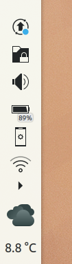
Breeze:
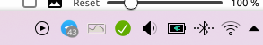
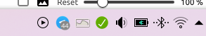
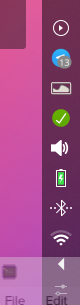
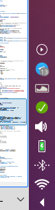
Before:

After:

Before:

After:

Feren OS's Plasma Theme:
Before:

After:

Before:

After:

Reactionary (3rd-party theme example):
Before:

After:

Before:

After:

(ignore the blur on the tray expand button, that's unrelated to this patch)
Diff Detail
Diff Detail
- Repository
- R120 Plasma Workspace
- Branch
- master
- Lint
No Linters Available - Unit
No Unit Test Coverage - Build Status
Buildable 22590 Build 22608: arc lint + arc unit
| applets/systemtray/package/contents/ui/main.qml | ||
|---|---|---|
| 291 | Don't use magic values. How about units.smallSpacing would be more semantically appropriate. That maps to 2, BTW. If 2 is still too cramped, you could do units.smallSpacing * 1.5 but using default spacing values is probably preferred. | |
Comment Actions
I think 0 doesn't look cramped at all. Increasing the spacing also increases the space usage . -1 from me
Comment Actions
Maybe units.smallSpacing / 2, i'm pretty sure people that use show all entries in systray will be unhappy to see no free space in their panels.
Comment Actions
Would people prefer that above design to 2px? (actual Units.smallSpacing according to the HIG - https://hig.kde.org/layout/units.html) ^ (above message)
Comment Actions
It doesn't matter that much to me. If it results in more clickable area for each systray item, then smallSpacing might be better.
Comment Actions
I have a vertical panel and use large tray icons but intentionally minimize their number, and the result looks fine to me IMO:
However I'll admit that I thought the status quo was fine too. So I have no particular opinion on the aesthetics of this patch, but I think we should be careful to avoid adding too much spacing because the people who have and like lots of tray icons have a legitimate concern here. To me, units.smallSpacing (i.e. 2) is the absolute max we should do.
To make this patch easier to review without applying it, please add all the various sets of before-and-after images to the Test Plan section, not in comments.
Comment Actions
Also, it's nice to have the "after" versions right after each corresponding "before" version so you can more easily compare them by clicking on one and navigating between them with the arrow keys. :)
Comment Actions
After a bit more digging around the code, I found another alternative way to do this which also fixes a bug I just noticed with this patch (there's clicking deadzones in-between the tray icons), however the method for doing it causes this spacing:

I'll do a bit more digging on this alternative way to see if I can get it to be a spacing we can all agree on more than the current one.
Comment Actions

Managed to come to a good compromise, however now I've hit a bit of a roadblock.
I've found that by editing these lines:
property int left: Math.round(units.smallSpacing / 2)
property int top: Math.round(units.smallSpacing / 2)
property int right: Math.round(units.smallSpacing / 2)
property int bottom: Math.round(units.smallSpacing / 2)
...to replace them with this:
property int left: Math.round(units.smallSpacing * 0.85)
property int top: Math.round(units.smallSpacing * 0.85)
property int right: Math.round(units.smallSpacing * 0.85)
property int bottom: Math.round(units.smallSpacing * 0.85)
...provides a better looking tray while not being that big spacing wise, while ALSO ever-so-slightly increasing hitboxes for each tray icon in the process:

However, there's one problem: Those lines aren't in the file currently being patched. They are there on the compiled version of the file, but for some reason they seem to be absent from the pre-compiled version of the file. I'll do some investigation, however for now I'll just mark as Changed Planned until I find a solution to the roadblock preventing me from replacing this patch with a better rendition of it.
Comment Actions
Nevermind, then, I guess something changed between now and Plasma 5.18.1 master code meaning that no longer works, back to the old method...
Comment Actions
copy paste from Telegram
fwiw I like units.smallSpacing / 2 more but it's not that big of a difference
Comment Actions
2*0.7 rounded down is going to be 1. Just divide units.smallSpacing by two if you want 1.
But then I have to wonder... is it really worth it to add one pixel of spacing?
Comment Actions
Fair point, just checked that now and they're indeed the same. Got confused with 0.65 as 0.65 looks different to 0.5.
Comment Actions
Hopefully people won't murder us over one pixel. :) IMO time to finish the bikeshedding if VDG people are happy with it and everyone else can tolerate it.
Comment Actions
There is already a margin added around icons, "units.smallSpacing / 2" if I remember correctly.
IMO it is OK without additional spacing (maybe because I'm used to it?). Anyway, VDG should decide what is the best and what is consistent with other elements of Plasma.

Comment Actions
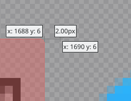
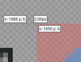
For future reference, how do you get that size examining mode in Plasma Desktop Workspace?
Comment Actions
Changed method used for increasing spacing between tray icons to something that increases hitbox sizes as well
Comment Actions
For some reason I couldn't get gammaray to do that over here, but I did come up with a new method for the patch that should increase hitboxes as well as icon spacing. Could you check if it does so, just to be sure?
Comment Actions
This should probably be two patches at this point: one to increase the spacing when using tablet mode (which IMO is an uncontroversial no-brainer) and another to increase the spacing when in desktop mode.
| applets/systemtray/package/contents/ui/main.qml | ||
|---|---|---|
| 45 | This should probably be rewritten as an inline function as it's now very difficult to read. e.g.: readonly property int itemSize {
if (Kirigami.Settings.tabletMode) {
return foo;
} else {
[put other logic here etc]
return bar;
}
} | |
Comment Actions
@ngraham How would I split it into two patches? Both patches would edit the exact same line.
Comment Actions
https://community.kde.org/Infrastructure/Phabricator#Marking_patches_as_dependent_on_other_patches
It would probably be simplest do just do this though:
- Abandon this patch
- Submit a patch to refactor that logic to use a nested multi-line function for readability, as proposed in my comment
- After that patch lands, submit two more patches, one to increase the spacing when in tablet mode, and another one to increase the spacing when in desktop mode. At this point each patch will be changing a different line in the function
Clear as mud? :)
Comment Actions
I agree with @broulik in that the spacing already feels quite excessive, or at least doesn't need to be increased (:
Does this depend on DPI/panel size maybe?
Comment Actions
Due to how the current patch handles it, I'll probably have to all of step 3 as one patch since they change the same line as each other, but for sure I can split steps 2 and 3(1)+3(2) of your post into individual patches.
Comment Actions
Actually, on second thought, @ngraham I'm not even sure if step 2 would even be worth it on its own, if possible.
On your suggestion you have it adjusted to have step 3's tablet mode checker in step 2. If I don't have that check in place, for step 2, then it'd just be how it currently is anyway on master, effectively resulting in nothing to edit for a patch. I'll definitely do Step 3 as a patch, though.
Comment Actions
The initial patch of the three, now I've thought up a suitable way of doing this, has been made:
https://phabricator.kde.org/D27465