The new notification pop-ups are great, but they can feel a bit cramped. This patch
slightly increases the paddings around the edges.
Details
Details

Diff Detail
Diff Detail
- Repository
- R120 Plasma Workspace
- Branch
- arcpatch-D21134
- Lint
No Linters Available - Unit
No Unit Test Coverage - Build Status
Buildable 12783 Build 12801: arc lint + arc unit
Comment Actions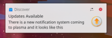
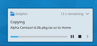
The padding of the screenshot doesn't match the rest of the notification now
The right padding doesn't match anymore either

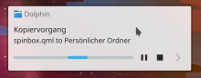
It also breaks when no buttons are in the title bar (that wasn't ideal before but now is even more noticeable), can be triggered when starting a copy progress and unchecking "keep progress open" in settings
Not a huge fan of the dialog margins tbh. The additional row spacing inside looks fine.
Especially the top padding looks a bit off, same for the right padding to the icon.

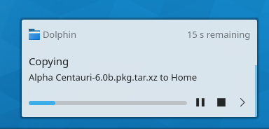
The padding of the screenshot doesn't match the rest of the notification now
The right padding doesn't match anymore either

It also breaks when no buttons are in the title bar (that wasn't ideal before but now is even more noticeable), can be triggered when starting a copy progress and unchecking "keep progress open" in settings

Code is fine I guess.
| applets/notifications/package/contents/ui/NotificationItem.qml | ||
|---|---|---|
| 262 | Why is this not bodyLeftPadding? | |
| 264 | Can't you just increase the overall spacing of the ColumnLayout rather than setting this bottomMargin all over the place? | |
Comment Actions
To anyone playing with those paddings: please note, that until T8177 is fixed, on X11 with hidpi screens you need to run Plasma with PLASMA_USE_QT_SCALING=1 env variable, as otherwise the font sizes are disproportionate to other UI elements.
| applets/notifications/package/contents/ui/NotificationItem.qml | ||
|---|---|---|
| 73–74 | Does this take into account layouts for RTL languages? | |
Comment Actions
I think you meant "don't forget to switch it back afterwards", as it's literally the only way to get correct paddings on X11 with hidpi.
Comment Actions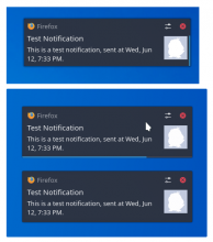
Just a mockup but is this middle ground solution good enough?

( I also suggested to move the disappearing indicator at the bottom here )
Comment Actions
All right, I *think* I've addressed the review comments and implemented something as close to @alex-l's design as I can get it.