(Sorry if this has been already discussed but I can't find anything here on Phab)
I think the indicator for disappearing notifications would be more visible at bottom because the line would be longer and assuming the time to consume it is the same it would disappear faster making it more prominent:
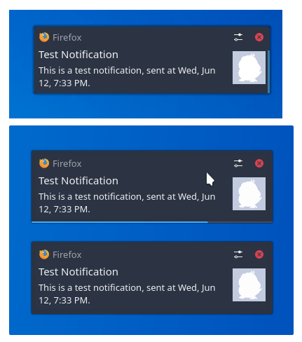
(in the mockup I added some padding to notifications but I see that even more of it has been added in master)