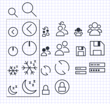
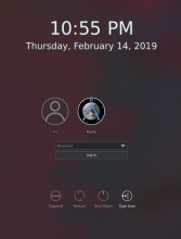
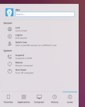
This patch adds new icons for the action buttons modified/added in D18893, and gives the suspend hibernate and switch user icons a makeover.
Details
- Reviewers
ngraham abetts - Group Reviewers
VDG Plasma - Maniphest Tasks
- T10325: 5.16 Login screen improvements
- Commits
- R242:e1248d68c27c: [breeze-icons] Revamp system.svgz
Other..:
List Users:
Diff Detail
- Repository
- R242 Plasma Framework (Library)
- Branch
- user-prompt-list-icons (branched from master)
- Lint
No Linters Available - Unit
No Unit Test Coverage - Build Status
Buildable 8497 Build 8515: arc lint + arc unit
Oh you don't want the suspend icon to have a circle? Oh well that changes things :D
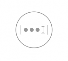
The I beam thing without the circle is kinda weird to me, but it actually looks fine with the circle around it.
What about putting a circle around the crescent/stars that are going to make up the new suspend icon?
Would an icon like this work?
Just trying to get to a good final icon for typing your user.
hey i like that, kai made fun of my version, but using both dots and an i beam could work
The only problem here that is that the label says "Type User" but the icon depicts a password field. Maybe the icon could depict both a username field and a password field, one on top of the other. Then I bet it would be tall enough that we wouldn't feel the need to put it inside a circle.
Is the objective that the user sees the icon first and then understands what is to be done? If that's the case, the idea of image correctness would be relevant. If however, you want to only convey an idea of typing, then I would say this is enough. Which of the two assumptions is the one we are going for?
P.s. are you sure about the I beam and the dots inside a password field?
It might turn out small to make out / appreciate
We actually tried that already and it turned out kinda boxy
Btw I don't think it has to be an accurate depiction seeing as we've got the label under it, so we've got more wiggle room that way
Yes. The previous symbol was a sun-like symbol (22px old version left of 32px new version): https://irc-attachments.kde.org/N8WwzDwg/file_13313.jpg
+1 on the List Users icon. Perfect.
For the Type User icon, I'm not sure it needs to be in a circle. With the new moon-style suspend icon on the left side, it might be better to have a non-round icon on the right side to balance it out.
I like the moon iconography in general. However I'm not as big a fan of the stars. They feel too regular, and the whole effect makes me think of the symbol for Islam:
Likewise, I don't think the new Hibernate symbol works on its own. Alone, it's just a snowflake, which to me means "snow" or "cooling" or "winter weather".
I think both of these symbols would benefit from having three Zs in the top-right corner like we discussed earlier. That would tie them both together conceptually as well as reinforce the concept that they're both modes of sleep.
Something like this (warning: crude icon butchery incoming):
Yeah in and of itself, the snowflake is good. I think it just needs something added to it so it doesn't look like it turns on the air conditioning as Kai alluded to. :)
I like it!
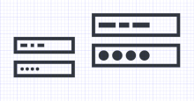
I think the "Type User" Icon would look better if the bars acting as placeholder text were a bit less regular in width and would not be shorter than they are tall (which is the case for the rightmost rectangle).
Also, can the usernames in the type user field contain spaces? If not, it might not be fitting to use multiple split rectangles to represent the username, as these gaps represent spaces.
You're right about the spaces, I'll remove them
But what do you mean by less regular in width?
As they are now it's long, short, long (exact same length as rectangle number 1), shorter than height (which looks bad imo). There are no medium lengths and the same length is used twice. I would suggest giving every bar a different length.
If you're going to remove the spaces, this won't be an issue, but I would not remove the spaces until we are certain that spaces are not allowed in the real thing.
Oh I don't mind removing the spaces
But people have complained that the end result looks like a progress bar...
I think the icon is pretty much there. Maybe the label can help the meaning come across. What about:
"Enter User"
"Type User"
"Change User"
haha it was actually changed to Type User then to Other... because we couldn't settle on a name, and thr fact that Verb + User sounds worse (grammatically) than Verb + Username (and Username is too long)
Change User also doesn't capture what the screen does
I think the label that truly captures that button is "Use Prompt" but it looks so ... weird :D
Well, maybe it is time to call it and be done. I don't think we are going to please everyone right now. Maybe our best option is to have you, as the proponent of this idea, make the decision after long debate.
You're right, and thanks for giving me the nudge I needed :D
Okay so, I propose the icon remain the way it is right now:
because
(1) we can't use an I beam with or without dots (the label is too vague)
(2) we could use a long bar, but it looks kind of like a progress bar
(3) we could use a circle, but we technically don't need to - and this sort of stresses the fact that it's an entirely different login screen that it'll take you to
I think the current revision is quite nice. We could always pick apart details and other potential solutions, but the icons get the point across and look good.
Almost perfect! I have one remaining visual nitpick:
Can we make the small version of the switch user icon have a body that's not filled in with Shade Black? That way it will match the small versions of all the icons user-style icons, all of which have outline bodies and black heads.
Oh and one more minor thing: the Zs look a bit small in Kickoff and especially Kicker when using a non-high-DPI display:
I guess the moon and snowflake iconography will have to hold the line :)
The new switch user also doesn't seem to handle being scaled down very well. Can we make it a tiny bit bigger if it's not already at the edge of its margins?
Actually those concerns should be in the icon theme patch, never mind.
I'm good with this now! Thoughts, other VDG people? Shall we land this?
I actually did resize this one too because you can never be quite sure which 22 px icon will be used hahahah
And I grazed the top margin a little bit but I actually managed to stay within all the other margins
