Edit Profile Dialog UI redesign
ClosedPublic

Authored by mglb on Nov 29 2018, 8:54 PM.

Details

Summary

Overall changes

  • Use a dialog with category buttons on the left, which is used in most KDE applications
  • Apply KDE HIG as much as possible
  • Align layout columns in multiple group boxes
  • Move some settings to another groups

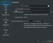
General page

Profile name and icon, and settings related to session/application
initialization.

  • Move "Show hint for terminal size after resizing" to Appearance page
  • Move "Dim the colors when the window loses focus" to Appearance page

Tabs page, rename tab dialog

Tabs settings

  • Only minor UI changes

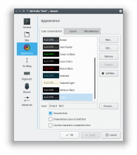
Appearance page


Settings related to basic appearance.

  • Add additional tabs
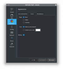
    • Cursor - cursor settings from Advanced page
    • Miscellaneous
      • Add "Line spacing" from Advanced page
      • Add previously missing terminal margins and terminal center settings (4 years old config-only feature)
      • Add "Show hint for terminal size after resizing" from General page
      • Add "Dim the colors when the window loses focus" from General page
  • Use customized font selection dialog
    • Show all printable ASCII characters and look-alike character sets as a preview
    • Live preview for changes in the dialog
  • Move "Show all fonts" to the font selection dialog
  • Remove "text size" (it is replaced with live preview in the font dialog)
  • Add live preview for cursor settings
  • Add live preview for "Line spacing"

Scrolling page, history size dialog

Settings related to scrolling and history.

  • Replace popping-in warning frames in "Scrollback" group with warning buttons which show floating warning after click. The controls does not change position anymore when switching the scrollback options. Applies also to history size dialog.
  • Replace scrollbar "hide"/"show on left side"/"show on right side" options with "visible" checkbox and "show on left side"/"show on right side" options enabled after checking the checkbox.

Keyboard page

  • Removed redundant group box

Mouse page


  • Shorten "Characters considered part of a word..." label
  • Replace "triple-click selects" drop-down with option buttons
  • Split settings to "Text interaction" and "Miscellaneous" tabs
  • Use monospace font for "Word characters" text input

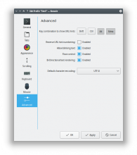
Advanced page

More advanced settings or settings regular user don't care about.

  • Replace "Show URL hints when these keys are pressed" checkboxes with toggle buttons which are easier to associate visually with hardware keys
  • Move "Line spacing" to Appearance tab
  • Move cursor settings to Appearance tab
  • Show "Default character encoding" value directly on drop-down button

Preview for: breeze (dark colors), Oxygen, QtCurve

Test Plan
  • Check visually with light/dark color scheme, Breeze, Fusion, Oxygen, QtCurve widget styles, normal/large font, QT_SCALE_FACTOR set to 1 and 2
  • Change every possible control to check UI logic
  • Change as much settings as possible and see if they are applied

Diff Detail

Repository
R319 Konsole
Lint
Automatic diff as part of commit; lint not applicable.
Unit
Automatic diff as part of commit; unit tests not applicable.
mglb requested review of this revision.Nov 29 2018, 8:54 PM
mglb created this revision.

!!!!

I had this on my-to-do list, but this looks amazing! A super duper humongous improvement! I will test this out and formally review soon!

This is just awesome. I have some inline comments to really polish the heck out of it:

src/EditProfileAdvancedPage.ui
176

In general, we try not to do
<thing> [x] Enabled.
Instead, do
[x] <thing>

If this would be awkward because there are no left labels, try to group them together and give the first one a "miscellaneous" or "general" label. Here's how it would look for this:

Miscellaneous: [ ] Reverse URL hint numbering
               [ ] Allow blinking text
               [ ] Flow control
               [ ] Bi-directional text rendering
src/EditProfileAppearancePage.ui
311

This could probably be shortened to just "Match current character"

398

It might not be the worst thing in the world to just remove the right label for this, and end up with:

Blinking: [ ]
608

This could probably skip the group box and be:

Window: [x] Show hint for terminal size after resizing
        [ ] Dim colors when inactive
src/EditProfileScrollingPage.ui
156

I think this would actually be simpler and better as a three-item radio button:

Scrollbar position: (o) Right side
                    ( ) Left side
                    ( ) Hidden
src/HistorySizeWidget.ui
38–40

We could probably remove the word "scrollback" from these strings, since the radio buttons' left label already uses it. So we would have:

Scrollback: (o) Fixed size
            ( ) Unlimited
            ( ) none

For some reason in this revision if I open the settings then click another page and go back to the general page, When i click the environment edit button the pop up gets opened several times in a row. I've added a gif showing the issue.

mglb updated this revision to Diff 46816.Dec 3 2018, 11:48 PM

Thanks!

All suggestions applied. However, I think the "Blinking" checkbox looks a bit weird without the right label:

Like, something is missing there visually.

@rizzitello thanks, bug fixed. Signal-slot connections were created on each tab change.

mglb updated this revision to Diff 46817.Dec 3 2018, 11:53 PM
mglb edited the summary of this revision. (Show Details)
  • Remove unnecessary line from description
  • Add: Use monospace font for "Word characters" text input
mglb marked 6 inline comments as done.Dec 3 2018, 11:55 PM

Wow, that's impressive. Thanks a lot for working on this - let me look at it further.

Does anyone else get this on the terminal that you started Konsole?

qt.svg: link y hasn't been detected!

ngraham added subscribers: mart, hein.Dec 4 2018, 3:03 PM

Thanks so much!

Replace popping-in warning frames in "Scrollback" group with warning buttons which show floating warning after click. The controls does not change position anymore when switching the scrollback options. Applies also to history size dialog.

This one one change I'm a little iffy about. I can understand that some people don't like KMessageWidgets because they reposition content, but I think it highlights the need for a new style of pop-up that appears over the view and looks visually connected to a particular widget. I believe @hein and @mart have discussed this in the past.

mglb added a comment.Dec 5 2018, 5:44 AM

New widget would be nice. The information here is not that important (for advanced user) and is not an indicator (where kmessagewidget is perfect) but more like an one-time hint. The warning icon indicates that the option should be used with caution, or that the configuration is somehow risky. Someone who cares about it can just click and read a message.

Current implementation could stay here until the new widget is made. It will also work as an use case and one of possible designs.

Is the discussion available somewhere, or was it on irc/telegram?

loh.tar added a subscriber: loh.tar.Dec 5 2018, 6:27 AM

Just a hint/question from someone who didn't try this particular patch.

What happens when the screen has a limited height? Can/will the dialog shrink to fit in?

There was a similar change sometime in the past (sadly I can't remember ATM where/what, sorry) which caused on my loved Netbook (1024x600) a very bad experience. You had to move the window by Alt-Mouse-Drag to view/access lower widgets.

Furthermore have these dialogs an issue when the text below the left icon row is too long, the text is broken then (not full readable) and you can't adjust the width of this column manually.

emateli added a subscriber: emateli.Dec 5 2018, 4:58 PM

Would be great if the "Line spacing" and "Margins" checkboxes were aligned.

In D17244#371489, @mglb wrote:

New widget would be nice. The information here is not that important (for advanced user) and is not an indicator (where kmessagewidget is perfect) but more like an one-time hint. The warning icon indicates that the option should be used with caution, or that the configuration is somehow risky. Someone who cares about it can just click and read a message.

Yeah, that makes sense.

Current implementation could stay here until the new widget is made. It will also work as an use case and one of possible designs.

Agreed.

Is the discussion available somewhere, or was it on irc/telegram?

I think it was only on real-time chat, but @hein might remember if there was something that was written down in a more permanent location.

Would you prefer to commit this and work out the remaining issues when you have time?

mglb updated this revision to Diff 47643.Dec 15 2018, 11:17 PM
  • git rebase master
  • Line spacing max is now set to 20px (was 5px), which can be useful for someone with large font.
  • Align "Line spacing" and "Margins" spin boxes (suggested by @emateli) - "side effect" of the above.

Preview:

mglb added a comment.Dec 15 2018, 11:23 PM

@loh.tar the window heigh is lower than 600px

@hindenburg I think it is OK to commit. Remaining issues are:

  • Design and create new widget
  • T10165

Both will take some time.

ngraham accepted this revision.Dec 15 2018, 11:26 PM

Awesome stuff. Any chance you'd be interested in giving the rest of Konsole's Settings window the same treatment, @mglb? Right now it uses a plain old tab view instead of this more common style.

This revision is now accepted and ready to land.Dec 15 2018, 11:26 PM
mglb added a comment.Dec 15 2018, 11:28 PM

Awesome stuff. Any chance you'd be interested in giving the rest of Konsole's Settings window the same treatment, @mglb? Right now it uses a plain old tab view instead of this more common style.

Sure, it's on my todo list after a few smaller things.

In D17244#377692, @mglb wrote:

Awesome stuff. Any chance you'd be interested in giving the rest of Konsole's Settings window the same treatment, @mglb? Right now it uses a plain old tab view instead of this more common style.

Sure, it's on my todo list after a few smaller things.

Woohoo! I can't wait!

hindenburg accepted this revision.Dec 16 2018, 2:44 PM

Thanks

This revision was automatically updated to reflect the committed changes.
hindenburg added inline comments.Feb 26 2019, 4:21 AM
src/EditProfileDialog.cpp
222

Can you explain why you expand the width here? On small screens, this causes the dialog to be much bigger and the right side of the dialog goes off the desktop edge. Removing this addition makes it appear as expected.

mglb added inline comments.Feb 26 2019, 9:39 AM
src/EditProfileDialog.cpp
222

IIRC to make text inputs in "tab titles" a bit wider by default.
I got 553x585px with Noto Sans Display 8pt@96dpi, and 902x742px with 15pt. Did you get something bigger, or those values are too big?

hindenburg added inline comments.Feb 26 2019, 1:20 PM
src/EditProfileDialog.cpp
222

I'm testing on a non-plasma desktop (xfce) w/ 800x600 dimensions; without the resize, the dialog is small enough to be seen (725x560); with the resize, the height is around 560 and right side is cut off 10 pixels.

mglb added inline comments.Feb 26 2019, 11:03 PM
src/EditProfileDialog.cpp
222

OK, so our results match. I'll post a patch tomorrow.