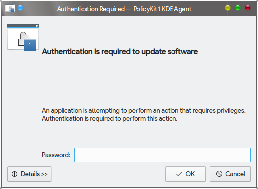
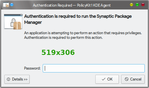
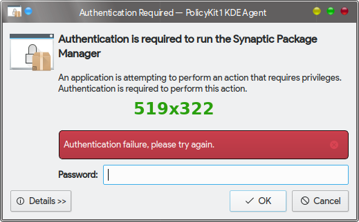
Adjusted spacers in UI file to properly align icon with message text. Also attempt to minimize white space in dialog box by hiding UI elements until they are needed. (Set height to 1, then restore to original layout size.)
Details
Details
- Reviewers
davidedmundson ngraham abetts - Group Reviewers
Frameworks - Commits
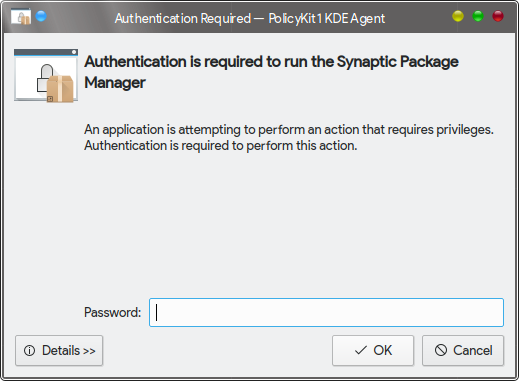
- R121:d4ee26a76a21: Align lock icon with bold message text; reduce overall size of dialog
- Compile polkit-kde-agent-1 with patch
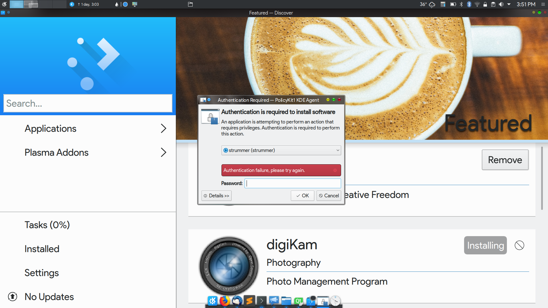
- Trigger a root password request window (launch Synaptic, try to change SDDM in System Settings)
- Ensure that lock icon is aligned with bold headline text
Diff Detail
Diff Detail
- Repository
- R121 Policykit (Polkit) KDE Agent
- Branch
- align-lock-icon (branched from master)
- Lint
No Linters Available - Unit
No Unit Test Coverage
Comment Actions
I just realized I inadvertently shrank the spacing between the bold headline and the non-bold explanation text. There's a lot of white space in this dialog. Let me know if you want something adjusted...
Comment Actions
How's this? It's a little tighter.

How's this? It's a little tighter.
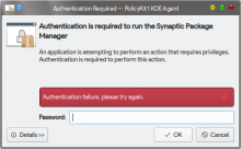
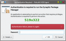
Some of the white space is reserved for otherwise-invisible error messages (like an invalid password).
If it gets more +1's, I'll update.
Comment Actions
Better already! Do we even need to reserve that space? Many other such dialogs dynamically allocate it when necessary by increasing the height of the box. Is that not possible here?
Comment Actions
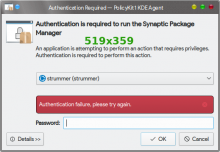
It's got a Big Scary Red Box that appears for an error. It's already in the UI design, just not visible. So when it's set to visible, its space is already allocated.

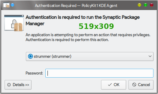
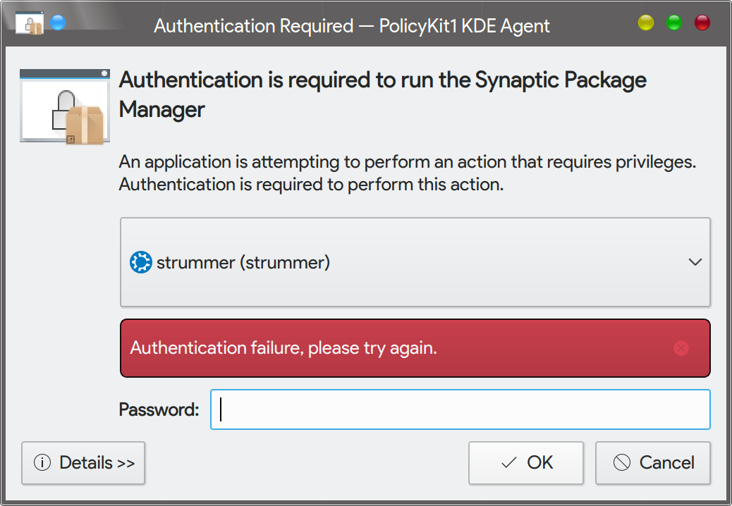
There's another hidden UI element above it, which is a combo box for selecting a different user. I've only got one user on my system, but i presume it activates when superuser privileges are requested, allowing you to enter the root password as a different user.
Comment Actions
Right. What I'm saying is: can we make the box compact by default, and become taller to accommodate the above-mentioned UI elements only when they're actually being displayed?
BTW, creating another user and then removing it later is trivially easy in System Settings → Account Details → User Manager.
This comment was removed by sharvey.
Comment Actions
- Reduce height of dialog by shrinking UI elements when not needed
Password error alert and user-choice combo box are reduced to 1px high when not needed, then restored to their original geometry when activated.
Comment Actions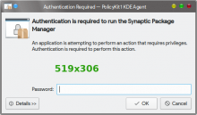

Here's the latest from the Pixel Conservation Society. I can't manage wholesale space-savings without breaking up the existing gridLayout and basically starting from scratch. It does resize a bit and does no harm.

Comment Actions
Much better! I'd still prefer less whitespace, but this is already an improvement. But now that I'm staring at this dialog over and over again, I'm wondering if we even need the non-bold caption text at all. It just repeats the bold text in a slightly more awkward and more wordy fashion. What do you think?
Comment Actions
I think there's something severly wrong with the dialog's size hints if we need to add arbitrary numbers all over the place. Can you make sure this doesn't break with
- different font
- larger font
- screen scaling
- different widget style
- ...
Comment Actions
The dialog seems immune to QT_SCALE_FACTOR=2.0 (because it's launched from a separate process?). I don't have a HiDPI display to test on.
The dialog seems immune to QT_SCALE_FACTOR=2.0 (because it's launched from a separate process?). I don't have a HiDPI display to test on.
I tried different fonts up to 15pt and all is okay. I even tried the nasty Windows-style widgets and it's still okay.
I agree the layout is kind of a mess. I can take a shot at reworking it if the reviewers think it's worth the effort.
Comment Actions
I think it would be worth it! It's definitely not a crown jewel of polished UI design, that's for sure.
To test scaling, try setting a systemwide scale factor in System Settings → Display and Monitor → Displays → Scale Display, then logging out and back in, then doing it again,
Comment Actions
The good news is that it still behaves properly with a scaled display.
The good news is that it still behaves properly with a scaled display.
The bad news is that, due to the minimumSize we configured for System Settings, I can't get back to the bottom of the Display KCM to reset my screen scale. Had to set QT_SCALE_FACTOR=0.5 and launch systemsettings5 directly. Never a dull moment!
Comment Actions
Ouch, that's pretty bad. Perhaps we should move the button up higher in the window so you'll always be able to reach it no matter what weird state you find yourself in.
Comment Actions
Reviewers: as part of my task to redesign and tidy up this dialog box, I'm considering removing the Details button in the bottom left corner, along with the small pop-open panel that shows additional information. My argument is that the info in the Details panel is quite technical (PID's of calling process and polkit process) and - in some circumstances - lucid information about the program needing authorization. Most of the time, what's coming through is in raw form, such as com.canonical.ubuntu.synaptic (more or less) instead of Synaptic Package Manager.
I know carving out UI elements can be controversial, so please give a few +/- 1's so I know what others think. Maybe some people use it. I don't. But that's not a good enough reason to remove it.
Comment Actions
In general it's okay to display nerdy technical information hidden away like this--as long as it's actually useful information! That's the real question. If it's of no real value to anyone for any use case that we can imagine, we can probably safely remove it. Otherwise, it should probably stay in.
Personally I have no use for it, but let's collect more perspectives.
Comment Actions
Do you really want to remove the proper source of information in security dialog that asks you some additional credentials?
Please keep it there.
Comment Actions
If you really want to save some space (and probably make it easier for users to understand the dialog without getting lost), I think the whole
An application is attempting to perform an action that requires privileges.
Authentication is required to perform this action.
boilerplate can be removed. It is some lenghty, generic text, which does not add any useful information.
If the Action in the Details tab is showing the raw id of the action, its the fault of the action definition, lacking a <description> tag.
Comment Actions
What about something like:
"Authentication is required to perform this action. Please enter your administrator password"
And nothing else. No 3 lines but just one.
??
Comment Actions
The "Authentication is required to ..." header line is directly sourced from the action definition below /usr/share/polkit-1/actions/*
"Administrator password" is insufficient/wrong, as you can also (dependent on system configuration) authorize the actions as another priviledged user, see the screenshots.
Password is redundant (label on the textfield), and wrong, as you can potentially use something like a fingerprint to authenticate.
Comment Actions
Btw, an easy way to trigger the dialog is e.g.
$> pkcheck -u -p $$ -a org.freedesktop.udisks2.eject-media-system
$$ is the PID of the shell.
Comment Actions
Semi-related bug from @stikonas, while I'm on dialog duty: https://bugs.kde.org/show_bug.cgi?id=393355
Comment Actions
So right now, we have two strings of text:
- The top bold string comes from the app and differs on a per-app basis
- The bottom long boilerplate string is from us, and shown all the time
I like @abetts' general idea: we should remove the app-specific text and make the always-shown boilerplate text short and to the point. We can massage the wording to apply to all situations.
Comment Actions
Hmm, I was actually leaning the other way. Ditch the generic boilerplate and keep the app-specific text. I think it's helpful when the dialog tells you why it appeared and what app/function is requesting your password.
Comment Actions
No, thats completely off, as thats the action you are authorizing.
Authorization is required to format disk WDC WD10EZEX-08M2NA0
I want it to show what it is asking permission for, and to be specific - does it want to format the USB stick I just inserted, or my home partition.
Comment Actions
As long as you keep the detailed information available, that's fine. You can always end up having a non useful name for your USB stick...
Comment Actions
Partition Manager wouldn't be able to show such specific text anyway (what is being formatted). It just starts a helper that can execute any command it asks. You can't make it work otherwise.
Comment Actions
Gnome-disks uses UDisks to do everything and can't do anything on its own. So available features are very limited (not even resizing partitions).
I suspect it is significantly less portable (e.g. to FreeBSD).
That's why gnome-disks was written from scratch (with fewer features than gparted that it was supposedly replacing) and it wasn't the case of somebody porting gparted to udisks .
Comment Actions
- Merge branch 'master' into align-lock-icon
- Undo manual resizing of ser combo box & password error box
Comment Actions
Okay, this patch is back to where we started, with nothing changed except centering the icon. Hopefully we can commit it now. I'll move the discussion over how to redesign the dialog itself to a separate task.
Comment Actions
FYI: I undid the wonky manual UI sizing that @broulik objected to. In hindsight, not the best approach.
Comment Actions
Does not work well yet, just a few errors where KPM succeeds:
- Cannot resize btrfs filesystem on /dev/sdb1: (null) filesystem 'btrfs' is not supported.
- LUKS encrypted ext4: looks like I can resize internal file system but no way to resize outer LUKS container (i.e. what cryptsetup resize does)
- Does not recognize LVM PVs, no way to resize them.
On the other hand, it might be useful in certain cases. E.g. to resize FAT and maybe HPFS (not all distros ship fatresize).
In any case, resizing is not the only thing. No way to copy/move file systems.
I'm not opposed to UDisks in principle, I am just saying it's not there yet.
Comment Actions
Wrong, tested, works. You have to use http://storaged.org/doc/udisks2-api/latest/gdbus-org.freedesktop.UDisks2.Filesystem.BTRFS.html