Clean up and standardize the UI to be in line with the KDE HIG.
Details
- Reviewers
davidedmundson - Group Reviewers
Dolphin Frameworks VDG - Commits
- R241:7138c046b10c: [Trash KCM] Clean up and standardize UI to be in line with the KDE HIG
- All functionality still works
- Checking and unchecking the checkboxes still enables and disables companion items appropriately
- No unit test regressions, and trash test still passes
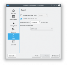
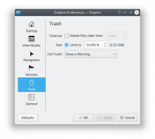
- Visual comparison:
Before:
After:
Diff Detail
- Repository
- R241 KIO
- Branch
- clean-up-trash-kcm (branched from master)
- Lint
No Linters Available - Unit
No Unit Test Coverage
I don't think putting whole phrases as a label before the checkbox works very well, and I would be surprised if that's what the HIG now recommends. I assume at most a single subject should be used there?
For example, instead of the awkwardly placed checkbox in
Limit to maximum size: [ ] 10 %
…it would work much better this way:
Size: [ ] Limit to 10 %
Not only is scanning the dialog much quicker if you only have to read a single word when looking for an option in that vertical row, but for languages with longer translations it's the only way to make the dialog not fall apart in the horizontal direction.
(Same reasoning applies to the other options too, of course.)
Yeah, that makes sense. Suggestions welcome, of course. Is this any better?
Still not super happy with "When limit reached:
Would it make sense to flip it? Start with:
Warn me - when limit is reached
Seems more natural to me
Hm, I think after the checkbox there should some sort of sentence, with a noun in front:
Cleanup: [ ] Automatically empty after 7 days
Putting the combobox in front would violate the HIG, wouldn't it?
@ngraham Please change your language to both Greek and German, and notice the width of the label as well as the width of the combobox. Your current proposal will blow up the width of the dialog massively, and create a huge amount of whitespace on the left as well.
Perhaps you need something like this:
Noun: Explanations are good
      Combobox
Alternatively:
Noun: ( ) Option 1
      ( ) Option 2
( ) Option 3Good idea, perhaps some radio buttons would make more sense here. I'll play around with it and try other languages.
That looks really good IMHO. Somewhat unrelated, I have seen a few UIs recently that ask the user to automatically empty their trash bin, can, container, whatever... every X amount of TIME UNIT. Would it make sense to add a feature like that in this KCM?
Thanks! A lot of the credit goes to Henrik, with his excellent eye for UI design.
Somewhat unrelated, I have seen a few UIs recently that ask the user to automatically empty their trash bin, can, container, whatever... every X amount of TIME UNIT. Would it make sense to add a feature like that in this KCM?
I think that would be enabled by the first checkbox, no? Or were you asking for the ability to change the time unit to hours, weeks, months, etc? An interesting idea, though out of scope for this patch.
Thanks, "Size" and "Full trash" are looking good now.
Just noticed that I based my suggestion on your screenshot, but missed to see that you changed the semantics compared to the original dialog: The trash won't be emptied completely after 7 days, but files older than 7 days will be deleted (based on the wording, you might want to check the code what's correct).
Therefore I think we might have to keep the original wording and only add the label in front.
(Which is why I'm not too fond of changing every UI to the new style, because it is much work but creates little value.)
What's your plan for landing this change, do you want to convert the other pages first?
Still looks good IMHO.
The value is in standardizing on something. Plasma, System Settings KCMs, and Gwenview already use this style. Many others don't (see T8655). We had many VDG discussions on the subject, and decided to standardize on the labels-on-the-left style instead of the labels-on-top style. If we had decided to standarize on the other one, we would have simply had a different set of work converting Plasma, System Settings, and Gwenview.
What's your plan for landing this change, do you want to convert the other pages first?
Yes, I'm doing all the other pages in D12571 (which is WIP).
The value is in standardizing on something.
Personally I'd be okay with a consistent style per application, with the new style applied to new applications, and allowing exceptions where it makes sense. You've already witnessed the amount of bikeshedding in Gwenview when we needed to add options, because with the new style it is much more challenging to get the wording right than with the traditional style.
Anyway, I'm not complaining too much (but please be aware that every change you propose creates additional work for reviewers and translators).
Right, but the end result was better (IMHO). Good design usually requires more work, and I'm very happy that you have high standards!
I'm quite aware, but this is just the nature of submitting patches, right? Nobody's making you review mine, and I hope you don't feel like it's your responsibility to babysit me to prevent things from getting broken or anything like that. :)
Well, I'd say you should use the resources available (which are quite scarce, as you are aware) wisely. I'd rather have the translators translate strings in Gwenview (there are many missing spots where we added things for 18.04) and work on my review backlog. Also note that fighting an uphill battle, i.e. more stuff getting broken than you are able to fix by yourself, is not much fun.
What are you actually asking me to do? Stop changing strings? Stop advocating for design changes? Stop submitting patches that implement design changes? Submit better patches that don't require so much reviewer time? Stop submitting patches entirely? Do less of those things instead of stopping entirely?
It's the unfortunate life of working in development. Changes are going to happen and others will have to make adjustments accordingly. There is nothing inherently wrong with that. If the argument is, "don't change things because they cause too much work for others" then we have to determine if we are a software provider that wants to keep the first iteration of their software and not hear customers, or if we want to hear customers and change our approach overtime, and evolve. I prefer the latter, no matter how many headaches I get. Let's take that approach and welcome change. Let's be sensible but not inflexible. I am sure there is a middle point for all of this.
In my personal experience spending more time on a limited set of items leads to better results and less churn (as in reverting commits, number of iterations per patch etc.) than only lightly touching a large amount of issues everywhere. Of course you can do whatever you feel is right, I was merely hinting at a potential issue (in particular with mass-changing UI everywhere).
Thanks for your clarification. Let's keep moving forward. What should be the end result of this patch?
Hopefully something like our latest mockup:
Do folks approve of this, or do we need some more visual design revision?
This revision improves the labels per review comments, but stays with a combobox instead of radio buttons in the interest of avoiding too many code changes in this patch, since the glue code changes quite a bit when you switch controls. If folks feel strongly that we need radio buttons instead of a combobox, that might be best to do in a follow-up patch.
| src/ioslaves/trash/kcmtrash.cpp | ||
|---|---|---|
| 303–304 | There's no benefit in changing the initial parent of these. It's all moot as QFormLayout::addItem takes ownership | |
| src/ioslaves/trash/kcmtrash.cpp | ||
|---|---|---|
| 303–304 | Ah right, I think I wrote this before I found that out. In fact, you can omit the parent entirely, so I think I'll do that. | |
Don't need to set a parent for mLimitReachedAction, since the QFormLayout it's in will just re-parent it anyway
Friendly ping! If nobody objects, I will commit this on June 3rd, or sooner if I get more explicit approvals.
Please wait till the 3rd.
Otherwise you give practically no days for the i18n changes to happen.
But then yes go for it. For future if I give an acceptance with a really minor comment feel free to push straight away after.


