[RFC] Add global themes that mimic other platforms' workflows
AbandonedPublic

Authored by ngraham on Sep 25 2019, 2:04 PM.

Details

Summary

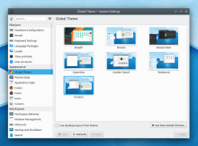
This patch adds the Cupertino, Garden Dwarf, Redmond, and Unueco global themes, which mimic the shell layout and workflow of popular alternative desktop environments.

Mandatory TODOs:

Points of discussion/future improvements:

  • Use real names for the themes that mimic FOSS desktops (i.e. GNOME and Unity)
  • Investigate using USwitch instead of the Lock/Logout widget for Garden Dwarf and Unueco
  • Investigate using one of those Windows 10 style menus on store.kde.org for Redmond
  • Implement Unity's Locally Integrated Menus by adding a few necessary features to Active Window Control or Window Title widget (See TODOs in Unueco's org.kde.plasma.desktop-layout.js file)

Closes T11743
Test Plan

New entries in the Global Theme KCM:

"Cupertino" Global theme:

"Garden Dwarf" theme:

"Redmond" Global theme:

"Unueco" Global theme:

Diff Detail

Repository
R114 Plasma Addons
Branch
add-cupertino-global-theme (branched from master)
Lint
No Linters Available
Unit
No Unit Test Coverage
Build Status
Buildable 17010
Build 17028: arc lint + arc unit
ngraham created this revision.Sep 25 2019, 2:04 PM
Restricted Application added a project: Plasma. · View Herald TranscriptSep 25 2019, 2:04 PM
Restricted Application added a subscriber: plasma-devel. · View Herald Transcript
ngraham requested review of this revision.Sep 25 2019, 2:04 PM

Note that this cannot be landed yet because it requires @mvourlakos' Window Title applet, which is not yet upstreamed. I tried to use Active Window Control, which is a KDE project, but it was too buggy and crashy and I found it to be practically unusable. I recommend upstreaming @mvourlakos's version and abandoning the original one or merging @mvourlakos improvements back into the original.

Fwiw I would totally love a patch to add an "application menu" to global menu applet and/or having a dedicated applet in plasma addons

Fwiw I would totally love a patch to add an "application menu" to global menu applet and/or having a dedicated applet in plasma addons

You mean a thing to add the current app/window's name to the left of the global menu? What's what Window Title does, and it's quite nice.

You mean a thing to add the current app/window's name to the left of the global menu? What's what Window Title does, and it's quite nice.

Pretty much. Ideally also with some common options like Preferences, Quit.

Maybe the contents of the Settings menu could live there, with the addition of Quit. Then again this almost seems like a change we'd want to make in KXMLGui because apps could benefit when using in-window menubars, not just when using a global menu. It's never made sense to have Quit in the File menu! :)

cblack added a subscriber: cblack.Sep 25 2019, 3:03 PM

Some suggestions:

  • Have the clock show day of the week
  • Add an applet that triggers KRunner by the system tray (can't remember if Plasma upstream has one)
  • Add a "sidebar" panel to the right with a calendar and notifications applet (auto hiding of course)

Ahh, great ideas!

ngraham updated this revision to Diff 66836.Sep 25 2019, 3:40 PM
  • Show day of the week
  • Show a button to trigger KRunner where the Spotlight button lives in macOS
  • Add an auto-hiding right panel that has a calendar and notification history
ngraham retitled this revision from Add "Cupertino" global theme that mimics the macOS workflow to [WIP] Add global themes that mimic other platforms workflows.Sep 25 2019, 5:19 PM
ngraham edited the summary of this revision. (Show Details)
ngraham edited the test plan for this revision. (Show Details)
ngraham updated this revision to Diff 66849.Sep 25 2019, 5:19 PM

Add "Redmond" theme

ngraham edited the summary of this revision. (Show Details)Sep 25 2019, 5:19 PM

One thing I'm running into is the need for a panel style that's always hidden until a button in another panel is clicked. Both macOS and Windows 10 have right screen edge sidebars that only appear when a button in one of the default panels is clicked. I like this quite a lot. It's much nicer than having the sidebar panel auto-hide and appear when the screen edge is touched with the cursor. since that leads to tons of accidental activations of a large panel that covers up a lot of the screen--including the window decoration buttons, which breaks your ability to fling the cursor into the top-right corner and click to quickly close a window.

ngraham edited the summary of this revision. (Show Details)Sep 25 2019, 5:23 PM

An application launcher of some sort (besides KRunner) seems to be missing

One thing I'm running into is the need for a panel style that's always hidden until a button in another panel is clicked. Both macOS and Windows 10 have right screen edge sidebars that only appear when a button in one of the default panels is clicked. I like this quite a lot. It's much nicer than having the sidebar panel auto-hide and appear when the screen edge is touched with the cursor. since that leads to tons of accidental activations of a large panel that covers up a lot of the screen--including the window decoration buttons, which breaks your ability to fling the cursor into the top-right corner and click to quickly close a window.

I think such a panel type would be nice, but how would adding such a panel work in terms of UX since it inherently relies on something other than itself by design?

An application launcher of some sort (besides KRunner) seems to be missing

The Redmond style has Kickoff.

The Cupertino style has a stripped down kickoff that only shows power and history items by default. IIRC macOS doesn't have an application launcher of any kind visible by default, just the apps in the Dock and the Applications folder which is also in the dock. The concept of this doesn't really exist outside of macOS though, and I don't think we have a widget that does nothing more than displaying a grid of all installed apps. That's what's needed here.

One thing I'm running into is the need for a panel style that's always hidden until a button in another panel is clicked. Both macOS and Windows 10 have right screen edge sidebars that only appear when a button in one of the default panels is clicked. I like this quite a lot. It's much nicer than having the sidebar panel auto-hide and appear when the screen edge is touched with the cursor. since that leads to tons of accidental activations of a large panel that covers up a lot of the screen--including the window decoration buttons, which breaks your ability to fling the cursor into the top-right corner and click to quickly close a window.

I think such a panel type would be nice, but how would adding such a panel work in terms of UX since it inherently relies on something other than itself by design?

A good question. It could also just be a widget whose expanded form holds other widgets, though that's basically just a panel...

ngraham edited the summary of this revision. (Show Details)Sep 25 2019, 5:32 PM
ngraham retitled this revision from [WIP] Add global themes that mimic other platforms workflows to [WIP] Add global themes that mimic other platforms' workflows.Sep 25 2019, 5:34 PM
ngraham updated this revision to Diff 66852.Sep 25 2019, 6:32 PM

Add Garden Dwarf theme

ngraham edited the test plan for this revision. (Show Details)Sep 25 2019, 6:33 PM
niccolove added a subscriber: niccolove.EditedSep 25 2019, 7:07 PM

In Cupertino, I think that the bottom panel should be limited in width and should auto-hide.
Regarding a side panel, I think it's really easy and nice to make the system tray somehow full height, that would easily mimick macOS and W10:


I'd also consider to make the global theme also change plasma theme, color scheme or even application style so that it switches to a even more similiar interface. If Cupertino global theme switched to a light version of https://store.kde.org/p/1252328/, that would be, well, extraordinary. In such case, I'd also consider the addition of a Fluent theme. Still, I can see why this would be much harder.

In Cupertino, I think that the bottom panel should be limited in width and should auto-hide.

It doesn't auto-hide by default in macOS. I decided to make it span the full width of the screen because not doing this is IMO one of the dumbest parts of that macOS dock, because it pointlessly wastes the bottom-left-most and bottom-right-most pixels, which are two of the four easiest to click pixels in the whole screen.

Regarding a side panel, I think it's really easy and nice to make the system tray somehow full height, that would easily mimick macOS and W10:

I'd also consider to make the global theme also change plasma theme, color scheme or even application style so that it switches to a even more similiar interface. If Cupertino global theme switched to a light version of https://store.kde.org/p/1252328/, that would be, well, extraordinary. In such case, I'd also consider the addition of a Fluent theme. Still, I can see why this would be much harder.

No, I explicitly did not want to do this with these themes. The idea is to mimic only the functionality of the targeted platforms, not their visual styles. There are already dozens of theme packages on https://store.kde.org that try to mimic the entire look-and-feel of macOS, Windows, Unity, GNOME, etc. We don't need more of those IMO. :)

It took me some seconds to get it where "garden dwarf" points do :-D
I think the previews for all look and feel packages KDE ships by default should show somehow the same desktop. Meaning have the same menu open or the same applications in the same spot.
Would make it easier to compare them and look more consistent. I also would like to have an option or even the possibility to have the widgets for the system tray using the complete screen height, like @niccolove suggested.

ngraham updated this revision to Diff 66859.Sep 25 2019, 10:01 PM

Add Unueco theme

ngraham retitled this revision from [WIP] Add global themes that mimic other platforms' workflows to [WIP/RFC] Add global themes that mimic other platforms' workflows.Sep 25 2019, 10:14 PM
ngraham edited the summary of this revision. (Show Details)
ngraham edited the test plan for this revision. (Show Details)
ngraham retitled this revision from [WIP/RFC] Add global themes that mimic other platforms' workflows to [RFC] Add global themes that mimic other platforms' workflows.
ngraham added a subscriber: Zren.

It took me some seconds to get it where "garden dwarf" points do :-D
I think the previews for all look and feel packages KDE ships by default should show somehow the same desktop. Meaning have the same menu open or the same applications in the same spot.
Would make it easier to compare them and look more consistent.

That's a good idea for apps. However we can't always show the same menu because the themes have different ones and in different places.

I'd also consider to make the global theme also change plasma theme, color scheme or even application style so that it switches to a even more similiar interface. If Cupertino global theme switched to a light version of https://store.kde.org/p/1252328/, that would be, well, extraordinary. In such case, I'd also consider the addition of a Fluent theme. Still, I can see why this would be much harder.

Please, no other plasma themes, color themes, application styles, icons, ... then the default ones in any official LnF. If we ship them as part of a default LnF we would need to support them as well. Documenting and fixing all the inconsistencies with the default ones is more then enough :)

It doesn't auto-hide by default in macOS. I decided to make it span the full width of the screen because not doing this is IMO one of the dumbest parts of that macOS dock, because it pointlessly wastes the bottom-left-most and bottom-right-most pixels, which are two of the four easiest to click pixels in the whole screen.

Even if you don't agree with the dock being limited in width, I think you still should make it limited. It is one of the most distinct visual aspects of the original desktop.

Can Late be used in LnF?

Yes, but if we ship a Global Theme that uses Latte in kdeplasma-addons, this would require making Latte a hard dependency of kdeplasma-addons, which is something that I'm not sure we're interested in doing.

mart added a subscriber: mart.Oct 4 2019, 12:18 PM

I'm actually not keen on the concept at all, about shipping what can only be badly done copycats of other platforms in lnf (or a separed layouts kcm.. which would be a big mistake doing at all)
this i think.. can only scream an impression of bad quality

In D24223#541957, @mart wrote:

I'm actually not keen on the concept at all, about shipping what can only be badly done copycats of other platforms in lnf (or a separed layouts kcm.. which would be a big mistake doing at all)
this i think.. can only scream an impression of bad quality

See some of the comments in T11743. Promo people are excited and say that users have been asking for this and will love it.

mart added a comment.Oct 4 2019, 12:22 PM

also, some bits of history:
kde2 had something along the lines in a startup wizard which could chose kde, windows, macos and irrc solaris (which was still a thing back then)

in the end, was deemed to be a bad idea both the startup wizard and those other platform mimicking setups

Well this isn't a wizard, it's just in the LNF/Global Theme KCM, so it's not going to be very in-your-face.

I can understand the concerns. However right now we do have a problem insofar as it's quite difficult for users to figure out how to change the layout (see for example T10047). I agree that there are pitfalls if it's not done well. But many other DEs and distros are now offering this kind of functionality out of the box now and it's been quite well-received. It seems like yet another example of us having the technology to do something cool, but not actually taking advantage of it to do that cool thing and playing second fiddle to our competitors who implement it first...

Hi, I am a developer of LliureX project (www.lliurex.net sorry, not in english) a Linux distribution used by public schools at Valencia, Spain (aprox 120k computers). This year we moved from Gnome to Kde!

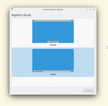
Ok, back to the topic, we have developed a wizard in order to allow users to select between two different layouts, a Windows-9x style and a OsX one. We call it classic and modern. It is built on top of plasma LnF engine with a custom QML. The problem with default Plasma look and feel kcm is that it presents all installed themes (we just want to offer LliureX presets) and the "use desktop layout from theme" checkbox which is default unchecked and everyone forgets to check before apply. We decided to use a hand made simple preview instead of a real screen capture, it works better, imho.

We are noob with all KDE-related stuff (Qt,KF5,QML,...) , maybe in a next update of this wizard would be nice to only set up panels and left wallpaper and widget theme untouched.

Hi, I am a developer of LliureX project (www.lliurex.net sorry, not in english) a Linux distribution used by public schools at Valencia, Spain (aprox 120k computers). This year we moved from Gnome to Kde!

Yay!

Ok, back to the topic, we have developed a wizard in order to allow users to select between two different layouts, a Windows-9x style and a OsX one. We call it classic and modern. It is built on top of plasma LnF engine with a custom QML. The problem with default Plasma look and feel kcm is that it presents all installed themes (we just want to offer LliureX presets) and the "use desktop layout from theme" checkbox which is default unchecked and everyone forgets to check before apply. We decided to use a hand made simple preview instead of a real screen capture, it works better, imho.

I agree that this off-by-default checkbox is not ideal. We're discussing how to fix that in T11746.

We are noob with all KDE-related stuff (Qt,KF5,QML,...) , maybe in a next update of this wizard would be nice to only set up panels and left wallpaper and widget theme untouched.

Yeah that's what these layouts I'm proposing do. I like your use of symbolic preview images. I should do that here too.

It looks like we want look and feel kcm split in two parts:

  • Desktop layout (panels and widgets)
  • Themes (wallpaper, color scheme, kwin theme, widget theme)
ngraham edited the summary of this revision. (Show Details)Oct 7 2019, 9:59 PM

Great work. This plus additional usability issues tackled in other streams will make my full switch to KDE possible (coming from Mac).
Two relatively minor things:

  • desktop icons (e.g. Recycle bin) are also part of it
  • Cupertino should have window control buttons on the left...
davidre added a subscriber: davidre.EditedOct 8 2019, 9:55 AM

Make it possible to have an auto-hiding panel that only appears when clicking on a button somewhere else: https://bugs.kde.org/show_bug.cgi?id=412483

I don't think the point matches the bug report entirely but maybe one could hack something like this together with
https://community.kde.org/Plasma/DeveloperGuide#DBus_autolaunched_Plasmoids or plasma scripting.

It doesn't auto-hide by default in macOS. I decided to make it span the full width of the screen because not doing this is IMO one of the dumbest parts of that macOS dock, because it pointlessly wastes the bottom-left-most and bottom-right-most pixels, which are two of the four easiest to click pixels in the whole screen.

Even if you don't agree with the dock being limited in width, I think you still should make it limited. It is one of the most distinct visual aspects of the original desktop.

I agree that being limited in width is a very import aspect of macOS. Whether it looks better or worse is debatable (personally, I prefer it limited), but it's a distinc visual aspect of the desktop, and it would confuse users to do that otherwise. Users who do not like it will be able to expand the panel.

We discussed this at the sprint and concluded broadly that we could move forward with it (once the TODOs are addressed of course). We also decided for T11746 that we would go with the approach of a sheet that lets you enable and disable parts of a global theme when you go to apply it.

Boxie added a subscriber: Boxie.Jun 24 2020, 6:29 AM

If I can make a suggestion here.

As others have mentioned - Let's not mimic other desktop environments (there are plenty of dragons and devils hiding there). We have plenty of cool features already - we are just choosing to expose one set of those (Breeze)

The other features (e.g. Global Menu, App Dashboard etc) don't get much of a look in - unless users go exploring and start figuring out that these features exist.

I propose that we have a small number of layouts that are all specifically KDE project related where we can showcase these other ideas.

Giving the users a chance to discover how these other features are envisioned to be put together and to give them a try - with an easy way to get back to what they normally use if they want - would aid in this.

Personally - as a user - I would love to see a simple way like this to try out other layouts/ideas.

Thanks for your time!

I'm open to re-doing this to expose alternative layouts that don't explicitly mimic other platforms. The problem is, I'm not very creative in my use of this functionality. All I really do is put my panel on the left screen edge. I would need ideas for alternative layouts.

Another idea is to put these explicitly-other-platform-mimicking layouts on store.kde.org so they're available but people need to manually download them. Not sure how much that would actually satisfy the original goal, though.

As others have mentioned - Let's not mimic other desktop environments (there are plenty of dragons and devils hiding there).

Are there really? If we really aren't confident enough in these new global themes I would consider adding "(experimental)" to their name. Even then I think that shipping any additional layouts by default will send the right message. I don't think it really matters if those additional layouts mimic other DEs/OSs or not but for simplicities sake and because in this case I see value in showing off I would encourage the current approach.

Some more thoughts because I (perhaps baselessly) feel like progress on this feature was held back by doubts: If I came from another OS and saw the option to fundamentally change the layout with two clicks I wouldn't actually be expecting it to work. Now this is Plasma and we want our most powerful features to work flawlessly as well but let's keep in mind that even a buggy attempt is more than others have attempted.
I also wouldn't worry too much about the theme not resembling an existing DE/OS close enough. I don't think users actually expect that unless we market it as such. On the contrary marketing has told users that iPhones from Androids from Windows from Macs are fundamentally different. So yea, picture me cheering "LGTM" from the audience.

Boxie added a comment.Jun 29 2020, 4:46 AM

As others have mentioned - Let's not mimic other desktop environments (there are plenty of dragons and devils hiding there).

Are there really?

Yes, because (for example) if you are coming from mac and choose the apple theme, you are expecting it to work like the apple environment, from shortcut keys, specific placement of items and look/feel of various components - even apps like dolphin not looking the same would be jarring.

What I believe would be a better way forward is some layouts using existing plasma stuff. - for example:

  • A "Laptop Layout" that has just a side menu with icon switcher because vertical space is at a premium.
  • A "Compact"? layout that has a global menu across the top
  • The "Traditional" layout with the app window switcher across the bottom

These themes would allow easy access to some "defaults" that users can them customise further if they want to.

if you are coming from mac and choose the apple theme, you are expecting it to work like the apple environment, from shortcut keys, specific placement of items and look/feel of various components - even apps like dolphin not looking the same would be jarring.

You are certainly picturing a more demanding and nitpicky user than I am but those do exist. I wonder where those expectations you mention would be coming from but I agree that if an apple® fan installs Plasma with the preconception it can be made to be exactly like macOS they'll be in for a reality check. I don't really think the existence of a "Cupertino/Pear/Raincoat" theme would worsen that problem though. That's what I meant when I said "I don't think users actually expect that unless we market it as such."
Anyways, going with "some layouts using existing plasma stuff" is alright as well even though this feels like we would be needlessly limiting us from offering layouts that are tried and tested.

Boxie added a comment.Jun 30 2020, 2:27 AM

Anyways, going with "some layouts using existing plasma stuff" is alright as well even though this feels like we would be needlessly limiting us from offering layouts that are tried and tested.

I am thinking this being a nice way to introduce users to Plasma features. a "Look at what Plasma can be for you" rather than limiting ourselves to "here is a copy of another DE"

Do folks have any ideas for alternative layouts that don't explicitly mimic other platforms?

Boxie added a comment.Jul 2 2020, 3:57 PM

Do folks have any ideas for alternative layouts that don't explicitly mimic other platforms?

How about a "Laptop" Layout.

  • Typically on a laptop you have a lot of horizontal space, not much vertical - Having the default menu on the left is a good idea for that (at least for languages that read left to right)
  • A top "global menu" might get in the way here, as not all programs have a menu (web browsers hide it be default or have an alternative system, spotify, discord etc all go without)
  • Using an Icon style task switcher to make good use of the horizontal space and keep battery life
  • As laptops might be touch friendlier, having larger icons on the desktop and task manager and maybe the Application Dashboard too

All of these are already the default settings except for the icons-only task manager being on the bottom rather than on the left edge.

crossi added a subscriber: crossi.Oct 9 2020, 7:41 AM
ngraham abandoned this revision.Nov 15 2021, 5:02 PM

I no longer think this is a good idea. :( User feedback suggests that our default UX is too similar to another platform (Windows) already, which puts it in an "uncanny valley" where it is like 80% the same as that platform, but divergent enough to cause frustration and anger.

I think what is happening is that people's brains are being primed to enter "nitpicky conservative mode" and focus on the differences from what's expected, rather than "open-minded exploration mode" where it's possible to feel playful and curious and enjoy the distinctiveness of our system. Because very Windows-familiar new users never enter that mode, the first time they encounter a major divergence from Windows--for example, System Settings, or how applets or wallpaper is configured, or how many clicks it takes to open files, or whether Dolphin opens archives itself--they feel angered and disgusted, rather than intrigued and curious.

Accordingly, I think formalizing this by offering global themes out of the box that provide similarly imperfect mimicry of other platforms would make this problem worse, not better.

Closing.