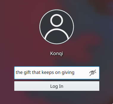
This patch replaces the login button label "Log In" with an icon, places it to the right of the password field, and centers the combination of the password field and the login button. It also adjusts for the button's right border, which has a tendency to extend to the right and beyond the username input field by one pixel.
Details
Details
- Reviewers
ngraham filipf - Group Reviewers
VDG Plasma - Maniphest Tasks
- T10325: 5.16 Login screen improvements
- Commits
- R120:602e5533d348: [sddm-theme] Replace login button label with icon
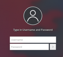
Before:(user list screen):

After (uer list screen):

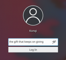
Before (user prompt screen):

After (user prompt screen):

Diff Detail
Diff Detail
- Repository
- R120 Plasma Workspace
- Branch
- arcpatch-D19214
- Lint
No Linters Available - Unit
No Unit Test Coverage - Build Status
Buildable 9285 Build 9303: arc lint + arc unit
Comment Actions
By the way, I've been testing this with Breeze Dark only - I don't know why the icon looks a lot dimmer with the Breeze color scheme, hence WIP
Also, I don't think that we have consensus yet whether we want this change or not - but in case we decide to go for it, here's the diff :D
Comment Actions
Design-wise I've been advocating this as well so it's obviously a +1 from me.
Usability-wise I'd like use to increase the height of the input field and consequently the login button size because you have to keep touchscreen users in mind. Bigger button = easier to hit.
Consistency-wise the lock screen will probably get mentioned in the discussion.
Comment Actions
Oh yeah that's right I have to do the lock screen too
One of the changes I've got planned for the password input field is increasing the font size so... we probably won't have to make the password field taller?
Comment Actions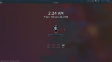
There's also the problem that even though they're technically the same height, when it's highlighted, the password field just seems taller (the highlight adds a pixel above and below it).

And yet if I make the login button taller, then it looks too tall when the field is unfocused (or defocused, I should say - hence the problem).
Comment Actions
Issues unresolved so far:
(1) Should this be done at all?
(2) Should the password field + login button be centered, or should just the password field be centered and the login button lie to its right? Especially considering the impact it would have on the user prompt screen
(3) Should the opacity of the login button (and/or the password field) remain at 100%? Especially considering the fact that (a) the theme doesn't really have a white background for any other element and (b) users can't choose color schemes for the SDDM theme, and users that prefer Breeze Dark might not take too kindly to such a white username field, password field and login button.
Comment Actions
+1 for this design as well. It's much better-looking overall.
If click targets are a potential problem for touch, my preference would be to make all of the textual elements larger, which would have the effect of scaling everything up--and also making the text more readable all over the place. Probably material for another patch though.
| lookandfeel/contents/lockscreen/MainBlock.qml | ||
|---|---|---|
| 97–108 | You don't need to add a separate iconItem; just give the button iconSource: "configure" | |
| sddm-theme/Login.qml | ||
| 112 | Ditto | |
Comment Actions
I think so!
(2) Should the password field + login button be centered, or should just the password field be centered and the login button lie to its right? Especially considering the impact it would have on the user prompt screen
I like the current approach where the field+button are centered. Looks great to me.
(3) Should the opacity of the login button (and/or the password field) remain at 100%? Especially considering the fact that (a) the theme doesn't really have a white background for any other element and (b) users can't choose color schemes for the SDDM theme, and users that prefer Breeze Dark might not take too kindly to such a white username field, password field and login button.
I understand that there are login screens out there that have blurry translucent text fields and buttons, and that the overall effect looks good. I'd potentially be up for something like that here, but it would probably have to be extensively designed and built. I'm not sure if just turning down the opacity on the existing UI elements would cut it.
Comment Actions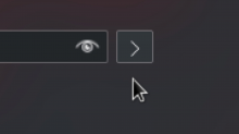
Oh I tried that - the problem is that when I use "iconSource" and then adjust the height by subtracting 1/2 units.smallSpacing (line 106), the icon isn't vertically centered:

So in order to manipulate its size from within the button I put it into an item in the button whose anchors I could tie to the button itself:
Comment Actions
It would probably be worth mentioning that in a comment--or fixing the PC2 button to always vertically center the icon. Alternatively, maybe the PlasmaComponents3 button works better?
Comment Actions
Im running into the same issue with PC3. The button also becomes elongated for some reason.
Comment Actions
However, if we do end up going with this, then we reeeeeeeeally need to fix this bug first, since it becomes significantly worse and more noticeable with this patch:
Comment Actions
How odd - I can reproduce this bug on neon but not on Arch or on Fedora, and I have no idea why
EDIT: We know what file (/etc/fonts/conf.d/56-neon-noto.conf) causes it now, there's some kind of substitution that occurs at lines 80-121 - if I remove lines 85 thru 119, the bug disappears.
Comment Actions
OK, so let's pretend the password field height bug doesn't exist since it's gotta be solved elsewhere.
Comment Actions
Haha sure thing :D I mean I was meaning to wait until it was resolved (seeing as 5.16's still pretty far away), but I don't mind dealing with it right away either
Should we wait for someone else to give us the go-ahead?
Maybe it'll provide even more incentive to get rid of the neon bug even sooner :D
Comment Actions
Should I include this in the preview screenshot for the reduced blur? :D Jumping the gun a little?
Comment Actions
Looks like https://bugs.kde.org/show_bug.cgi?id=399155 has revealed that the text field itself just isn't tall enough. Fixing that should fix both the bug mentioned above, as well as the hackaround to make the button shorter so they're the same height.
Let's either fix the issue in the PlasmaComponents text field before we land this, or else see if we can port this to use the Kirigami ActionTextField instead, which should be the correct height.
Comment Actions
And it comes out looking big and boxy
It's the same size at a smaller font size too
I don't know. The Kirigami field uses a different glow, so I'm not sure which one of these is the better solution.
While I understand that this height bug should be fixed, using Kirigami actually reveals how tall the field gets

And it comes out looking big and boxy
It's the same size at a smaller font size too
Comment Actions
Hmm, the Kirigami text field doesn't look like that in an app. Must be some weird SDDM environment thing?
Either way, let's fix the height issue *somehow*. :)
Comment Actions
It's sorta ugly but what's tripping me up is... why doesn't it get smaller if i set pointSize to 1 (and gets bigger if I set it to, say, 32)
Comment Actions
I don't know, but I think it's an idea worth exploring
I also think it would still suffer from the same height issues regardless of the button

Comment Actions
P.S. If I set the font family to "Noto Sans Symbols2" this happens
I firmly believe that this is a Noto Sans Symbols2 issue and I'm growing increasingly disenchanted of the notion that there is an issue in the PC2 and PC3 text fields.
I suggest that we just remove the relevant portions from 56-neon-noto.conf until Noto Sans Symbols2 gets fixed. Otherwise this'll never get landed.
And as far as every other distro is concerned, this is a nonissue.
Comment Actions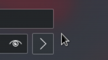
If I don't subtract 0.5 units.smallSpacing (two pixels), this happens:

(I don't know how or why but it's always two pixels taller than it's supposed to be)
After I subtract, the height's fine:

| lookandfeel/contents/lockscreen/MainBlock.qml | ||
|---|---|---|
| 97 | Perfect. | |
Comment Actions
Thank you so much this particular landing has been a long time coming :D
It's a little strange the way 602e5533d348 took inventory of the changes.... was it because of all the indentation?
But I've checked the tree and everything looks fine?