[Lock, Login, and Logout screen] Adjust visual feedback of action buttons
ClosedPublic

Authored by filipf on Mar 2 2019, 4:03 PM.

Details

Summary

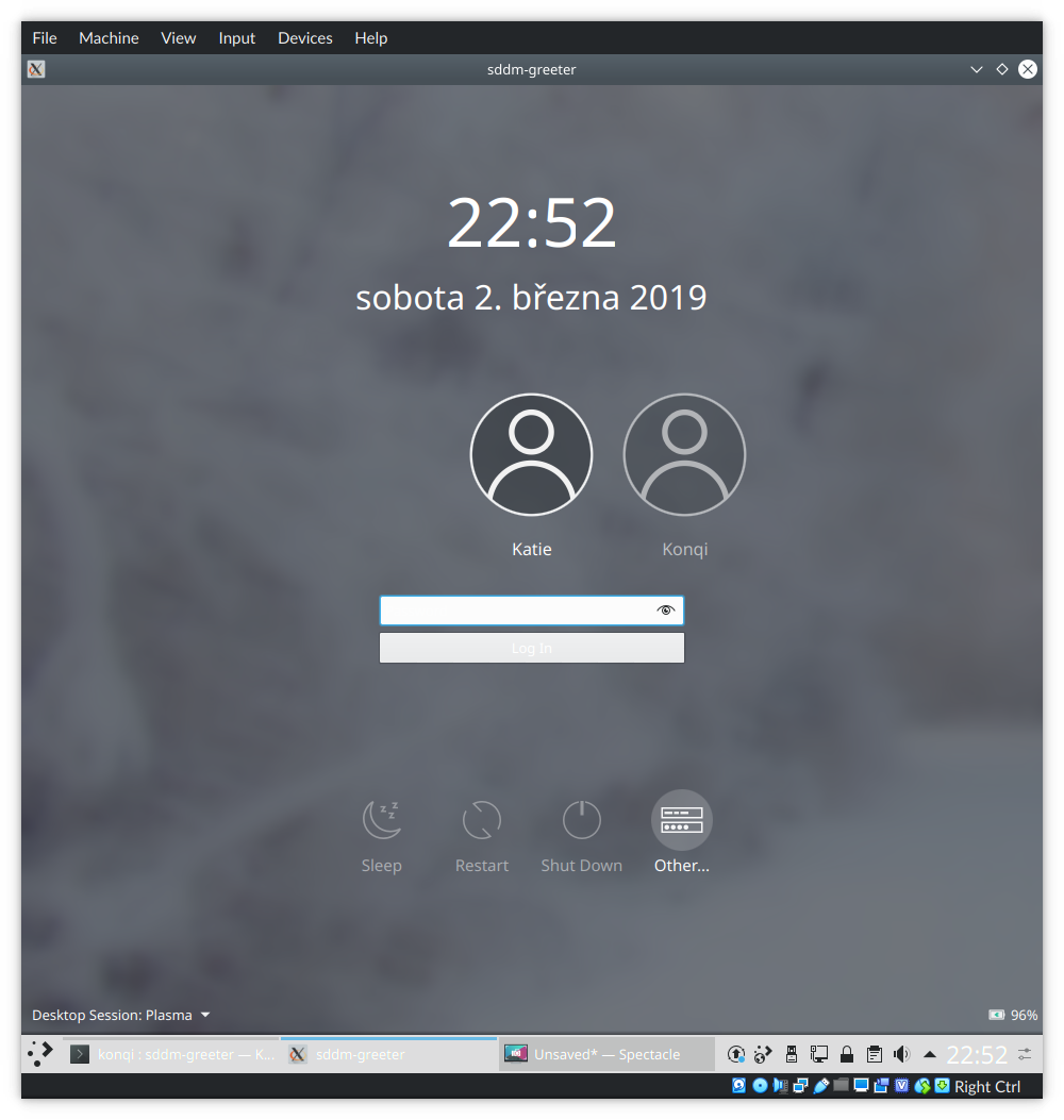
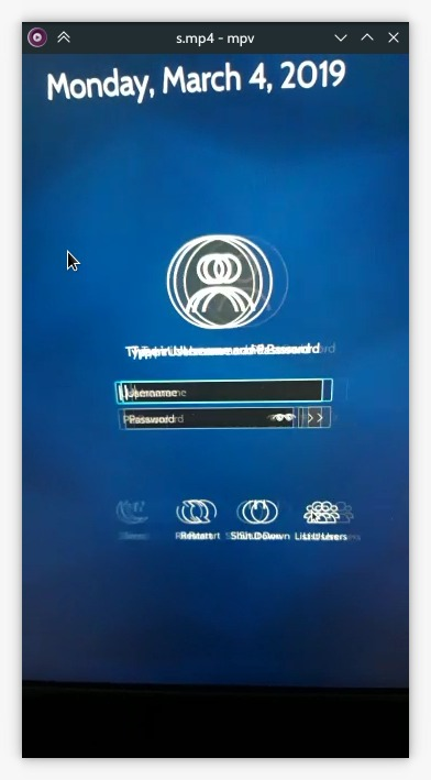
Unlike in the logout screen, our action buttons in the SDDM theme currently offer no visual feedback when interacted with. This patch adds a minimal yet effective amount of opacity shifting, as well as a transparent circle behind the button. The same circle is added to logout screen, where it remains always visible to better indicate the chosen option.

BUG: 393048

Test Plan

Logout:

Lock:

Login:

Diff Detail

Repository
R120 Plasma Workspace
Lint
Automatic diff as part of commit; lint not applicable.
Unit
Automatic diff as part of commit; unit tests not applicable.
There are a very large number of changes, so older changes are hidden. Show Older Changes
filipf requested review of this revision.Mar 2 2019, 4:03 PM
filipf edited the summary of this revision. (Show Details)Mar 2 2019, 4:04 PM
filipf edited the test plan for this revision. (Show Details)
filipf added reviewers: rooty, ngraham, VDG, Plasma.
rooty accepted this revision as: rooty.Mar 2 2019, 7:58 PM

Very elegant

This revision is now accepted and ready to land.Mar 2 2019, 7:58 PM

+1 conceptually. But there may be a more elegant way to do this...

Specifically, perhaps we should just migrate the opacity logic implemented in the the Logout screen's ActionButton subclass to the base item itself, and then remove the subclass. That way all ActionButton users would get the same hover behavior.

Also, if you implement the selected/hovered appearance cleverly enough, it would fix https://bugs.kde.org/show_bug.cgi?id=393048.

filipf added a comment.Mar 2 2019, 9:55 PM

Very interesting and tricky issue which we should try to solve.

Two differences between the logout screen and SDDM though: the former is darker. (unlike 5.15, in master it now fades to pitch black, bug?) That's why it allows for the opacity of unselected items to be 0.5. That would be too faint in SDDM.

But thinking outside the box, we could have other mechanisms. Embiggening though, I think would look tacky. That leaves background circles.

In the logout screen shouldn't do QML circles because it will interfere with other themes; at first glance seems messy to implement as well. I think it would be best if we made icons with background, but this time with a major difference: the background circle would take on textColor and could then be pretty faint.

Example of what that would look like, 0.2 opacity:

Then for SDDM we would try to match as much as possible.

filipf added a comment.EditedMar 2 2019, 10:06 PM

Okay so the logout screen is the bigger issue, I propose we make icons with the equivalent of:

color: PlasmaCore.ColorScope.textColor // because doing backgroundColor would add little to no contrast, unless we add a light border
opacity: 0.15 or 0.2

They would look like this. Light theme, text is white:


Dark theme, text is black:

Then add them to Logout.qml, making sure they can fallback on regular icons with other themes.

Finally we adjust SDDM's action buttons to get a QML circle equivalent (as close as possible) of those icons and behavior in the logout screen.

That sounds suspiciously like my approach in D16034 that we decided not to implement. :)

That sounds suspiciously like my approach in D16034 that we decided not to implement. :)

Yep, it's more or less the same, but the background color needs to be different so we can't use those icons.

As a draft, here's what we could do in SDDM to match the logout screen behavior:

filipf updated this revision to Diff 53026.Mar 2 2019, 10:50 PM

For now copy the OpacityAnimator from LogoutButton.qml

filipf updated this revision to Diff 53027.Mar 2 2019, 11:26 PM

Add circle with animation in preparation for changes in the logout screen

filipf retitled this revision from [SDDM theme] Add opacity on hover to action buttons to [SDDM theme] Add visual feedback when hovering over action buttons.Mar 2 2019, 11:28 PM
filipf edited the summary of this revision. (Show Details)
filipf edited the test plan for this revision. (Show Details)
rooty added a comment.Mar 3 2019, 3:23 AM

Actually this works on the logout screen too, at least on my setup:

On the logout screen, navigating using the arrow keys should move the background circle too.

But in general I think his is actually really great. It solves the problem perfectly and it looks good. On the downside, it doesn't particularly look like the other hover effect used for any other button, including the ones on the lock and login screens.

Thoughts?

filipf added a comment.Mar 3 2019, 5:28 PM

Changing this component would affect all 3 screens. The logout screen is trickier though due to key presses.

What if we did this?

Login screen

Lock screen

Logout screen

That's beautiful! I love it.

rooty added a comment.EditedMar 3 2019, 8:54 PM

This isn't bad (especially with a top margin) but I actually like the subtlety of not having the circles and having them pop up on hovering over them.

How about using this style for the logout screen and the opacity 0 then 0.15 for the sddm and lock screens?

This isn't bad (especially with a top margin) but I actually like the subtlety of not having the circles and having them pop up on hovering over them.

How about using this style for the logout screen and the opacity 0 then 0.15 for the sddm and lock screens?

I think there's some value to having the same UI in all three places. However that may just be the side of me talking that looooooves background circles! :-p Mmmmmm, such nice background circles...

rooty added a comment.EditedMar 3 2019, 10:15 PM

This isn't bad (especially with a top margin) but I actually like the subtlety of not having the circles and having them pop up on hovering over them.

How about using this style for the logout screen and the opacity 0 then 0.15 for the sddm and lock screens?

I think there's some value to having the same UI in all three places. However that may just be the side of me talking that looooooves background circles! :-p Mmmmmm, such nice background circles...

The circles are fine but I'd rather not include them in the SDDM theme - the circles appearing on hover is a very fancy effect. If they're there from the getgo the SDDM theme loses the element of surprise ("Wow I didn't know it could do that!").

As for the logout screen, I'd place the circles there because of poor visibility, not because I think they necessarily look better than circles appearing on hover. If we could avoid them and maintain visibility, I'd just as soon do that :D

filipf updated this revision to Diff 53088.Mar 3 2019, 10:36 PM
filipf edited the summary of this revision. (Show Details)

split SDDM & LockScreen circle opacity settings, override ActionButton.qml root
opacity, change label top margin in logout screen

filipf updated this revision to Diff 53089.Mar 3 2019, 10:41 PM

itemOpacity override is not needed after all

filipf retitled this revision from [SDDM theme] Add visual feedback when hovering over action buttons to [Lock, Login, and Logout screen] Adjust visual feedback of action buttons.Mar 3 2019, 10:42 PM
filipf edited the summary of this revision. (Show Details)
filipf edited the test plan for this revision. (Show Details)
rooty edited the test plan for this revision. (Show Details)Mar 3 2019, 10:46 PM
rooty edited the test plan for this revision. (Show Details)

@davidedmundson we have some considerable issues with text opacity failing when the logout screen is superimposed over a light background:

You mentioned something about sending in a Qt patch for this in the bug report. Could we use QtRendering to work around the issue until the patch lands?

rooty added a comment.Mar 4 2019, 1:22 AM

The animator causes a little bit of a problem (keep your eye on the Sleep button):

rooty added a comment.Mar 4 2019, 9:26 AM

If I use PropertyAnimation instead of OpacityAnimator, the opacity problem seems to go away. Can anyone confirm?

Could we use QtRendering to work around the issue until the patch lands?

Go for it. Add a comment why we're doing it

filipf added a comment.Mar 4 2019, 9:54 PM

Could we use QtRendering to work around the issue until the patch lands?

Go for it. Add a comment why we're doing it

Thanks! Done in D19510

As for this diff I now also find myself favoring circles appearing only on hover in the login and lock screens. While there is merit to consistency, I don't think the buttons there are of that great of an importance as in the logout screen. We also don't need to be solving any legibility issue.

filipf updated this revision to Diff 53321.Mar 6 2019, 9:56 PM

Circles in the logout screen are only visible if the option is selected or hovered over

filipf updated this revision to Diff 53322.Mar 6 2019, 9:58 PM

go back to using opacityanimator

filipf edited the test plan for this revision. (Show Details)Mar 6 2019, 10:10 PM
ngraham added inline comments.Mar 6 2019, 10:22 PM
lookandfeel/contents/logout/LogoutButton.qml
34

This comment doesn't seem accurate anymore.

filipf updated this revision to Diff 53325.Mar 6 2019, 10:58 PM

fix comment

filipf marked an inline comment as done.Mar 6 2019, 10:58 PM
ngraham accepted this revision.Mar 6 2019, 11:00 PM

This looks and feels great to me! A huge improvement IMO. And the code looks good.

I'd also like a pressed state for these buttons too, but since the lack of them is a pre-existing issue, we can do that in another patch. :)

rooty requested changes to this revision.Mar 7 2019, 2:15 AM

I really hate to be a bore but without the switch to PropertyAnimation that annoying bug (that you might not be able to notice but I am) keeps rearing its ugly head.

This revision now requires changes to proceed.Mar 7 2019, 2:15 AM
filipf updated this revision to Diff 53353.Mar 7 2019, 11:11 AM

replace OpacityAnimator with PropertyAnimation and explain why

filipf updated this revision to Diff 53354.Mar 7 2019, 11:13 AM

replace yet another OpacityAnimator with PropertyAnimation and explain why

rooty accepted this revision.Mar 7 2019, 11:13 AM

Perfect

This revision is now accepted and ready to land.Mar 7 2019, 11:13 AM
filipf updated this revision to Diff 53355.Mar 7 2019, 11:14 AM

fix comment: "intervals" -> "random intervals"

filipf updated this revision to Diff 53356.Mar 7 2019, 11:15 AM

Actually fix comment: "intervals" -> "random intervals"

Anyone from Plasma have an opinion on the code or functionality?

Visual indication on mouseover is generally a good thing ++

lookandfeel/contents/components/ActionButton.qml
44

I ran with:

opacity: activeFocus || containsMouse ? 1 : 0.85
    Behavior on opacity {
        OpacityAnimator { // OpacityAnimator makes it turn black at random intervals
            duration: units.longDuration * 2
            easing.type: Easing.InOutQuad
        }
}

on my system, worked fine. Can you give any more details on "randomly"

55

width/2

rooty added a comment.EditedMar 7 2019, 12:29 PM

Visual indication on mouseover is generally a good thing ++

It's this problem (keep your eye on Sleep)

It occurs with OpacityAnimator but not PropertyAnimation
"Sleep" and the other icons seem to lag (turn dark then white) as you hover over them with your mouse and/or switch screens between the user list and user prompt view, and all of this seems to occur randomly

rooty added a comment.EditedMar 7 2019, 12:43 PM

These screenshots might make this problem more appreciable.

OpacityAnimator:

(Sleep darker than the other buttons, certain other buttons become dark on hover then turn white, I can't explain why)

PropertyAnimation:

(Sleep has the same opacity and color as the other buttons - there are no circumstances under which the buttons turn dark, and any one button is just as bright as any of the other buttons)

filipf updated this revision to Diff 53360.Mar 7 2019, 1:46 PM

divide radius with 2

filipf marked an inline comment as done.Mar 7 2019, 1:47 PM
filipf added a comment.Mar 7 2019, 5:55 PM

These screenshots might make this problem more appreciable.

OpacityAnimator:

(Sleep darker than the other buttons, certain other buttons become dark on hover then turn white, I can't explain why)

PropertyAnimation:

(Sleep has the same opacity and color as the other buttons - there are no circumstances under which the buttons turn dark, and any one button is just as bright as any of the other buttons)

I can't spot this IRL (might depend on the screen). But when you pause it I do see that "Sleep" lags behind the other buttons when switching the screens and using OpacityAnimator.

ngraham accepted this revision.Mar 7 2019, 10:47 PM
This revision was automatically updated to reflect the committed changes.