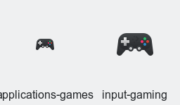
Before
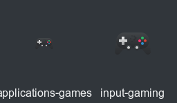
After

| No Linters Available |
| No Unit Test Coverage |
| Buildable 5880 | |
| Build 5898: arc lint + arc unit |
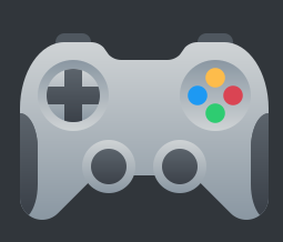
In general, color icons are the same in Breeze and Breeze Dark while monochrome icons change their primary color. I think the light and dark versions of this icon should be the same.
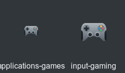
I think the overall design of this icon needs to be changed though. The proportions look odd to me. I think basing it on the F310 or F710 would be a good idea since it's already similar to those. Those controllers are a hybrid of the Xbox and DualShock controller designs.
Here's a rough draft of something similar to the Logitech F 710, but with colors that are more similar to the original gray DualShock controller:
100%
200%

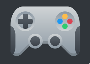
Maybe it is better to remove the dark sides? Only F710 has this design. Most controllers, including PS4 and XBox One, are pure white or black or other colors.

This is another example where a subtle outline could help visibility for dark themes, without having to resort to drawing a whole new version of it.
An outline would not look very subtle on this shape at this size. I think it needs to be redesigned anyway. As I said in a previous comment, the proportions look weird. It doesn't quite match the folder-games icons either.
We'll need something to make the handles look somewhat separate from the body. If we don't do that with side grips, maybe we can do that with gradients. I don't think we need to match the most commonly used controllers though since users will still know it's a game controller. I just used that look because I liked the contrast and symmetry.
It's looking good. I would say change the last tone to a tad lighter. The gray has too much black in it. I would probably move the hue to the yellow side.
@ndavis To be honest, I liked the shape and composition of the original icon better than your proposed new one. I'm not a huge fan of the flat sides and lack of visual distinction between the body and handles. +1 on removing the superfluous Plasma logo though.
That's much better! I think I would still prefer a bit more slope on the sides though. However at this point it's just aesthetic quibbling. :)
Better, but the dark parts of the dark version still disappear against a dark background. Most of the time we solve this with a transparent outline (we did this for the clock icon recently), and I think that could work well here too.
No, there are too many details and not enough room. It worked for the clock icon because a lot of clocks have a frame like that around them.
No room? Instead of widening the grips by one pixel to make room for the contrast border, how about building it in, effectively narrowing the grips by one pixel?
That's what I had in mind to begin with when you said to add a border. It just doesn't look right. There's no controller in existence that looks like that.

Hmm, I see what you mean. Okay, let's go with this one!
BTW, the duplicate test fails as of f2509047d4372f1a59d8f8b5ff009146f1a6adcb:
********* Start testing of DupeTest *********
Config: Using QtTest library 5.12.0, Qt 5.12.0 (x86_64-little_endian-lp64 shared (dynamic) release build; by GCC 7.3.0)
PASS   : DupeTest::initTestCase()
FAIL!  : DupeTest::test_duplicates()
  The following files are duplicates but not links:
    - /home/dev/kde/src/breeze-icons/icons/actions/22/go-up.svg
    - /home/dev/kde/src/breeze-icons/icons/actions/24/go-up.svg

   Loc: [/home/dev/kde/src/breeze-icons/autotests/testhelpers.h(42)]
FAIL!  : DupeTest::test_duplicates()
  The following files are duplicates but not links:
    - /home/dev/kde/src/breeze-icons/icons-dark/actions/22/go-up.svg
    - /home/dev/kde/src/breeze-icons/icons-dark/actions/24/go-up.svg

   Loc: [/home/dev/kde/src/breeze-icons/autotests/testhelpers.h(42)]
Do you think you could fix that after landing this?
Looks like I forgot to make the icon actually 24 px when I copied in the 22px version. I'll be sure to fix that.
I should probably also update the 64px device icons for gamepads to match this.
