User Details
- User Since
- Mar 24 2021, 9:49 PM (161 w, 2 d)
- Availability
- Available
May 16 2021
Oh alright, I thought that, using two colors, like the clock app depicted above, would appeal more without destroyed UX and usability. It would make apps look more "interesting" imo. Maybe I'm just saying all those because it happens in most other popular software.
May 15 2021
I'm kinda confused. You mean that, the sidebar and the files view (content) should share the same colour? Like in Discover? Wouldn't it help users to identify whether what they look at is a sidebar if it has a different colour (like eff0f1)?
May 14 2021
What about desktop-"focused" apps like dolphin? I think that those apps could look like dolphin: window content (large areas) should be lighter than sidebars and titlebars+toolbars, in breeze light. I haven't studied dark theme though to tell a lot.
May 6 2021
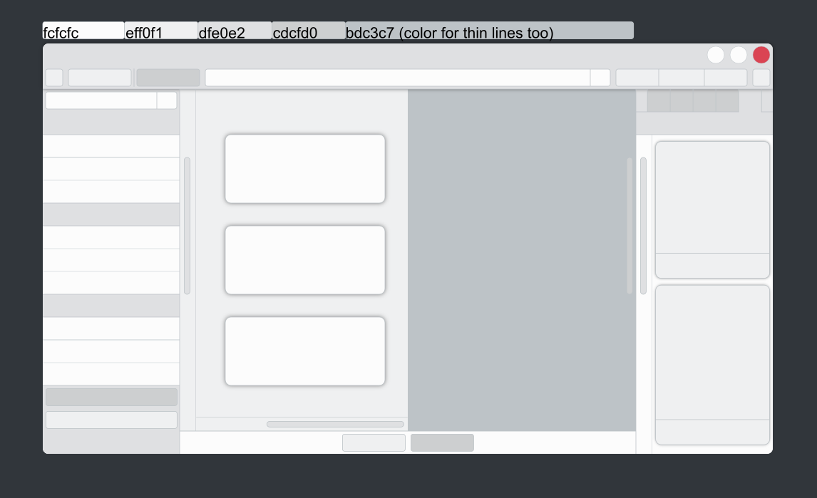
Made some mockups, showing the various colors, some KDE apps can include.
There are more to do, I know. But those are some of those widgets and decorations you can find around.

Apr 26 2021
Not exactly. It does for some, not all, but it can be "fixed" without code.
Apr 24 2021
Apr 1 2021
I think giving the lightest color to the widest areas seems technically the best: You got the darkest shade for titlebars, the middle one for sidebars and the rest (usually) will have the lightest color. (Talking about Breeze Light).
Do they really have to be made within LMMS and nothing else? There are few other open-source projects like Ardour and Zrythm (but the latter is still in development).
Mar 24 2021
Yes, I always wanted to see the other two action buttons have a blue circle... just darker colors...