Apply the KDE HIG, make the list headers and desktop file consistent.
| hein | |
| ngraham |
| KWin | |
| Plasma | |
| VDG |
Apply the KDE HIG, make the list headers and desktop file consistent.
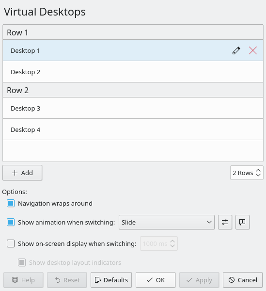
Open the Virtual Desktops KCM.
| Lint OK |
| No Unit Test Coverage |
| Buildable 14746 | |
| Build 14764: arc lint + arc unit |
Could we put the Rows spinbox on the other side of the list with whitespace between it and the plus button maybe? Otherwise I feel that by putting it right next to the plus button, we'd be creating a visual connection between the two that isn't accurate.