[InformationPanel] Use the new inline configuration mode
ClosedPublic

Authored by bruns on Apr 14 2019, 4:01 AM.

Details

Summary

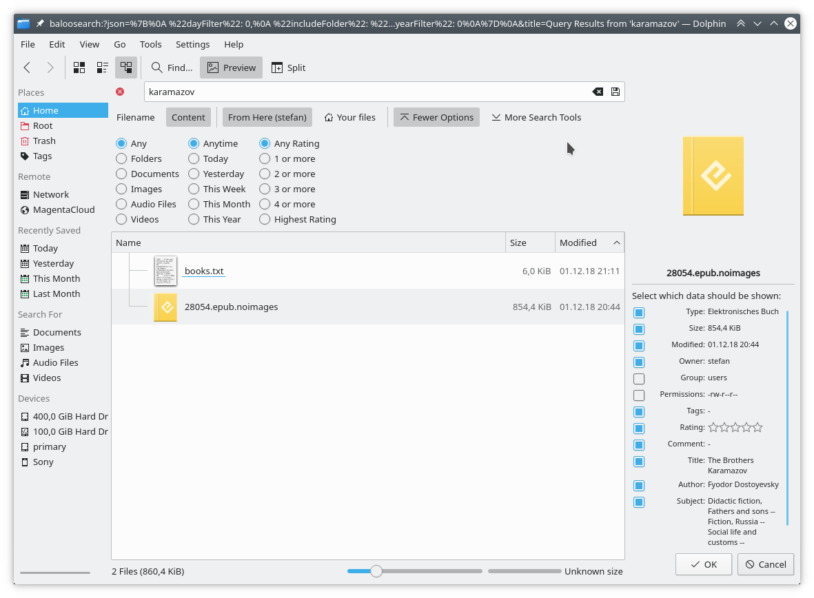
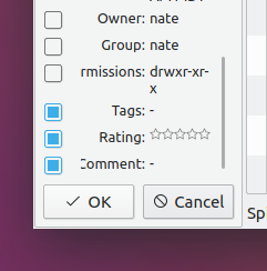
The current external configuration dialog has some issues:

  • its layout is suboptimal, as its initial size is typically to small
  • it is quite disassociated with the actual widget it configures, properties have a different order, and the property names can be quite abstract without the corresponding value.

Doing the visibility selection inline typically avoids the sizing problem,
as the containing application (dolphin) is often vertically maximized.
The selection becomes more obvious, as the item order is kept,
and the values are shown.

Depends on D20524

CCBUG: 389571

Diff Detail

Repository
R318 Dolphin
Lint
Automatic diff as part of commit; lint not applicable.
Unit
Automatic diff as part of commit; unit tests not applicable.
bruns created this revision.Apr 14 2019, 4:01 AM
Restricted Application added a project: Dolphin. · View Herald TranscriptApr 14 2019, 4:01 AM
Restricted Application added a subscriber: kfm-devel. · View Herald Transcript
bruns requested review of this revision.Apr 14 2019, 4:01 AM
bruns added a comment.Apr 14 2019, 4:02 AM

bruns updated this revision to Diff 56168.Apr 14 2019, 4:06 AM

remove obsolete include

bruns added a comment.EditedApr 14 2019, 4:12 AM

After selecting "Configure ..." from the context menu:

OldNew
meven added a subscriber: meven.EditedApr 14 2019, 9:07 AM

I like this change. This will make D19243 D19241 irrelevant and fix indirectly the bug 389571.

bruns edited the summary of this revision. (Show Details)Apr 14 2019, 1:49 PM
ngraham added a reviewer: VDG.Apr 14 2019, 2:12 PM

+1, this is a much nicer UI. Some of the text gets cut off horizontally though when the panel is narrow:

I imagine it would be even worse in German or with a Romance language. Maybe in edit mode, you can just show the properties and not their values as well?

bruns added a comment.Apr 14 2019, 2:20 PM

+1, this is a much nicer UI. Some of the text gets cut off horizontally though when the panel is narrow:

I imagine it would be even worse in German or with a Romance language. Maybe in edit mode, you can just show the properties and not their values as well?

This is probably a caused by the minimum width calculation now being off.

I think it is quite useful to have the values, especially for some more "obscure" properties. The user gets an immediate feedback if the property is the one she/he is interested in. Maybe just cutoff or ellide the value, and make sure the label is visible.

elvisangelaccio requested changes to this revision.Apr 14 2019, 8:45 PM
elvisangelaccio added a subscriber: elvisangelaccio.

Please bump the minimum required version for KF5BalooWidgets to 19.07.70.

src/panels/information/informationpanelcontent.cpp
121

Why this-> only on this line? (I'd just remove it as it's unnecessary)

127

Same here

229

Coding style: brace should go to next line (the function below is also wrong...)

This revision now requires changes to proceed.Apr 14 2019, 8:45 PM

About the UI, I noticed that when the panel is in "configure" mode, it's still possible to right-click it and click the "Configure" entry, which will do nothing.
We could fix this by disabling the entry once clicked. Another idea: make the entry checkable instead of using the buttonbox.

If we choose to go with the buttonbox, I'd rename the "Ok" button to "Save" or similar.

bruns updated this revision to Diff 56287.Apr 15 2019, 10:09 AM
bruns marked 3 inline comments as done.

bump baloo widgets version
cleanup

bruns added inline comments.Apr 15 2019, 10:09 AM
src/panels/information/informationpanelcontent.cpp
229

The glory of copy and paste ;-)

bruns added a comment.Apr 16 2019, 1:28 PM

+1, this is a much nicer UI. Some of the text gets cut off horizontally though when the panel is narrow:

I imagine it would be even worse in German or with a Romance language. Maybe in edit mode, you can just show the properties and not their values as well?

This is probably a caused by the minimum width calculation now being off.

I think it is quite useful to have the values, especially for some more "obscure" properties. The user gets an immediate feedback if the property is the one she/he is interested in. Maybe just cutoff or ellide the value, and make sure the label is visible.

This is actually not a regression caused by this change, although the change makes it somewhat more obvious.

Currently, the minimum width is essentially set by the preview above, which gives suffifient space for labels like "Permissions:". When you disable the preview, you can shrink down the information panel down to 60 px. The problem is somewhere in the widget stacking not respecting or setting a minimum width.

I think this problem should not be tackled here.

bruns updated this revision to Diff 56405.Apr 16 2019, 11:08 PM

disable configure action when in configuration mode

src/panels/information/informationpanelcontent.cpp
113–114

Why split the i18n sentence into two lines? It looks weird imho.

118

Coding style: missing space before/after |

122–124

These 3 lines could go in a dedicated function which we could call from both lambdas, to avoid code duplication. Or it could even be a private slot connected to QDialogButtonBox::clicked.

bruns updated this revision to Diff 56732.Apr 22 2019, 11:49 AM
bruns marked 3 inline comments as done.

coding style, rebase

bruns added inline comments.Apr 22 2019, 11:50 AM
src/panels/information/informationpanelcontent.cpp
122–124

I don't think an extra level of indirection makes the code easier to understand ...

elvisangelaccio accepted this revision.Apr 22 2019, 3:25 PM
This revision is now accepted and ready to land.Apr 22 2019, 3:25 PM
This revision was automatically updated to reflect the committed changes.