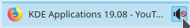
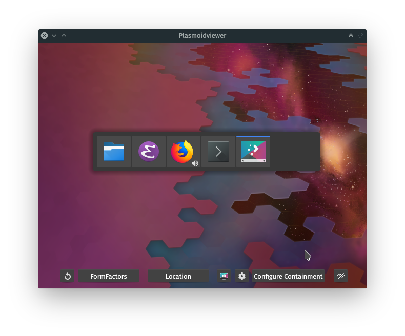
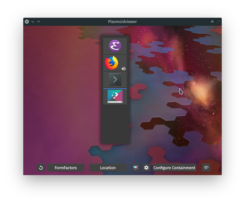
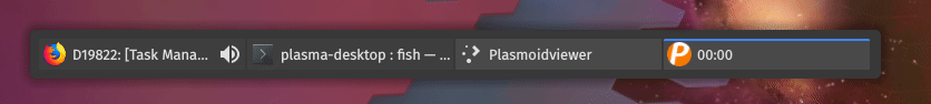
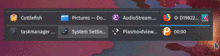
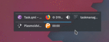
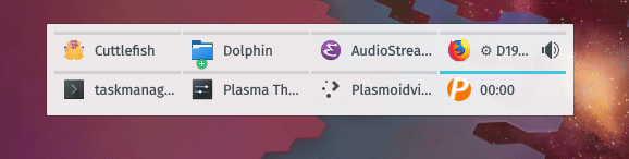
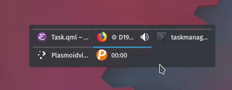
The task manager shows an indicator on tasks playing audio (when
enabled in the settings). This patch adds the ability to mute/unmute
an application playing audio by clicking on the audio indicator in
the task manager.
Details
Details
- Check "Mark applications that play audio" in the Task Manager Settings
- Open an application that plays audio
- Click on the audio indicator and it should toggle the mute state
Diff Detail
Diff Detail
- Repository
- R119 Plasma Desktop
- Branch
- arcpatch-D19822
- Lint
No Linters Available - Unit
No Unit Test Coverage - Build Status
Buildable 18401 Build 18419: arc lint + arc unit
There are a very large number of changes, so older changes are hidden. Show Older Changes
Comment Actions
I think this makes sense.
| applets/taskmanager/package/contents/ui/Task.qml | ||
|---|---|---|
| 505 ↗ | (On Diff #54077) | Don't need braces here |
Comment Actions
LGTM. @broulik?
Also, it would be nice if you also work on making the volume indicators smaller and always in the corner.
Comment Actions
I still think we should make it configurable. We'd want to be able to avoid situations with parents or a newbies going something like: "I was watching/listening to X and your darn Linux stopped playing sound!".
Comment Actions
Cool! I think the top-right corner would be more appropriate though, as long as there's no other badge there. Also, the volume indicator badge shouldn't expand the geometry of the item.
Since we're KDE, then sure, why not. :)
Comment Actions
- [Task Manager] Make mute/unmute behaviour configurable
I added the possibility to enable/disable this behaviour in the
plasmoid configuration. I added it to the 'Appearance' section even
though it's a behaviour. Could you suggest a better wording for the
text and for variables names?
Comment Actions
- [Task Manager] Enable ability to mute tasks by default
- [Task Manager] Change wording in config ui
Comment Actions
I'm not a fan of the checkbox, I think it's a little gratuitous. If you add a small feature and need to immediately add a checkbox to disable it, it's rather a red flag to me. It means either the feature or the checkbox should probably go. Firefox gets away without the option BTW.
Comment Actions
This is a specious argument. It's like the single click vs double click debate. Either the single clicking goes or the option to disable it does - neither a particularly delightful option. Keep both and you get to avoid this pitfall.
In essence, I believe that whether or not you can disable this feature should have no bearing on whether it should be included. And as far as dropping the option to disable it goes, why? It just detracts from more versatility.
I like this change I'd just prefer it if you could post screenshots in the test plan section?
Comment Actions
I don't see a correlation between the quality of a feature and having a checkbox in this case. The feature is useful. As for the checkbox, I think it's only a matter of are we going to add it now or after someone opens up a bug report.
Chrome BTW even totally nuked the flag: https://www.reddit.com/r/chrome/comments/9hi48g/the_ability_to_mute_a_tab_that_is_currently/e6clssr/
But we can do better than Firefox and Chrome.
Comment Actions
This is a specious argument.
No, it's not. Trivial options have a lot of cost attached to them: They make a UI noisier and more intimidating, and therefore less appealing. They also make it less effective by making it harder to find what you're looking for, as you have to scan through more options. They also introduce additional codepath and states, increasing the maintenance burden and complicating user support ("is your configuration X or Y?").
Moreoever, adding options like this is almost always lazy and unloading a burden on the user instead of designing a UI that does the right thing and doesn't need the option.
Options have to be earned.
My take is this:
- If the danger of users clicking the indicator accidentally and getting upset by it is high, this is a bad feature and shouldn't go in.
- If the danger isn't actually that high, there's no need for an option.
A possible improvement to make here is to make the indicator visually react to hover by recoloring the icon, to teach that it's seperately interactive and will do something different than clicking elsewhere on the task button, so users get habituated not to click it accidentally. This should probably be done anyway (we're usally pretty triggerhappy on the hover feedback).
As for the checkbox, I think it's only a matter of are we going to add it now or after someone opens up a bug report.
No, if that bug report comes and comes repeatedly, we know it's a bad feature and drop it again.
Chrome BTW even totally nuked the flag: https://www.reddit.com/r/chrome/comments/9hi48g/the_ability_to_mute_a_tab_that_is_currently/e6clssr/
According to the linked discussion, Chrome is nuking the entire feature - it's not about the indicator being clickable. And they're doing it for unrelated reasons that are mostly strategic to the web platform and don't concern us here.
Comment Actions
No, it's not.
Yeah it is :D
Trivial options have a lot of cost attached to them: They make a UI noisier and more intimidating, and therefore less appealing. They also make it less effective by making it harder to find what you're looking for, as you have to scan through more options. They also introduce additional codepath and states, increasing the maintenance burden and complicating user support ("is your configuration X or Y?").
And that's why :D Your argument hinges on the idea that something trivial makes the UI cluttered (and also imposes a maintenance burden). I think that's too broad/dogmatic and can be true but it really doesn't have to be the case. The task manager settings aren't really laden with settings so this would hardly be an imposition.
Plasma's incredibly tweakable. I like to think that's one of the reasons people like it so much.
But if you're gonna force the issue, I'd much rather keep the feature and remove the option to disable it.
Moreoever, adding options like this is almost always lazy and unloading a burden on the user instead of designing a UI that does the right thing and doesn't need the option.
Options have to be earned.
Lazy? No.
A UI that wouldn't require you to pick an option might be a better choice.
A UI that wouldn't require you to pick an option but would still allow you to do so might be the best choice.
My take is this:
- If the danger of users clicking the indicator accidentally and getting upset by it is high, this is a bad feature and shouldn't go in.
Agreed.
- If the danger isn't actually that high, there's no need for an option.
Agree to disagree.
A possible improvement to make here is to make the indicator visually react to hover by recoloring the icon, to teach that it's seperately interactive and will do something different than clicking elsewhere on the task button, so users get habituated not to click it accidentally. This should probably be done anyway (we're usally pretty triggerhappy on the hover feedback).
This would be nice to have, I agree. This might also be a good thing to implement in Latte, @mvourlakos thoughts?
No, if that bug report comes and comes repeatedly, we know it's a bad feature and drop it again.
While a potential consideration, it's not certain that the feature should be removed in case this happens. It would be silly for us to, say, stop shipping the notification widget just because there we get bug reports about glitchy placement, for example.
According to the linked discussion, Chrome is nuking the entire feature - it's not about the indicator being clickable. And they're doing it for unrelated reasons that are mostly strategic to the web platform and don't concern us here.
They GNOME'd it. :D
Comment Actions
I made the suggestion to have an option not because there might be something wrong with the feature, but because there is a subset of users who have a harder time finding their way around the UI - the non-tech say people and/or (now that I think of it) perhaps those with impaired vision who might not register the changed icon.
We could work around not having an option by spawning a notification "Audio in %application has been muted. Click on the audio icon again to re-enable it". But then you'd probably want to have an option to remove the notification...
As for options overload, based on the reasoning above and the fact that we've recently split up the options and that we have space, I don't agree that this should be approached through the prism of UI clutter.
The Chrome example was more to show that users want this sort of a feature. Which is why I don't think:
No, if that bug report comes and comes repeatedly, we know it's a bad feature and drop it again.
would be the right approach. Also, generalizing this position and applying it to some existing cases would probably be troublesome.
The suggestion about the hover effect though is a nice one +1
Comment Actions
The suggestion about the hover effect though is a nice one +1
I wonder if we should make it turn gray when hovering over the option and stay gray while muted, or just turn gray and then once you move your cursor away it gets its color back regardless of whether muted or not.
Comment Actions
+1 for refining the visuals to make it clear when a click will activate the Task vs mute/unmute its audio streams. Also now that I think of it, it would be nice if the "playing audio" icon itself changed to reflect the current status.
I'll stay out of the to-option-or-not-to-option debate for now. I just want this on by default, regardless of whether or not it has an option attached to it. :)
Comment Actions

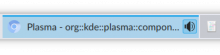
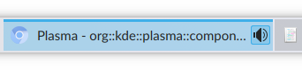
I added a screen recording to the test plan.
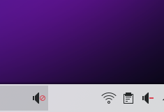
The icon already shows the current status:
Comment Actions
Well... sort of. :) What I meant (and should have clearly stated the first time) was that it should use the audio-volume-muted icon when muted, rather than just becoming semi-transparent.
Comment Actions
Test plan looks like some other icon theme, this is what I get with Breeze:
Interestingly enough, with Kirigami.Icon I get this:

Comment Actions
Would something like this work?
We would need to port the PlasmaCore.IconItem to Kirigami.Icon to support the color property.
Comment Actions
It's my job as the author and maintainer of the Task Manager to determine when it is the case, based on experience and a broader perspective beyond an individual change request. In projects where maintenance is lacking you will notice a trend towards options sprawl for that reason.
The suggestion wrt/ hover feedback that you all seem to like comes from asking "what's the actual problem, and is an option the best way to address it?". See why the mental habit is useful?
"Plasma does the right thing without needing to be tweaked in the first place" is a more lofty and mature aspiration than "Plasma is infinitely tweakable".
"We had so many options we went from one page to two pages, so now we can add more options!" :-)
Comment Actions
"We had so many options we went from one page to two pages, so now we can add more options!" :-)
Yeah but they're good options, great options, the best of options!
Just kidding, let's work on making this feature a bit more dummy-proof then.
Here's the code I have for color:
- I removed edits in Task.qml
- and in AudioStream.qml I did:
`
Kirigami.Icon { // replaces IconItem at line 106; need to import Kirigami as well
    id: audioStreamIcon
    anchors.fill: parent
    color: mouseArea.containsMouse? theme.negativeTextColor : theme.textColor
}

MouseArea {
    id: mouseArea
    anchors.fill: parent
    hoverEnabled: true
    enabled: parent.shown
    onClicked: toggleMuted()
}
`
Comment Actions
In projects where maintenance is lacking you will notice a trend towards options sprawl for that reason.
That doesn't make sense. It might mean there's a lack of direction but not necessarily a lack of maintenance. Whether expansion leads to "option sprawl" really is a matter of opinion.
The suggestion wrt/ hover feedback that you all seem to like comes from asking "what's the actual problem, and is an option the best way to address it?". See why the mental habit is useful?
That is a leading question (and a strawman fallacy) based on the supposition that there is a problem. It may be and most often is a matter of preference.
"Plasma does the right thing without needing to be tweaked in the first place" is a more lofty and mature aspiration than "Plasma is infinitely tweakable".
Plasma being infinitely tweakable doesn't entail its not doing "the right thing" in the first place. Versatility doesn't mean indecisiveness.
"We had so many options we went from one page to two pages, so now we can add more options!" :-)
Just use the one page then and claim there's no more room for more features :-)
I'm not going to sign on as a reviewer here and I'm going to leave it up to you guys. But I don't think that anxiety over whether or not the settings window is going to balloon up is a good reason not to do this. I'll say again, I'd rather give up the option to turn it off than give up the feature itself.
Comment Actions
Hey guys,
I propose that we shelve the discussion about making this optional since it seems like we all agree that it should be on by default. In my experience, focusing on the points of disagreement makes it likely that nothing gets landed, and relationships get damaged in the process. Once we've got the feature polished up, endowed with a solid user interface, and in production, maybe at that point we can evaluate from a position of having more information whether we really need an option for it.
Thanks!
Comment Actions
rooty, your behavior in this thread has been extremely aggressive, disrespectful and uncollaborative. I'd like to ask you to stop at this point and not participate futher, as well as in any future threads related to the Task Manager applets.
Back to work: For this patch to proceed further, please remove the setting.
For the hover feedback, I'd like to get @mart's opinion on Kirigami.Icon vs. whether we should look into making PlasmaComponents fitter in this regard.
Comment Actions
- Revert "[Task Manager] Make mute/unmute behaviour configurable"
I removed the configuration option.
Comment Actions
If you want to recolor it dramatically indeed you would have to use kirigami.Icon (or add the same feature to iconitem, which is also fine)
you would need to recolor both states, normal and hover, otherwise the normal state may be recolored the wrong color (in cases when the plasma theme doesn't follow system palette)
alternatively to use the standard mouseover effect, it can use the builtin highlight effect in iconitem made with kiconeffect (maybe if is too light, the default highlight effect in kiconeffects has to be reconsidered?)
weight-wise, kirigami.icon should be slightly ligher (eh, not too much :p) than iconitem and would like in the future (kf6?) to just have that one instead of the duplication plasmacore.iconitem and kirigami.icon
Comment Actions
i quite like it in firefox, i do see other people mistakenly clicking on the speaker icon instead of the tab and getting confused tough
Comment Actions
I'd say let's go with Kirigami.Icon for now then, and recolor the icon to the highlight color on hover. @faridb could you take a stab at that? :)
Comment Actions
one important thing, it should be an icon ending with -symbolic, as otherwise coloring would destroy badly e.g. an oxygen icon.
(i'm not sure breeze has symbolic icons for the speakers?)
it should be Kirigami.Icon {
isMark: true
icon.name: ...
icon.color: hover condition ? theme.highlightColor : theme.textColor
}
Comment Actions
Highlight color is nice, but in my tests I really like having red for the muting because it gets the point across that a disabling action will be triggered. Therefore the code I have now is:
color: mouseArea.containsMouse? (task.muted? theme.highlightColor : theme.negativeTextColor) : theme.textColor
Which then ends up looking like:
However there is an inconsistency issue the Kirigami icon brings about (@mart perhaps you might know why?). It picks up a different muted icon (code points it to the same icon) than IconItem which results in an inconsistency with the media applet muted icon:
BTW I'm getting no interference of the color property with Oxygen icons, there is no coloring applied to them.
Comment Actions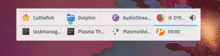
The highlight effect provided by PlasmaCore.IconItem is only visible when used with dark or colourful icons:

I also tried reducing the opacity of the icon, which results in the following effect:
Comment Actions
About the icon issue, IconItem by default uses the icon theme overlay from the Plasma theme, Kirigami.Icon will use the regular Plasma icons. That's kind of tricky - with Breeze we could totally make them match, but other Plasma themes would have issues.
A long time ago I suggested that the overlay shouldn't be put into IconItem in this way, and instead it should be something like IconItem { source: OverlayIcon {} } to factor out the overlay stuff and keep IconItem generic. I wish we had that now, then it'd just work with Kirigami.Icon.
Comment Actions
Hmm, while the red highlight effect is pretty and distinctive, typically we don't telegraph what will happen when clicked using an item's hover effect. Though it's more boring and conventional, I would recommend using the typical effect. :)
Comment Actions
There was something bothering me about the effect, and now that you mention it this is actually it - it's unconventional, feels a bit out of place.
The built-in highlight effect looks really good with dark and colorful icons. What happens when you combine it with this opacity approach, how does the opacity shift look like when the icon is dark?
Comment Actions
Just throwing out another possible solution: the PlasmaComponents Highlight thingy:

Might be considered too obtrusive though.
EDIT: not a good idea "2.0 to be used only as the "highlight" property of the ListView and GridView primitive QML components (or their derivates)"
Comment Actions
Then just use the FrameSvgItem directly:
PlasmaCore.FrameSvgItem {
    imagePath: "widgets/viewitem"
    prefix: "hover"
}Comment Actions
This patch doesn't apply anymore. I think something went wrong with adding that last change.
Comment Actions
Approach is fine, but please move the MouseArea into the audioStreamIconLoader's source component so it's not always instantiated even when it's not needed. :)