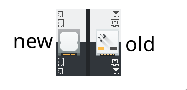
The old 16 and 22 px drive-harddisk icons didn't look like hard drives. The new design for 16, 22 and 64 px is easier to resize and adapt. Symbols can be added to the light area on top of the 64px icon to show different types of drives (e.g., a globe for iSCSI). Also, not many people use IDE drives anymore, which the old 64px icon represents. People are more likely to recognize a SATA interface.
Details
Details
- Reviewers
ngraham pstefan - Group Reviewers
VDG - Maniphest Tasks
- T9740: Improve disk presentation in the Places panel
- Commits
- R266:3f7ca1b59557: Change drive-harddisk to more adaptable style
Diff Detail
Diff Detail
- Repository
- R266 Breeze Icons
- Lint
Automatic diff as part of commit; lint not applicable. - Unit
Automatic diff as part of commit; unit tests not applicable.
Comment Actions
I only added 16, 22 and 64 px icons in the current revision, but I also have a 32px version. Is there a reason that there are only 16, 22 and 64 px versions for all device icons?
The 64 px version already scales down to 50% size quite well, but the 32px version might be useful to people making icons for alternative harddrive types.
Comment Actions
I think "64 px version already scales down to 50% size quite well" is the reason to omit these icons. 16/22 have to be specifically designed to be recognizable, but omitting 32 avoids wasting disk space and avoids the potential problem of differing design for 32/64/128.
Comment Actions
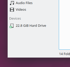
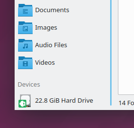
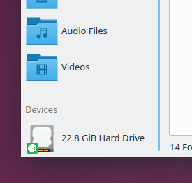
Wow, this is amazingly better. Here's how it looks in the Places Panel at various sizes:
Small (default):

Medium:
Large:
Huge:
Comment Actions
In the monochrome icons (size 16px and 22px) you forgot to add the stylesheet. Without it, the monochrome icons won't be able to adapt to a changing color scheme.
You will have to run the scripts "apply-stylesheet.sh" and "currentColorFillFix.sh" –from here– with your files as arguments. You will need the program "xmlstarlet" as dependency.
Or, if these scripts do not work correctly, you'll have to do it by hand. I will take icons-dark/devices/16/drive-harddisk.svg as an example.
You'd need to copy line 2-9 from the old file to the new file. You would also need to change the fill to "fill:currentColor", and then add the "class="ColorScheme-Text" ". But if you are lucky the script will work and you won't need to do a thing :)
PS somewhere there's a script that changes the color of your monochrome automagically to the dark variant. So you don't have to do it by hand.
Comment Actions
Ouch, I was not aware of this. All of the other monochrome icons I made that have been committed to master probably lack this as as well. It would be nice to have all the required info for making icons on a wiki somewhere. The icon HIG doesn't say anything about this.
Comment Actions
Sounds like we should document it there. Wanna submit a patch? The repo is git://anongit.kde.org/websites/hig-kde-org.git :)
Feel free to also submit a patch to do this for the other icons you've recently made.
Comment Actions
I would, but I feel like there may be other things I don't know and I don't want to be a blind man leading the blind. Right now, what I know is "copy this code into the file" because the scripts didn't work. Why? Because it somehow improves compatibility with the system colors. It's not only an unsatisfying answer, it seems like an inelegant solution as well.
Comment Actions
Makes sense. @pstefan, could you take charge on that since you seem to have some knowledge about this process that the rest of us lack?
Comment Actions
Hard drives typically have this swivel elevated section that this tries to simulate.
For a lack of a better picture: https://de.wikipedia.org/wiki/Datei:Damaged_Hard_disk_drive_for_data_protection_.JPG see the elevated sections on the top case?
Comment Actions
Two examples, a good matching one and a slighly different:
https://gzhls.at/i/75/63/757563-n0.jpg
https://gzhls.at/i/82/31/1508231-n1.jpg
Comment Actions
Thanks again for this lovely icon, @ndavis. Next up, we need a variant of it that communicates "I'm the OS/root volume!" See https://bugs.kde.org/show_bug.cgi?id=399307
This supports one of the next open tasks for T8349: Improve Places panel usability and presentation that is a prerequisite for D15739: [Places panel] Don't show Root by default.
Thanks!