Improve disk presentation in the Places panel
Closed, ResolvedPublic

Description

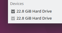
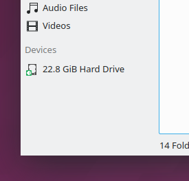
Right now disks do not have the strongest visual presentation in the Places panel:

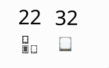
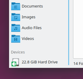
One quarter of the icon is covered with a green emblem that shows it's mounted. Taken together, the overall effect is muddy and visually indistinct. It's really hard to tell what it's supposed to be communicating to you. The situation is a little better if the icon is larger, but not by much:

I think there are two problems here:

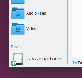
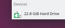
First of all, the use of emblems on top of the icon to connote mounted status results in 1/4 of the icon being obscured. And at the default small size, the emblem's icon is indistinguishable; only its color stands out. We could probably indicate status with different icons rather than emblems on top of one icon, which would solve this problem. Or alternatively, we could use smaller colored dots as the emblems and forget about sticking an icon inside of them. Or only show the full size version at a large size, and fall back to a small colored dot for 22px and smaller.

Second, the drive-harddisk icon itself could stand to be improved. Particularly at the small sizes, it doesn't look anything like a disk. I see an old-fashioned CRT monitor when I try to figure out what it is. Also, the Plasma logo adds visual noise and doesn't really make sense to have on there because there's no connection between Plasma (a piece of software) and a hard disk.

I think a better icon could help a lot here, especially if it's less visually busy and sticks to the basics of communicating, "hey, I'm a disk!" For reference, here's the icon used in macOS Finder, which has a very similar Places Panel to our own also also uses monochrome icons:

Thoughts?

ngraham updated the task description. (Show Details)Sep 25 2018, 4:36 AM

I would also suggest do just color the icon, maybe in green when its mounted ? But would only work for symbolic isons.
There is also a bug report to show an eject symbol right next to mounted disks, maybe if we could achieve this, it would make this icon changes obsolete ?

How about dimming the icon for unmounted/ejected drives?

ngraham added a comment.EditedSep 25 2018, 5:07 PM

@svenmauch I like the idea of dimming unmounted disks.

There is also a bug report to show an eject symbol right next to mounted disks, maybe if we could achieve this, it would make this icon changes obsolete ?

You're talking about https://bugs.kde.org/show_bug.cgi?id=154499. If I understand you, you're saying that the visibility of the eject symbol might be enough to communicate whether or not the disk is mounted?

Exactly this one as it is also on the T8349 list.
+1 also for the idea with dimming, looks quite nice.

Please consider Dolphin changes in concert with the Plasma Device Notifier to minimize inconsistency. In plasmashell 5.13.4 on Fedora 29 beta after mounting a USB flash it has the same obscure green emblem but offset, a different more colorful icon with a weird extra blue bit on the bottom, a blue "progress bar" indicating used disk space (which I thought Dolphin Places panel displays for the selected disk then I realized that's the horizontal scrollbar 😄), and an eject symbol. I like the idea of dimming an unmounted drive but leaving the mount symbol (an inverted eject in the Plasma Device Notifier with a nice tooltip) active. If you added the used space bar and mount/unmount icons underneath the disk name then the disk icons could be larger which has pros and cons.

(I'm not a developer, sorry if this is inappropriate here, thanks for all you do!)

Here are some ideas I came up with for new 22 and 32 px drive-harddisk icons. It's currently lacking in visual features, but the overall design can be more easily adapted to different sizes and symbols can easily be added to the light area of the 32px icon to let us make new icons. For instance, we could add a globe on top of the 32px icon for an iSCSI drive.

That's a big improvement, @ndavis! I like the bottom-right version of the 22px icon the best.

I've turned the 32px icon into a 64px icon and it actually scales quite well down to 50% size

Here is a 16px version.

ndavis added a comment.EditedSep 29 2018, 11:05 AM

Does anyone have any ideas for what I could put on the color icon to make it feel less empty?

I feel like it doesn't need anything right now, but I like your idea of conditionally adding stuff to it based on the type of disk it is. For example:

  • Generic internal disk (the base image; what you have right now)
  • Disk that is the current root partition (put some technical or system-looking symbol on the empty space in the center)
  • Disk that is external and removable (maybe looks like an external hard drive enclosure?)
  • etc

Either way, feel free to submit what you've currently got as a replacement for the existing drive-harddisk icon. I think it's a huge improvement.

I really appreciate your icon work, @ndavid. It's really awesome stuff. You're helping us move the Breeze icon theme to a new, more mature stage of its life.

bruns added a subscriber: bruns.Sep 30 2018, 2:25 AM

Does anyone have any ideas for what I could put on the color icon to make it feel less empty?

a "K" vendor logo? Or just a circle for the hub/motor. Preferably in a light color, to add some structure, but not to disturbing.

Anyway, looks much better than the current one.

In T9740#162112, @bruns wrote:

Or just a circle for the hub/motor. Preferably in a light color, to add some structure, but not too disturbing.

+1, that could work.

ngraham added a comment.EditedSep 30 2018, 5:22 PM

Looking at D15853 (thanks for the awesome new icon, @ndavis), I notice that the mounted/unmounted emblem is only really a problem when using the Small or Large size, where it takes up a full quarter of the space. It's pretty reasonably sized with Medium or Huge:

Small (default):

Medium:

Large:

Huge:

We should adjust the size calculation so that it never takes up 25% of the area of the base icon. Code is in dolphin/src/kitemviews/kstandarditemlistwidget.cpp::updatePixmapCache()

Never mind, the fix was in KIConLoader::drawOverlays(). Here's a patch: D15866

Here's an idea: we don't even show the "Mounted" emblem in the places panel at all, just the "Unmounted" emblem when the disk isn't mounted.

Also, an idea for making the root disk stick out: if it's available, we use the OS's own logo instead of the disk icon. It's available in the LogoPath key in /etc/xdg/kcm-about-distrorc. If no suitable image is available, we fall back to the Plasma logo, or else a new icon drive-harddisk-root that's equivalent to the current icon with some symbol on it.

Thoughts?

Here's an idea: we don't even show the "Mounted" emblem in the places panel at all, just the "Unmounted" emblem when the disk isn't mounted.

This makes the most sense to me and would look much cleaner. Add emblems to unusual or non-standard modes. I'll go out on a limb here and say mounted is the standard that doesn't need an emblem. I'd prefer this over dimming.

Also, an idea for making the root disk stick out: if it's available, we use the OS's own logo instead of the disk icon. It's available in the LogoPath key in /etc/xdg/kcm-about-distrorc. If no suitable image is available, we fall back to the Plasma logo, or else a new icon drive-harddisk-root that's equivalent to the current icon with some symbol on it.

Thoughts?

OS logos could open up some pitfalls like dark theme support, bright colors grabbing attention, etc. I'd go with the new icon and add a slight distinction to it. Maybe a slash symbol in the middle?

Here's an idea: we don't even show the "Mounted" emblem in the places panel at all, just the "Unmounted" emblem when the disk isn't mounted.

This makes the most sense to me and would look much cleaner. Add emblems to unusual or non-standard modes. I'll go out on a limb here and say mounted is the standard that doesn't need an emblem. I'd prefer this over dimming.

I rather agree. The emblem should alert you to an unusual state, not the common or expected one. For the same reason, we badge folders that are read-only or write-only, but not folders that are read-write as you would expect. This is a fairly trivial code change and I will submit a patch.

OS logos could open up some pitfalls like dark theme support, bright colors grabbing attention, etc. I'd go with the new icon and add a slight distinction to it. Maybe a slash symbol in the middle?

That would certainly be the easiest path forward. I have a diff for Solid that displays a different icon for the disk mounted at / (thanks for your help with this, @bruns!). Of course, we would need an icon first. For that, I've filed https://bugs.kde.org/show_bug.cgi?id=399307. @ndavis, would you like to take a crack at that?

I've submitted a new HIG page for emblems. It clarifies that only unusual, uncommon, or non-default statuses should be indicated.

D15897: Add new page on Emblems