RFC: Use full-sized highlight
Changes PlannedPublic

Authored by broulik on Sep 17 2018, 2:52 PM.

Details

Reviewers
elvisangelaccio
fvogt
ngraham
Group Reviewers
Dolphin
VDG
Summary

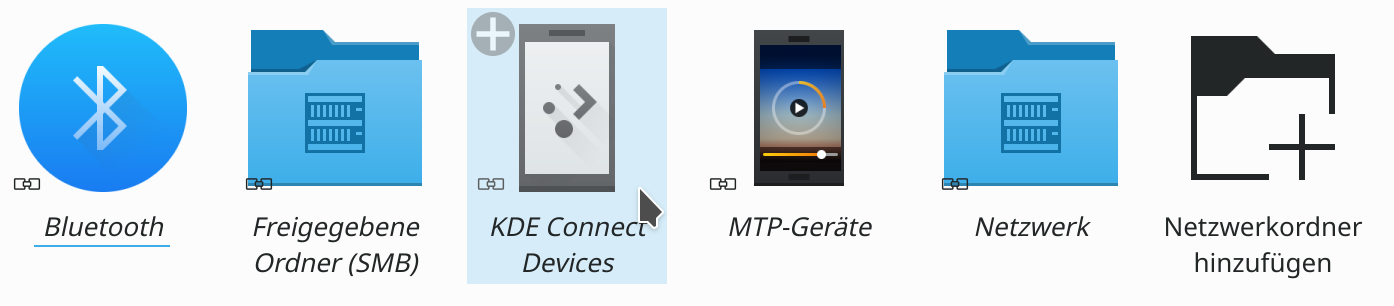
This uses the same full-sized highlight as used in list view and details view as well as by the file dialog and similarly by Folder View.
The decision to only highlight the label and then custom-tint the icon has been controversial from the beginning and has been carried over from the Oxygen days.
I think after more than five years of being like this, we should re-evaluate whether this is still the look we desire.

BUG: 309722
FIXED-IN: 18.12.0

Test Plan

Oxygen

Diff Detail

Repository
R318 Dolphin
Lint
Lint Skipped
Unit
Unit Tests Skipped
broulik created this revision.Sep 17 2018, 2:52 PM
Restricted Application added a project: Dolphin. · View Herald TranscriptSep 17 2018, 2:52 PM
Restricted Application added a subscriber: kfm-devel. · View Herald Transcript
broulik requested review of this revision.Sep 17 2018, 2:52 PM

+1 because this makes Dolphin's Icon View visually consistent with the file open/save dialogs, and at least conceptually consistent with Folder View, which also uses a full-sized highlight (even though it looks different there).

It might be nice to round the corners a bit, if that's not too hard--and then make the same change for the open/save dialogs too.

abetts added a subscriber: abetts.Sep 17 2018, 3:36 PM

What to we think of a split highlight? Something like a rounded square for the icon and a rounded square for the labels?

broulik edited the test plan for this revision. (Show Details)Sep 17 2018, 3:37 PM

It might be nice to round the corners a bit, if that's not too hard--and then make the same change for the open/save dialogs too.

That's governed by the widget style. Breeze uses square corners, Oxygen, for instance uses round ones, so doing that should be easy, and will affect all places, so any change there must be done carefully.

I would not do a heavy rounding, just take maybe 3 or 5 pixels max from the corner to round them

It might be nice to round the corners a bit, if that's not too hard--and then make the same change for the open/save dialogs too.

That's governed by the widget style. Breeze uses square corners, Oxygen, for instance uses round ones, so doing that should be easy, and will affect all places, so any change there must be done carefully.

In that case, Folder View is inconsistent because it uses rounded corners...

In that case, Folder View is inconsistent because it uses rounded corners...

Folder View uses the Plasma theme and Breeze Plasma theme has always used rounded highlight, in Kickoff and elsewhere.

ngraham accepted this revision as: VDG.Sep 17 2018, 4:07 PM

Technically that is correct--Breeze widget theme vs Breeze Plasma theme. But from a user perspective, it's a needless inconsistency. The fact that Folder view is a Plasma widget rather than an extension of Dolphin is an implementation detail lost on people who aren't power users or developers. And even for someone who understands the distinction, they might (not unreasonably) think, Why should the Breeze widget theme look different from the Breeze Plasma theme? Aren't they both Breeze?

Anyway, that's another issue, and for the purposes of this patch, I'm a +1. Consistency with the file open/save dialogs is good enough for now, and we can investigate rounding the corners in the widget theme later if necessary.

cfeck added a subscriber: cfeck.Sep 18 2018, 11:44 PM

Does the hit-box match the highlight region? Please also test with wide icon texts.

See also discussion at bug 309722.

ngraham edited the summary of this revision. (Show Details)Sep 19 2018, 3:11 AM
ngraham requested changes to this revision.Sep 19 2018, 3:24 AM

Tried this out and there's a little problem: the underline looks bad for us low-DPI folks. It takes a chunk out of the bottom edge of the highlight:

Other than that, I think it's a pretty clear improvement! And since this removes the tint for selected items, I marked it as fixing 309722 (thanks for mentioning that, @cfeck).

This revision now requires changes to proceed.Sep 19 2018, 3:24 AM

Does the hit-box match the highlight region? Please also test with wide icon texts.

No, the hitbox does not match the highlight region. I'm ambivalent about making it do that since with a tight grouping, that would result in very little whitespace available for right-clicking on or starting a selection marquee.

Here's how it looks with the widest possible label:

broulik planned changes to this revision.Oct 3 2018, 3:30 PM

I just found there's a separate textFocusRect method that is used for the focus line. Perhaps I can tweak it such that it only engulfs the label as before, maybe that also fixes the "cut out" highlight.

filipf added a subscriber: filipf.Jun 25 2019, 9:55 AM