Draw borders around side panels by default
AbandonedPublic

Authored by ngraham on May 12 2018, 1:06 PM.

Details

Summary

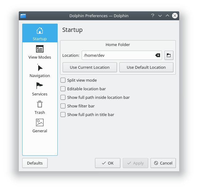
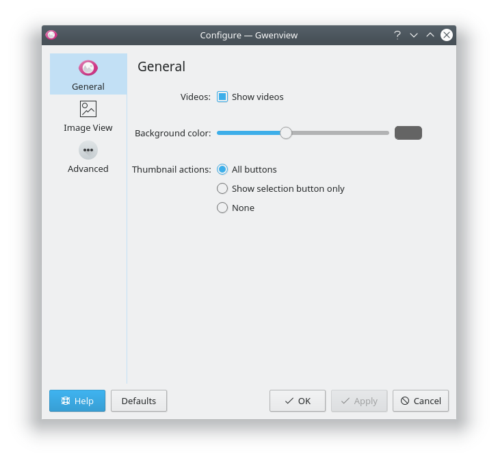
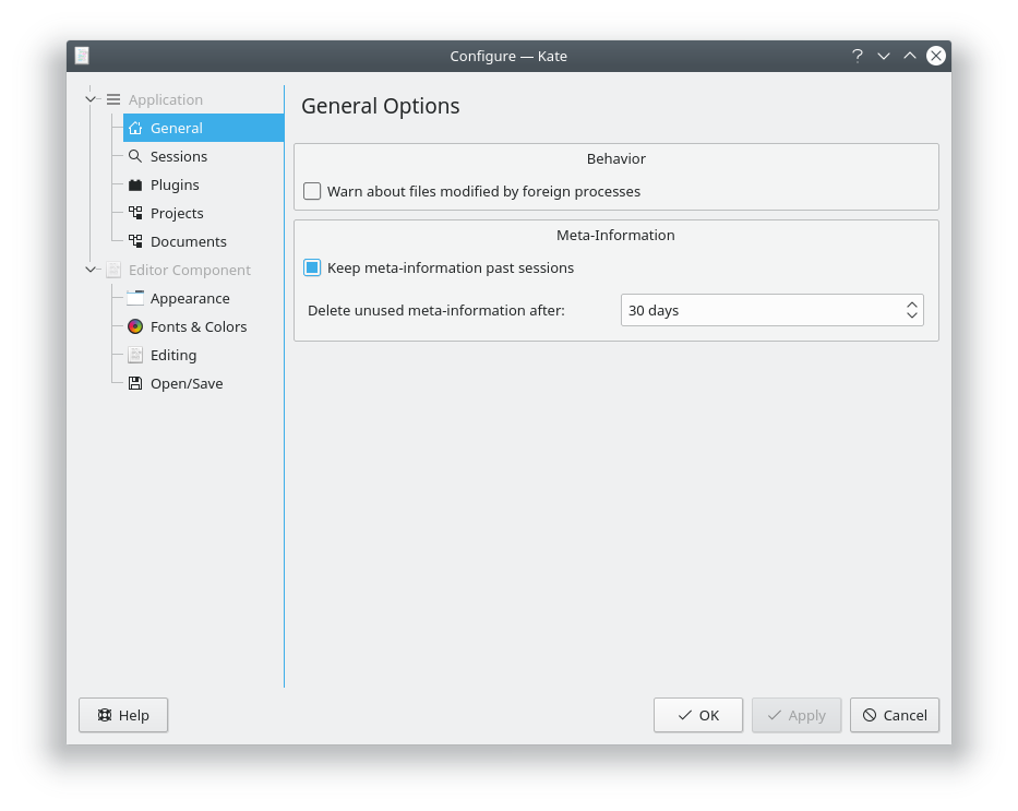
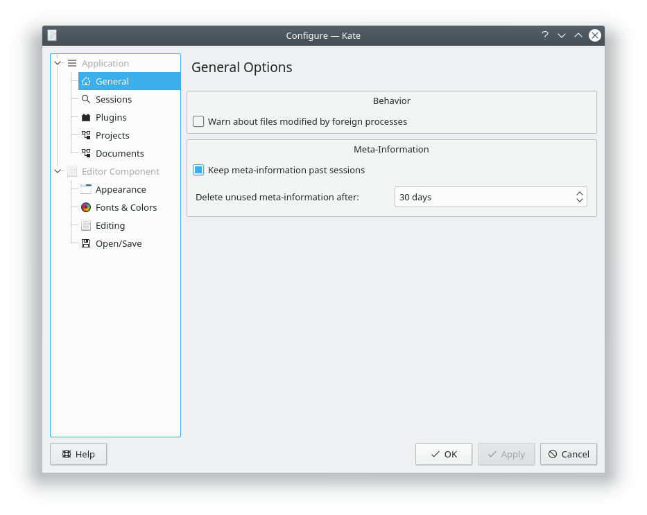
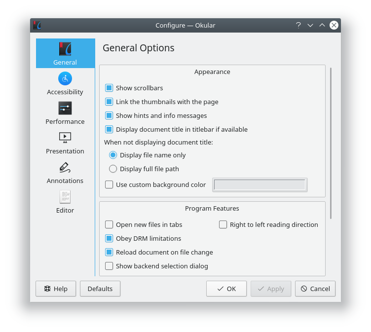
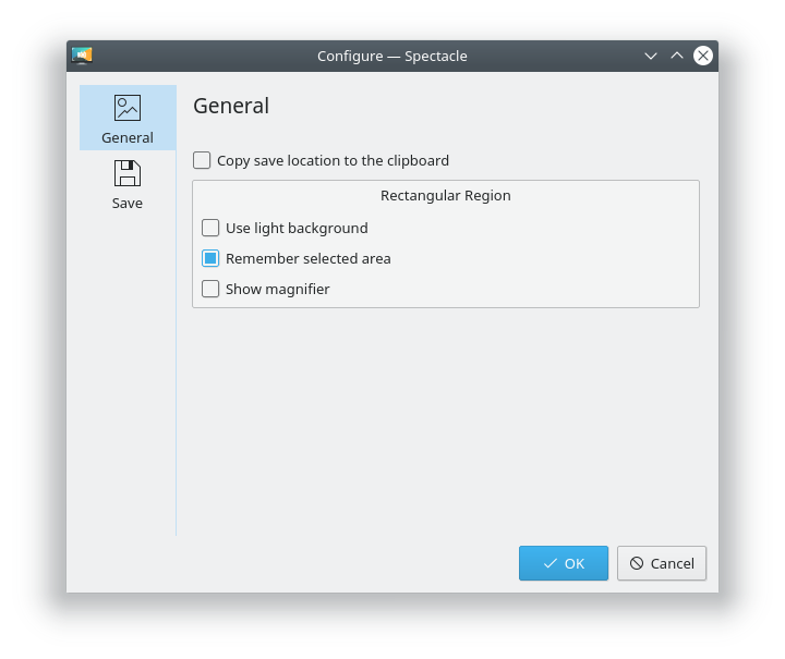
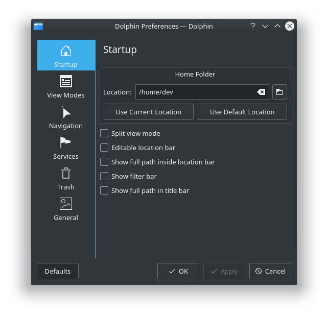
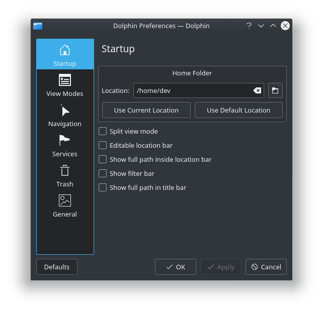
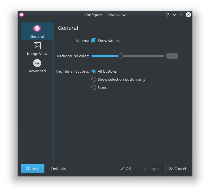
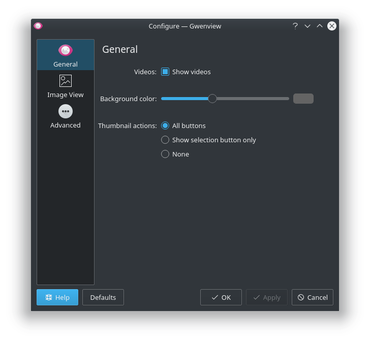
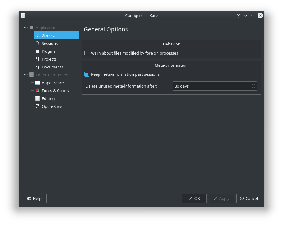
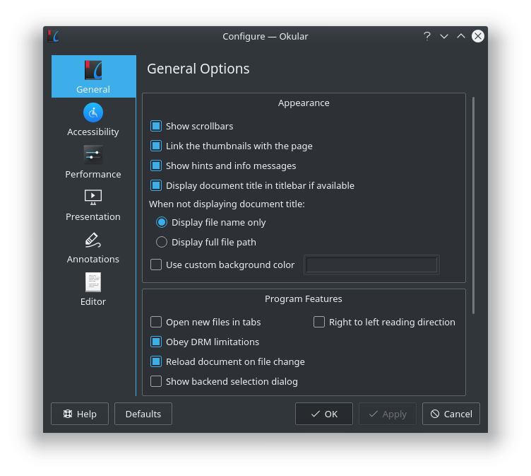
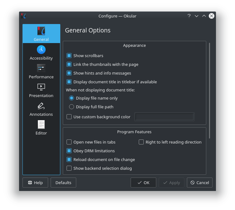
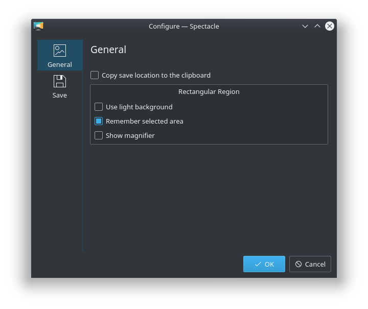
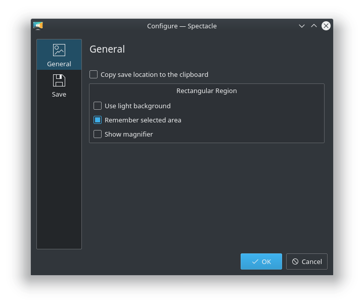
This patch changes the defaults to draw borders around side panels in settings windows.

Drawing the full border makes the window feel less muddy and imparts clarity by visually separating the navigation panel from the content. I think it's a pretty clear visual improvement.

Test Plan

Log in with a new user account and check out various KDE apps' settings windows:

Breeze Light

Dolphin settings window, before:

Dolphin settings window, after:

Gwenview settings window, before:

Gwenview settings window, after:

Kate settings window, before:

Kate settings window, after:

Okular settings window, before:

Okular settings window, after:

Spectacle settings window, before:

Spectacle settings window, after:

Breeze Dark

Dolphin settings window, before:

Dolphin settings window, after:

Gwenview settings window, before:

Gwenview settings window, after:

Kate settings window, before:

Kate settings window, after:

Okular settings window, before:

Okular settings window, after:

Spectacle settings window, before:

Spectacle settings window, after:

Diff Detail

Repository
R31 Breeze
Branch
borders-around-settings-window-side-panels (branched from master)
Lint
No Linters Available
Unit
No Unit Test Coverage
ngraham created this revision.May 12 2018, 1:06 PM
Restricted Application added a project: Plasma. · View Herald TranscriptMay 12 2018, 1:06 PM
Restricted Application added a subscriber: plasma-devel. · View Herald Transcript
ngraham requested review of this revision.May 12 2018, 1:06 PM
ngraham edited the test plan for this revision. (Show Details)May 12 2018, 1:09 PM
cfeck added a subscriber: cfeck.May 12 2018, 1:49 PM

While I also use this setting, we probably should not make it default, unless the QtQuick dialogs (try desktop RMB > Configure Desktop ...) also respects this setting.

rkflx added a subscriber: rkflx.May 12 2018, 2:13 PM

Is it really necessary to revert design decisions made for Breeze (compared to its predecessor Oxygen)? FWIW, I find the "after" screenshots look quite dated, and I cannot see any functional or visual improvement.

In addition, I find the overall design direction quite confusing. On the one hand, we remove borders (group boxes, places panel in the file dialog), and on the other hand you want to reintroduce the old rectangle-heavy design (side panel).

IMO we should respect those design decisions taken for Breeze, and not constantly change things around.

ngraham added a subscriber: abetts.EditedMay 12 2018, 5:49 PM

I wasn't around for the KDE4/oxygen days, so I wasn't aware this represented a reversion of anything; I just think this patch results in better visual design that the status quo.

Breeze may be a minimalistic theme, but minimalism always rides a fine line. If you take away too much, you can reduce clarity, or muddy the boundaries between things that are different and separate. The status quo here has never sat well with me: the side panel feels like it isn't sure what it wants to be. Is its content a part of the main window, or separate? It feels like neither. And what's with that blue line that doesn't extend all the way to the top or the bottom? The design feels like an unhappy compromise, not something that's bold and proud (apologies for all the subjective touchy-feely language; this is just how it feels to me). At least with this patch there's a clear and confident visual separation of the category list and the content area, and now I realize that's what I'm looking for.

As an alternative, perhaps we should instead move towards making the side panels (and dockable panels) look more like System Settings' sidebar: a white background, but without a distinct frame, and a one-pixel line separating it from the content area that extends the full height of the window. This would Breezey and modern, and much better than either IMHO. We might even be able to remove the setting entirely...

andreaska accepted this revision.May 13 2018, 6:39 AM
This revision is now accepted and ready to land.May 13 2018, 6:39 AM
rkflx added a comment.May 13 2018, 6:53 AM

If you revert a design decision, your summary should include a reference to the arguments of the original decision, a justification for changing it back again based on those, and you should try to get consent from the original authors and designers.

In general it's a sensible thing to respect the choices of your fellow contributors working on the code before you, because working with each other is more effective than working against each other in the long term.

I wasn't around for the KDE4/oxygen days, so I wasn't aware this represented a reversion of anything; I just think this patch results in better visual design that the status quo.

No need to go back to KDE4, you can simply try Oxygen and Fusion. IMO the whole point of different styles is to look different, and the minimalism of Breeze is just part of its DNA. If you think of the current design as a vertical tabbar, it makes sense (you would not apply the same patch to the normal tabbar, would you?).

Breeze may be a minimalistic theme, but minimalism always rides a fine line. If you take away too much, you can reduce clarity, or muddy the boundaries between things that are different and separate. The status quo here has never sat well with me: the side panel feels like it isn't sure what it wants to be. Is its content a part of the main window, or separate? It feels like neither. And what's with that blue line that doesn't extend all the way to the top or the bottom? The design feels like an unhappy compromise, not something that's bold and proud (apologies for all the subjective touchy-feely language; this is just how it feels to me). At least with this patch there's a clear and confident visual separation of the category list and the content area, and now I realize that's what I'm looking for.

What you wrote here confirms my guess: It's how you feel about it (and in older screenshots of yours it's clear you changed this setting a long time ago, now trying to push your personal preference to everybody). My goal is not to question your preference, but to speak up that there are users who feel different and like the current design, even though those might not have discovered your Diff.

As an alternative, perhaps we should instead move towards making the side panels (and dockable panels) look more like System Settings' sidebar: a white background, but without a distinct frame, and a one-pixel line separating it from the content area that extends the full height of the window. This would Breezey and modern, and much better than either IMHO. We might even be able to remove the setting entirely...

I doubt that will work because of the buttons on the bottom left, which would be squished visually below your all-white background.

This is really interesting how things go back and forth if you wait long enough ...
Removing this frame (by default) was a _big_ thing at the time breeze was designed, and there was countless discussion on how to do it.
Wait five years, and the same discussion comes again, full reverse, with using the same arguments, reverse, in the sense that what was used to say "its good" before, has now become "bad" and vice versa.
To me, at least, who has attended both debates, the whole point seems a bit pointless. (and demotivating).

Maybe it is just me who has been around for too long ...

Note that there is no bug report, to my knowledge, complaining about this. (neither usability wise nor design wise).

I am not saying that the current design is the best one. However it was designed as an improvement to the framed one. Reverting to the framed version is basically discarding this work. I would rather see some work done on improving upon what has been done rather than discarding it.

I as someone being around for 15 years now also immediately thought "huh? Why this forth and back and forth..."?

I believe you need much more investigation here and discussion with the visual design group, maybe a blog asking about what people like more.

ngraham abandoned this revision.May 13 2018, 1:19 PM

Wow, I didn't know what a minefield I was stepping into with this topic... but I believe my suspicions are confirmed that this design choice represented a compromise that did not satisfy everyone--hence the option. I can see now that flipping this default won't cut it, and we need to do some more serious design work if any changes are to be made. I'll see if I can dig up the history behind this (already found https://forum.kde.org/viewtopic.php?f=285&t=120006) so I can be more informed going forward.

What I see folks objecting to most in the discussion here is the frame. That's actually the part I think is least important and that I'll agree is most dated-looking. To me, what's needed is a bit more visual separation of the list and the content area-it doesn't need to be a frame though! What needs to be communicated is that they're connected, but different. Conventional tabbed views accomplish this very well, but I'm not sure the current design here does the same. The categories just feel unmoored to me, floating there in the window without enough containment. To me they feel jarringly like they could escape underneath the part of the window where the blue line doesn't extend all the way to the bottom. And it feels awkward that their background color is the same as the rest of the window. Most other UIs in our software that involve sidebars use a different color for the backgrounds of the sidebar and the content area (but often inconsistently).

And yes, all of this is my subjective feeling.

I agree with you @ngraham that the current design is not optimal and is not standardized enough in our HIG nor in practical usage by KDE apps and Plasma.

But simply changing the default and by that adding more frames again as already said by others here is not the right way forward. I personally like @abetts mockups for System Settings in this regard featuring "inverted" colors [1]. It's also what other modern UIs currently seem to favor and also what for example @hein chose for his Konversation QML rewrite [2]

If we want to go into such a direction in general (i.e. in Breeze, Plasma and Apps and above all the HIG) this needs to be discussed in the VDG. It should also become part of T7983. See our comments there in regards to the usage of color, light and geometric objects to express functionality and/or structure. What I mean by that is: this needs to be discussed on a more abstract level being valid for all KDE software with modern Ui and a concrete decision then deduced.

[1] M112
[2] http://i.imgur.com/7G0rBOL.png

Yeah, this definitely morphed into a more general discussion about Breeze design, and a desire to make lists look somewhat more like the screenshot you posted, Roman (in terms of borders and lines; no discussion yet on background color).