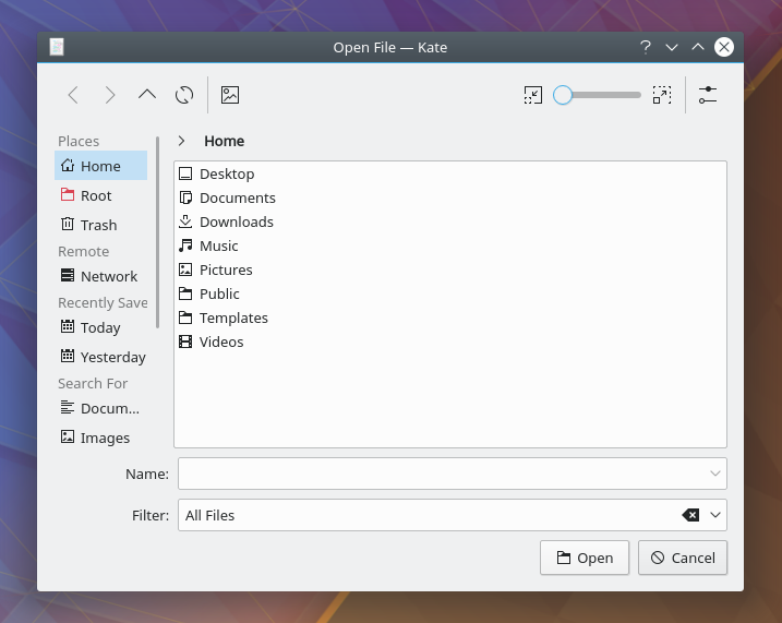
This patch adopts Dolphin's location for the toolbar: above all other widgets. This improves consistency as well as freeing up precious horizontal space on the toolbar for additional items, or better padding and sizing.
Details
Details
Diff Detail
Diff Detail
- Repository
- R241 KIO
- Branch
- move-sort-order-chooser-to-toolbar (branched from master)
- Lint
No Linters Available - Unit
No Unit Test Coverage
Comment Actions
Please add a mockup of how your final vision of the dialog looks like after all changes in T8552 are done, in particular "Move the File Name field to the top of the window" and any toolbar additions. Otherwise it's really hard to judge an individual change like this.
Also, as more and more things are added to the places panel, it might get a bit too short in the end, requiring too much scrolling?
Another point would be to research why it looks like it does today. After all, in KDE3 we already had something like you are proposing right now, so changing it back yet again should come with a good reason.
Comment Actions
I did some spelunking, and here's where the layout was first changed: https://cgit.kde.org/kdelibs.git/commit/kfile/kfilewidget.cpp?h=Active/Two&id=1c850c60d4bbe2c838941ea1ffff787a6e4ddb6e
It looks like the reason was to make the dialog "look better and more ergonomic". I'm not sure if I agree that making the toolbar not span the width of the top of the window actually accomplished this. I'm with Kai that consistency with Dolphin is important.
it's true that this reduces the amount of space available for Places a bit, but that's a problem Dolphin has too, and it should be alleviated by many of the tasks in T8552: Polish Open/Save dialogs. Also we could consider making the defauly size a tad bigger. They are really quite small right now.
I'm willing to put "Move the File Name field to the top of the window, like GTK and Mac file pickers" on hold for now, or indefinitely. Your arguments in the meta-task were convincing.
Comment Actions
Thanks for looking into this. There is one way the "more ergonomic" might have been meant: When navigating in the file view, the distance for the mouse to travel to the navigation buttons is much shorter when they are directly above the file view, i.e. like they are currently in the file dialog, but not in Dolphin.
Also, if a patch refers to Celeste (see https://en.wikipedia.org/wiki/Celeste_Lyn_Paul), that's often a good indication that the decisions made there were investigated thoroughly ;)
I'm not yet giving your patch a -1, but perhaps we should just see how the default dialog size and the toolbar content turn out in the end, maybe it turns out that we won't need to move the toolbar (and can even find a way to change Dolphin to be consistent :D
we could consider making the defauly size a tad bigger.
Yup, especially the default height should be increased slightly if we decide to go with Detailed (Tree) View.
put "Move the File Name field to the top of the window, like GTK and Mac file pickers" on hold
Good to know ;)
Comment Actions
Ah, this makes a lot of sense.
Also, if a patch refers to Celeste (see https://en.wikipedia.org/wiki/Celeste_Lyn_Paul), that's often a good indication that the decisions made there were investigated thoroughly ;)
Wow, it's great that we had someone like her working on KDE stuff. I see she's now at the U.S. Department of Defense now, whoa!
I'm not yet giving your patch a -1, but perhaps we should just see how the default dialog size and the toolbar content turn out in the end, maybe it turns out that we won't need to move the toolbar (and can even find a way to change Dolphin to be consistent :D
If we change Dolphin, we need to solve the same problem here: the toolbar becomes too small and space becomes precious.
Also IMHO it's a visual and consistency regression; in general toolbars span the whole horizontal width of the window, not just some of it. The presentation becomes muddy and awkward, especially given the lack of separators between elements in the standard breeze style. Things feel jumbled together and it's hard to tell where one thing ends and another begins (a separate issue in Breeze of course).
Perhaps we could make the toolbar span the full width, but align things such that the navigation buttons are always over the view?
Like this:
Comment Actions
Ok, let's not get distracted with Dolphin…
Now you have a similar problem for the view mode buttons (and changed order compared to Dolphin). The top left corner is an awkward spot really :( I thought about putting the configure menu over there, but then it's too prominent again… In a way having the "Places" header there made some sense. For example the Qt file dialog has a "Look in:" over there (but we cannot use such a thing). Maybe this would be a good places for an Advanced/Simple mode switcher later on?
Hm, as I said, I'd wait a bit for a final decision.
Comment Actions
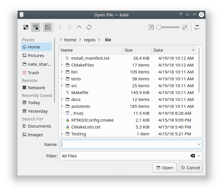
Here's another crude mockup: we could add only the navigation controls to the layout above the KDirOperator view.
That would actually make the dialog even more "ergonomic" from the perspective of placing the navigation controls close to the view that they affect.
Comment Actions
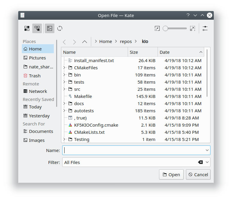
Yeah, but the view mode buttons are still in that awkward corner, even though they affect the view too. Also you are now in the "two rows of icons above each other" territory, which is one of the few things I don't want to get back from past UI designs…
I don't think the ideas are getting better than what we currently have. Let's work on the rest first, before prematurely undoing the change by Aaron and Celeste.
Comment Actions
Lately, the zoom widget is placed at the bottom in most programs, perhaps it can be moved at the left of the Save/Open Cancel buttons.
If the mouse distance is a problem, the navigation buttons can be placed at the top right, just where the zoom widget is now.
This is just another idea.
Comment Actions
Nice idea, but if I understood Nate correctly we want to put the New Folder button in this place. Also, there is a conceptual difference between a main window with a status bar of an application, and a dialog which normally has a row of buttons at the bottom.
Comment Actions
I gave a +1 to the original idea because I feel that there isn't really much closeness that you can achieve with the open dialog. It is simple, straightforward. If we wanted to do a strict fitt's law follow, then each back and forth icon would be next to each of the folders and not in a toolbar. But we also have to see that there is stronger merit in organizing and looking for symmetry. Symmetry will sometimes help a user more than Fitt's guidelines. I say, let's keep the original request for change and then get user feedback.
Comment Actions
I find the pre-patch design also very streamlined.
If we wanted to do a strict fitt's law follow, then each back and forth icon would be next to each of the folders and not in a toolbar.
Let's not throw the baby out with the bath water. Having the navigation buttons right above the breadcrumb bar is still better the having them crammed in the top left corner.
But we also have to see that there is stronger merit in organizing and looking for symmetry. Symmetry will sometimes help a user more than Fitt's guidelines.
This statement may be true in general, but does not fit in our case, as I don't see much symmetry here, TBH. Panel and item view occupy most of the height, and thus are the most important elements. They are split asymmetrical in the horizontal direction, and rightly so. Adding a centered toolbar goes against this and breaks up the split, adding even more asymmetry.
Furthermore, users are able to hide the places panel. With the current design the spatial relation between buttons and item view stays constant, while with a centered approach it will jump around.
get user feedback.
The file dialog is an important piece of the entire UI. We cannot endlessly change things back and forth, we have to get it right by logical thinking the first time (in this case it would even be the third time!). In KDE3 it was centered, based on feedback from a usability expert it was changed to the current design. In terms of user feedback, I'm not aware of any huge issue users have with it right now.
Do you want to change things around again until there actually is negative feedback? I'd agree with basing design decisions on user feedback if we had better telemetry or did some eye tracking studies, but our current method of hearing user's opinions over on Reddit and Bugzilla is not very effective in painting a broad picture, IMO.
Anyway, I'll come back to this Diff once the Sort button is in and we decided on a final default dialog size. This should make the decision easier, because after all the main motivation was to create space for more buttons.
Comment Actions
+1
I think you are swimming against a non existent wave with your argument. I believe also that we are turning this discussion into a right/wrong argument. I don't think that there is a right/wrong approach in this case. If we want to hold on to ideas developed or talked about in KDE 3, then we are already setting ourselves back a few years. Design evolves. I can understand the desire to adhere to "laws" or guidelines, they provide consistency, ideas that we follow and easy answers. However, the VDG has not really come out in support of this or that "law". We believe that flexibility allows us to grow and evolve. Guidelines can be good reference points though.
The proposed alignment has a few advantages, mentioned above. It is also a model that Windows and MacOS currently use and have used. I feel that if others can pull it off, we can too. This is not about "let's do it the Windows or Mac way" but rather it shows an example that while we seem to have a problem with it, other, more major and widespread systems, don't have a problem with it at all. Plus, it really seems overkill, design wise, to have 2 sets of controls that allow you to go back and forth between directories, and they are together in one horizontal plane. The first one, would be to the right of the breadcrumb navigation and the second would be the breadcrumb itself. Two sets of controls that do the same next to each other.
Something that can help is to set the steps a user will take to get to the action of opening a file:
- User clicks open
- User looks for file
- User navigates to desired folder
- Breadcrumb grows as folders are clicked
- User double-clicks through folders
- User goes back to previews folder (Because he can't find the file to open)
- User clicks breadcrumb, user clicks arrows, user hits backspace
- User finds file
- User double clicks file to open
- User could also select by clicking once, then click Open
- User could also click to select and hit ENTER
Alternatively
- User clicks sidebar to find file
- User double clicks file
In these two interaction cases, I am not seeing the need to have 2 sets of navigation buttons together.
Comment Actions
Sorry, I don't really get what you mean. I'm not proposing going back to KDE3, Nate is proposing going back to the KDE3 design! (In KDE4 this was improved to what we have in KF5, FYI.) Also, I don't see where you get from that I'm proposing to follow any "law"? Not sure what you mean with "2 sets of navigation buttons" which are "together in one horizontal plane", either. If you are referring to Nate's mockup, I'm the wrong person to ask. Comparisons to Windows are moot, because there you have different design constraints due to the position of the breadcrumb bar. Lastly, I don't get the connection between your example and the title of the Diff.
@ngraham Do we need to take a decision right now, or are you willing to wait until some of the other stuff has cleared up?
Comment Actions
Definitely willing to wait. We're pretty close to having all the pieces ready for Goal #1 on T8552 , so maybe let's focus on that first.