New icon for Elisa music player
Details
Details
Diff Detail
Diff Detail
- Repository
- R266 Breeze Icons
- Branch
- master
- Lint
No Linters Available - Unit
No Unit Test Coverage
Comment Actions
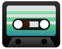
Hmm, the old-skool cassette doesn't really blend in with Elisa's sleek, modern appearance IMHO.
Comment Actions
My first try for Elisa's icon looked like a small guitar amp. But after discussion, @andreaska of the Breeze team suggested that I make this cassette-shaped icon.
Comment Actions
Elisa is a new music player app (yes another one) cassettes are old-school yes, but the benefit is that it look like an old (stable well developed) app in addition it's way more unique than other music player apps.
Comment Actions
I was a little bit hesitant at first, but I'm starting to like the idea of a cassette as an icon for Elisa. But I think the text in the icon is not required. It will usually be so small that no-one can read it.
Anyways, Matthieu should have a comment about this.
Comment Actions
Yes you're right, the text makes the icon more cluttered. I could remove the text or draw some kind of stylized text that would read better.
I'm not sure about the color, is green OK ?
Comment Actions
Agree with the text not being useful for small sizes, but it could look good for a large logo-style image (like say, a 256px logo on the wiki/homepage).
A cassette is definitely an interesting idea for an icon. At least it's not another musical note or play icon :)
It's true that it's old school, but we also use CDs for albums which is also kind of old school now, so it's not totally off. Green is ok too, since the CDs and their background are all green (and blueish). You could also mixing it with some subtle blue/cyan tints in there.
Also, I think if we're going 80s we should go all the way. Instead of a gradient (green to white), consider using some 80s motif like the vanishing lines in here:
https://www.google.com.ar/search?dcr=0&tbs=imgo%3A1&tbm=isch&sa=1&ei=zzp-WvW5MsPCwATB-LGwAQ&q=awesome+mix+vol+2&oq=awesome+mix&gs_l=psy-ab.3.1.0l10.345494.346631.0.348056.11.9.0.2.2.0.144.983.4j5.9.0....0...1c.1.64.psy-ab..1.10.890...0i67k1.0.QW76y1ueao8#imgrc=66ooLxhTsA9q2M
You should probably limit it to 1-2 lines for the smaller sizes though. You could probably replace the text with the lines/motif in small sizes too.
BTW, love your avatar!
Comment Actions
Thanks for your work. I am hesitant about the choice of an audio tape. I fear people under 30 will not recognize it.
I would like to propose trying the tape with the current color and we can revisit this decision in 6 months.
I agree on the text removal and your choice of color is good for me.
Comment Actions
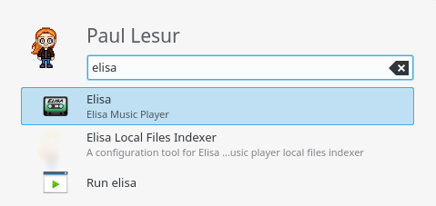
I followed your advice, here is a big version and a preview in my application launcher


I understand your concern. However we could say the same thing about vinyls, and many apps are using vinyls as icons.
Comment Actions
Old-school rules! Also just think of the floppy 💾 disk icon which is mostly everywhere the save icon.
Comment Actions
@paullesur do you have a KDE contributor account ? If not, I cannot push due to life events pushing me away from keyboard.
Comment Actions
I believe there was no objections to this choice of icon. Can we ensure this gets landed soon ? I would prefer to be able to have the new icon as soon as possible.