Search button indicates now also the toggle state.
Shortcuts still hide search and filter bars ...
Search button indicates now also the toggle state.
Shortcuts still hide search and filter bars ...
I like it, specially because we are talking about Android notifications, but also Plasma make a lot of use from Icons in notifications and I prefer to have them because they make it clear what kind of notification it is and I know if I have to care about before I need to read it completely.
I can't help me but I have some trouble to unterstand the privacy issue which comes up every time when such a topic gets discussed.
Okay I can imagine ehy it can be a privacy issue but then it would mean thaht the the background itself is one. So lets say I am sitting with my notebook on some public place like the airport und someone looks over my shoulder then he other peobple walking by can see my wallpaper too (if there are no maximized windows of course).
So privacy issue = yes but not only a problem of the login/lock-screen.
Addressed the mentioned issues.

@dfaure Thank you for your answer :-)
As I am still at the beginnings I am really grateful for such constructive and valuable feedback like yours it helps me to become better and improve my code.
@broulik Thanks :-)
My idea was to add a submenu "own templates" to the menu but this would greatly exceed my knowledge. At the moment this is more try, error and debgugging, learning by doing ^^
Will try to improve this patch further and see what I can do here because my main goal is that we can use normal files as templates again ;-)
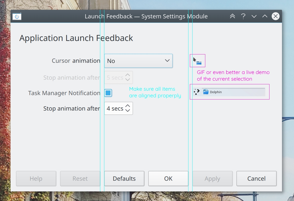
The filter bar indicates the toggle state very nice as it was my plan to be consistent with the preview button ;)
I wanted the same also for the search but was not able to figure it out until then.
Well not really because I can't really imagine what use case this would be and further more when you hit Ctrl + F twice the bar appears again and you can type again. So when anyone know in which situations it would help when the shortcut does not toggle the bar it be great to be enlightened.
There are still many pages which show the old design from kde.org are these sites going to be updates as well ? Should I post them here too ? Because it's very weird to click trough and get to a site which does not fit into the design from the rest of th homepage at all. Some users may even wonder where they has been landed and for me it's clear that these sites are completely outdated.
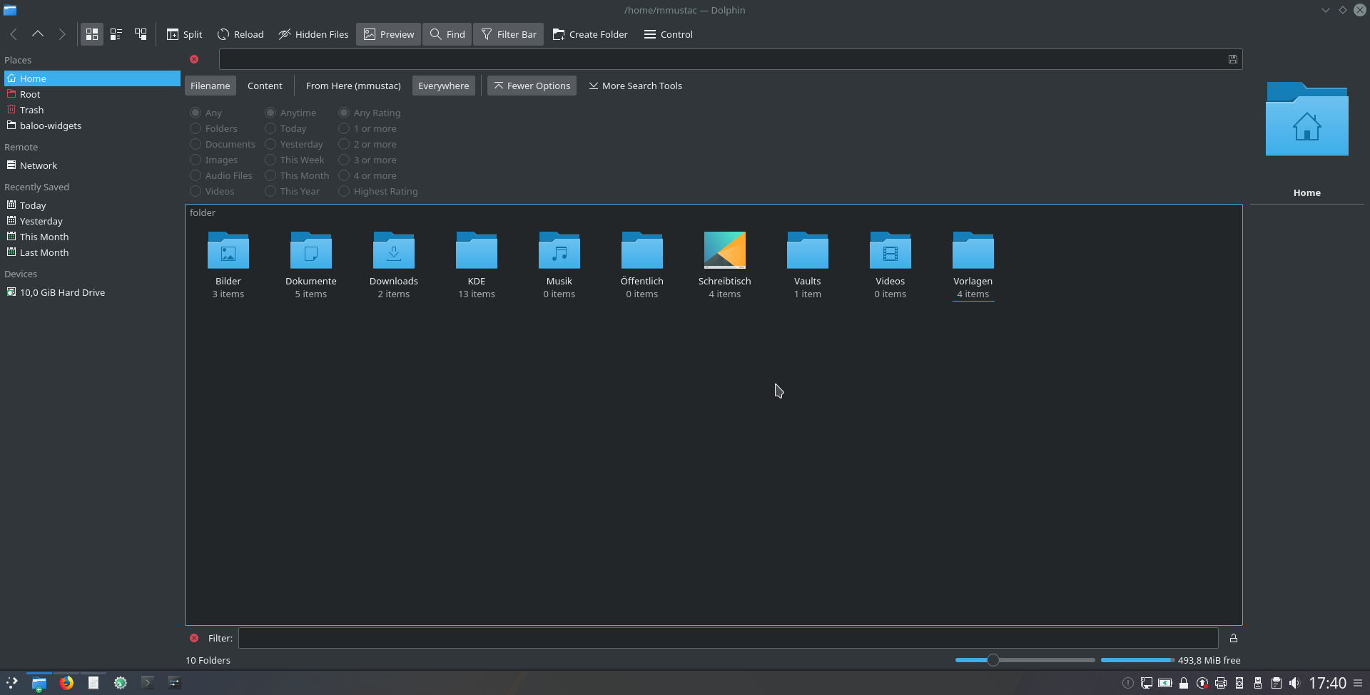
I know this has nothing to do with this patch - maybe I should file a bug for this ? - anyway I wanted to share my thoughts after reading Mark's position and I think he's right. We should not put everything into the places panel nor should it be a sperate panel ... sound weird ? Well ... I like the idea of having different panels for different working scenarios but the static job they were created for is not ideal, altough we can hide groups from the panel now. My idea is to be able to add one ore more panels which would be just a container which then can be filled with different views / models ? (Like toolbars) So for example I can create a panel by my own, give it a name and customize it to show a list of tags and shortcuts for my saved searches for example. Then another panel could contain my device list and the default places section and a third one to contain the directory tree. That way I would be able to switch very quick between them, don't need to scroll or reconfigure my panel over and over again. Maybe someone can follow me and what I am trying to describe. Dolphin then could offer some preconfigured panels by default but let the users all possibilities to customize it wahtever they like. Easy by default, powerfull when needed.
What is the current status here? I would love to see this feature coming in the near future.
Another thing that would be great: If we could click on the labels / buttons and they would switch to an editline where we could enter a value by our own and the pandel would change according. Some people - like me - like their panels pixel perfect specially when you have three monitors and want the same size on all three of them.
@ngraham Great to hear that. I will be one of the first to test your explanations if they are also ready for noobs like me :-D And provide my feedback of course.
What about editing the "Get involved" page on kde.org as first step?
I am missing an up2date step by step guide to get a working development environment.
Because I really would like to get started.

Does this patch then also affects the speed of the copy operation?
I think this describes the main problem for most users (including me) very good:
KDE Forum: Padding in plasma panels
It look out of place and jumps right into the eyes.
I have three screens, the main screen display the time with secons and the date, while the other two just show the time /default settings) and are really big.
I don't know if I am allowed to write here, so sorry if not ...
I just wanted to share my point of view (daily user).
While the first screens look good for me, the second one here seems to be very restless and so I wondered if I should share what I would like to see here.