I have no Linux system to use at the moment but Dolphin service menus should be located at ~/.local/share/kservices5/ServiceMenus/ so removing everything inside will at least remove all user-installed service menus. Personally, I never got Dolphin to crash because of those, even I wrote some on my own.
Feed Advanced Search
Nov 9 2020
Nov 9 2020
mmustac added a comment to T13843: KDE/Dolphin store quality/version control .
Aug 4 2020
Aug 4 2020
mmustac added a comment to T13465: Cool tips and tricks to show on social media.
One little gem I found out lately is the option to bind a shortcut to "open klipper at mouse position" option which is really useful in my opinion.
May 20 2020
May 20 2020
mmustac added a comment to T13180: Make it easier to apply the wallpaper to the desktop(s), lock screen, and login screen all at once.
Simiar to T12622
Apr 1 2020
Apr 1 2020
mmustac added a comment to D28487: Redesign of system monitor plasmoids.
Those look very lovely.
mmustac added a comment to D27504: smb faster copy to local.
Feb 12 2020
Feb 12 2020
mmustac updated the task description for T12420: Redesign/tweak applications.
mmustac added a comment to D25447: [Baloo KCM] Add the ability to suspend, resume, and monitor indexing.
Wouldn't it look better to use the new header/title component for the list view ?

Feb 1 2020
Feb 1 2020
mmustac added a comment to T12631: [RFC] Make Kirigami's headings smaller and set default top/left margins.
Finally ! So much better.
mmustac awarded T12631: [RFC] Make Kirigami's headings smaller and set default top/left margins a Love token.
Jan 30 2020
Jan 30 2020
mmustac added a comment to T12622: [Approved] Move wallpaper changing into a KCM and make it easier to apply the wallpaper to the desktop(s), lock screen, and login screen all at once.
An option to sync/set wallpaper (settings) automatically for login and lock screen would be nice too.
Jan 22 2020
Jan 22 2020
mmustac added a comment to D22074: Add image annotation via libKImageAnnotator.
It seems to me that KColorPicker has not been pushed into KWidgetsAddons until now. Maybe it would also help to port KImageAnnotator to make use of KColorButton instead which is already included in the widgets?
As I am no developer I am not sure if this could help but it seems to me that this dependency/build problem is the last piece left before it could be shipped, right?
Jan 6 2020
Jan 6 2020
mmustac added a comment to T12488: Use a different repo for the new version of the Breeze widget style and come up with a name for it.
The evolution of Breeze could be a Gale and a storm after that.
Dec 24 2019
Dec 24 2019
mmustac added a comment to T12420: Redesign/tweak applications.
I've made a mockup for Okular some time ago.
M159
Dec 16 2019
Dec 16 2019
mmustac updated images of M159: Okular revamped.
Oct 4 2019
Oct 4 2019
mmustac added a comment to T11808: Show more way to download apps in kde.org/applications.
Works for me on Windows 10 (with FF & Chrome) and get a link to the Microsoft store. All fine.
mmustac added a comment to D24407: Increase UI commonality between KCM and applet.
Not related to this patch, but...
While looking at these screenshots I find it not self-explaining but more confusing that both buttons look the same, except one of them is in "active" state.
I would propose to change the icon for the non-default device to an empty star, with just an outline to be more clear which device is the current default.
Oct 1 2019
Oct 1 2019
mmustac updated images of M159: Okular revamped.
Sep 30 2019
Sep 30 2019
mmustac added a comment to M156: Dolphin.
I wouldn't embed the filter bar in there because then we would lose the ability to keep the filter bar open while navigating around, as you can right now. However using it as a search field would make sense since you never need to navigate while the search field is open. basically we do what modern web browsers do, for the same reason.
Sep 26 2019
Sep 26 2019
mmustac added a comment to T11661: Replace framed views with single-pixel separator lines.
With sidebar ?
Sep 25 2019
Sep 25 2019
mmustac added a comment to D24223: [RFC] Add global themes that mimic other platforms' workflows.
It took me some seconds to get it where "garden dwarf" points do :-D
I think the previews for all look and feel packages KDE ships by default should show somehow the same desktop. Meaning have the same menu open or the same applications in the same spot.
Would make it easier to compare them and look more consistent. I also would like to have an option or even the possibility to have the widgets for the system tray using the complete screen height, like @niccolove suggested.
Sep 24 2019
Sep 24 2019
mmustac added a comment to T11767: Improve Release Announcements to better serve Developers Interests.
Personally I really enjoyed reading the release notes from 19.08 and was also impressed when I saw them the first time.
I was really cool and pleasant to have this full text which covers the most interesting part. After finishing I always take look into the full release notes to dive deeper into it.
What about combining those two formats? Cover the interesting parts with floating text and the important ones underneath it with bullets like it was with 19.04 and before.
Maybe make the link to the full changelog/release notes also more prominent?
mmustac added a comment to M155: KMail revamped.
I never thought I would get such a bunch of feedback, wow :-D
mmustac added an inline comment to M154: KOrganizer revamped.
I think it would be too much. You have already up to three indicators where you are. But show the number of the day while hovering over the corresponding section might be cool.
Sep 23 2019
Sep 23 2019
mmustac updated images of M154: KOrganizer revamped.
mmustac updated image descriptions of M155: KMail revamped.
mmustac updated images of M155: KMail revamped.
Sep 20 2019
Sep 20 2019
dvratil awarded M154: KOrganizer revamped a Love token.
ognarb awarded M154: KOrganizer revamped a Love token.
Sep 18 2019
Sep 18 2019
mmustac updated the task description for T10243: Some KDE applications could use better icons.
mmustac added a comment to T11665: Make adjacent mutually exclusive ToolButtons look like segmented controls.
I really like the first approach even more if we could make it a little bit more like GNOME:

When T10201 is finished we could maybe also change the color of the toolbar buttons so that they would stand out more?
Sep 14 2019
Sep 14 2019
mmustac added a comment to D23757: Clean up hamburger menu and viewport and single-folder context menus.
What about removing the "select all" & "invert selection" from the hamburger menu?
Advanced users may know the shortcuts already and normal users maybe would not have to work with such big amounts of files that they could not do it manually?
Sep 9 2019
Sep 9 2019
Aug 2 2019
Aug 2 2019
mmustac added a comment to D22884: [RFC] Don't show title on page by default.
I agree that it looks quite strange or at least unusual to me.
Find myself always sliding to the left do regonize which topic is selected currently it seems not self explaining and I would miss the header.
Jul 31 2019
Jul 31 2019
Jul 28 2019
Jul 28 2019
mmustac added a comment to T10997: Improve check box design.
Well the square one are checkboxes they can be checked or unchecked, typicall yes/no choices.
The round ones are radio buttons at least two or more belong to the same group and only one of this group can be checked and uncheckes the others they are used here for example to switch between different behavior.
Jul 25 2019
Jul 25 2019
Jul 19 2019
Jul 19 2019
mmustac updated the task description for T11243: Update kde.org/plasma-desktop.
mmustac added a comment to T11243: Update kde.org/plasma-desktop.
What about using small videos (as section background) or gif animations ainstead of static pictures ?
It could be more informative and appealing, special when it comes to show how customizable plasma is.
Jul 8 2019
Jul 8 2019
mmustac added a comment to T11179: Update wikis version and theme.
Can we propose some design changes ?
Like remove the icons from the "note" box and add some additional margin and padding to the list on the right side ?
Jun 14 2019
Jun 14 2019
mmustac added a comment to T11069: Improve KDE PIM.
It would be really great to extend the "online accounts" kcm and make the PIM software automatically use those accounts.
I really enjoyed this workflow in my GNOME days back then.
Or maybe combine them anyhow ?
May 14 2019
May 14 2019
mmustac added a comment to T10159: kde.org/applications rewrite.
If ind it quite a pitty that there are only so few informations about all those cool applications which are part of the great KDE project.
May 9 2019
May 9 2019
mmustac added a comment to D21037: Add deselect action.
I am not familiar with this but shouldn't the "deselect" option be directly above the "invert selection" option or does it have no effect on the order ?
Apr 24 2019
Apr 24 2019
mmustac added a comment to D20693: Remove pixelated border.
@ngraham: Fo sure, I will add my post from the forum here for better reference.
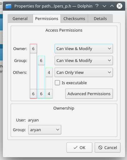
mmustac added a comment to D20735: [KPropertiesDialog] Add octal permissions.
We could also make the permissions interactive and explaining at the same time.
I could imagine something like this:
Apr 17 2019
Apr 17 2019
mmustac added a comment to D20576: Add new notifications KCM.
What about edit-clear-symbolic or window-close (I think this would be the same as for the dismiss action in the widget?)
mmustac updated the diff for D20571: Add public holidays for Lower Saxony (Germany).
Only changed the abbreviation from "ns" to ni" like it is on Wikipedia.
I've checked the holidays carefully and would be grateful if you could commit this patch than you think it's okay, because I do not have the access to. Thanks.
Apr 16 2019
Apr 16 2019
mmustac updated the diff for D20571: Add public holidays for Lower Saxony (Germany).
Adjustments to formatting.
Apr 15 2019
Apr 15 2019
mmustac requested review of D20571: Add public holidays for Lower Saxony (Germany).
Apr 5 2019
Apr 5 2019
mmustac awarded D20266: Add new notification plasmoid a Orange Medal token.
Mar 20 2019
Mar 20 2019
mmustac added a comment to T10402: Find a way to remove the Desktop Toolbox in its current form (i.e. a hamburger menu button in the corner of the screen).
I think the most important thing which you haven't covered in your rant is the following, because you are always talking about the right click menu which is fine when the default settings are active.
Feb 21 2019
Feb 21 2019
mmustac added a comment to D19077: Redesign the theme preview window.
To be honest this kcm looks out of place when I compare it to the newer refurbished ones. The new look is quite an improvement compared to the current state but when I look at the color, window decoration kcm we have at first a big grid view and can then customize those themes by pressing the floating edit buttons which appear while hovering over them. Personally I would suggest to transfer those behavior to this kcm too to keep the uniefed design and workflow.
Jan 16 2019
Jan 16 2019
mmustac added a comment to T10317: Search&Replace plugin improvements.
Maybe it's because of I have to work quite often with Windows but mostly there ist Ctrl + F used for search and Ctrl + H for Replace functions in for example: Word, Notepad, Notepad++, SQL Management Studio. Browsers, Telegram and many other software which do not offer a replace function make at least use of Ctrl + F for search too. So while using Kate or KDevelop I see me quote often press those shortcuts and get something different. Do not know to which action they ae assigned at the moment.
Nov 16 2018
Nov 16 2018
mmustac added a comment to T10047: Guerilla UX testing: a GNOME switcher.
While in Panel Edit Mode, use buttons to determine screen edge rather than making the user manually drag the panel
Nov 12 2018
Nov 12 2018
mmustac added a comment to D16830: Add file related actions to Tabbar context menu and File menu: Rename, Delete, Compare (new), and some more.
I would love to see features like this. Specially the compare function would be a great benefit and improve workflows.
Oct 19 2018
Oct 19 2018
mmustac added a comment to T9895: Improving single-click / creation of contextual action toolbars.
Windows explorer has also a feature like this I think already since the XP era.
Oct 11 2018
Oct 11 2018
mmustac added a comment to T9830: Application Menubar states and usability.
Personally I like the approach dolphin uses right now. I am no friend of having a global menu nor I like to have another button cluttering my title bar but the worst case would be to have the complete menubar shown in dolphin just becuase the other options does not suit me. I think it is a good idea to keeps the things clean and simple and this is was dolphin does. Instead of proposing to remove this feature just because is it not following the other applications we maybe could think the way around and implement such simpler menu structures inside the applications.
Sep 25 2018
Sep 25 2018
mmustac added a comment to T9740: Improve disk presentation in the Places panel.
Exactly this one as it is also on the T8349 list.
+1 also for the idea with dimming, looks quite nice.
mmustac added a comment to T9740: Improve disk presentation in the Places panel.
I would also suggest do just color the icon, maybe in green when its mounted ? But would only work for symbolic isons.
There is also a bug report to show an eject symbol right next to mounted disks, maybe if we could achieve this, it would make this icon changes obsolete ?
Sep 4 2018
Sep 4 2018
mmustac added a comment to D15206: [Kickoff] Add a subtle separator line between the header and the content view.
Personally I like it more without the separators but except of that the top-margin of the first element seems to be only 6px while the margin to the underneath elements is about 12px. I think we should use the same margin here to have a consistent look.
Jul 25 2018
Jul 25 2018
mmustac added a comment to D13474: Remove "Use Default Location" button in settings window.
Personally I had never used this buttons since I am a happy dolphin user but maybe becuase my default location is and will stay my home directory.
Regarding your question: The reason will be to just reset the location field. When someone changed the view settings underneath and clicks on the default button these settings will also get lost even this was not intended.
For me it would not hurt to remove both like Mark proposed. On the other hand people are always complaining when Gnome removes somtheing ... well I am not sure and can't speak for all users out there just wanted to share my point of view.
Jun 23 2018
Jun 23 2018
mmustac added a comment to T8751: Update Widget and panel edit modes.
Maybe I sound now a little bit heretical but why not replace the plasma panels with latte-dock at all?
The project has become quite popular over the last months and not only for Plasma or KDE enthusiasts.
Jun 22 2018
Jun 22 2018
mmustac added a comment to D10363: [KIO] Add support for XDG_TEMPLATES_DIR in KNewFileMenu.
I would not close the bug yet. Unfortunately I am busy at the moment so I can't tell you when I will find to take a deeper look at the main problem from the bug:
Although we have support for the template directory now, it is still very difficult to display your own templates in the menu. At least I will try to solve this problem without breaking some of those bugfixes which disabled this feature in the past.
Jun 21 2018
Jun 21 2018
mmustac added a comment to D10363: [KIO] Add support for XDG_TEMPLATES_DIR in KNewFileMenu.
@dfaure Can you commit these changes as I don't have the access to ?
May 30 2018
May 30 2018
mmustac updated the diff for D10363: [KIO] Add support for XDG_TEMPLATES_DIR in KNewFileMenu.
Updated to the latest comments.
May 16 2018
May 16 2018
mmustac added a comment to D12911: Add 'Sort By' and 'View Mode' into Dolphin file context menus.
I agree with Henrik and think this should not be part of the context menu and then it should not appear when clicking on files or folders but only when clicking on empty space.
May 7 2018
May 7 2018
mmustac added a comment to D12732: Show a warning when running as the root user.
Shouldn't this be a warning instead an error message? I can understand that the signal color red was used here because of the security risk this action may provide but it's not used correctly here in my opinion.
Apr 30 2018
Apr 30 2018
mmustac added a comment to D10363: [KIO] Add support for XDG_TEMPLATES_DIR in KNewFileMenu.
No problem David, it's okay :)
I will work on your suggestions and update this revision accordingly.
Apr 26 2018
Apr 26 2018
mmustac added a comment to T8552: Polish Open/Save dialogs.
Just as a side note. The Vivaldi browser for example has an option "Use buttons instead of slider" which will toogle the zoom controls which are also located in the statusbar (a place which is best for this in my opinion)
Apr 20 2018
Apr 20 2018
mmustac added a comment to D11483: [WIP] Make some properties searchable.
To jump into the little offtopic disccusion here. When it comes to edit tags and meta data I would prefer to just click on the label in the info panel and the label switches to an editline, where I can make my changes (or cancel with ESC) which would be saved when the focus changes.
This approach would look much sleeker and would be quite faster too but would then require another aproach for searching ... But back to topic, I really love your idea to make the infos baloo already has stored searchable great feature and improvement to find your files :-D
mmustac added a comment to T8552: Polish Open/Save dialogs.
Make the toolbar editable (fixes https://bugs.kde.org/show_bug.cgi?id=137837)
Apr 18 2018
Apr 18 2018
mmustac added a comment to T7238: Lookandfeel (kinda done).
Hi Kai, do you think it would be possible to trigger a preview for the layout similiar to what is done for the ksplash?
Apr 10 2018
Apr 10 2018
mmustac added a comment to D12077: Show view mode buttons in the open/save dialog's toolbar.
Great, I even didn't know that this was possible *lol*
But wouldn't it be more consistent with dolphin to add the list view also ?
Apr 6 2018
Apr 6 2018
mmustac added a comment to T8213: Patrons logos.
I don't know if KDE is allowed to do that but I would propse to make the logos even smaller by adding all 6 of them into one row and move them down in the page hierarchy because they are not that much important and would also fit better into the footer section with the bold heading, see attachted screenshots. I also removed (or reduced) some margings and padding to achieve a more compact look.
Mar 22 2018
Mar 22 2018
mmustac added a comment to D11569: Improve consistency of "Open With" UI by always showing top app inline.
I have two questions regarding this "open with" topic.
Is the displayed app the one which is also set as default for this file type or the first alternative (2nd app) ? If it's the default one why should someone make a right click on a file to open it with his/her default app instead of making a single/double click on it?
The second point: Shouldn't the "Open with" stuff be at the very beginning of the menu when we have a file selected for quick access? (1. opening, 2. create new files (for folders), 3. direct file operations, 4. additional file operations, 5. everything else)
Mar 15 2018
Mar 15 2018
mmustac added a comment to D11354: Add vi-mode.
While I think this could be useful (never used vi) your patch breaks the selection of files.
For example I created a bunch of files, each one starts with one letter from the alphabet and now I want to jump to "h.txt" so I press the letter h on my keyboard and it jumpes up instead of selecting the file which is bad.
Mar 12 2018
Mar 12 2018
mmustac added a comment to T8187: Single click vs double-click.
When I started using Plasma I was really confused about the single click feature (I know where to change it) but I took this challenge and now I just don't want to go back anymore even I use Windows on the other hand with the double click enabled. I can conform the mentioned issue above regarding the multi selection in the file open dialog. I know to press Ctrl or Shift and slect more than one file but it's just not so discoverable. On Windows I love the option which display additional checkboxes to select multiple files.
Feb 24 2018
Feb 24 2018
mmustac updated subscribers of D10804: Show "Empty Trash" button inside trash directory.
Cool :-D Can you add a screenshot as well?
Feb 15 2018
Feb 15 2018
mmustac added a comment to D10522: Added vertical separator.
I liked Breeze because of its light and easy concept, get rid of too many lines, keep only the ones which make sense or are totally necessary, this feeling gets lost here for me so that Breeze would slowly increase into a Storm (little overstated I know) Even when this change should happen, I would vote for an opt-in feature so that the default keeps clean.
Feb 14 2018
Feb 14 2018
mmustac updated the summary of D10508: Add icons for KStandardActions Deselect and Replace.
mmustac added a comment to D10508: Add icons for KStandardActions Deselect and Replace.
I can't access the link at the moment but changed the title according ;)
And kate picks up this change automatically because they relay on this framework already or did I get you wrong?
mmustac retitled D10508: Add icons for KStandardActions Deselect and Replace from [KStandardAction] Add additional icons to menus to Add icons for KStandardActions Deselect and Replace.
mmustac requested review of D10508: Add icons for KStandardActions Deselect and Replace.
mmustac added a comment to D10503: Add icons to Edit menu.
No I don't have commit access so far.
My email is mustacmarijo@googlemail.com
mmustac requested review of D10503: Add icons to Edit menu.
Feb 13 2018
Feb 13 2018
mmustac added a comment to D10494: update handle- icons for kirigami.
I agree with Andreas and think that the new icon is a huge improvement. +1
mmustac added a comment to D10438: reserve space for checkable widgets in menu items.
I am a user :-D
To be honest I liked Vlad`s proposal after my first comment a lot. { margin-left: 10px; }
The current implementation is nothing I would really like to have and be definitly a reason to search for a solution or another theme (which would propably be the easier part for most of the poeple, specially new ones).
Feb 12 2018
Feb 12 2018
mmustac added a comment to D10463: [WIP/RFC] Consistently use a Toolbar for headers.
Definitely a step into the right direction. Thumbs up.
mmustac added a comment to D10365: New icon for Elisa music player.
Old-school rules! Also just think of the floppy 💾 disk icon which is mostly everywhere the save icon.
mmustac added a comment to D10429: Disable the title bar separator by default.
mmustac added a comment to D10438: reserve space for checkable widgets in menu items.
I like the margins how they are at the moment and personally would increase it maximum by 5 px or so.
The new margins shown in the screenshot are just too huge for my taste.
Feb 9 2018
Feb 9 2018
mmustac added a comment to D10246: Toggle search and filter bar.
Okay I don't know what to do now. I wanted to add a new setting to dolphins general settings menu -> no problem at all.
Then I wanted to extend the find() and showfilterbar() function with an optional parameter so that I would be able to set them active then the shortcut was used (and the option off which would be the default) or toggle them when the button in the toolbar or menu was clicked.
First I tried to extend the connect() call with this parameter but I noticed that this is not so easy possible and then I tought "Is this the right way at all? This will not help at all because the signal will be forwarded anyway if the shortcut was pressed or the button was clicked ..."
My next idea was to make a new Action out of it but I don't want to have two actions in the menus and furthermore the shortcut could only handle one of it which would be really weird and confusing.
And so I am sticked and searching for a way to find out if the call from find() or showfilterbar() was made trough a button or the shortcut to make this different behavior possible. Any ideas?