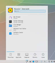
I have received negative feedback (and I agree with it) on the current state of breeze shadows: they are quite dark, narrow, and feel unnatural. I tried to adress that by making shadows more sparse and a bit lighter especially on the angles while trying to keep it distinguishable when on white background. I received some positive feedback on these shadows from T10891 and the VDG channel.
More specifically, I changed dialogs/background.svg and widgets/panel-background.svg to have a) longer linear gradients and b) radial gradients instead of linear on the four sides to make the center darker than the angles.
Details
Details
- Reviewers
- None
- Group Reviewers
VDG
Diff Detail
Diff Detail
- Repository
- R242 Plasma Framework (Library)
- Branch
- breeze-shadows (branched from master)
- Lint
No Linters Available - Unit
No Unit Test Coverage - Build Status
Buildable 17611 Build 17629: arc lint + arc unit
Comment Actions
I'm sorry, when I use scour on svg files, it looks like git does not recognize that the file has changed. How can I fix that?
Comment Actions
That means that the files actually haven't changed compared to the prior version. It looks like the diff is messed up and is using the scoured version as the base rather than the latest git master.
Comment Actions
It now shows me a diff, is relatively to master or to my previous svg? in that case, I can do another diff without messing up (hopefully)
Comment Actions
b) radial gradients instead of linear on the four sides to make the center darker than the angles.
Other than this, they look great to me. I think they should be uniformly dispersed.
One of the things with shadows is that the user shouldn't really notice them. With the radial style I can't help but notice there's shadows missing in the corners.
Comment Actions
Making good looking pure svg box shadows is a bit tricky.
A while back I tried to create one:
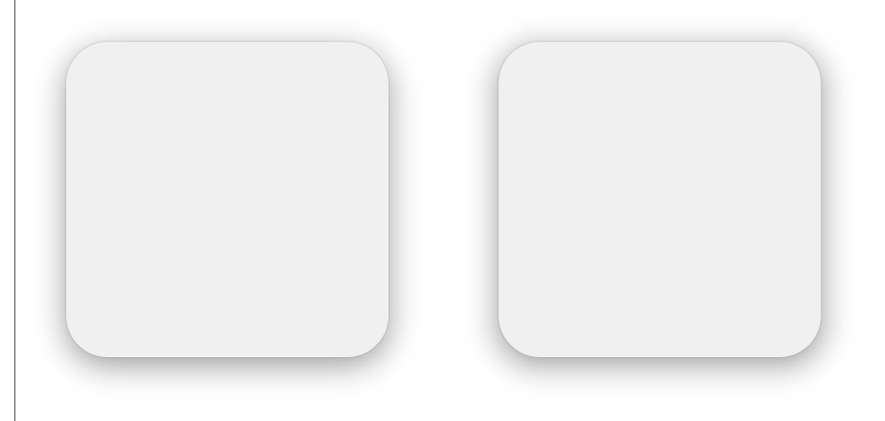
The left one uses blur (like breeze decoration does) and the right uses gradients with quite a few stops to emulate the blurred square (I don't know if this has any effect on performance), radial gradients were used only in the corners.
It this is of any help, here is the svg:
Comment Actions
What do you think?

Thanks, that's interesting. May I ask why did you use multiple linear gradients instead of a big linear one?
Comment Actions
Is this ready for formal review now or are you still tweaking and/or soliciting comments?
Comment Actions
Does it apply now? If not, I messed up something and I will just reset to master and add the svgs again.