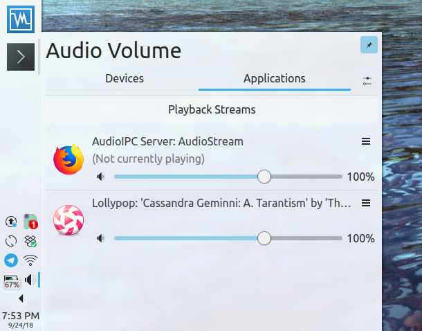
When a stream is present but not playing anything ("corked"), show icon slightly translucent
BUG: 398476
FIXED-IN: 5.16.0
When a stream is present but not playing anything ("corked"), show icon slightly translucent
BUG: 398476
FIXED-IN: 5.16.0
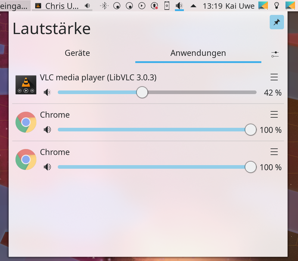
VLC is playing, Chrome has a paused video open

The information is the same used to determin whether to show the audio indicator in Task Manager and isn't super reliable but it's a nice subtle info
| Lint Skipped |
| Unit Tests Skipped |
That dimming effect might be too subtle on a brightly colored app icon. How about dimming the black volume icon instead of or in addition to the app icon?
We need to take care to not make it confusing with the "muted" state where it fades the slider
Also if we fade the volume icon, might indicate "disabled", "why can't I mute this"?
Hmm. Here's another idea: we could badge the app icon with player-volume-muted, maybe.
I just worry a bit that lightening the app icon may be too subtle, and people might see it as a bug or wonder why it looks different.
Basically +1 on the concept, but I think we need to make the appearance a bit more distinct between playing vs non-playing. I've thrown out some ideas, and I'm open to others. Reducing the opacity even further would work. Adding a little tiny piece of text that says "Not currently playing" to the right of the app name could work too, especially in conjunction with the reduced opacity.
How about changing the volume icon for the non-playing application to audio-volume-muted.svg? Then, when it is playing audio, it reverts to low/high icons as usual, based on slider location.
That happens already when the stream is muted, so we can't re-use the effect for this.
All of that is reserved for being "Muted". Just because it doesn't play something doesn't mean it couldn't start producing sound any moment.
We shouldn't use anything that could be confused as "muted" ("can never make any sound") for "not playing currently"
I see what you mean, I thought we had a "muted" icon. The volume icon with a slash in the middle.
Ideally the volume lines would show how loud an application currently is by having an equalizer-like overlay on the blue volume bar.
For now I think having the icons with less transparency is confusing. At least for me it doesn't seem intuitive enough what it means and it might open up possibilites where some icons look weird when dimmed.
Adding icons to all apps that are currently not playing would clutter things up since there's usually more apps open that are not playing anything than vice-versa.
I thought about adding another volume icon to the bottom-right side of the app icons but that would probably look weird right next to the other volume icon. Maybe someone can come up with a better idea?
This feels too much. There is no need to be so obvious, just need to be able to differentiate when there are multiple streams.
Can't we dim label instead? It easier to distinguish with other labels, as they have the same color.


This is with opacity 0.6. It could be more obvious with 0.55 or 0.5.
Can't we dim label instead?
I quite like that. Also not very obvious what it means, I guess..
Not sure if it was already discussed, but what about adding an overlay pause-icon, similar to D3302? Maybe this is easier to understand?
This could be interpreted as a button.
Not that we removed the audiostream description, can add a message to the right (No output)
Although I like none of these two. I prefer simply dimming the label.
I'd prefer some dimmed label next to the app name but with the radio button and manual size calculations all over the place now, this is difficult