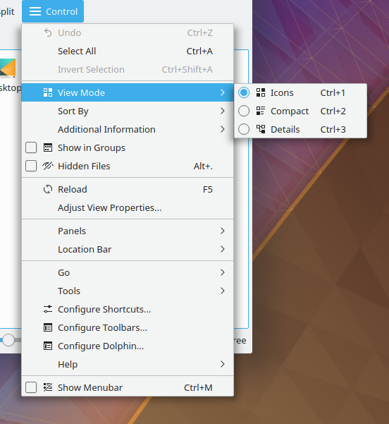
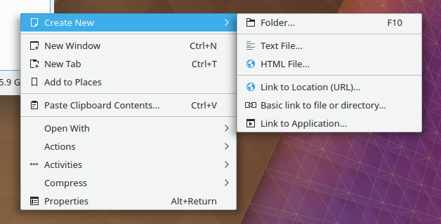
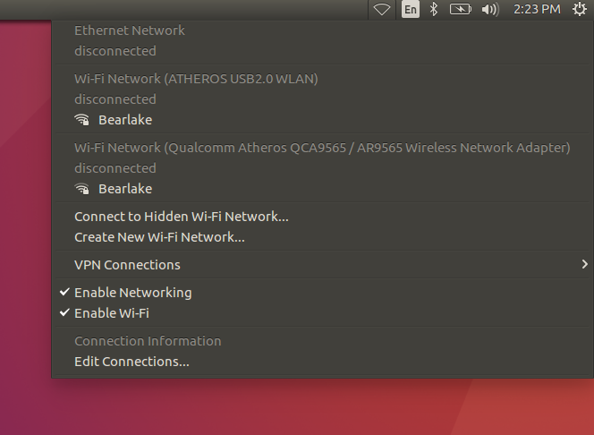
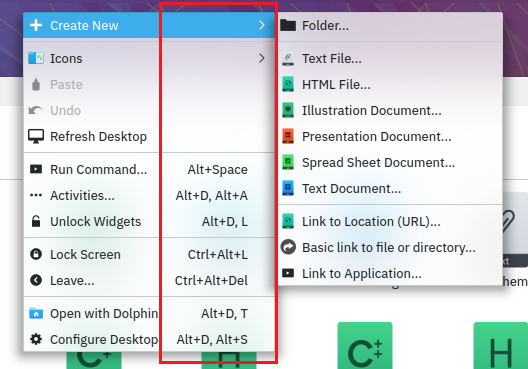
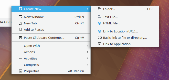
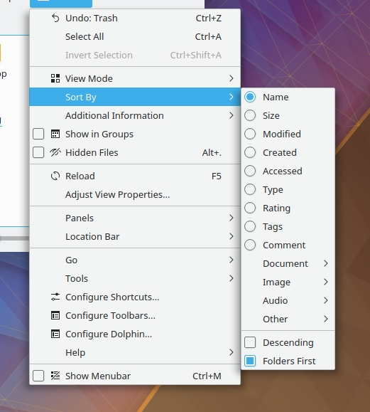
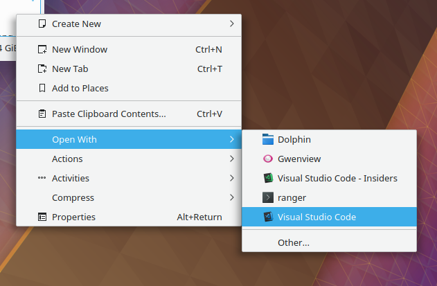
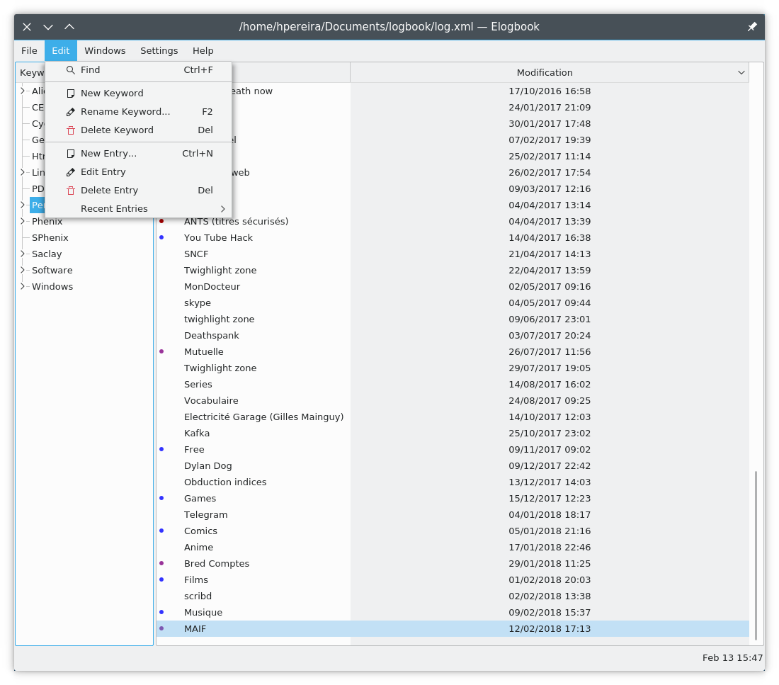
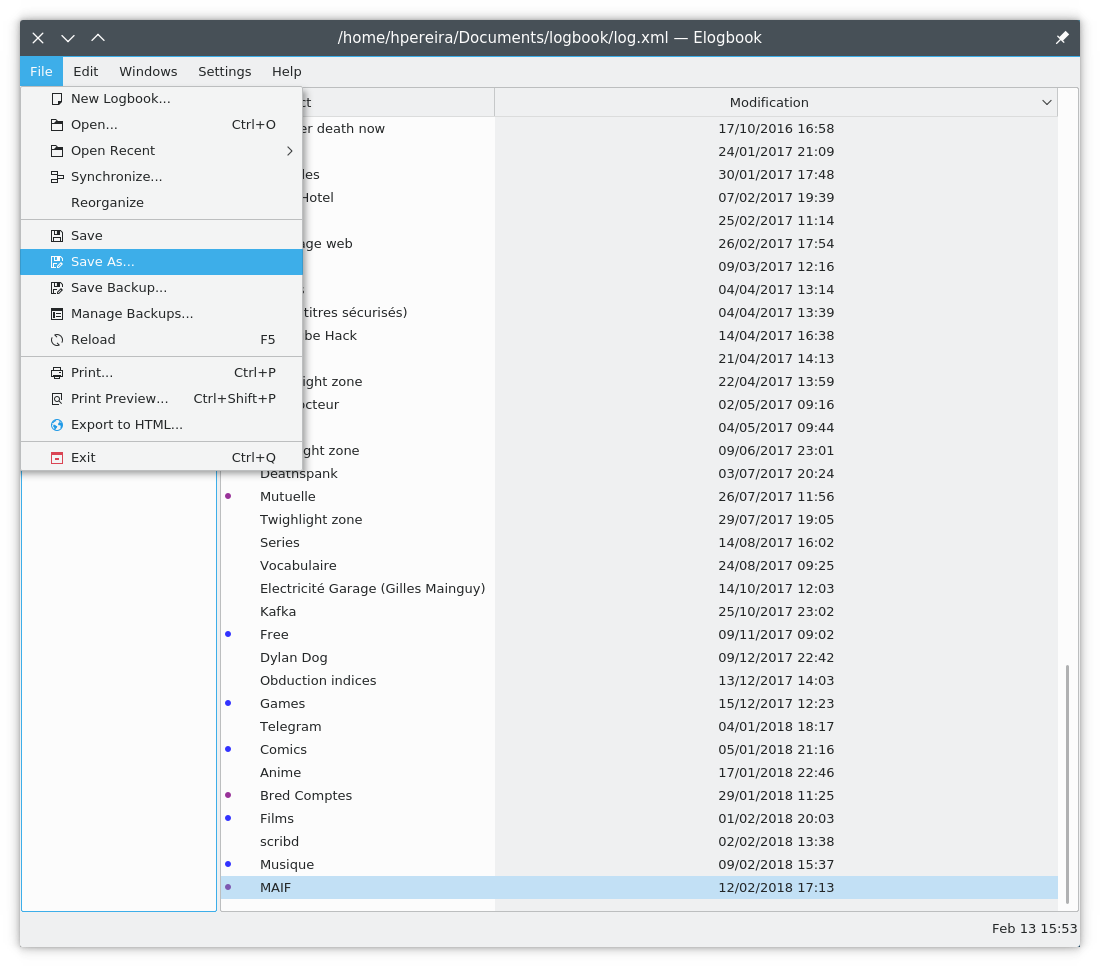
At a given moment, menu items do not have empty space on the left side.
This feels not really comfortable or "natural"(I don't know how to
express this feeling).
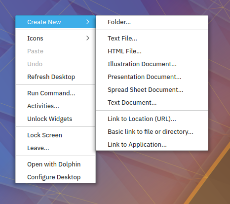
This revision tries to solve the problem above by reserving space for checkable
widgets. Also, it achieves consistency with macOS/Windows/Unity/etc.
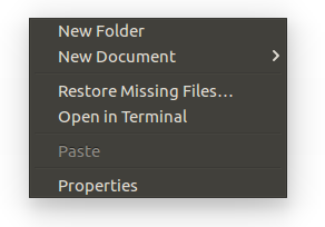
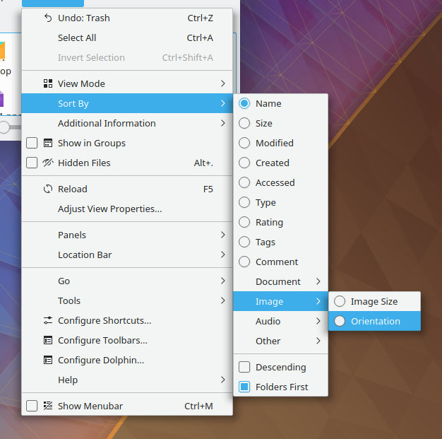
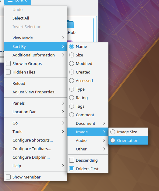
Before

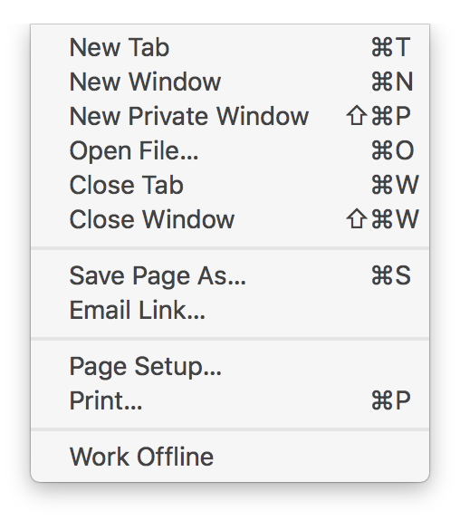
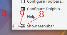
After

Context menus with checkable widgets(e.g. radio buttons or checkboxes) look the same