Update of Default User Interface
Open, Needs TriagePublic

Description

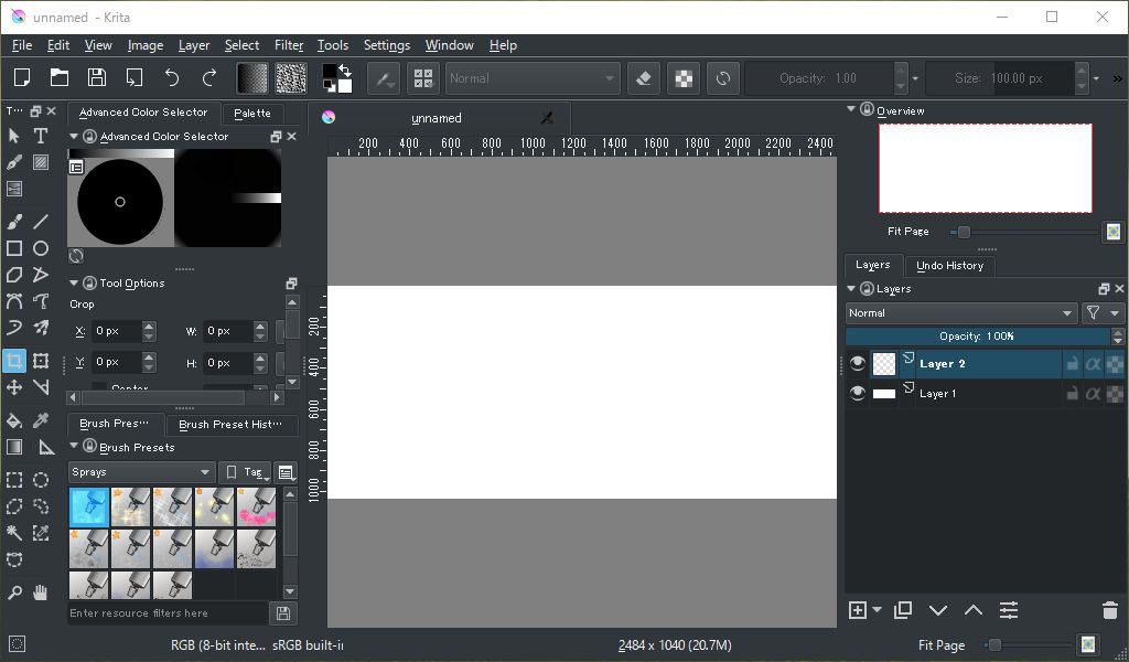
Krita has a highly customizable UI. However, Default UI is pretty unfriendly towards newbies to Krita. Current Default UI should be judged to be poor rather than simple, so we should add more contents to our default UI. I tried making a draft of a new default workspace and toolbar. My draft is inspired Paint tool SAI and FireAlpaca...


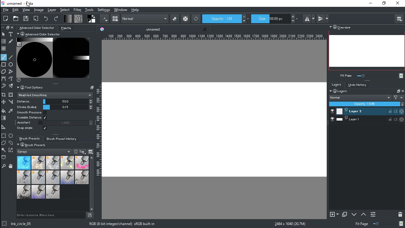
The new UI is roughly divided in four sections: Color, Tools, Brushes and Layer&Navigator

I newly added the following contents to the new UI.
Toolbar: Showing File Toolbar by Default, and added Export, Undo and Redo
Docker: Remove Specific Color Selector and Color Slider, and added Palette, Brush Preset History, Navigator and Undo History

I think "good" is very subjective in this case. It depends on what applications people are coming from. If someone is coming from a tool like Paint Tool SAI, Krita is probably a bit complex an 'unintuitive' as they are not used to this layout.

If someone is coming from an application like photoshop, the current UI is probably close to "perfect". It is more similar to that user interface. If we do any changes, we have to understand there will be some backlash. Do we want the complaints to come from Photoshop users, or Sai users?

I'm ok for adding another advanced workspace like this, but I believe it shouldn't be default, because we always try to get default worspace as simple as possible for at least two reasons:
-to can fit on smaller screens
-to leave more space for the drawing area

and maybe also to not overwhelm new users with too much things.

@tokiedian - I think for a UI discussions, it is good to start with a very concrete problem and work from that. Without a problem and saying "why", it makes your solution look very subjective. Maybe you can clarify a bit some information on why you see it as not user-friendly.

How about prompting for the layout on first startup? With a "simple" and an "advanced" option, something like that?

tokiedian updated the task description. (Show Details)Nov 8 2016, 2:25 PM

First of all, What we should suppose is that newbie users probably won't predict that krita has a workspace system and can't find where they should go to customize UI by themselves, which means that quite a few users will keep using krita with default workspace. Therefore, I think to set too simple workspace as a default one is the same as to leave newbies behind a desert island.

For smaller-screen users: I know, but also we should remember that to hide dockers is far easier thing than to restore dockers. If you want to restore dockers you should go to menu>setting>docker (Remember that most of newbie users don't know even these panel are called as "Docker"). However, when you want to hide a docker, it's simple: to click the cross on upper-right, which is a predictable action to most people who have experience of touching computer. The fact that sometime we see people who ask us how to restore a docker which they hide by mistake but hardly see people who ask us how to hide a docker prove the presumption.

If smaller-screen newbies find that their default workspace spare too much area for dockers, they will hide some of them and secure sufficient space. However, newbie with poor default UI are highly likely to get lost and throw us away. This is the reason why I suggest that we set more advanced workspace as default.

The thing with default workspace being like it is for smaller screens is that if the app start with too much dockers that can't fit the screen, the window gets bigger than the screen and just removing dockers don't restore it properly.

At least that's what it used to do. Maybe this has been fixed since then, anyway if we make a new default workspace we must be sure it opens properly on a 1024x600 screen (I know that is small, but some users are still stuck with this resolution, and many projectors found in conferences are still at this resolution).

tokiedian added a comment.EditedNov 8 2016, 4:46 PM

I check and rework my workspace in 1024x600. It wouldn't go crazy like when I switched my workspace in Animation in small screen. Please ensure that by yourself.


First of all, What we should suppose is that newbie users probably won't predict that krita has a workspace system and can't find where they should go to customize UI by themselves, which means that quite a few users will keep using krita with default workspace. Therefore, I think to set too simple workspace as a default one is the same as to leave newbies behind a desert island.

And so I think asking on first startup could be a good idea because it can also let first-time users know about the workspace feature. Maybe it can also account for the small screen and suggest a compact workspace.

@alvinhochun wrote:
And so I think asking on first startup could be a good idea because it can also let first-time users know about the workspace feature. Maybe it can also account for the small screen and suggest a compact workspace.


And so I think asking on first startup could be a good idea because it can also let first-time users know about the workspace feature. Maybe it can also account for the small screen and suggest a compact workspace.

I agree to your idea that add first startup choice something like that

  • Minimum (recommended to smaller screen than AAAxBBB)
  • Normal (recommended to a screen between AAAxBBB and CCCxDDD)
  • Advanced

Although it need a discussion when we display it, for example on installer or the first launch.

tokiedian updated the task description. (Show Details)Nov 8 2016, 5:19 PM
rempt added a comment.Nov 14 2016, 4:18 PM

To be honest, I don't really support having such a cluttered workspace by default even for people with bigger screens. And, when it comes to easing people in from other applications, as Scott pointed out, the current setup is almost perfect for the biggest group: the photoshop users.

What I would like is to have the improved overview docker enabled by default in the right-hand column, and one color selector less... But that's my personal preference.

Btw, probably my comment is a bit irrelevant to this discussion, but there is one more problem we have with the default settings: by default the user has no favorite composite ops. And it is really difficult to find Normal composite op in our long folded list. I even had a report in VK telling that "Krita 3.1.1 has no Normal composite op". The problem can be solved by adding a few blending modes to favorites by default.

@dkazakov That is a good point. There is a big amount of blending modes and it can be overwhelming at times.

If we are not talking about any fundamental changes to the UI, I do not see any particular problem with the current setup, at least in my experience. Anybody who works with the program for some time will start to customize it to their needs sooner or later, and Krita does well at that.

For newcomers, perhaps this can help to ease them into the program:

1- Including in Krita by default actual workspaces named after popular applications such as Ps or Sai, each with an interface similar to those applications. (Dockers, docker positions, toolbar options)
2- Selecting the preferred workspace at startup, as suggested above. There could be a dropdown menu with a list that includes i.e. Krita Painting, Krita Animation, Photoshop, SAI...
If the newcomer chooses "photoshop", Krita starts with the Photoshop Workspace, including the Photoshop shortcuts (which we already have). If the favorite composite ops can be changed as Dimitry mentioned, the Photoshop standard blending modes could be loaded as well.

rempt added a comment.Jan 5 2017, 9:53 AM

I was wondering about that, because that's a regression; there must be a set of default favorite composite ops.

rempt added a comment.Nov 1 2017, 4:14 PM

The default composite ops are back, btw.