Note: every idea below needs to be at least somewhat confirmed. Suggested condition: two long-term Krita contributors agree something is a problem. (Can be developers or artists like David R.). Needs to be issues with UX (impacting user experience, not just easthetical).
- Measure Tool vs Assisstant Tool icon
- while they are different, they are both "tiny bit triangles"
- they are located in nearly the same place
- in real life, the tool that the assistant tool icon represents can be used to measure things, too...
- in result, the user needs to remember which icon was for which tool.
- That is experienced by and believed by Tiar, Lynx3D and Emmet
- Proposed solution: redesign either of the icons so that (1) they're not similar, (2) neither represents something that can be identified as the other tool
- Suggestion by tomtom - use something for perspective for the assistant tool:

- remember that the goal is to make users brains remember it easily, it doesn't need to represent everything that can be done with the tool (vide: Wrap-around mode icon which looks interesting, even though it doesn't exactly represent how it works).

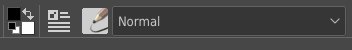
- Brush Presets chooser popup (from the toolbar)
- when I'm looking for the brush editor, then I know which one it is
- when I'm looking for the brush chooser popup, I'm not sure which one to click because my brain sees the brush icon and thinks that clicking it will get you to the chooser that is full of brush icons like that
- that is experienced by and believed by Emmet and Tiar (although assistant/measure tool icons are more important)
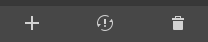
- Snapshot docker
- make the icon on the button to load snapshot more obvious (now it can be confusing and user can think it's a button to create a snapshot, deadly mistake...)

- make the icon on the button to load snapshot more obvious (now it can be confusing and user can think it's a button to create a snapshot, deadly mistake...)