Description:
Animtim & scottyp are working on icons and UI changes in Krita to make it more polished. There are however some issues, and since there is no MR and it's probably not a good idea to start a KA thread or make bug reports about them, I'll list them here. If it's fixed, please feel free to cross them off.
Issues:
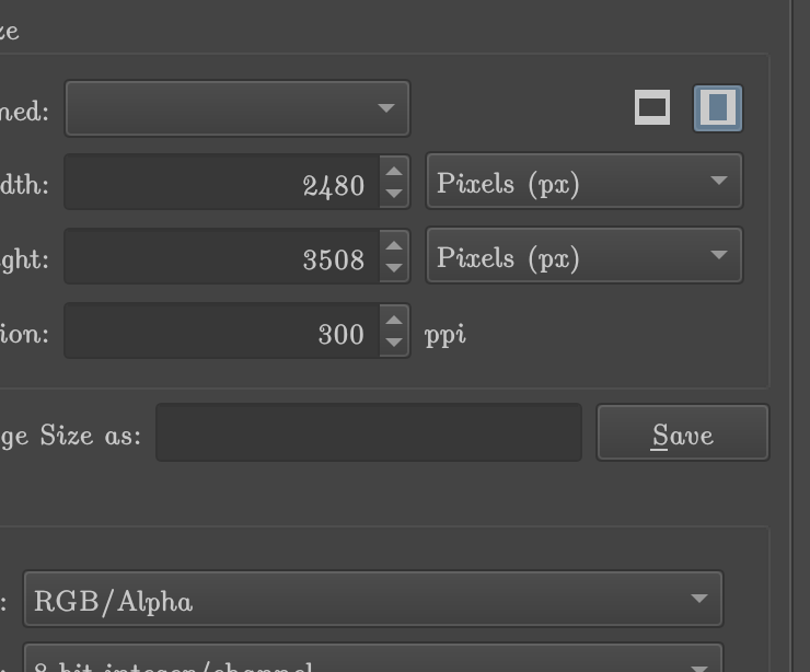
- File -> New -> New Document dialog has buttons for horizontal and vertical canvas size.
- in stable/4.4.2, the current one is highlighted in blue and it looked good.

- on master (0d4c96259d), the current one has just dark color (Fusion, with default Krita's theme), and now it's difficult to tell which button is pressed unless you look very closely.
- in stable/4.4.2, the current one is highlighted in blue and it looked good.
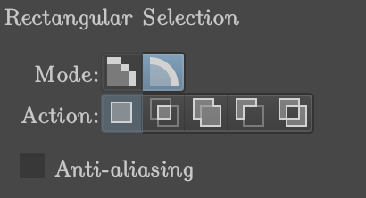
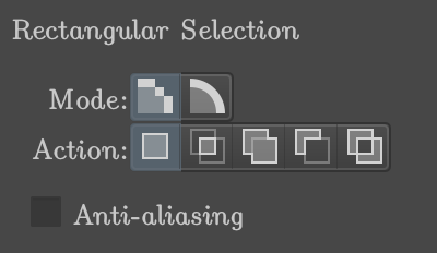
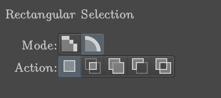
- on master (0d4c96259d), Tool Options for selection tools (checked with Rectangle Selection Tool):
- select Rectangle Selection Tool
- select Pixel Selection in Tool Options
- select Freehand Brush Tool
- select Rectangle Selection Tool: see, in Tool Options the pixel selection button is darkened and the vector selection button is highlighted.
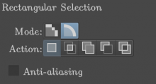
- correct pixel selection marking:

- correct vector selection marking:

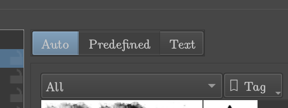
- on master (0d4c96259d), Brush Tip -> Auto/Predefined/Text
- I don't know how exactly would I get this result, but I did get it:

- as you can see, the tab chosen (and here, darkened) is Predefined, but Auto is highlighted.
- I don't know how exactly would I get this result, but I did get it:
- on master (bc233c344b) Tab names
- cutting of the name is difficult to read/recognize
- too much vertical space

- (fixed in https://invent.kde.org/graphics/krita/-/commit/2685304ce02c96a131ae0cca91dd379585e88d10 )

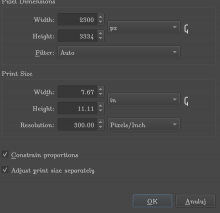
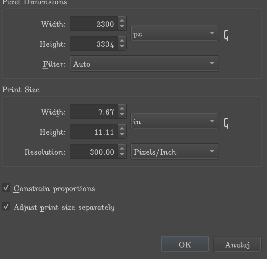
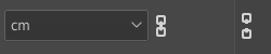
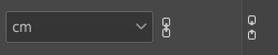
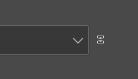
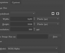
on master () Image -> Scale to a New Size, or Image -> Resize canvas, or the same features for a Layer, or Transform Tool -> Scale, or probably other places. I think all of the instances of those icons are wrong on my system now.
- the chain icons are too big and cropped