User Details
- User Since
- Nov 25 2017, 11:10 AM (334 w, 4 d)
- Availability
- Available
Jan 4 2023
I would like to help. the last time was a pleasure, so count with me if you need something online or images.
Jun 8 2022
Hello everybody. My 2 cents are here. I give all the brave Krita users access to edit the document, coment and share. Enjoy and Help if you can ;)
https://drive.google.com/drive/folders/1UMTT6TumIXr0NurBf0rex7-podiQjxwH?usp=sharing
Apr 20 2021
hmm, that deevad's icon with gear like mechanics for the brush editor,
seems good for me. I think more people are used to that symbol to
understand that "they are going to change something." than an icon with a
couple of lines. That represent the brush editor .
May 26 2020
Thanks Tusooa for your hard and useful work. I think Snapshot docker is a good addition for complex images.
For your week 6 if you think this could be doable:
I used that in PS long time ago and i remember there was a feature that allowed you to paint from history. (history mean ,snapshot) It is only a note if you are going to work more in this feature with more options. Right now in my tests works pretty well. Again Thanks
Apr 7 2020
Nice to see you find it useful. :D Thanks for the merge.
Thanks @genevievey for the token even when i don't know what is useful for or what does it mean, really.
Feb 18 2020
Feb 17 2020
Dec 9 2019
Well here goes my 2 cents for now about tags. I have to read all to give a better feedback.
Feb 8 2019
Hi, The most important feature i wish is scaling the size, brightness and contrast. They are sliders. ;) But i think more features like i propose is more fun. We are not in a hurry, so we can talk about it. Maybe users are not using this because is not so comfortable as we could expect and breaks the creative workflow.
Feb 3 2019
Feb 1 2019
the "creamy effect" selected by default nice , then i agree to integrate it in preferences.
New users are not even worried about these variants. They look for the "Patched mode" based on another softwares experience.
Hi all
Happy to see this is evolving ;D
Referring to Deevad last comment showing the prefs with patch, i don´t see
this as a need. After testing a lot, the "flow changed" release, for me it
is better, and keeping an older version can be more confuse more new users.
Jan 23 2019
I agree with everything said here. I think is good for Krita to fit the standards when we are talking about basic features. So for me is a good oportunity to fix something we have used to ( a bit weird in some cases).
Breaking something that a user has created (custom brushes) is dangerous. i agree with @Deevad worries.
And also agree with @kamathraghavendra we have to take in mind the manual too and not loose coherence between what the softwares do and what the users read when they are learning.
Mar 19 2018
Hi i am using this thread only to give my feedback. The entire set is good for lot of stuff. And now is more organized. we go from 132 brushes to 117. Less brushes with more diversity. Cool!
My first impressions are divided in 2 groups.
Things i miss:
- some brushes to create smoke or better particles Fx like rain or snow.
- more brushes to recreate texture of rocks.
- A brush flat (digital) for concept. i solve this changing the ratio on the brush.
- Soft brush to create skin. Solved with another brush. So maybe 50% miss
Mar 2 2018
Feb 25 2018
Wow! My smartphone told that lot of feedback is happening. So first of all thanks all for being here on Sunday ;) and let me give my 2 opinion. Wich is that.
Feb 24 2018
@razvanr i will read this later but thanks for the feedback and ideas. Our most important resource is human resources.
Feb 22 2018
@rempt i agree we could add the bundle installed but dissabled. This is a good idea. People is going to look for their old loved ones.
Feb 20 2018
Referring to feedback from @razvanr
Well here i go, after reading the last comments. great to see feedback so here i left my 2 cents.
Feb 18 2018
Nice feedbak. Tomorrow i will test it. Thanks Razvan
Feb 16 2018
Well this what i understand is a good basic preset for sketching. It is different and uses base resources. We can control the ratio, pattern, and opacity to achieve a wide range of effects. i hope you like it. It doesn´t use tilt i think and works also with the mouse but not so well. I am sure i can improve some pencils for the final release
@woltherav i think black is better for fill also because it is "paint" action. Wich i would think is normal. A brush without opacity control.
I sent the right brushes to get 4 different effects we hadn´t. I gave them good names to be shown in order of use by pairs, And i am testing to include 2B as people understand 2b usually and use a lot like for example Elias and other users of the krita group.

i am in Krita 4 Beta (krita-nightly-x64-v4.0.0.51-300-g4840e16bfe)
I have noticed there are some issues with pencils and i have some thoughts that i want to share with you.
Feb 15 2018
Brushes:
The icons:
updated: Brushes
Feb 14 2018
I like the way that they looks after some changes. Just testing on my pc.
While i am reviewing the wetpaint brushes i upload these icons to see what do you think
The Basic Airbrush with a not so dark spot i think gives the idea that the color increases gradually in a soft way.
Only showing the opacity change. This is what i understand as basic brush. Hard Edges, opacity by pressure and good opacity curve to ensure that the low levels of pressure are well used. "S" type curve.
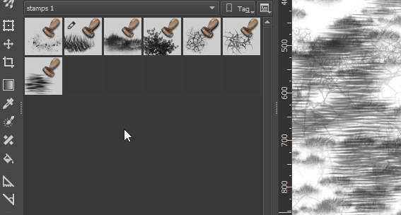
And some stamps brushes icon
Grass icon You can see the spikes when zoom out and not as opaque shape but with blank areas.
Cracks. Here the pattern is simmulating some kind of dirty voronoi with a brush tip. When zoom out, you can recognize the shape as "lines with some spots "
Water. very useful to create little waves on water. I just leave a spot of what is the brushtip When zoom out, The horizontal shapes are good to make difference from other stamp brushes.
Feb 13 2018
@woltherav i am doing this with the old set trying to organize my ideas to make the set in krita 4.0 the most complete we can. without forgetting good stuff that comes from 3.x. This is to understand better why we add something or why we remove it. because we have started from 0 and that is easy but maybe not the best way. So my idea is to combine both. No review is needed for 4.0 because we are doing it right now.
- 1 it can be changed by eraser soft. They do basically the same, erase softly. the Airbrush erase don´t use the Airbrush feature. Also imo is not a good idea put an eraser as the first brush in the default pack.If you(begginer) try it in a blank layer you can see nothing is happening and think the software is bad or the tool is not working.
- 3 The “noise” size controlled by density can’t be modified In big canvas sizes this could be make the noisy effect invisible or not perceptible.
- 4 Airbrush pressure is a redundant term. It would be like the tipical Airbrush. Added 2 instead, Airbrush linear i would remove linear.
- 7 we have a lot of “wetpaint” colorsmudge brushengine based brushes.
- 9 Gaussian term is not a common word to describe behavior in brushes. It is slow and Soft curve can do the same and more imo.
- 12 The Soft thing is not enough for me to be as brush.
- 14 Added 20 instead. If the tablet has no tilt options, we can use RMB to change angle.
- 22,26, 27 Added 24 instead.I wish to control the size of bristles and the scale of them. nowadays they are always 1px width wich is nice for low res but is useless for highres images. 6000px wide.
- 38, 39, 40 i can’t see practical uses. Maybe sketching. Added 37 to have a sample of this brushengine. I would add to the “specials” category
- 44 added 45 instead in “ink” category. It is only to fill big areas, it could be replaced by 86 or 87. The tip can be changed to be square to be more usable in squared surfaces just changing the brush tip to square.
- 46 Slow and nowadays we have another Blender Blur wich is soft. If DOF is what we need i would put it in FX or Distort Category
- 51 There is a newer version for krita4. WIP
- 55, 56, 57 Added 53, 54 instead in Texture category
- 60 It can be replaced by 63.
- 62, 64 Very small imo. Added 63 instead
- 65 added 68 instead.
- 69, 70, 71,72 i consider them as basic brushes. 69 or 71 can be replaced for 20. 70 can be replaced by basic brush with opacity by pressure. 72 can be replaced by ink brush just to take notes.
- 77 added 78 instead . Is texture controlled by pattern in Basic category
- 94 Added 93 instead. We can control opacity by the upper menu slider or RMB. it would be great to have opacity by pressure or gradient as original Alchemy software.
- 97,98,99,100,101,102,103,104,105. added 95, 96 as representation of the Sketchbrushengine. Shows basic features. too much variation of the same brush engine (11 brushes). The pencil icon is not very intuitive. Size doesn’t control real size but Area to be affected and this is not usual behavior but special behavior in sketch brushengine. This can confuse some users.
- 115 Useless imo. Only show change on color dynamics.The sorrounder brushes are very different. And the icon is related to dry technique like pastel so this could be confusing.
- 117 Added 120 (Blending cat. “Particle” Effect that blends color.)
- 123 Added 118, 121 instead
- 129 It is not related with nature neither texture. Random in rotation makes very hard to predict results. And useless imo.
Feb 12 2018
I often find myself searching for the right presets and then I have to search by word or visually. That is not a big issue. It takes me little time but I feel is not the best way to do that.
ok, here i update the latest pencils using default resources as they are renamed in krita 4.0 Beta night build (git0c60008)
Feb 9 2018
@woltherav thanks for the work, i will check them today.(Btw sorry for the doubled shadow. When you see the icon hundred times you get a bit lost until refresh, so thanks for extra work. )
Feb 8 2018
@scottpetrovic Hi, glad you like them.
After some feedack in twitter https://twitter.com/ramonmva/status/960947431809732610 and facebook Krita group https://www.facebook.com/groups/883585008407522/permalink/1490887627677254/
i agree with you. people prefer colored ones. and as Wolthera says is cyanesque color or teal as you commented.. so we are right following guides.
Feb 7 2018
Here you have 2 more brushes for Draw/Sketchiin with pencil or charcoal feeling
With this 4 we con cover a wide range of sketching i hope you find them interesting

Feb 6 2018
Well after some consideration, i have done a version of the Blending icons with gradient to see if the result are better or not. Cyan was rejected as color because it has same tone vale than BG. so i test with white. That helps a bit. The good stuff is that keeps coherence with the default set so we don´t have to remake all the icons even when there is a lot of stuff to improve imo but slowly. I am taking notes to get order in the chaos.
Talking about sketching, you know i published some sketches recently. These are the brushes i used.
I think we already have good tips and enough to create good sketches and even more completed traditional pencil looking images. So i have used default resources to create these 2 new brushes:
Blender blur DONE (Blender_Blur Copy_01.kpp)
Can have auto spacing turned off.
Feb 3 2018
Testing pencils to see what kind of texture i can achieve. I use 2 brushes to do this. one for details and another for shading areas.
Feb 2 2018
@scottpetrovic glad you like them. Tomorrow morning i have time. I will be awaken since 9:00 so if you want to talk is perfect.
Your other languages ideas and concern are totally true.
Text is something to be discused. I have done some others to show you too
Hi, today i have been working on icon redesign. Following David Revoy template with Safe frame i have made this
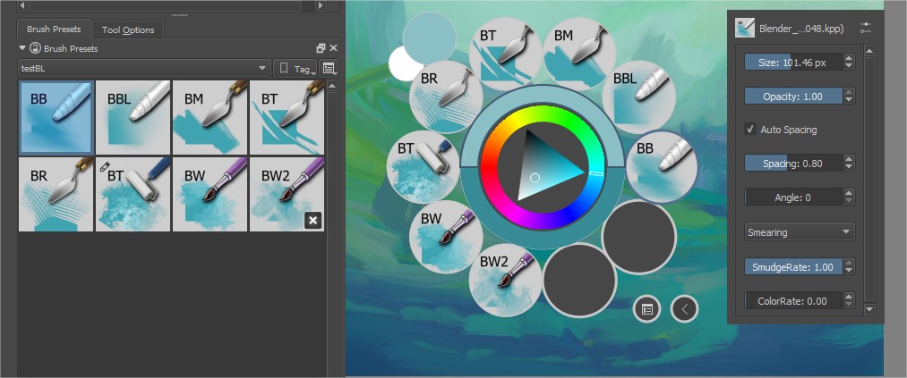
you can notice different little changes:
- Text on the upper left to help with mnemonics Blender Basic is just BB and that way is more recognizeable.
- The Shape for brushtroke blending is different enough in each of them.
- The color has changed from cyan, which doesn´t help very much to recognize the shape. anyway the color can be changed. (Each brushtroke use a filter layer with color balance.)
- No gradient on background. Helps readibility adding contrast between BG and Brushtroke.
- Tested on mini size and text still readable and i can find them between other presets easily.
Feb 1 2018
Ok here we go with the first Category I am reviewing Blending
The brushes with "Copy 0x" in the name is only to follow their changes. can be removed. These are my suggestions and ideas for blending topic. I hope you like them but if you have better ideas just improve them and let me know These brushes try to follow my guidelines for brushes. Icon design is another task. I focus here in the behavior.
After a talk with Razvan yesterday i decided to give a try in blender to make seamless textures to be used as pattern in Krita. He sent me the link and i said WOOW.i want it.
As you know i use Krita, Gimp, Gmic, inkscape, Gwyddion and Photo(with manual cloning) to create patterns. Blender is superpowerful but a wild horse sometimes.
I hope this will be a cool beggining for more advanced patterns . Experts in Blender are very welcome and also comments to give ideas or feedback. This shows an aplication with a more elaborated texture from the creator of the plugin. If you wanna try visit https://blenderartists.org/forum/showthread.php?377518-Addon-Piles-N-Tiles-Seamless-Tools-for-Blender
Jan 30 2018
Well here i am again, and in this case i post my own guidelines for my creative process:
I divide my brush behavior in 2 basic stages. Low pressure, high pressure.
I follow these guidelines:
Jan 17 2018
Hi all, I am testing the new brushes latest build. hope to get news soon.
@scottpetrovic Glad to be useful for the project and have contribuited in some way. i think there was some interesting stuff that is no added , we can discuss that here. maybe with examples. what do you think?
Jan 12 2018
Done with the first brush.
Low pressure makes xtrange artifacts in color which i found very interesting. When more pressure is applied the color flows and you get fresh variation of color.
Well ,naming is always hard, i think those names are enough orientative. in favorites i use the word "Fav" I am going to think about this weekend also i have finally ending my first contribution to brushes. There is a lot of fun on them.
hope more content soon.

Jan 6 2018
Hi, I am preparing a post about that task. Right now is in spanish, just wait these weekend and i will do the translation.
Basically textures are used to:
Jan 3 2018
Ok guys, new stuff is coming for patterns. And after this i will go for the presets . Hope you like it and ennjoy. Of course they are tileable and lot of fun to play with them. i upload them as images , and you download whatever you want.


Jan 2 2018
if someone wants to explore the creation with svg files here i upload 3 basic examples.
Papers for evaluation
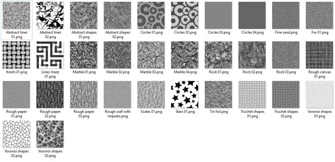
The Goal is to produce a base resource you can combine to create infinite results and to show how we can create more resources besed on fractals, vector, and painted techniques (maybe for a later release)
Dec 15 2017
Also i think this is very basic but good tips are crucial for good brushes so i created for my own uses this.
It is very easy to use. maybe you find it useful let me know.
Dec 14 2017
Hi all, i realized that we are very focused in brushes which is good. And i am still experimenting a lot. So i have created a simple way to do them. I will publish them too.
But first i was concerned about the textures or patterns we already have in krita. If we use them as fill layer with pattern, in some areas we see no tileable parts or too much emphasis in some parts of the image. So i decided to review them first because i think the resources inside the program are also important and must be the best we can give. This takes me also on the topic how we can create our own "patterns" and this takes me to fractals, noise, gimp filters and inkscape extension wich i have tested a lot. A week to be exact. But first things first.
Dec 1 2017
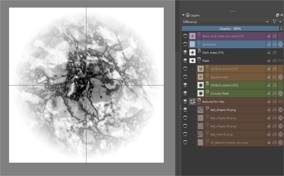
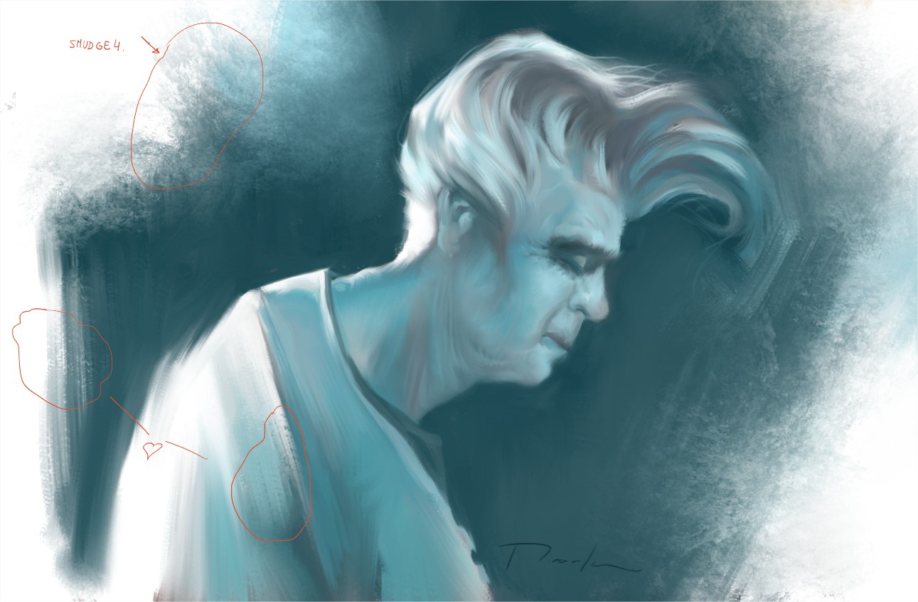
I have been testing the @radianart set. Veri nice the 010_smudge3. I modified a bit the Way that blends the paint to get more soft blending in low pressure. (personal choice) making the smudge lenth curve controlled by pressure a bit more in "s" shape. I disabled the size controlled by pressure and put the mirror option to give a random effect, but this is something i can not see clearly. anyway i have marked parts on the image that i love the texture.
Nov 28 2017
These were done mainly for muses , use it if you want.
Nov 25 2017
Hi all, Lot of info here. Interesting to see what can be improved. Where do you think i can give more help? I start to feel well and this topic is one of my favorites. Also this is my first phabricator comment so i don´t know very much the platform :D