At the moment there are several different ways tabs styles and behaviors used in KDE apps. The goal of this task is to find common guidelines on behavior and style for them.
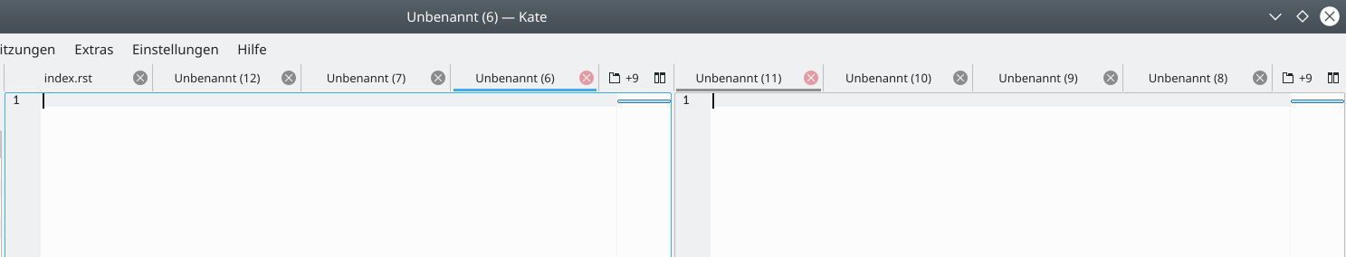
Kate
Dolphin
{F6511559}
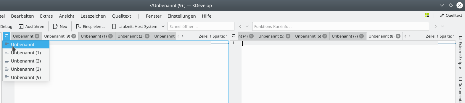
Kdevelop
Konsole
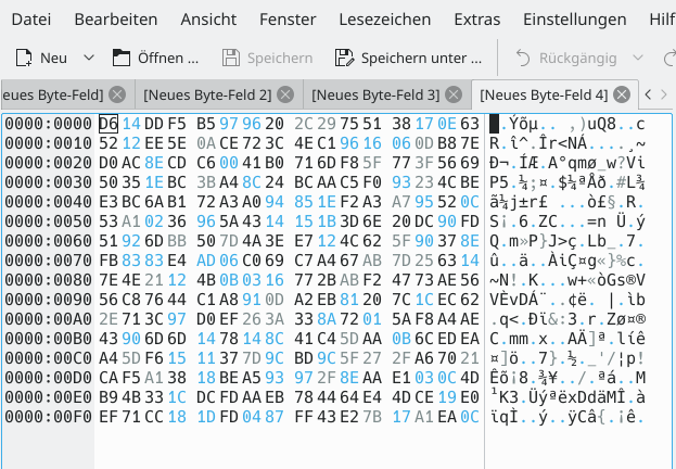
Okteta
Settings
Some observations of the current status:
Splitting:
No Splitting
- Okteta
Split inside the tab content
- Dolphin
- Konsole
Splitview outside of the tab (document based)
- Kate
- Kdevelop
These are fundamental different concepts of how the content is handled and can not be unified.
Close button:
Close button per tab
- Kdevelop
- Okteta
- Dolphin
- Krita (red close button for the current document)
No close button (by default)
- Konsole
Optional there is a global close button for the active tab in eg Konsole.
Tab height:
- Okteta 27px
- Dolphin 27px
- Kate 30px
- Kdevelop 30px
- Konsole 30px
Active indicator:
Background color, active tab is connected to the current content
- Okteta
- Dolphin
- Konsole (not connected to the current content)
- Kdevelop
Blue line (like in the task bar):
- Kate + Red close button
There are several more aspects that should be defined in additional tasks:
- Keyboard shortcuts
- Tab right click, available actions, icons, ...)
- Tab overview buttons like in KDevelop or Kate
- Menu actions, buttons for splitting
- Icons in the tab
