Brush editor mock
OpenPublic

Mock History

Current Revision

Mock Description

A proposal for the brush editor revision idea.

my mock is somewhat smilar to scotts mock and borrows the tab idea , pinning to top and drop downs for pixel brush engine from it. but instead of keeping tabs open and expanding the editor side way I keep the tab open inside the current area only. except for the scratch pad

I have assumed that most of the time user goes to brush editor to edit the current brush in hand, hence i have shown the editor in basic options. if he wants to choose a new pixel engine or a brush preset to edit he can go to another tab. there he will be presented with an option to choose brush presets to edit or duplicate a preset and then edit it and as well as delete the preset .

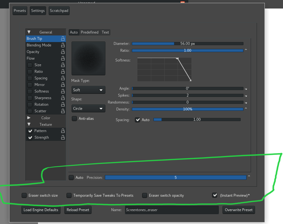
I have also grouped some common parameters for basic usage and most uncommon ones inside the advanced options. clicking on advanced option with expand the brush editor window downwards to accomodate all parameters.

Ill add more supporting mocks of brush icon editing, window showing paramenter section with curves etc

The use of icons is always welcome, and the compact look is quite appealing. Basic and advanced options... I prefer parameter categories the way they exist now. Maybe they could be better organized (i.e. airbrush is currently in the "color" parameter category), but on your mockup, the full parameters list looks cluttered.

To me, the preset browser and the scratchpad will work better the way Scott already changed them, as sections you can toggle on and off: it's convenient to be able to flip through presets and rapidly check the brush parameters. Less mouse travel, less clicks.

Thank you for your work! Really looking forward to seeing how this is gonna end up in the end.

nice mockups. There are some good ideas in here.

I am not sure what the "edit preset" button would do. you are already in the editor, so everything you are doing is centered around editing a brush. I do like the potential idea of having a duplicate or delete preset in the presets selection area. I have recently heard @Deevad request that feature to delete one.

For the edit icon...the only time the preview icon really matters is if you want to save or overwrite the preset. You will need to do other things like name it, so I stuck it in a separate window in mine.

I like the idea of simplifying the parameters somehow. I think they need to be categorized or have their names changed for that to work. For example the "Strength" setting is specific to the Texture. If you don't have a texture applied, I don't think it does anything. That might be another thing we want to address. If we can make the setting names more clear and organize everything better, I would vote to just show everything like your advanced view and not have a "simplified/advanced" toggle. If we want to get this editor much smaller, those settings will probably need a vertical scroll box anyway to scroll through everything. The current tree nature of the settings does make it more complex looking.

The "New Brush" idea might be a bit confusing as it takes you back to something that would usually be step 1 in the brush editing process. I would think it would have a dialog that would ask you to name a brush and anything else needed to make a new one.

Will probably have more thoughts later. A lot to look at and think about. great job!

kamathraghavendra added a comment.EditedNov 18 2016, 5:06 AM

@gdquest

I prefer parameter categories the way they exist now. Maybe they could be better organized (i.e. airbrush is currently in the "color" parameter category), but on your mockup, the full parameters list looks cluttered

yes agreed , this is an oversight on my part. i intend to keep them grouped the same way they are now. i forgot to group them in mock.

To me, the preset browser and the scratchpad will work better the way Scott already changed them, as sections you can toggle on and off: it's convenient to be able to flip through presets and rapidly check the brush parameters. Less mouse travel, less clicks.

I agree, you get to browse through the presets and quickly see the parameters. The main reason that I separated them because I wanted to keep the brush editor window smaller and not have it grow to its original size. If the users keeps the tab open and have the window grown to the size that we have today then point of reducing or compacting gets nullified. I mean if more and more people use it in expanded mode then we shouldn't keep it compacted. Further assumption was that.

  1. user wants to quickly edit the brush he is working with
  2. Chooses a preset and then based on that preset he would like to edit it or make a new one.

Having said that I agree there is minimal clicks in scotts mock, +1 for it.

@scottpetrovic

I am not sure what the "edit preset" button would do. you are already in the editor, so everything you are doing is centered around editing a brush

that was for editing the selected preset, it will take you to the editor tab. Once you choose the brush engine and then one preset then you may want to edit it . This is because of the assumption that user selects the preset first and then he edits it separately.

I like the idea of simplifying the parameters somehow. I think they need to be categorized or have their names changed for that to work. For example the "Strength" setting is specific to the Texture. If you don't have a texture applied, I don't think it does anything. That might be another thing we want to address. If we can make the setting names more clear and organize everything better, I would vote to just show everything like your advanced view and not have a "simplified/advanced" toggle. If we want to get this editor much smaller, those settings will probably need a vertical scroll box anyway to scroll through everything. The current tree nature of the settings does make it more complex looking.

+1

the new conveniences that i request with this mock are

  • adding tag while creating the brush itself.
  • deleting a brush
  • duplicating a preset, so that one doesn't accidentally overwrite the existing one.
  • having two modes in brush editor - basic and advanced

Other workflows should be clearly thought, out I may have made wrong assumptions too.

scottpetrovic added a comment.EditedNov 19 2016, 6:23 PM

I think one area we need to think about cleaning up is the random settings down here.

We try to have a flow of selecting a setting's section first, then modifying the settings that are associated with that section. These settings though seem to fall away from that pattern. I know some of them are more "global" type settings, so maybe we need to add a section in the settings called "Global" that we can organize them into.

The way it is now it is really expanding out the brush settings window and will makes it difficult to to condense. Checkboxes outside the settings also are a bit confusing as to what they will affect (ie. just this brush, every brush, etc)

The direction I am starting to go now, I am putting the following settings in a new "Global Preferences" section. These settings are not saved per brush, but are more like preferences that applied globally to all brushes. ;)

  1. Temporarily Save Tweaks
  2. Switch Brush Size
  3. Switch Eraser size

I might change the name of them a bit so they are more clear. We have the space. The other section I think that would be good to add is a "Performance" section. This would include the following settings:

  1. Precision
  2. Instant Preview

It might be helpful if both of these settings get a little more description about what they do. Putting them in their own section would allow for that space to do that. Doing these two things will clear up the editor a bit and organize all of the settings into the correct sections.

Sounds good! There are 3 params that feel like they could also be merged or moved around:

  • source and painting mode don't have a checkbox like other params, so maybe they could go along with the performance section. Either all 4 params together in a "rendering" section, or just both in a "painting mode" section
  • the airbrush is only 1 slider, and on top of that it only works with the mouse (at least doesn't work on both tablets I use).

Also there's the text brush tip type that I've never managed to find a use for. There are a few reasons for that, starting with the fact that if I exceptionally need text on a painting, it's going to have to be unique and I'll use the text tool, transparency and transform masks (especially when the text tools have been updated). But then you can't change your brush size, you have to use the font size you pick in the system dialog... how about removing it altogether? I've never come across a brush preset that uses it, including in Krita's default preset.

And how about the Chalk brush engine? Here's a quote from the docs: "So there you go, this brush is here for algorithmic demonstration purposes. Don't lose sleep because you can't figure out what it's for, it Really doesn't do much."

Just leaving that here open for discussion.

Right click is used to input values on a slider in Krita. However, in the brush editor, it sometimes sets the value like you would with left click, plus it often fires up the following context menu:

Should this be reported as a bug or does it also relate to your current work on UX?