These wireframes will track the vector tools update in Krita. The goal is to improve usability, and have a more efficient design for working.
Mock Description
Mock Description
Comment Actions
I didn't look closely into the mockup, but one comment seems to be obvious:
Inline Comments
Comment Actions
Sorry for that lots of comments :)
I really love the way you solved the problem of multiple vector tools! It will work really nicely :)
Inline Comments
- To keep the consistency with other programs I would rename the sections:
- Object -> Geometry
- Line -> Stroke
- It might also be good idea to introduce "Transform" section. Or merge it with "Geometry" somehow. It is needed to implement section 6, especially 6C of the Selection Tool requirements.
According to section 6D, the user can also apply scale/rotate/shear. It means that we should also show him values of the bounding box area of the shape somewhere, because they will not be the same as xywh shown here. We have two solutions:
- Do the transformations in Geometry tab and show the bounding box in some label below.
- Move the transformations into a separate tab. Then Geometry tab will always control the bounding box, and Transform will work with the rest.
Line can also have the full list or color fillers:
- None
- Solid Color
- Gradient
- Pattern
- Inherit
So it should probably moved to the bottom of the docker :)
I like this idea.
To make the user experience smooth one should be able to exit the gradient editing mode without clicking on that button again. What should be the triggers for exiting this more? I can think of only three:
- clicking on any control in the tool options
- changing tool
- changing shape
Does it sound ok?
Does this button add a preset or a stop? :) Can I add a stop with some button? Or I should click somehow?
Here we need several different wireframes. Each one for different kinds of selections. The proper GUI will be show depending on the type of shape the user selected:
- one rectangle
- one circle/ellipse
- one polyline (path)/polygon
- one line
- multiple objects of different types
- multiple objects of one type
I am a bit of scared of "Edit" button :) At the first stage I would just prefer to "read" styles from some shape and save them somewhere.
I guess we can postpone the discussion of the "Style" docker at least until I implement SVG loading completely. It is highly probable that we will be able to parse CSS, at least partially, then the styling will become much easier. At least "easier to implement iteratively".
Comment Actions
Hi, @scottpetrovic! I have checked the updated design and it seems to be almost perfect now! The rest can probably decided only during the implementation phase :)
Though there is one thing that we completely forgot about: right-button clicks!
Users are extremely accustomed to right-clicking on the objects for modifying their properties. How do you thing, what actions would be needed for the right-button menu?
I can guess only few:
- Cut/Copy/Paste/Delete/Duplicate
- Group/Ungroup
- Clip Path (how should it work?)
- Clip Mask (how should it work?)
What do you think?
Comment Actions
I think these are fine for now.
Cut/Copy/Paste/Delete/Duplicate
Group/Ungroup
We can always add to the list as people start using it. We can add actions later with whatever is most useful. I don't want to be guessing. Maybe there is a vector artist out there that would have good feedback.
Comment Actions
hi, @kamathraghavendra!
Yes, I think it should work somehow like the transform tool does
Comment Actions
Hi, @scottpetrovic!
I have a feeling that we need some shortcuts for changing stroke and fill color of the shape, like when using color picker or something. Can you suggest anything?
As far as I know, in Inkscape, the user can just select the color picker with a shape active, and the color will be changed during picking atomagically. How can we adopt it to our Krita shortcuts?
Comment Actions
Inkscape spefically has colorpicker use click for fill and shift+click for the stroke. Maybe something like our regular color pick invocation with ctrl+leftclick setting the fill and ctrl+rightclikc(or whatever we have set for 'pick background color' set for stroke???
Comment Actions
@dkazakov ahh that is getting a bit advanced for me as I have never really used shortcuts for that sort of thing. Usually I just select multiple objects first, then change the properties in a GUI panel. That updates all of the objects I have selected.
I wonder if there are any vector artists around that might have an opinion. @woltherav has a good idea with what she suggests. I don't have much of a preference.
Comment Actions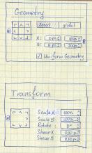
Hi, @scottpetrovic!
I extended your design to cover new information I got during refactoring the transformation tools. Could you please review my drafts of Geometry and Transform pages?
Proposed changes
- Both widgets should use the same anchor selection and locking(?) widget as the transform tool
- Geometry has two modes: local and global. These two modes are switched by two buttons at the top. In local mode, you edit the size and offset of the object in local object's coordinates. In global mode, the coordinate system will be linked to the coordinates of the document.
- "Uniform Geometry" checkbox shows if the width of the stroke and patterns will be scaled when the used edits the size of the shape. In other words, the option means: "should we scale the outline together with the shape or not". Basically, when "Uniform Geometry" options is used, the shape is not resized, but its attached transformation is changed.
- In the transform page, I propose not to use radio buttons, but just provide 5 spinboxes. We don't have 3 kinds of rotations here (no perspective transforms for shapes), so the amount of spinboxes is not so huge.
The questions that should be answered
- Is anchor point locking a top priority?
- Is global/local switch useful for artists?
- What mode should be the default?
- Is "Uniform Geometry" an interesting option for real artists?
- Should "Uniform Geometry" be turned on by default?
My guesses
- Is anchor point locking a top priority?
I guess not
- Is global/local switch useful for artists?
I don't know, it allows resizing a shape that lays under a complex transformation, e.g. rotation
- What mode should be the default?
I guess "global", because in this mode the values in spinboxes coincide with what the user sees on the canvas
- Is "Uniform Geometry" an interesting option for real artists?
I guess so
- Should "Uniform Geometry" be turned on by default?
I thing, yes. It is the most obvious when everything scales uniformly. And if you don't want your lines to scale, just switch it off
Comment Actions
- Is anchor point locking a top priority?
it is not top priority but it will be nice to have it.
- Is global/local switch useful for artists?
I didn't understand what exactly this can acheive.
- Is "Uniform Geometry" an interesting option for real artists?
yes
- Should "Uniform Geometry" be turned on by default?
no
Comment Actions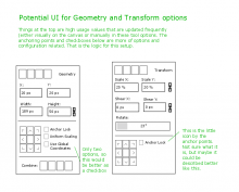
I took a look at the designs. Those are some pretty neat features you are adding. I am not sure if we want to make the design three columns wide (eg. anchor, x, width) as it will make the entire docker wider which I don't think we want.
I also think the Global/Local change can be a checkbox. It is more of an option that doesn't affect the final visual appearance on the canvas, so I think it can be a checkbox as more of an option.
I attached a potential idea. Just my thoughts.
Comment Actions
@scottpetrovic, btw, just wanted to let you know, that I love your idea and I'm going to base the real widget on it :)
Comment Actions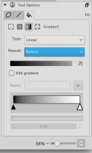
Hi, @scottpetrovic!
I'm working on the Gradient editing GUI right now. I though I could reuse the stop-based gradient editor. How do you think?

Though I cannot say I like how it looks. The thing I don't like the most is a pair of combo boxes at the top that occupy really a lot of space and are not used that often. Could you recommend something?
UPD:
Probably, I could move the combo boxes into a popup and make the editor widget a bit more compact?
Comment Actions
Here is my attempt at making this approach work. I do like the stop based gradient editor. It seems to be easier to use than the other UI I had.
I put the settings that I think are used the heaviest at the top. I think it might be confusing to have two gradients close together if we put the presets at the top, so I moved them to the bottom.

Comment Actions
Hi, @scottpetrovic!
Here is a video demoing on-canvas gradient editing. Please notice that the handles snap to their original position, as well as to the shape boundaries! :)
Comment Actions
@scottpetrovic @dkazakov , sorry this may be a bit out of the current conversation flow.
I was trying out the svg branch today , it is good and feels nice to draw in vectors in krita.
I had some observations while drawing ,I know it is too early to report issues and too late to suggest features but I thought I should share it here.
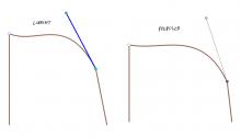
- I feel that the color of the bezier lines and handles are bit too saturated and primary, currently the bezier line shows blue color, nodes are florescent green and change to red on hover. I would suggest a bit neutral or toned down colors and thickness of the bezier line , a mock up here ->
- The pattern fill icon in the tool option (next to gradient icon) is looking like transparency icon.
- the gradient preset drop down(gradient strip next to floppy disk icon in tool options) is not clear enough, a down arrow or some other hint to show that you can click and select other presets will be good.
- Will there be other types of gradient example conical, square etc?
Some additional improvement request :
- Will it be possible to show(possibly an option to show hide) transform handles while selecting multiple nodes. It helps to manipulate multiple nodes like shown in this video ->
- Can it be possible to go into edit mode just by double clicking on the shape, as shown in this video -> this would be good as it saves time , currently we have to click on the path editing tool to go into edit mode
- Can there be some options to align nodes , this will be shown in tool option when two or more nodes are selected.
- Shortcut for filling shape and its stroke -> Select a shape and then left click on a swatch in pallete , Shift hold + left clicking on the swatch for filling the stroke
if you feel that these can be added as separate feature request, then I can make a wish bug for them.
thank you
Comment Actions
Hi, @kamathraghavendra!
Thank you for early testing of my branch! :) Some of your comments are really important :) I'll try to answer them one-by-one:
I feel that the color of the bezier lines and handles are bit too saturated and primary, currently the bezier line shows blue color, nodes are florescent green and change to red on hover. I would suggest a bit neutral or toned down colors and thickness of the bezier line , a mock up here ->
I haven't touch the path editing tool yet. I will use your probosal when polishing it. One question: do you think there is enough contrast between selected and deselected nodes in your proposal? Probably, we could make it a bit more contrast?
Could you also check the colors of the handles in usual shape selection? Are they okay? Can (and should?) we reuse these colors?
The pattern fill icon in the tool option (next to gradient icon) is looking like transparency icon.
Both tools will be deleted soon. All their usecases are transferred to the usual selection tool.
the gradient preset drop down(gradient strip next to floppy disk icon in tool options) is not clear enough, a down arrow or some other hint to show that you can click and select other presets will be good.
I will check what can be done with it. Not sure why it is not painted.
Will there be other types of gradient example conical, square etc?
No, SVG standard supports only linear and radial gradients.
Some additional improvement request :
Will it be possible to show(possibly an option to show hide) transform handles while selecting multiple nodes. It helps to manipulate multiple nodes like shown in this video ->
Please report it as a separate ticket on phabricator (in Abyss) and make it a child of T1005. Such feature was not in original plan, but it looks extremely useful.
Can it be possible to go into edit mode just by double clicking on the shape, as shown in this video ->
this would be good as it saves time , currently we have to click on the path editing tool to go into edit mode
Yes, I will implement it as part of section Selection Tool -> 2) of requirements
Can there be some options to align nodes , this will be shown in tool option when two or more nodes are selected.
Yes, this feature is already available in two ways: 1) right click on the objects, 2) Settings->Dockers->Align
Shortcut for filling shape and its stroke -> Select a shape and then left click on a swatch in pallete , Shift hold + left clicking on the swatch for filling the stroke
The shortcut already works, bun in a bit tricky way: if you activate Fill/Stroke Tab, then changing the color and gradient in any Krita widget will select this color as Fill/Stroke of currently selected widgets. I thought this interaction might be more obvious for people. If you think it is not convenient, please tell.
Comment Actions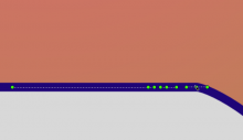
@dkazakov your node handles and decoration is awesome, I tried the branch and it feels nice already.
regarding the node handles i feel the actual node and the bezier handles shouldn't be similar, there should be some difference, the nodes should be either bigger size or of different color than the bezier handles, because when you select multiple nodes it becomes confusing to differentiate which is node and which is its handle. for example see the screenshot below
All the nodes and handles are shown same.
Also I wanted to know if it is good time to test and report bugs for this branch.
Comment Actions
@kamathraghavendra, yes, dmitry officially declared it testable yesterday. Add the bugs you find here: T3936, that task is the direct head task of this one and still lacks in comments so it should be fine to add lots of little comments to it :)
Comment Actions
Just a little comment to say I tested to open the krita svg icon in krita, and the result shows a bunch of the important missing feature.
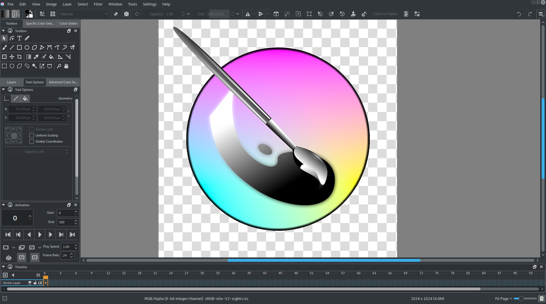
Just a little comment to say I tested to open the krita svg icon in krita, and the result shows a bunch of the important missing feature.
(Also the fact that there's no way to edit grouped shapes without ungrouping them is not very convenient).
Comment Actions
Just a little comment to say I tested to open the krita svg icon in krita, and the result shows a bunch of the important missing feature.
Maybe it would be handy to have a list of missing svg elements/features -- easier than eyeballing the result :-)
Comment Actions
bug with copying vector objects. Using the Copy option from the right click menu, or pressing Ctrl+C, automatically puts you into the shape editing mode.
Comment Actions
It's true that a list of what is wrong on loading this file would help.
At first sight, I thought it was some issues with clipping/masking that the original icon used, but then I remembered I "cleaned" the icon some time ago to not use those features anymore.
So, The issue seems to be mostly with gradients not being properly loaded.
And also, the blue stroke uses some filters that we don't support yet (feTurbulence and feDisplacementMap I guess..). About filters, strangely, the blur on the stroke is visible in krita, but not on all the other shapes on the brush that only have blur filter. Could it be because the blur on the blue stroke has a result=1 value, and/or its filter stack also has a feComposite node ?
Comment Actions
Also, not sure if that's been reported yet: moving shapes with keyboard arrows does weird move in top-left direction, no matter the arrow used.
And undoing such move doesn't restore the shape in its original position.
I guess this should be a part of Editing Tool, shoudln't it?