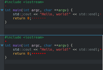
On HiDPI screens and/or usage of small fonts current size of marker is
so small making it almost invisible, even with a saturated color choice.
This is specially visible on darker themes.
Details
Details
- Reviewers
mwolff kfunk cullmann - Commits
- R39:92ec63dd1b07: - Increase size of trailing mark
Diff Detail
Diff Detail
- Repository
- R39 KTextEditor
- Lint
Automatic diff as part of commit; lint not applicable. - Unit
Automatic diff as part of commit; unit tests not applicable.
Comment Actions
I think "spaceWidth() / 2" goes a little bit too far.
Shouldn't spaceWidth() fix the HiDPI problem?
Comment Actions
I agree. The 'before' screenshot looks better in my eyes. The trailing mark indicator is supposed to be a *subtle* hint, not something causing eye cancer to the casual reader :)
Shouldn't spaceWidth() fix the HiDPI problem?
Comment Actions
Kate already has many options, so we try to be careful with adding even more options.
What I would like to clarify first is the use case: If I understand correctly, the trailing space visualization is too decent for you. The decency is indeed intended, since the trailing spaces should not stand out more than the actual code itself.
You are trying to fix this by increasing the visual appearance of the trailing spaces.
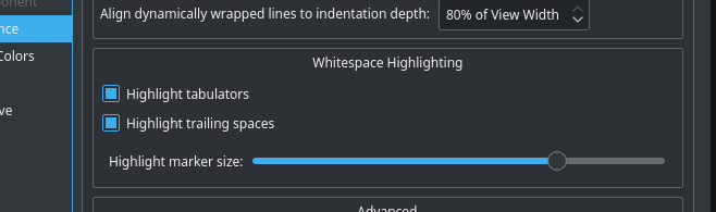
Instead, would it also be an option for you to simply change the color of the trailing spaces? This can be configured in the Fonts & Colors config page.
Would another solution be to add a high contrast color scheme?
The point is: the colors are configurable because we can never fulfill everyone's needs. So simply charging the color to your own liking would be the preferred solution.
Comment Actions
Is not that simple.
Change only the color is fine, but then the effect is almost imperceptible,
Right now from home i'm using a 25' 2560x1440 resolution with fonts in size 10. Is a regular monitor, not the most expensive.
Even changing the color a single pixel is barely visible. And yes, the fonts are.
If i go to HiDPI screen this becomes totally impossible to see ( unless you have eagle eyes ). This cases using a light background or white.
If you are using darker backgrounds, like i use Breeze Dark, a pixel even on the most bright red color still mixed up. So, no good.
To make my case mor appealing, all the other tools that we use, from simple vim to gerrit revision system shows a big mark, way more visible and this is essential to use to fix on the editor side or reject in gerrit side. So the only way that makes impossible to see the characters visible is kate. Assuming the current state is "good enought" of all cases was not a true statement
Comment Actions
I would rather go with the "make the markers much larger but less contrast" solution than a setting for their size.
Perhaps we really just need to look at how other editors do that.
Eye-cancer like markers are no solution either, but I agree that if people turn them on, they should be able to spot them easily.
Comment Actions
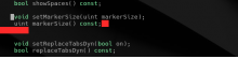
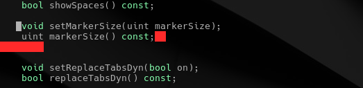
- Moved calc logic to updateMarkerSize
- Fix identation
- Make value properly float
- Update view when apply pressed
This comment was removed by helio.
Comment Actions

And then will end up with the regular "this size is not good to me, can you make larger/smaller ?".
Unfortunately, no size fits all, so i made the reasonable assumption to go from the original size to the near character size.
I honestly think that this will cover the 99% of users that will need this feature.
This is how it appears on vim:
We don't have the option on gedit.
On Atom, we can't change color, we just can change the character of "Invisibles", which makes very bad at least on my screen:
Comment Actions
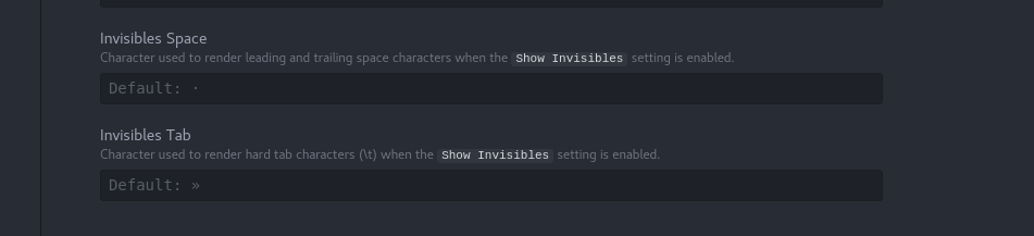
Given it seems Atom even has the option to choose the sign for that, we can live with an option I assume (and the code for it is already written anyways).
Others ok with that, too?
Comment Actions
I'm OK with an option for this. The only problem, with the option in the screen-shot, is that it could be interpreted as also effecting the tabulator mark.
Comment Actions
I did not changed the current behavior, if you keep in the same initial level, all stays same.